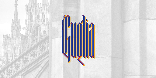
Spires inspire Leo Colalillo's very italian typeface Guglia
"Observing and analyzing the intricate details of what surrounds me is exciting and it is my main source of inspiration" notes Leo Colalillo.
"The result is a natural, curious and careful process – a synthesis of what we absorb every day incorporated into my work" adds the Milan based graphic designer.
"This method provides me with a good dose of experimentation by using new techniques and media, but also rediscovering traditional techniques, without dismissing those that are most unusual and forgotten, creating ever changing projects".
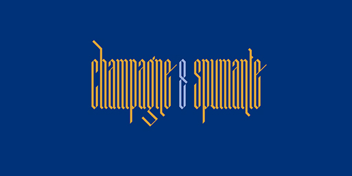
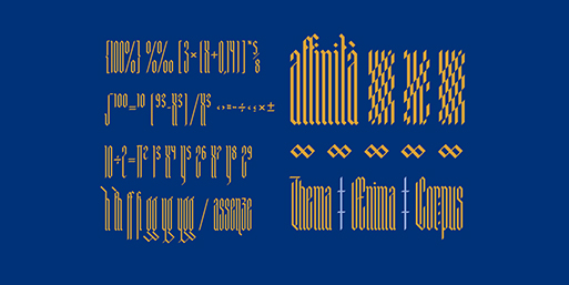
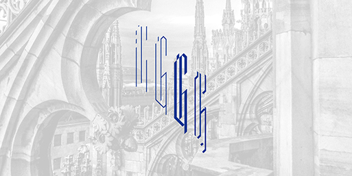
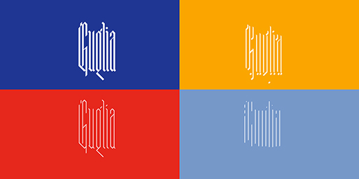
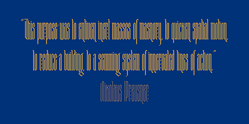
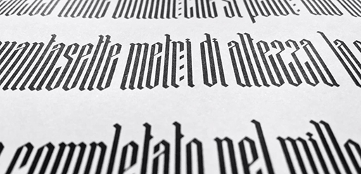
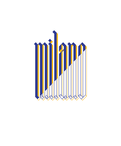
To further proof his working method Colalillo presents Guglia. "An extra textura typeface inspired by the gothic architecture shapes and in particular to his vertical extremization based on a rigid scheme, like the calligraphy of that period. A spire (Guglia in italian) is a tapering conical or pyramidal structure on the top of a building, often a skyscraper or a church tower" adds Colalillo.
Explore more of his work here.
Submit your works and portfolio here.
Tags/ typeface, calligraphy, graphic designer, milan, gothic, italy, experimentation, leo colalillo, guglia, extra textura, spire


