Sit still. Chinese fonts are on the way to conquer the typographic realm
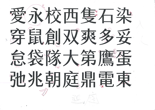
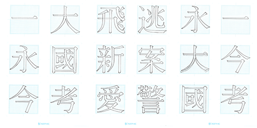
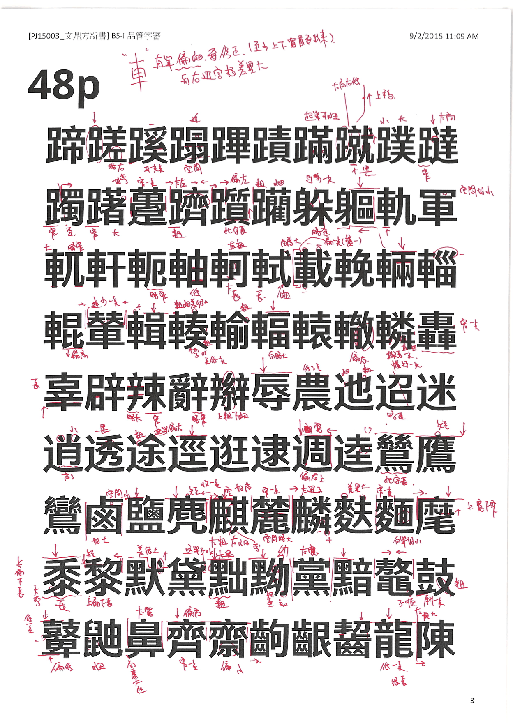
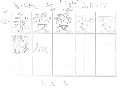
"It took China’s communist government more than 10 years of dedicated work to complete its character simplification scheme, and even now it is not without controversy. For the same reason, there has not been much innovation in fonts ever since” reports Quartz on the Chinese fonts, an instant design obsession of it. “There are many things people in the West take for granted, but here’s a big one: typographic diversity. For Latin languages, you can find sites that offer 10,000 fonts for $20—a variety for every possible mood, style, and feel. For Chinese, there is no equivalent; it’s just too massive a written language” notes the report. “The default set for English-language fonts contains about 230 glyphs. A font that covers all of the Latin scripts—over 100 languages plus extra symbols—contains 840. The simplified version of Chinese, used primarily in mainland China, requires nearly 7,000. For traditional Chinese, used in Taiwan and Hong Kong, the number is over 13,000. An experienced designer, working alone, can create a new font in under six months that covers dozens of Western languages. For a single Chinese font, it takes a team of several designers at least two years” adds Quartz which hails a brand new era in the painstakingly art of typographic Chinese fonts thanks to "better technologies for the design, display, and transmission of fonts".
For more visit Quartz here and here


Tags/ design, typography, technology, latin, taiwan, quartz, language, chinese fonts, west, china, hong kong, scripts, character building


