Eyes open wide with Optician Sans, a typeface inspired by LogMAR chart
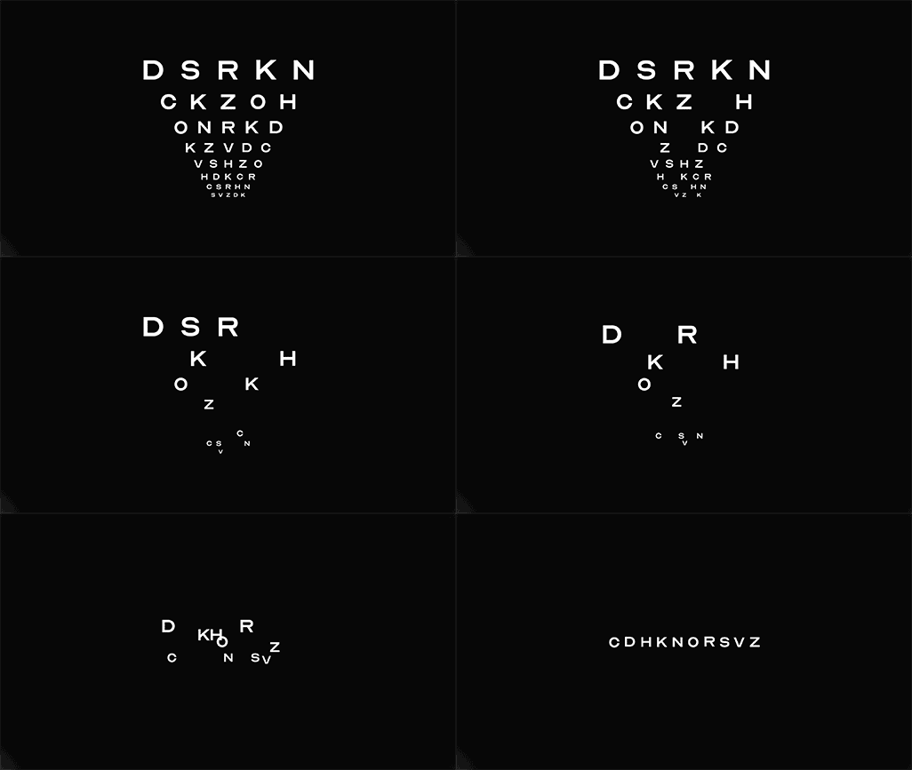
Optician Sans is a free typeface based on the 10 historical optotype letters seen on millions of eye charts around the world, finalising the work that was started decades ago.
Developed by creative agency Anti, the custom font has a full set of characters adding to the ten letters – C D H K N O R S V Z – used in historic optotype eye test charts.
The universal optometrist eye charts have been around for decades and seen by millions of people worldwide. The first standardised chart was created by Hermann Snellen in the Netherlands in 1862, before Louise Sloan designed a new set in 1959. These letters make up the now universal chart for testing visual acuity, also known as the LogMAR chart, which was developed by National Vision Research Institute of Australia. But ever since 1959, they have consisted of only 10 letters.
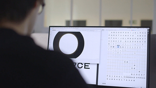
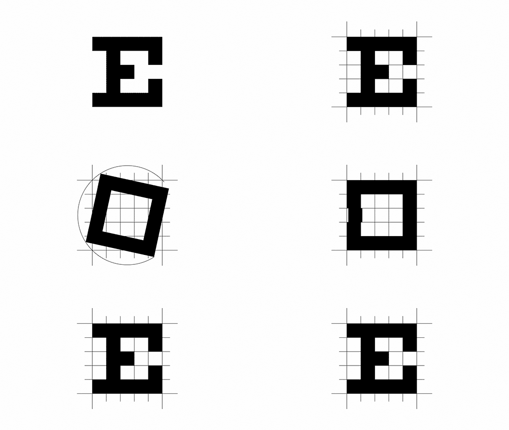
With Optician Sans, Anti finalised the work that was started decades ago by creating a fully functional typeface based on the historical optotype letters, including numbers and special characters.
The project was initially instigated for the visual identity of a Norwegian optometrist called Optician-K, the "K" standing for the Krogh family who have been in the optometry business since 1877.
Learn more here.


Tags/ typeface, netherlands, custom font, optician sans, anti, optotype, eye test, hermann snellen, louise sloan, logmar chart, national vision research institute of australia, optician-k


