Ogilvy celebrates seven decades of advertising brilliance with new visual identity
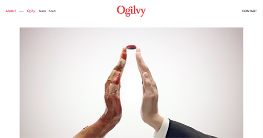
Ogilvy unveiled its new face to the world this summer. Seventy years to the day after copywriter David Ogilvy decided to launch his own glory Ogilvy is being rebranded as a creative network that “Makes Brands Matter,” according to a new tagline reports AdWeek.
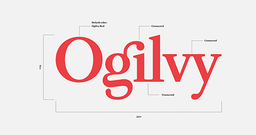
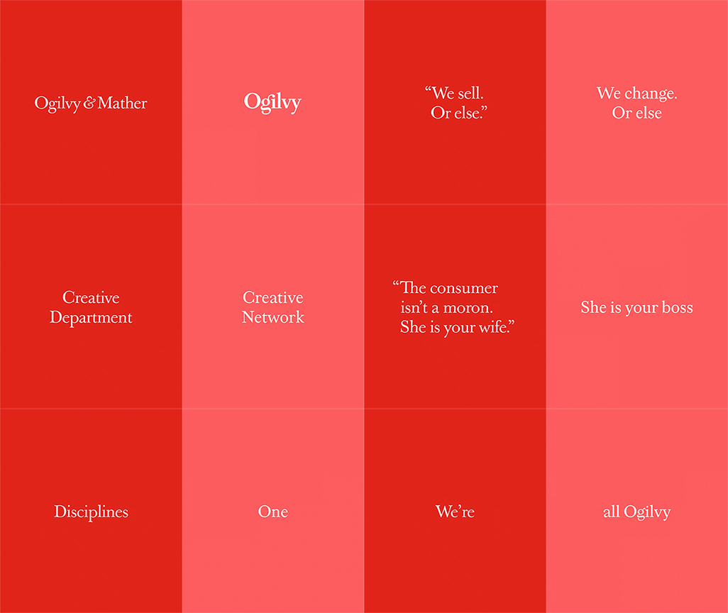
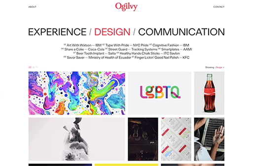
Brian Collins worked with Ogilvy to give the agency its new look. To underline the new direction, Ogilvy’s red logo has been modified with a brighter Pantone and a secondary palette of gray, pink, blue and yellow has been added "to emphasise the company’s desire to modernise, while maintaining, its strong heritage". The Ogilvy fonts have also been recut and customised as Ogilvy Serif and Ogilvy Sans.
“These developments symbolize Ogilvy’s desire to modernize while hewing to the principles that made it stand out in the first place” notes the press release.
The changes have been described as a "refounding" of the WPP-owned global network that was created in 1964 when the New York ad agency founded by British businessman David Ogilvy merged with the London advertising agency founded in 1850 by Edmund Mather.
On June 5, Ogilvy officially celebrated its re-founding.
Learn more here

Tags/ london, new york, rebranding, fonts, ogilvy, adweek, agency, david ogilvy, make brands better, brian collins, pantone, heritage, ogilvy serif, ogilvy sans, wpp, edmund mather


