Nice, Epic & Cool: the three custom typefaces for The Face 2019
The Face is back for business featuring three custom typefaces in print.
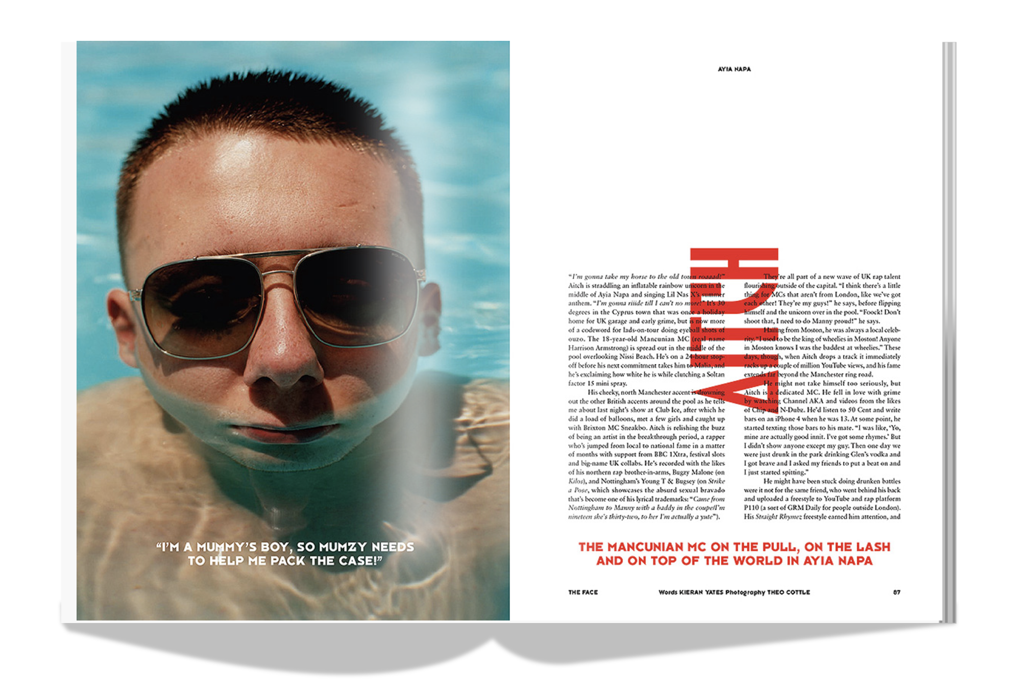
Designed by Jacob Wise whilst he was woking at Bureau Borsche, the three typefaces are named after the brand -Nice Face, Cool Face & Epic Face.
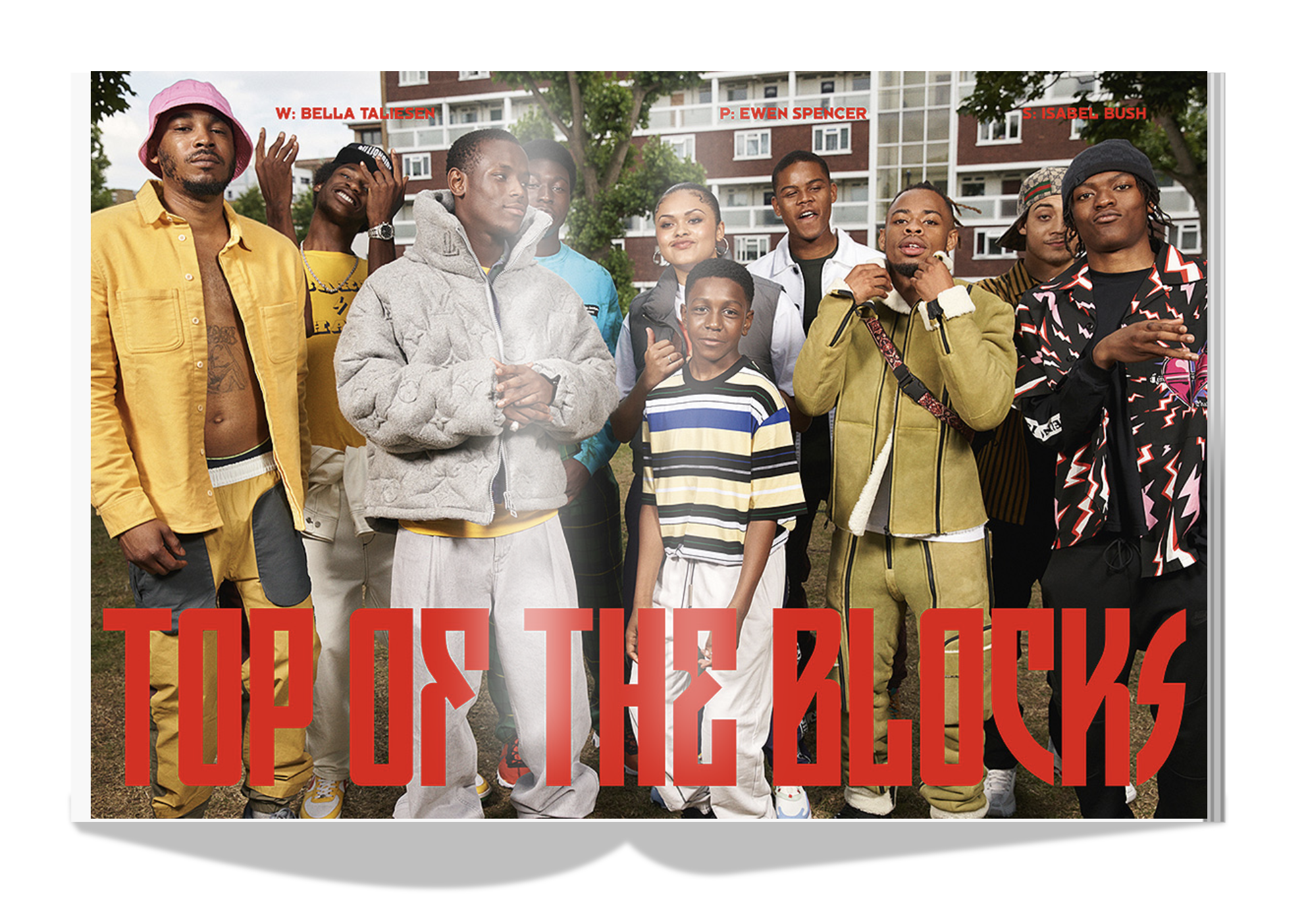
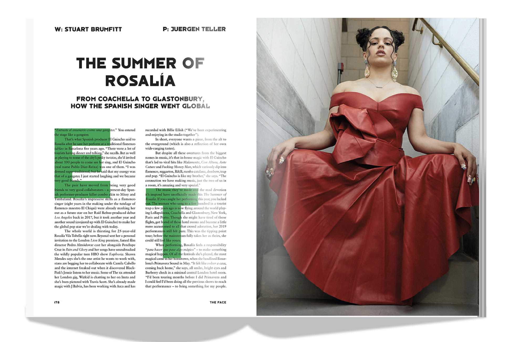
“Nice is the day-to-day one that has been used most since our launch online earlier this year. Epic Face is our heavy condensed type, which has a range of glyphs that we can use to mix up similar-looking letters (see the Harry cover, where we have two ‘R’s to play with). Then finally we have Cool Face, which we used in the back section of the magazine, to give a unifying look to quite a broad mix of content in such a short space. We use Sabon for the bulk of the body copy, it was useful to have something ‘normal’ in the mix to stop us being too nice and also just very practical! The ability to mix between four typefaces is really useful in stopping the fatigue and boredom when designing pages-and-pages of content” says The Face's art director Alex O’Brien in his interview with It's Nice That.
“Jacob and I worked quite a while on these three typefaces, which also should stand for three different design decades of The Face” adds Mirko Borsche (of design studio Bureau Borsche) who was tasked along with O’Brien to redesign the iconic zeitgeist of all things Briitish for its 2019 version.
“My bureau was discussing it in so many details with regard to these fonts and changed them back and forth. We wanted to design Headline fonts, which work as the foundation for the new DNA of The Face, which don’t need a lot of design in typesetting and still look interesting. It’s a tough job to work on something, which you admired so much in the early days of your job. Designers like (Brody) are the pop stars of our business and need to be well respected in what they created, that’s what I tried, but it’s hard to judge, when you are involved so much” he adds.
Per WWD “the British magazine is not trying to go back to its heyday. The covers for its first print issue in 15 years — 100,000 of which are being printed and will be sold on newsstands and online through The Face web site — are the first clue that the magazine is uninterested in capitalizing on its the fond memories many in fashion have of its initial iteration. For its first new quarterly issue, the very 2019 pop stars Harry Styles, Dua Lipa, Tyler the Creator and Rosalia are each getting their own cover.”

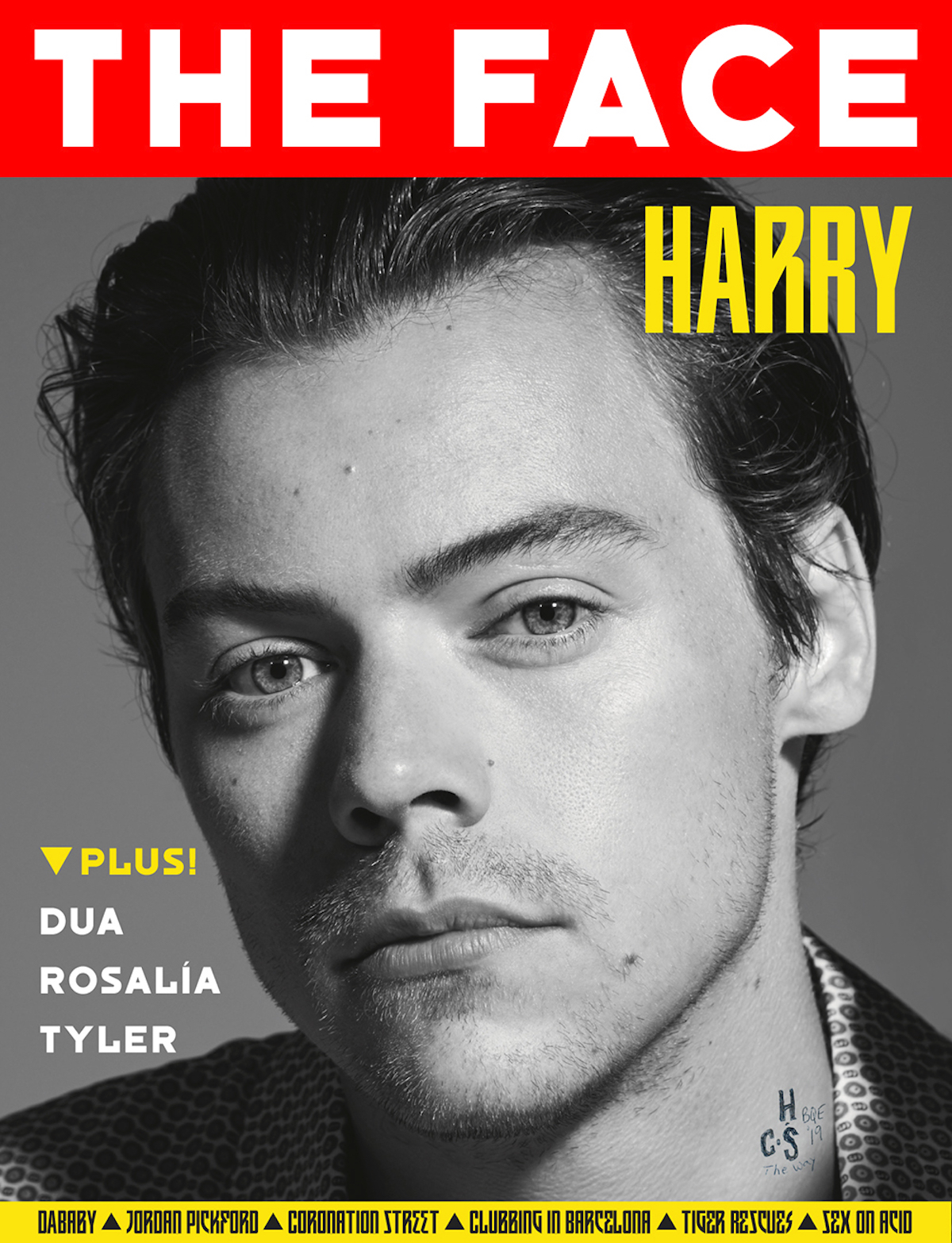
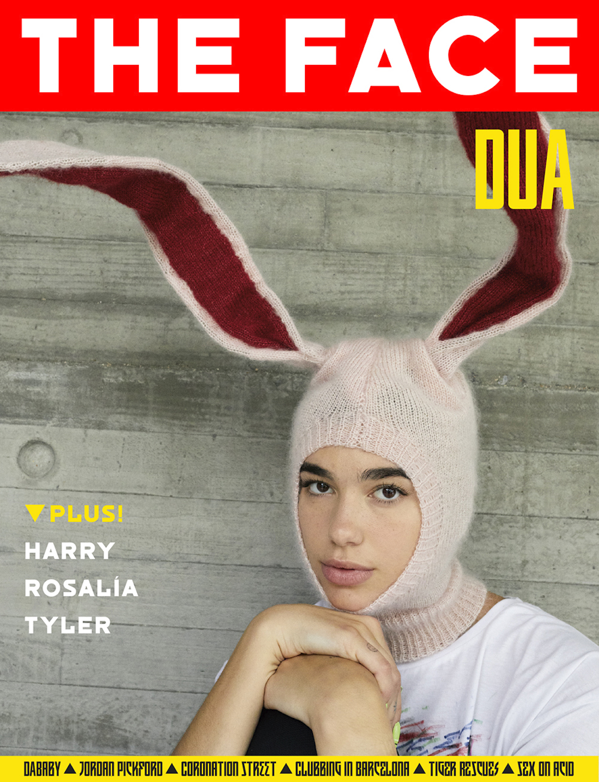
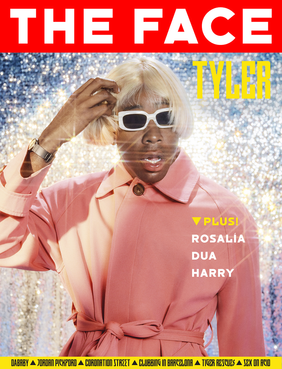
“As for why the magazine should go back into print at all after a relaunch of the web site in April, managing director Dan Flower took a line he said he heard first from an unnamed competitor, comparing different platforms for content to air travel: 'The web and social is economy, the magazine is first-class. We hate this whole print is dead vibe, because it’s not'.”
“The Face of 2019 is not aiming to be dependent on just selling pages in a magazine, which was the case when it closed print in May 2004, the advent of the modern Internet but with none of today’s constant accessibility. There’s now a studio/brand consultant element which has already worked with Adidas, The North Face and Gucci on campaigns. There are current discussions of how to branch out into TV production with a slate of ideas developed. There’s e-commerce, with a handful of brand products in an online store. And on the content front there’s push into video and also audio, offering even more opportunities for ads and branded work” adds WWD on the relaunch of The Face in print and beyond.
Grab your own copy of The Face 2019 here.
Tags/ typefaces, magazine, adidas, fonts, neville brody, mirko borsche, custom fonts, bureau borsche, the face, it's nice that, relaunch, alex o'brien, the north face, gucci, custom typefaces


