Monotype's Walbaum elegant restoration is the ambitious modern serif font du jour
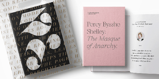
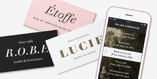
"Monotype's Walbaum typeface is the modern serif font to beat all modern serifs" notes the renowned type foundry of it's Walbaum typeface. Dating back 200 years, the freshly restored by Monotype Walbaum typeface "oozes charm and sophistication, while remaining warm and approachable".
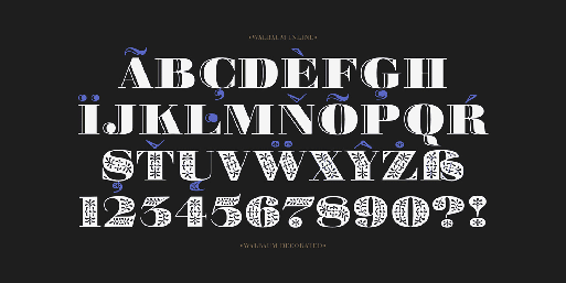
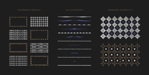
The typeface, designed by Charles Nix, Carl Crossgrove, and Juan Villanueva morphs "from elegantly matter of fact, to unashamedly attention-grabbing – and that’s before we've even mentioned its collection of ornaments" claim the designers.
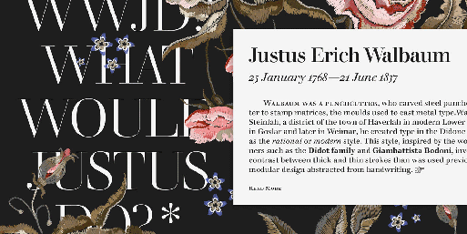
"Typeface restoration is a careful balancing act. Designers walk a fine line between preservation and modernization – staying true to the spirit of the letterforms, while reimagining them for contemporary use. So when Carl Crossgrove, Charles Nix and Juan Villanueva started working on a restoration of Walbaum, they set themselves a simple mantra: 'What would Justus do?'
Justus Walbaum’s original display sizes were relatively limited. But given the time, the tools, and the array of type uses of today, what would Justus have created?" notes Monotype.
"Justus Erich Walbaum designed his typeface in Germany in the early 1800s – creating an elegant yet readable modern serif that still “pushed a boundary in a very artful way”, as Nix describes it. However the typeface was a victim of history and circumstance, with the Napoleonic Wars and the death of the designer’s son preventing Walbaum from fulfilling its potential. Although comparable typefaces such as Bodoni or Didot thrived, Walbaum flew largely under the radar – except for a period in the mid 20th century when it became a favorite choice for book typography. A range of weights, a much more robust character set and the ability to move seamlessly across the full range of text sizes are just a few of the updates Carl introduced for contemporary digital use" adds the team.
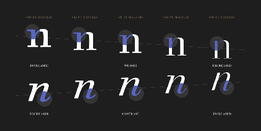
With 32 weights including italics, ornaments and two decorative cuts, the Walbaum typeface wants to take the original design to its "most extreme form of expression".
Learn more of the ambitious restoration here

Tags/ typography, type, typeface, monotype, type foundry, letterforms, germany, walbaum, serif font, charles nix, carl crossgrove, juan villanueva, restoration, preservation, justus erich walbaum, napoleonic wars, bodoni. didot


