Monospace fonts: this #fontsunday your love is monospaced
Today's #fontsunday is dedicated to #Monospace and Design Museum calls Twitter to pay its tribute to the typefaces whose letters and characters each occupy the same amount of horizontal space.
A monospaced font, also called a fixed-pitch, fixed-width, or non-proportional font, is the opposite os the variable-width fonts, where the letters and spacings have different widths.
Monospaced fonts are customary on typewriters and for typesetting computer code and were widely used in early computers and computer terminals, which often had extremely limited graphical capabilities.
Popular in computer displays as ever monospaced fonts are usually the default typeface due to the readability of source code, which is often heavily reliant on distinctions involving individual symbols, they provide.
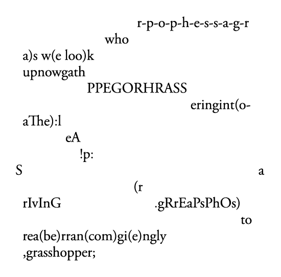
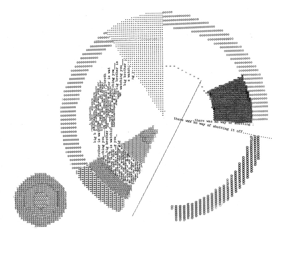
Monospaced fonts are also associated with the creation and viewing of ASCII and ANSI art. Some poetry composed monospaced on typewriters or computers also depends on the vertical alignment of character columns. E. E. Cummings' poetry is often set in monospaced type for this reason.
Monospaced fonts are used in some classic video games (e.g. Nethack) and those imitating their style (e.g. Dwarf Fortress), in biochemistry, monospaced fonts are preferred for displaying nucleic acid and protein sequences -they ensure that the representation of every nucleotide or amino acid occupies the same amount of space- and all over the entertainment industry as both screenplays and stage play scripts frequently use 12 point Courier as the industry font standard to make it easier to judge the time a script will last for from the number of pages.
Examples of monospaced fonts include Courier, Monaco and PF DIN Mono.
Do send your examples with the appropriate #Monospace hashtag here.

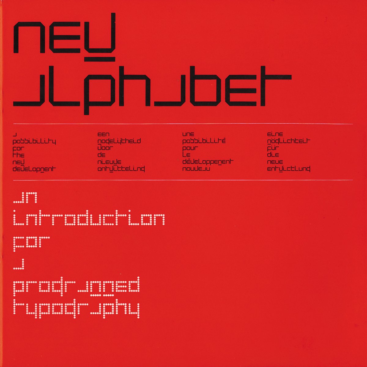
All hail the true King of Grid and TDC Medal recipient 2019, Wim Crouwel

E. E. Cummings used the typewriter to change the design (layout) of the words in his poems to give time poetic effect. His grasshopper poem is perhaps the most famous example via

Occupy Monospace by Aaron Gillett, Luke Robertson

PF DIN Mono Pro is the latest addition to the ever-growing set of DIN superfamilies by Parachute®. This is a monospaced typeface which is comprised of characters with fixed width. Traditionally, monospaced fonts have been used to create forms, tables and documents that require exact text line lengths and precise character alignment. DIN Mono Pro, on the other hand, can prove to be more than a useful typeface for technical applications. In the world of proportionality, DIN Mono stands out as an alternative to the popular standard, particularly for publishing and branding applications.

Tags/ twitter, design museum, fontsunday, font sunday, monospace, pf din mono, typerwriter


