Matt Yerman’s Horrible Five is a bloody typographic tribute for any Friday the 13th
Matt Yerman, the Oakland-based designer and art director who loves to help brands tell their stories through digital experiences, has a thirst for blood and cool graphic design splattered with type.
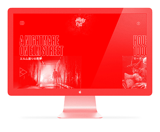
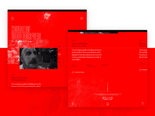
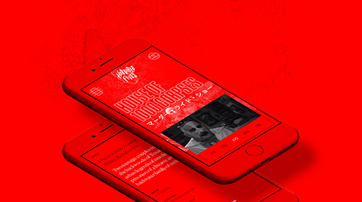
His project “Horrible Five” is proof. From serial slashers to blood-thirsty aliens, this arrangement tackles the best scenes from contemporary horror to vintage classics.
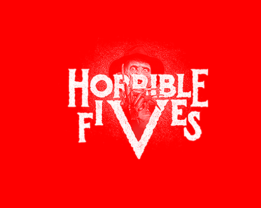
“Blood & gore is fun, right?” notes the designer of his project. “I’ve been collecting images of old VHS box covers and a lot horror-related imagery for years, so it was fun to pull it all out and explore different interpretations for the logo. I’m absolutely in love with hand-drawn type and there were some extremely iconic pieces from the 50s – 90s that inspired the other versions below” he adds on this bloody party of five that is ideal for viewing any Friday the 13th.
Enter at your own risk here.

Credits: mattyerman.com
Tags/ typography, type, graphic design, logo, digital, collection, art director, vhs, designer, hand-drawn, matt yerman, horrible five, oakland, horror, blood, gore, friday 13th


