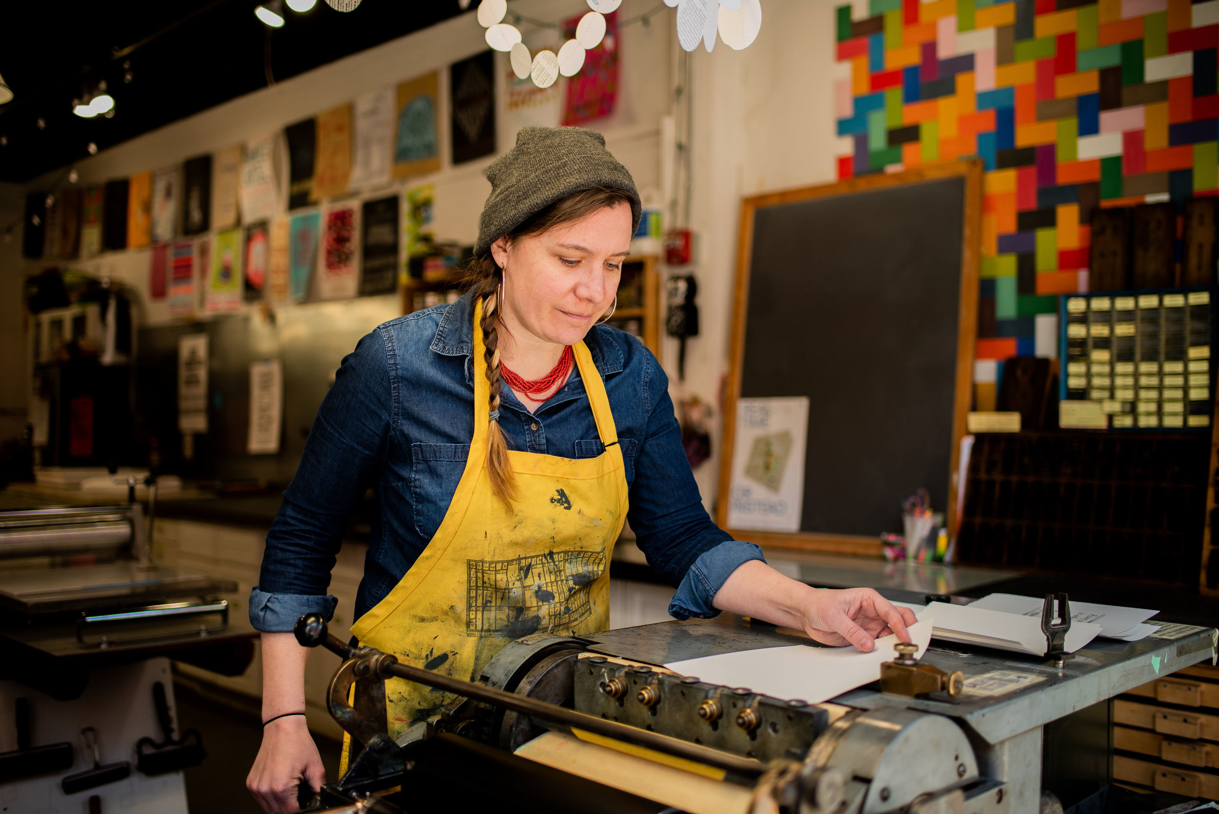
Make a Garamond wish with Nicole Em's The Printer's Tarot
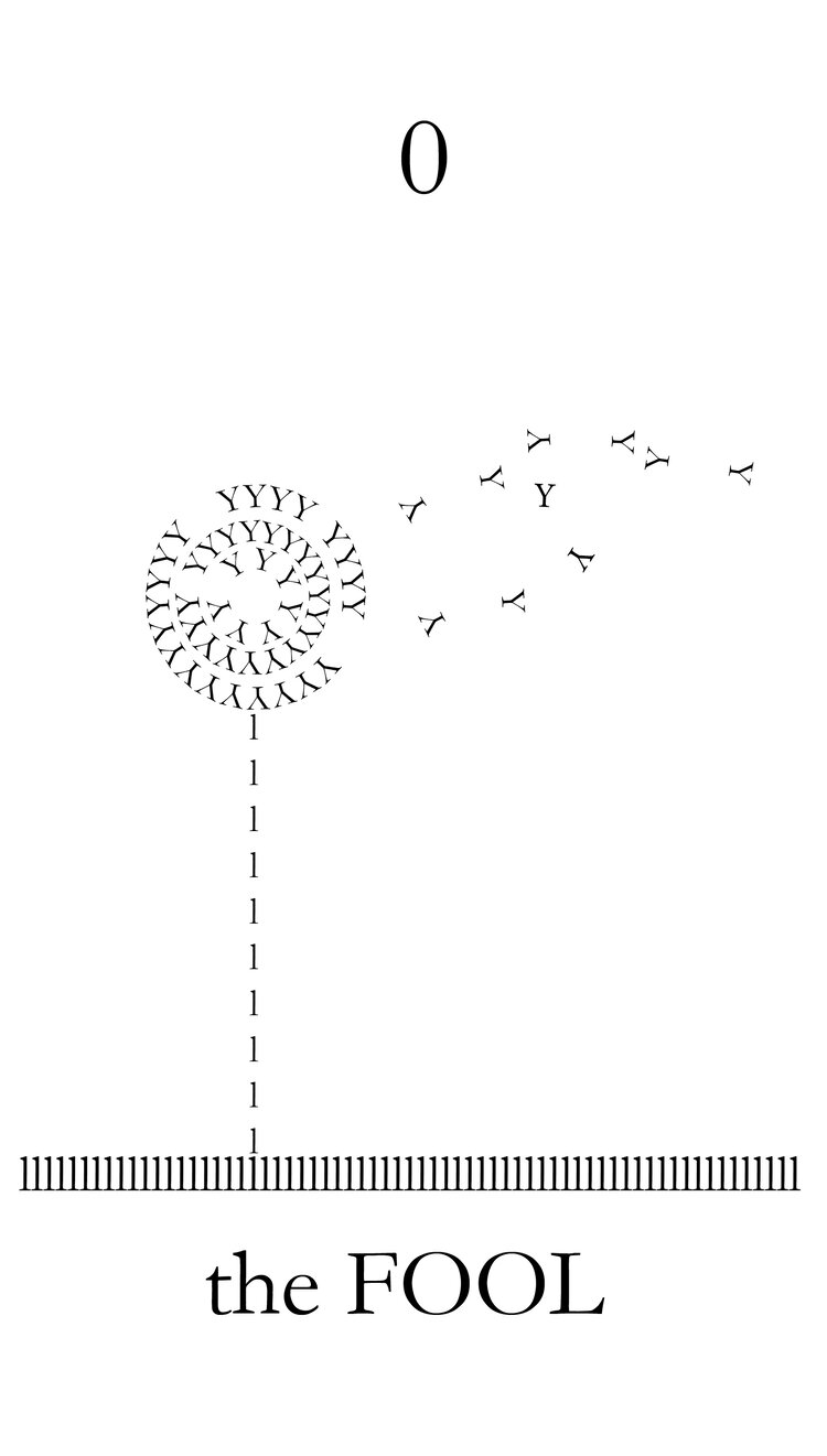
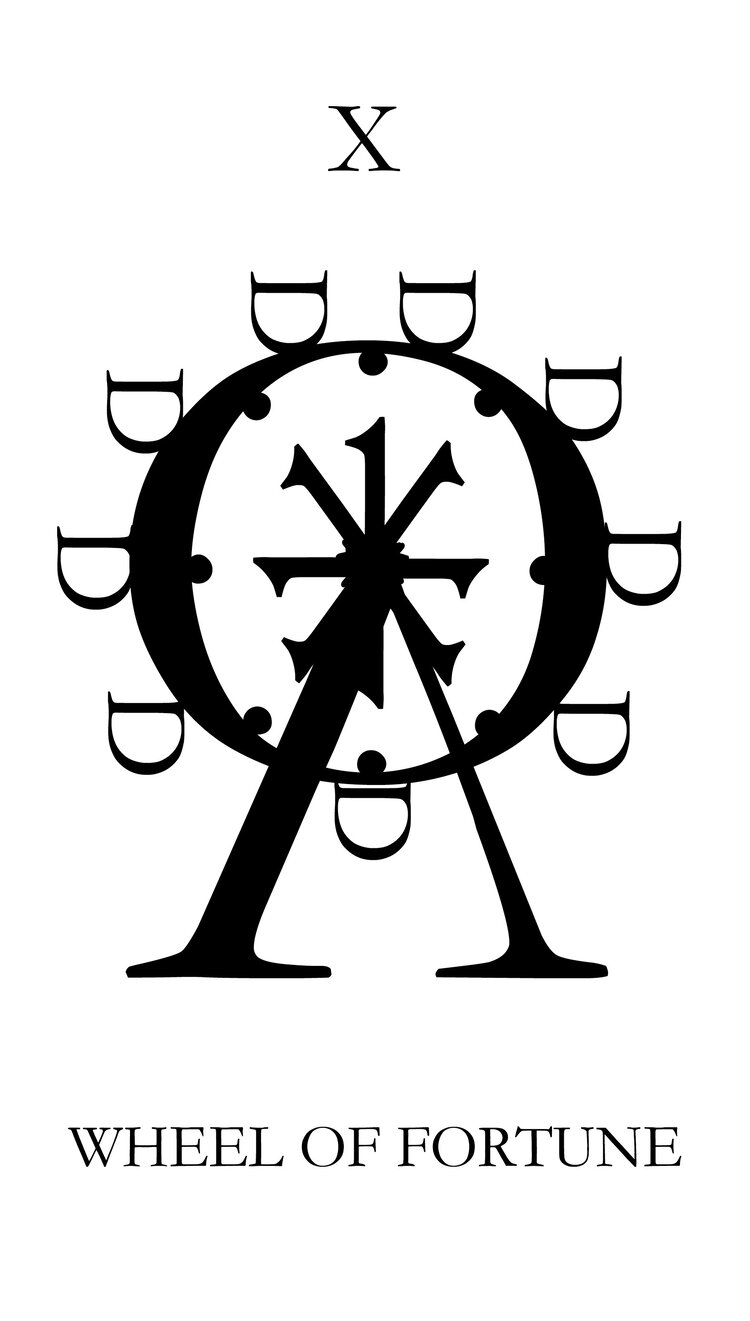
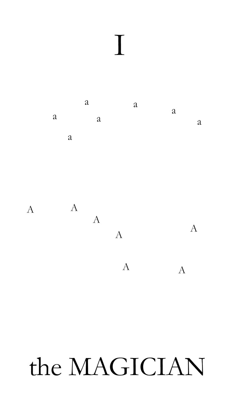
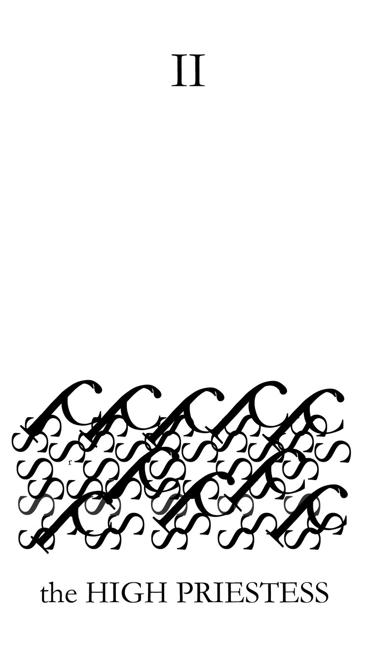
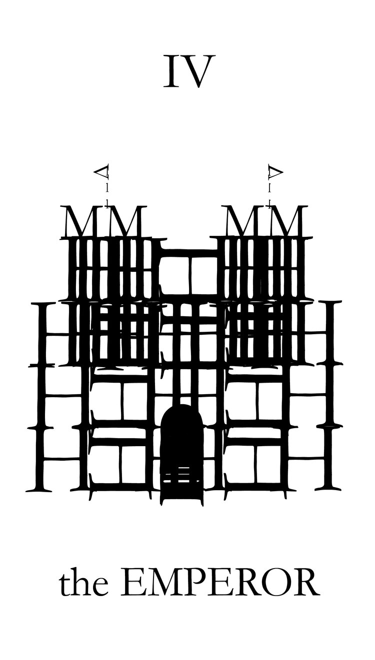
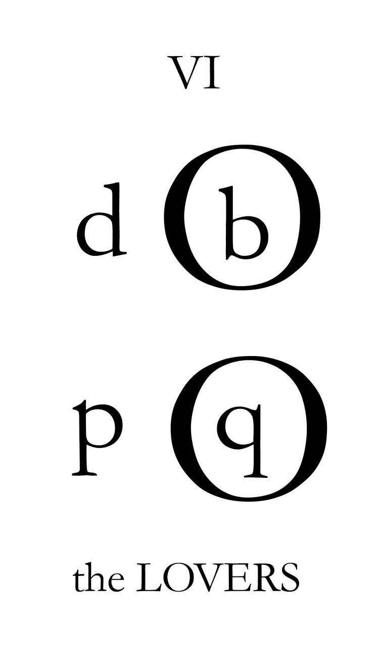
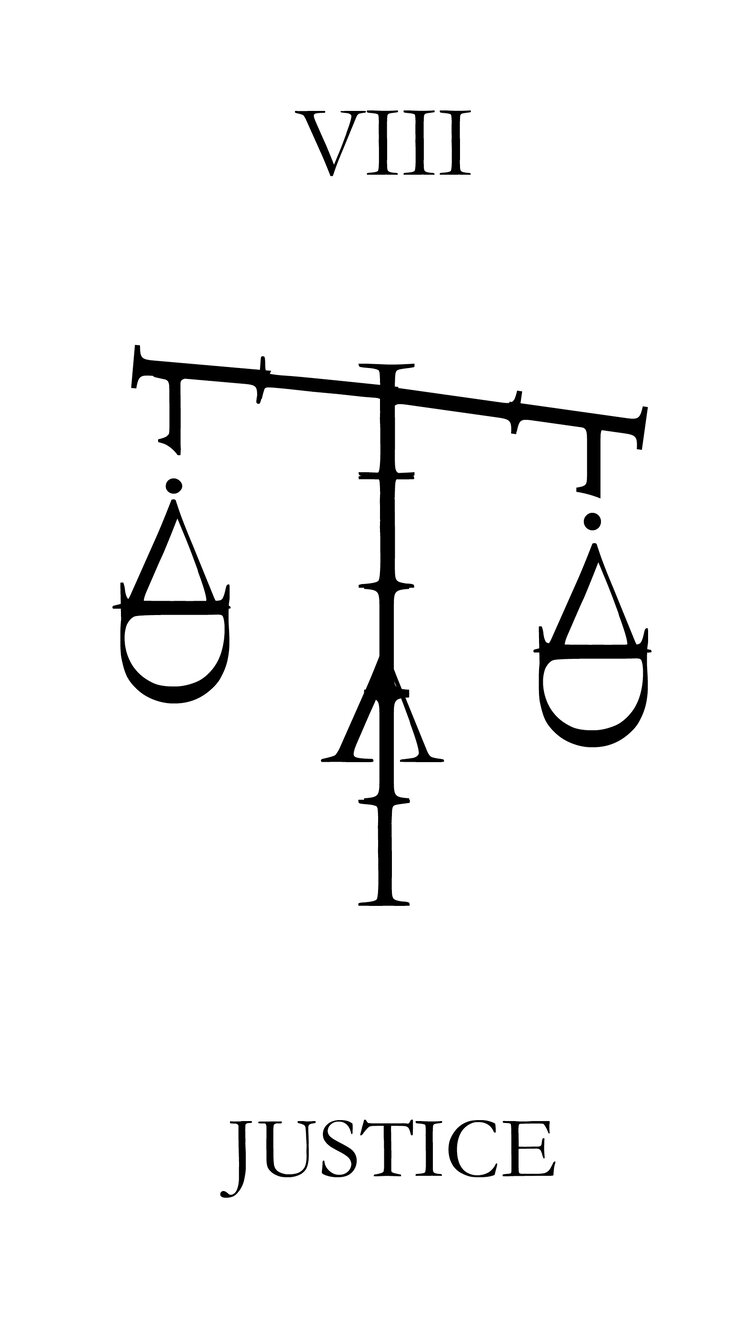
Do you wanna play a game? The Printer's Tarot, conceived and created by Nicole Em, beginning in November 2017 ensures you will.
“In a true moment of flow, she designed almost the entire Major Arcana in one sitting. As a student of letterpress printing, Em has a deep love of letterforms and a belief that typography is simply full of magic” notes the site of this beautifully designed 78-card black and white tarot deck made of entirely using Garamond's forms to create images -a typeface which hails from the same era and locale as some of the first tarot decks.
The Printer's Tarot is a typographic infused take of the tarot which was first introduced in the mid-15th century in various parts of Europe to play games such as Italian tarocchini, French tarot, and Austrian Königrufen, of which many are still played today.
In the late 18th century, some tarot packs began to be used as a trend for divination via tarot card reading and cartomancy leading to custom packs developed for such occult purposes.
Garamond is a group of many old-style serif typefaces, named for sixteenth-century Parisian engraver Claude Garamond (generally spelled as Garamont in his lifetime).
Garamond worked as an engraver of punches. His designs followed the model of an influential design cut for Venetian printer Aldus Manutius by his punchcutter Francesco Griffo in 1495, and helped to establish what is now called the old-style of serif letter design, letters with a relatively organic structure resembling handwriting with a pen, but with a slightly more structured and upright design.
'Petit texte' type intended for body text, created by Garamond. Image via Wiki
Some distinctive characteristics in Garamond's letterforms are an 'e' with a small eye and the bowl of the 'a' which has a sharp hook upwards at top left. Other general features are limited but clear stroke contrast and capital letters on the model of Roman square capitals. The 'M' is slightly splayed with outward-facing serifs at the top (sometimes only on the left) and the leg of the 'R' extends outwards from the letter. The x-height (height of lower-case letters) is low, especially at larger sizes, making the capitals large relative to the lower case, while the top serifs on the ascenders of letters like 'd' have a downward slope and ride above the cap-height. The axis of letters like the ‘o’ is diagonal and the bottom right of the italic 'h' bends inwards.
Inspired by a long history of movement artists & activist printmakers, Nicole Em, a letterpress printer & graphic designer living in Portland, Maine has developed a deep appreciation for the power of words. Em, currently a member of Pickwick Independent Press and a junior designer & copyeditor at the Portland Design Co didn't distort the letterforms to make the images; they were merely manipulated in space and layered.
The face cards depart from the traditional and are instead made up of novices, apprentices, journeymen, and master printers. It seemed only right to celebrate the skill, trade, and craft of letterpress printing as part of a deck that is so wildly enamored with typography.
To purchase your own deck of cards click here.
All images via Emprints, portrait photo by Elle Darcy
Tags/ typeface, garamond, letterpress, cards, portland, nicole em


