IKEA reconstructed: Seventy Agency on the rebranding for the digital ages
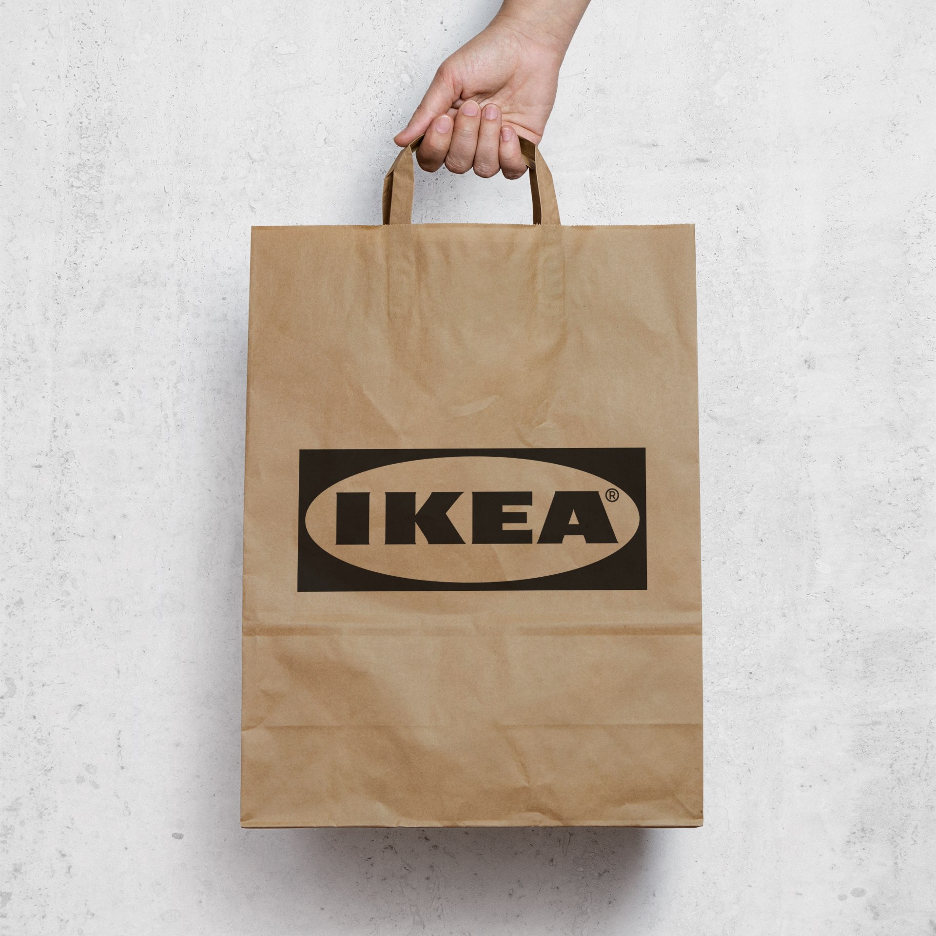
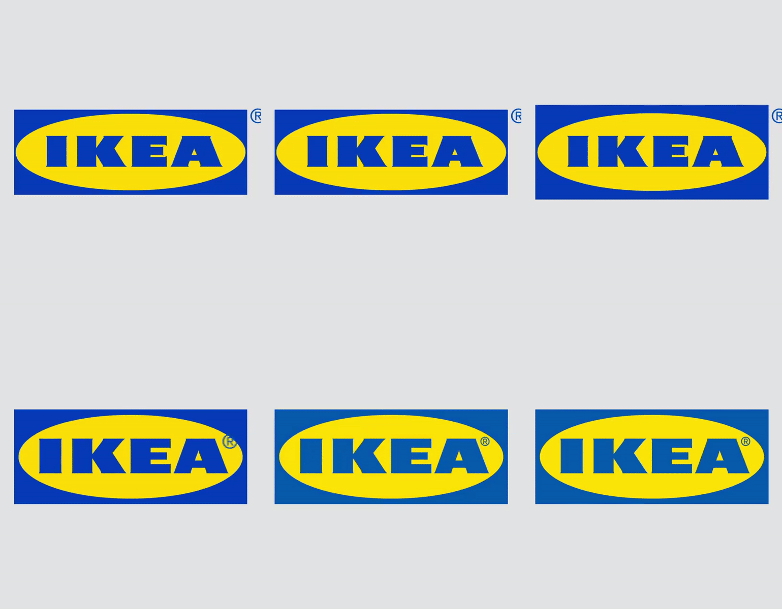
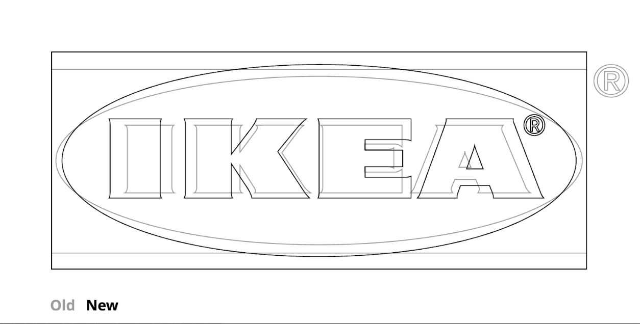
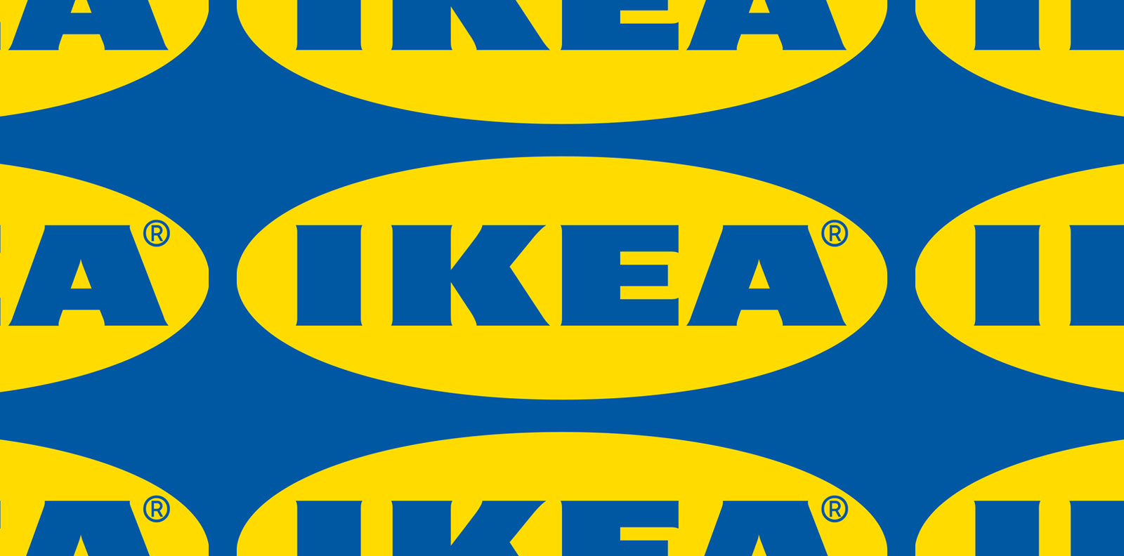
The registration mark is not where it used to be, the kerning is obviously better and IKEA has been rebranded for the first time in years with a logo responsive to humanity's digital needs.
"The change is about fine-tuning of the logo, it’s the first step of refining and clarifying the logo that ensures it works in all channels” note IKEA Brand and Trademarks Concept Leader Åsa Nordin and Seventy Agency's Creative Director Joakim Jerring in their interview with Resumé, sharing their thoughts behind IKEA logo's subtle transformation.
"Many things have changed since 1983, but the IKEA logo has remained the same" notes the acclaimed Stockholm based agency with an international team of strategists, designers, analysts, film makers, programmers and business consultants that fuse multiple perspectives on brand building.
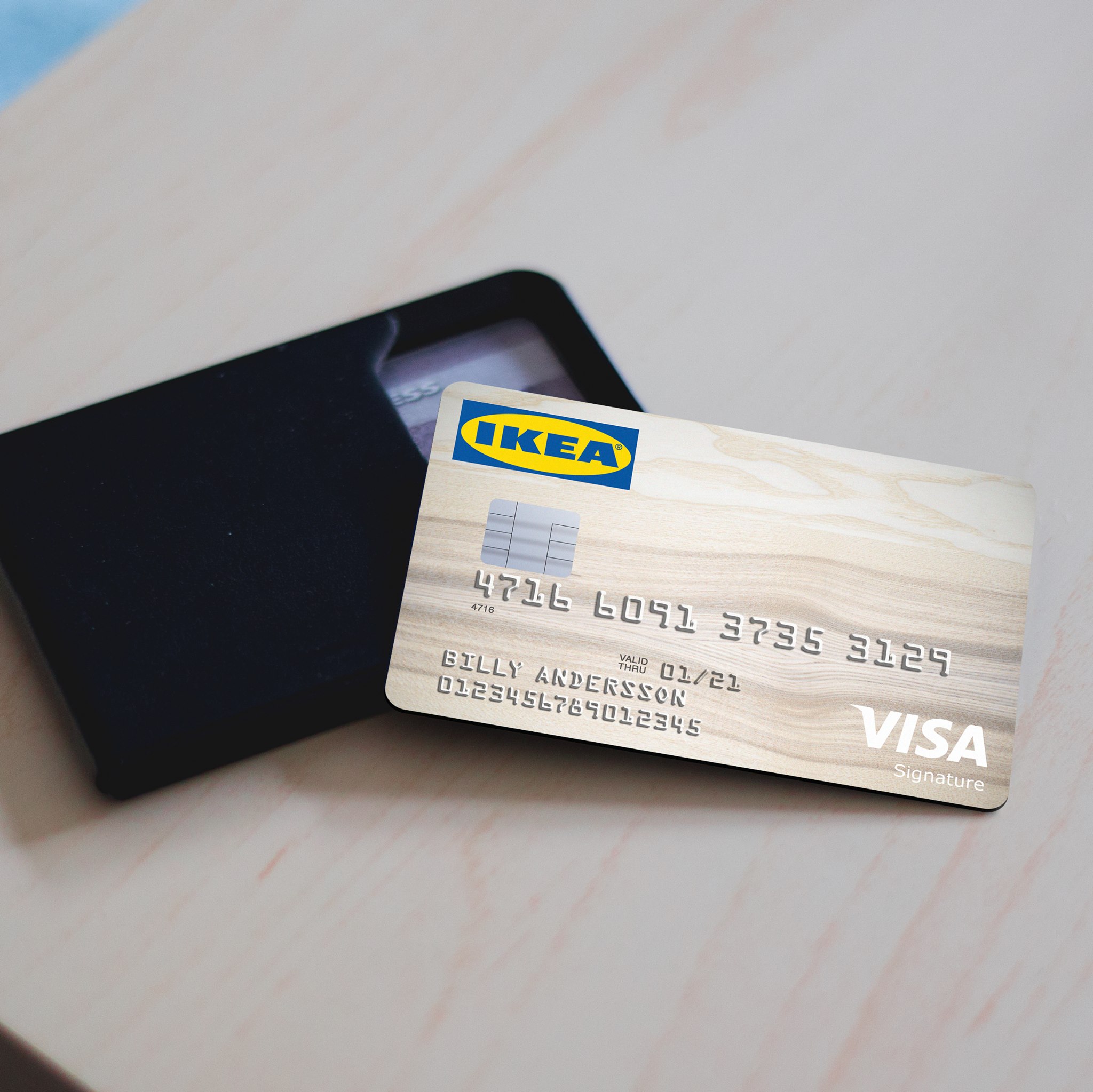
"We examined every detail and are now proud to introduce a refreshed logo, optimized for physical and digital environments, and representative of IKEA’s modern and forward-thinking positioning. We refined and reshaped the letters, evolved the proportions, and updated the colors to align across media. With a few subtle but impactful refinements, the timeless IKEA logo is ready to carry the brand into the digital age and beyond" says the agency which has been honored with Regi’s Agency of the Year four years in a row since it's inception back in 2013.
The rebranding has caused a lot of stir online with many debating if it's as groundbreaking as it could have -or not.

All images via Seventy Agency.
Tags/ logo, stockholm, rebranding, kerning, digital, ikea, registration mark, seventy agency


