GBH.London gives SailGP the dazzling sans-serif rebranding it deserves
"If your mind is open, we will move mountains to work with you" is GBH's statement in the company's website, yet in their latest project the fearless creatives of GBH sailed away with a brand new dazzling visual identity for SailGP.
The international sailing race in which athletes from different nations compete at high speeds in various locations across the world aims to make the sport more accessible to a wider audience. In exact the same spirit GBH.London decided to push the event into a brand new typographic route with an all-capitals logo in the sans-serif typeface Founders Grotesk by Klim Type Foundry.
This bold, seriously very contemporary visual language of the event which kicks off next month in Australia is already riding the biggest waves in typography as it shifts the old tranditional narrative of what sailing is all about across multiple platforms, both print and digital.
The game has been upgraded in dazzling ways and GBH.London is for the win.
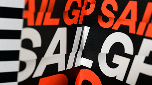
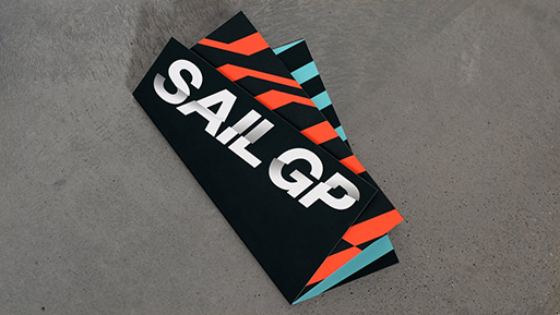
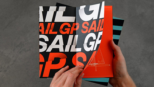
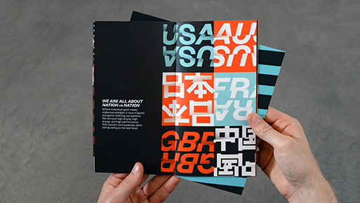

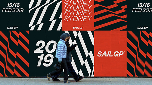


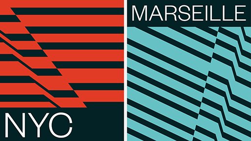


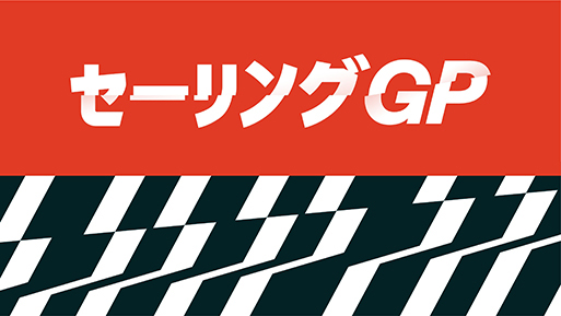
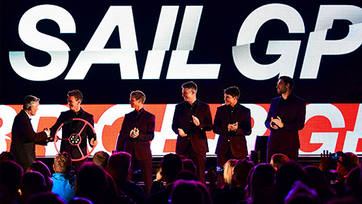
Images via GBH.London
Tags/ typeface, visual identity, logo, australia, sans-serif, gbh.london, sailgp, sailing, founders grotesk, klim type foundry


