The Face: Bureau Borshe rebrands the iconic magazine for a new generation
Bureau Borsche, the renowned for its versatility graphic design studio which since 2007 redefines the visual language of our digital times, has done it again.
Mirko Borsche first became involved in the project after receiving an email from Dan Flower, the magazine’s managing director reports It's Nice That.
“He asked whether I would be interested in designing a website and magazine that was from the 90s – he didn’t mention the name, but he’d left The Face’s logo in the footer of his email, so I knew that’s what it was about. After three or four emails, we agreed [Bureau Borshe] would do the art direction and creative direction for the magazine and the website,” Borsche notes of the just relaunched online edition of an iconic magazine and brand that defines an era.
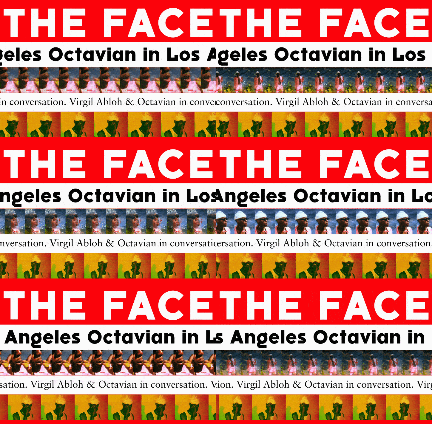
Rebranding Neville Brody’s iconic graphic design legacy is risky, Borsche says but eventually the same DNA runs free in this relaunching that is totally revamped. "We re-did all the typefaces, we tweaked the logo and redesigned the layouts” he adds of the magazine which will feature three new and custom typefaces -one solely for online use and the other two for the first print issue which will be available later this year.
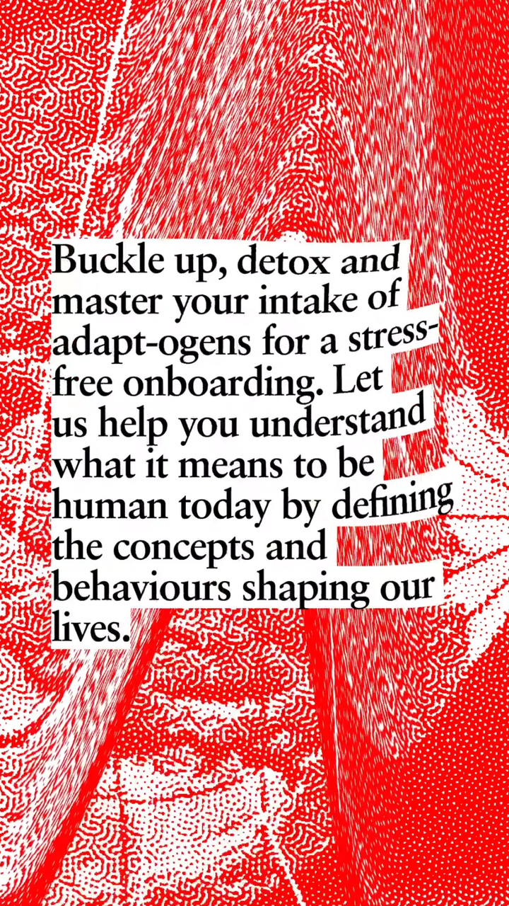
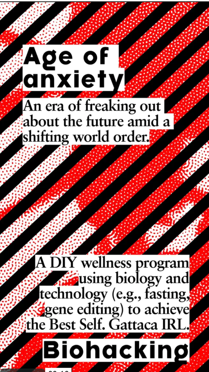
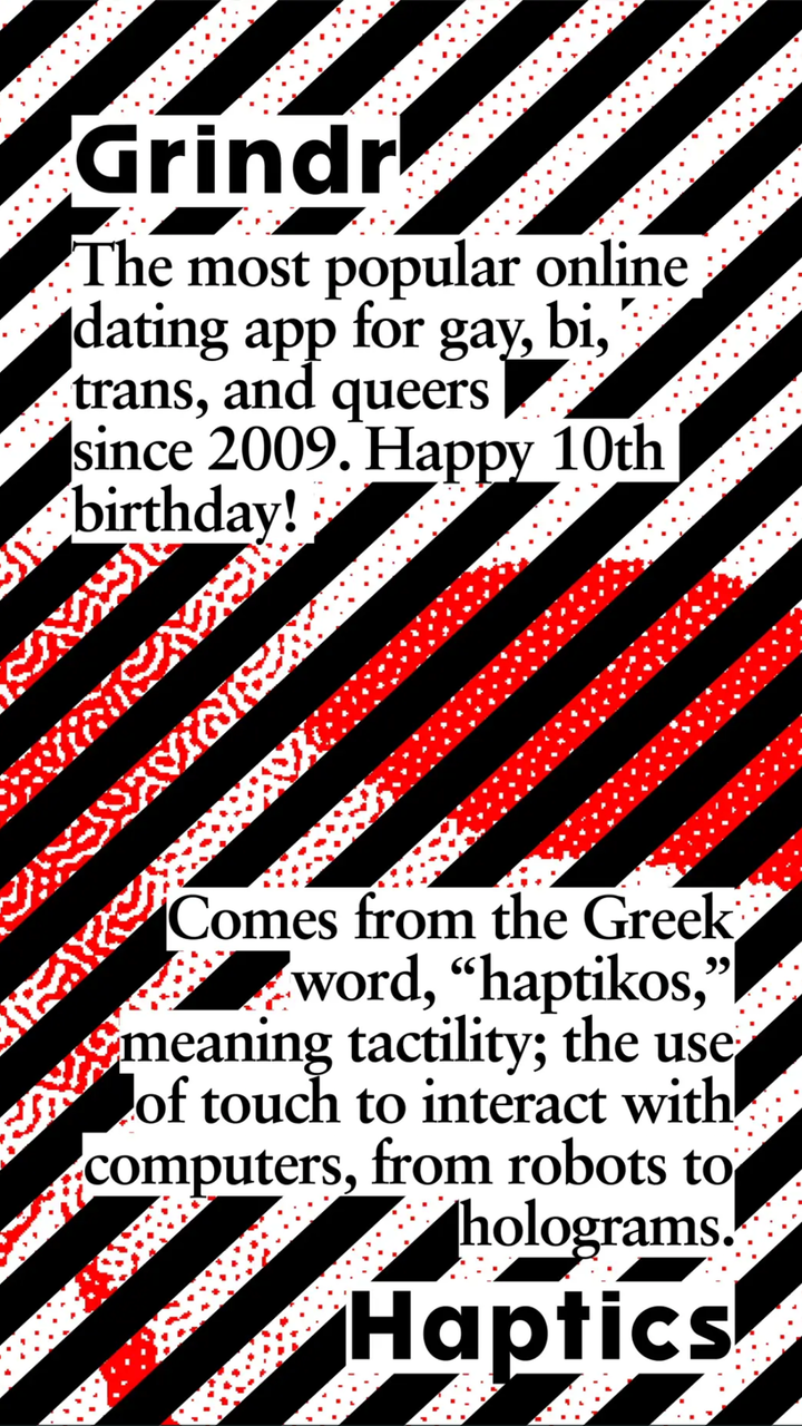
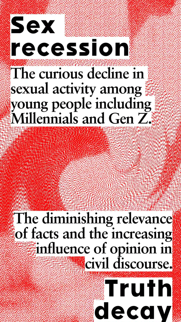
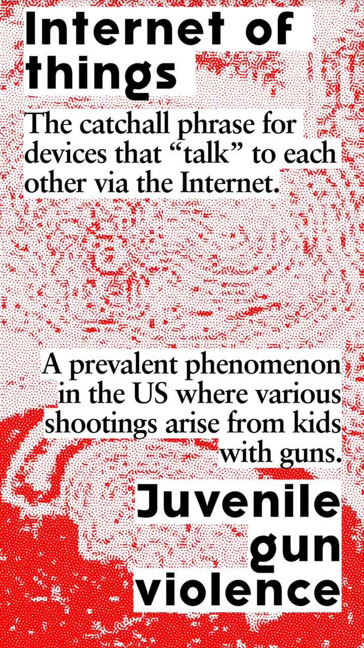
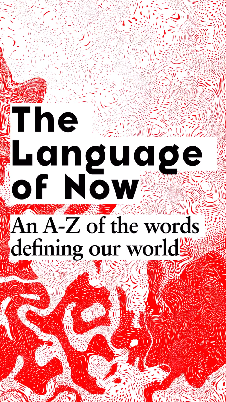
The Face’s new website is live and we loved the Language of Now feature and from this Friday on everything old is new again here.
Tags/ typefaces, punk, magazine, neville brody, print, eighties, mirko borsche, bureau borsche, the face, relaunch, its nice that


