Sex, football and movies: Typeroom's top five posts of 2018
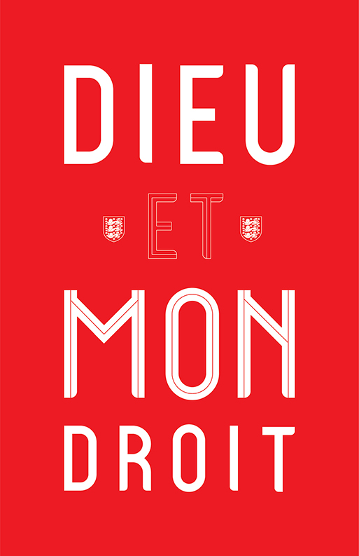
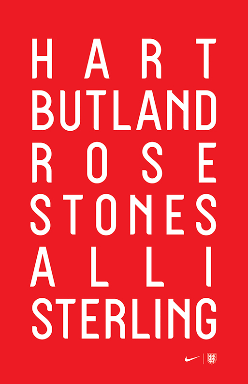
Renowned for his pioneering typographic works, Chris Ward delved into the English typographic heritage (eg. Gill, Flaxman, Johnston etc.) for England's World Cup Kit 2018, the most viral of all fonts in this year's Typeroom typographic newswire.
“Parts of the type actually quote aspects of other fonts to feel a little more familiar – the W in Railway Sans in particular, and the flare of the alternate R is a nod to Gill. I also included a perfectly circular O should they want to use it” notes Ward of his project.
Other posts that made it to the top are our tribute to the iconic Stephen Hawking, the best type design in cinema ever, the redesign of The Guardian and our talk with award-winning art director and educator Mirko Ilić on "Head to Toe: The Nude in Graphic Design".
A bold collaboration with Steven Heller, the renowned design critic, author, art director, and educator, that chronicles the myriad myriad ways the human body is shown, implied, drawn and painted upon, politicized, abstracted, and illustrated to convey all manner of messages, both artistic, and commercial.
Discover the top five of Typeroom's most viral features as follows:
5. Head to Toe: Mirko Ilić & Steven Heller bare it all in their latest xrated publication
4. What the Guardian’s tabloid format says about print today
3. From Alien to Seven: 7 times typography ruled the silver screen
2. Stephen Hawking's words of wisdom
1. Craig Ward on his typeface for England World Cup Kit 2018 for Nike


Tags/ fonts, steven heller, the guardian, gill, mirko ilic, top 5 2018, chris ward, england world cup kit 2018, railway sans, stephen hawking, head to toe: the nude in graphic design


