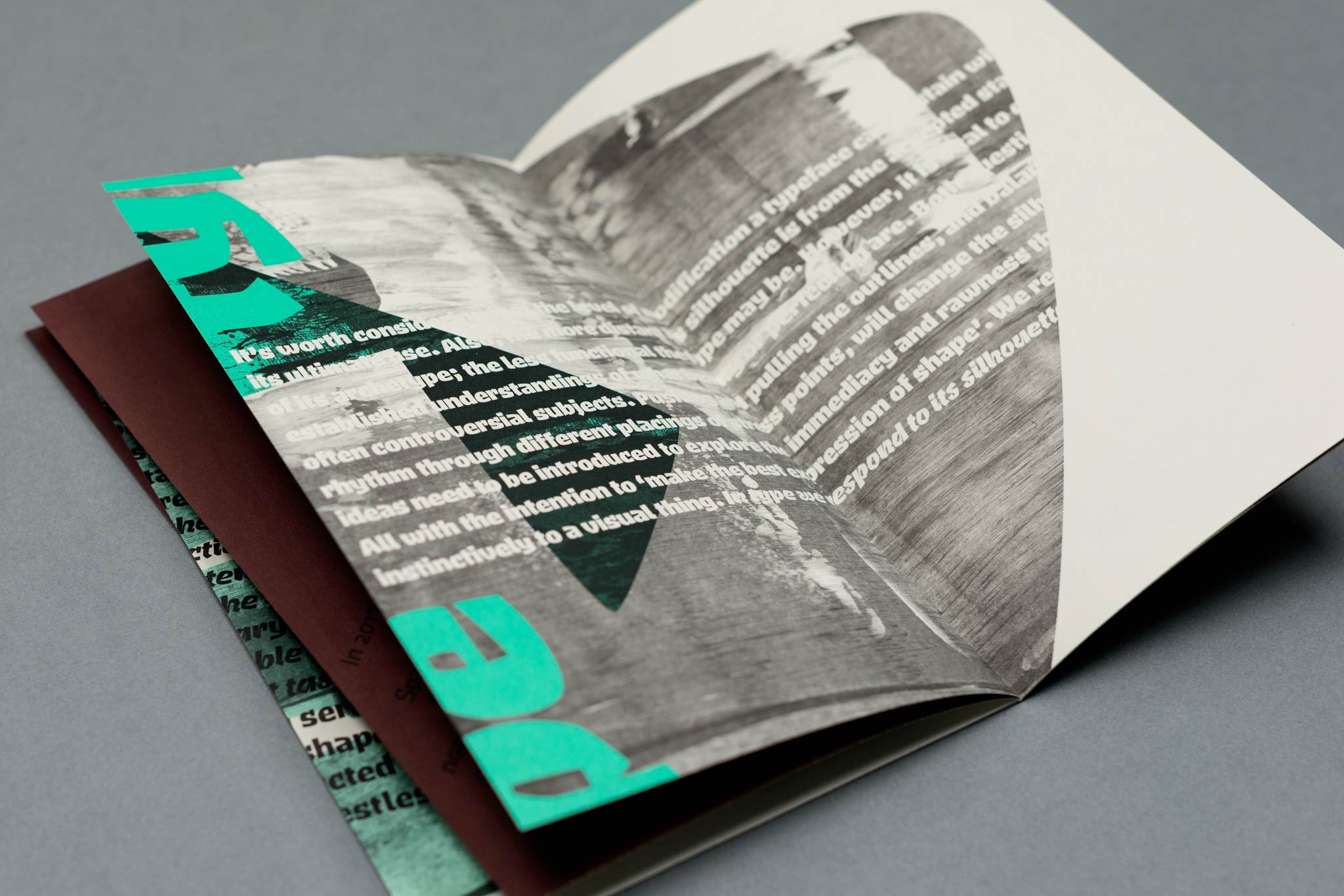
Brucker is a purposefully restless typeface unleashed
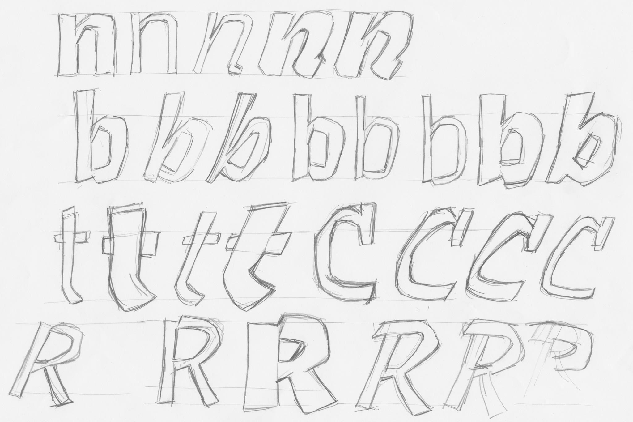
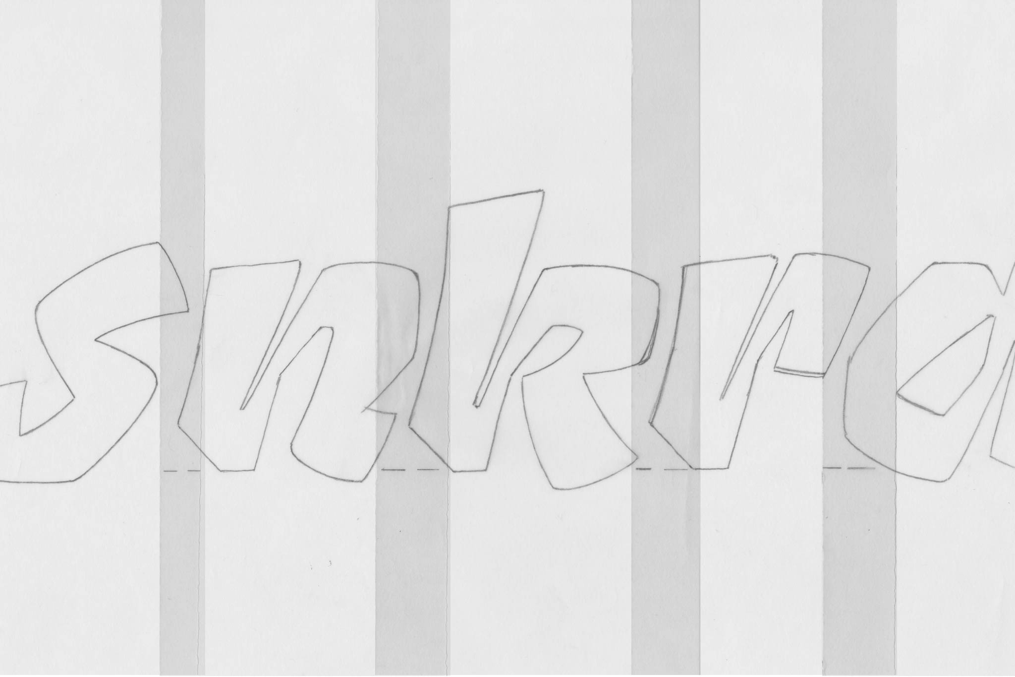
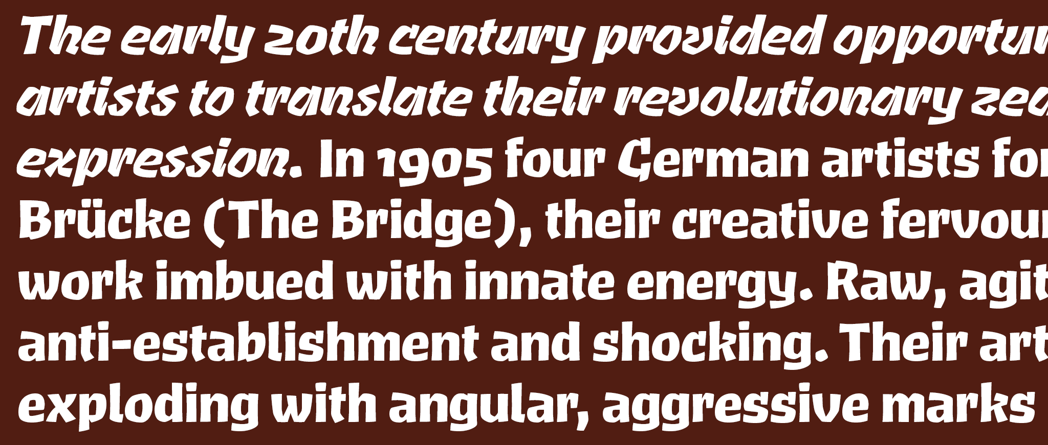
June 10 sees the publication of the latest typeface from Jeremy Tankard Typography. Aptly named Brucker this "purposefully restless typeface" with a robust presence is designed to create an aggravated and expressive text image through the use of interrupted curves, a dynamic rhythm and disjointed baseline. Primarily created for display use it does, however, function surprisingly well at text sizes.
Brucker takes its inspiration from the emotively charged art of the Expressionists. Their vision of the world is made from broken lines and uncompromising, energetic, feverish marks. Several of the posters produced to publicize their new art use crude, black letter shapes.
These are directly cut and jammed together to make dense evocative blocks of text. Building on these immediate and expressive letters, those of Brucker have been "carefully drawn to avoid the cleansing mechanical line of the computer."


Read more on the story behind the inspiration and development of the typeface here.
Tags/ typeface, fonts, release, jeremy tankard typography, display use


