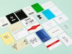
Colby Poster Printing Company: a legacy of fluorescent power made in LA
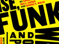
With their bold and strictly black typography emerging through the day-glow palette, Colby Poster Printing Company became an integral part of L.A.’s street aesthetic for more than a century. Sadly the all-manual print shop didn’t survive the digital age yet, luckily, it’s iconic heritage still goes strong.
Having its doors closed back in December of 2012, the Colby Poster Company made posters that were designed to catch the eye of passersby for more than half of a century. Delivering the message as directly as possible was the only task of each employee of the company that began in 1948 as a neighborhood operation to promote local happenings like street fairs, concerts, art exhibitions and political campaigns with their eye-catching flyers. No one had any formal training in graphic design. They were members of the letterpress union, the screen printers union, and the typesetters union.
“They were kind of naïve, breaking what most typographers would think is every rule”, says Brian Roettinger, the L.A.-based artist and graphic designer who co-authored the book—In the Good Name of the Company: Artworks and Ephemera Produced by or in Tandem with the Colby Printing Company. Along with Christopher Michlig and Jan Tumlir, the three men preserve Colby’s fluorescent legacy, featuring more than 300 full-color photographs of the company’s prints in the publication that followed an extensive exhibition at ForYourArt in L.A. four years ago.

“Since they were a merchant print shop, the company didn’t see what they did as art, and never created an archive of their own work” he told to Co.DESIGN. By creating this archive of the family-owned Colby’s signature fluorescent inks and bold, all-caps typography Roettinger, who grew up in L.A., helped save the company from obscurity. These people didn’t know they were making art. They didn’t sell any poster. They just made them. “If you wanted one of Colby’s posters, you had to steal it”, he commented.
Colby’s minimal, lowbrow all caps typographic approach, which was typically employed to promote small-scale neighborhood events, became an artist’s favorite in 1962 when Ed Ruscha commissioned the company to create the announcement for his exhibition New Painting of Common Objects at the Pasadena Art Museum. The heavy, sans-serif typeface on the straight-faced announcement of a show that includes artists like Jim Dine, Roy Lichtenstein, and Andy Warhol, is characteristic of the company’s creations, “but it also seems to embody the Pop aspirations and strategies of the time, appropriating a vernacular form and recontextualizing it”.

Since then, the Colby Poster Printing Company has gone on to serve as an important resource to a broad range of LA-based artists providing them with an alternative escape of the studio or a gallery. Through Colby’s poster medium, artists could engage the life of the street and their posters became a form of public art perfectly suited to the LA context with its inherent transience and disposability.
From Allen Ruppersberg (who transcribed Allen Ginsberg’s epic poem “Howl” into phonetics in 2003) to Eve Fowler (who transcribed Gertrude Stein’s “Tender Buttons” onto Colby posters in 2012), Colby Poster Printing Company’s iconic bold typography helped artists reach the streets of L.A.
Their fluorescent posters and their collection of over 150 wood and metal (mostly sans serif) typefaces were a perfect match for literally anything.
Tags/ origins, posters, colby poster printing company, los angeles


