Young blood: from memes to moving posters a talk with millennial type designer Jules Durand
Millennials are regarded to be a rather unique generation -always on the move, always questioning the dos and don'ts of the industry they work for. Therefore we asked Jules Durand, a type designer and an intern in Typeroom and Parachute Typefoundry for the past couple of months, to share his thoughts on the graphic design and typographic scene he is about to enter.
Here is what a 23yo type designer has to say about his up and coming adventures in type and do take notes -the youth has spoken.
First things first, why did you decide to study typography?
I’m studying in ENSAD, a fine art school in Nancy, France, where I’m currently doing a master degree in the Graphic Design Department run by Pierre Vanni, Christophe Jacquet & Frédérick Wecker. When I arrived in Nancy, I was in love for display letterforms, wood letters, and titling typography. Then, on the last floor of the building, I discovered the ANRT -a place where very talented students are doing a post-graduate diploma specialized in type design. There, thanks to teachers such as Sarah Kremer, Thomas Huot-Marchand, and Émilie Rigaud, I began to learn some serious knowledge on Glyphs, how to correct curvatures, to design fonts with components and to impulse something new into the design of the font.
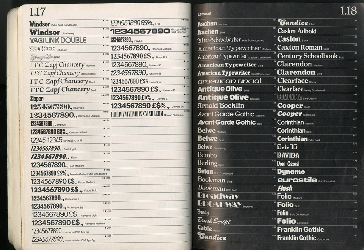
I really wanted to get more into typography, but it’s such a wide topic that could be approached from many ways, so I focused on the Letraset Catalogue, and the story behind this collection of types from the early ’70s until the rise of the domestic computer.
The way this catalog was curated, by Roger Excoffon or Herb Lubalin among others, and the result of this variety of wonderful fonts, that are grouped together in a modernist layout is just completely stunning to me. Since then, I try to connect all my works with the Letraset, by taking inspiration from my favorites alphabets and trying to revive them.
How is your generation different to type designers of the past generations?
Very! The newbies, like myself, seem to actually understand post-modernism and new trends whereas old school type designers are stuck with classic staff such as Gotham or Scotch Modern. As a young creative beginning to deal with type, I definitely pay huge respect to some old figures such as Matthew Carter, Willian Addison Dwiggins, Frederic W. Goudy, or Edward Johnston, and I understand the need to design fonts that can last for ages. But I think a lot differently when it comes to design. As Leah Maldonado, a friend of mine who is currently an intern in Future Fonts, once told me: “The newbies understand that a typeface is more about expression than being something that needs to last for years. We think in pixels they think in lead.”
For me, there is a totally different mentality between those two generations in type design. When young designers are trying to impulse feelings and something sensitive to the letterforms, they don't do it for money or business anymore. It’s about the vibe and the commitment to create new fonts that look nice and people can enjoy using.
You are regarded as one of the most educated generations ever and you are technology-savvy. Do you see these qualities in the portfolios of young designers?
There is definitely something happening online involving new super fresh type designers, and the notion to give feelings to a font is quite prevalent. I found out about it when I was in HFG Karlshure for the Saturday Type Fever, during the talk of Charlotte Rohde. She told us that her way to design fonts is emotional, contrary to the rational way of most of the Swiss and German male type designers.
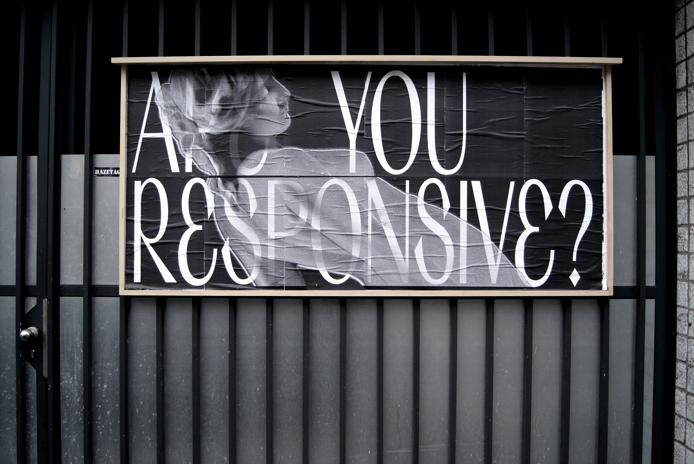
Image via Charlotte Rohde
Her work involves feminism and feeling, she uses technology to break the boundaries of the Bezier curve, for instance, the Serif Babe font is a convincing example of this philosophy. There is plenty of other young designers exploring this field of thinking, some might be found on the last Shoplifter of Actual Source, or through the Type Club Düsseldorf which is closed now, but the website is still online. Otherwise in TyP UdK or in ECAL Typefaces and TIP Foundry.
Do you agree with the notion that print is dead and digital will rule them all?
Definitely not. Print is and will always be crucial in graphic design. I’m very materialistic, and I can’t imagine a world without beautiful books.
What do you think of the state of the typographic industry at the moment?
There is a terrible normalization everywhere with big brands been “refreshed” with neutral sans serif logos -a choice which I find pretty boring. I do understand their need to have a responsive icon that appears good on screen but the spirit behind the beautiful serif fonts they used to have is gone and forgotten. This trend is clearly involving typographic industry. Indeed, we should live at the moment and some old codes and rules need to be reapplied but this evolution needs to be done in order to improve our state of being, our perception of who we are. Even if typography is not gonna change the world, it can do something about it and I think it doesn't.
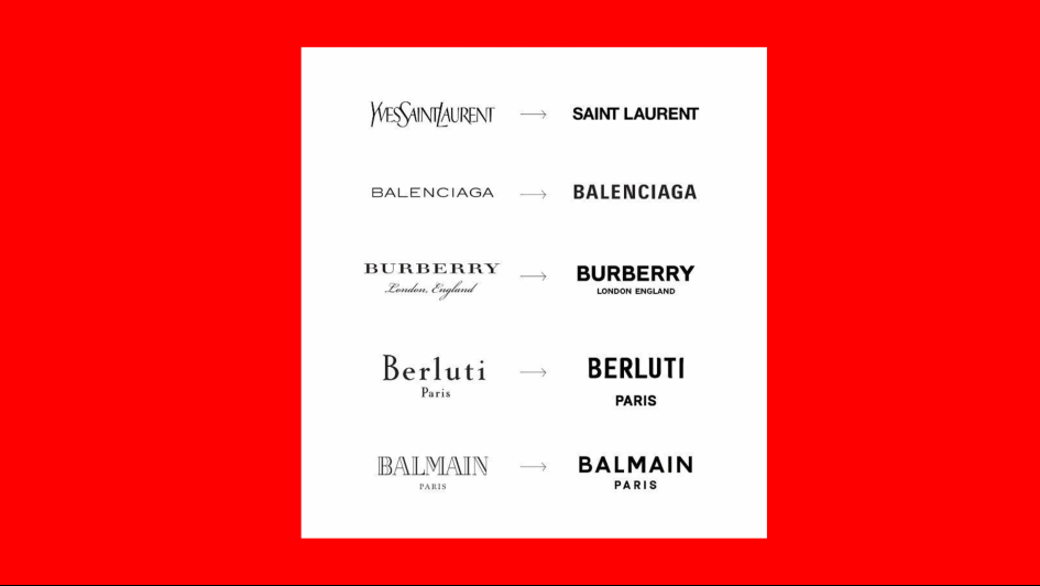
“There is a terrible normalization everywhere with big brands been 'refreshed' with neutral sans serif logos -a choice which I find pretty boring”
NoFoundry is a platform for cross-university networking of young type designers. Would you consider it a game-changer?
Nowadays, it’s pretty hard to find people who give you a chance as a student to publish your fonts and to get attention for your work. I had this nice opportunity to get in touch with the super cool students who build up NoFoundry, and I really enjoyed working with them. They are very open-minded and always on the lookout for new experimental fonts.
Although this initiative to share students fonts is such a wholesome lead, only few type foundries are dedicated to this enterprise. Similar foundries are pushing this idea, like typelab.fr or themtyp.es who are not retailing directly but are curating new fonts, mainly made by students.
Memes are a rather new form of conveying a message. Do you find them revolutionary?
The power of communicating with pictures is extremely strong, at least for us, the so-called “Millenials” who choose to express their throughs and reflexions about our society in this format. Memes are our new form of art that we can share both in public and in more intimate ways alike.
The language of millennials is also evolving and following the trends of some memes, there is a real IRL notion going on and people are becoming conscious of what our role is through social networks. Subculture and mainstream culture are always fighting each other, but eventually, everyone agrees that memes are something good on a global scale.
Which would you consider the best fonts for memes?
Talking about typography, there is not a long list of fonts in use in memes format. The Impact font is dead and “normie” since at least 10 years. Helvetica Neue is overrated but works very well -it’s a standard imposed by the interface of Twitter so...- but everybody seems okay with this legible format. However, some new memes makers on Instagram are beginning to deal with new funny fonts in super maximalist layout, so the classic format is once again evolving and improving into new shapes.
.jpg)
Is sustainability an issue for young designers? How do you think your generation should tackle the environmental crisis and other burning issues nowadays?
We are all concerned with sustainability, obviously an issue we will all have to deal with at some point in our career. In design, we can find really pragmatic solutions -yet printing quotes saying that “it’s bad to cut trees” on a paper that is made out of trees is obviously not an appropriate way to tackle the issue. Print is not dead, print just needs to be improved and reinvented in more environmentally friendly ways.
Which would you consider the upcoming trend in type design?
Everyone is talking a lot about kinetic typography, animated typography is also very trendy, but the real thing that is coming is probably the moving posters.
Demo Festival, Graphic Matters & The Moving Poster are some great resources on this new up and coming form of graphic design art.
As for the type design, some new 3D experiments are becoming very interesting. A fine example being the last collaboration between Dinamo TF and Manuel Roßner of HighType with their HT Standard, a 3D typeface model which looks pretty dope.
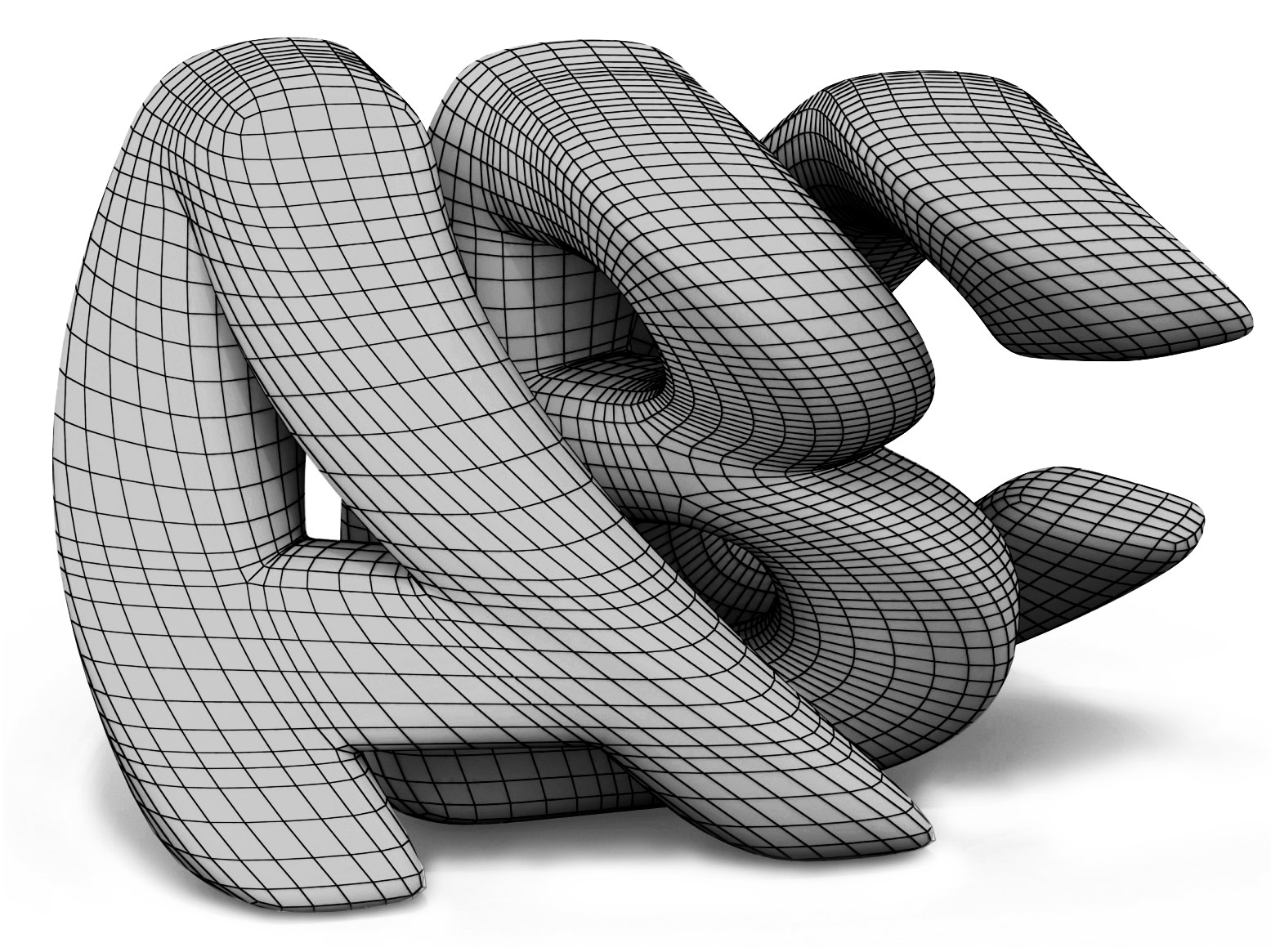
Image via Dinamo TF
Last but not least, the work of Eliott Grunewald on his Epoxy 3D font is super cool and futuristic. Something big is happening in this field.
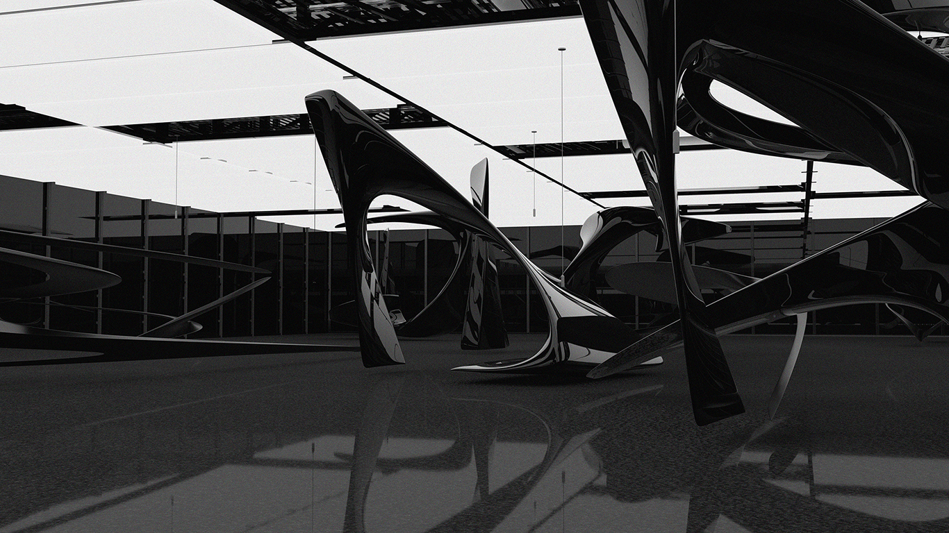
Image via Eliott Grunewald
How important is it for you, a French, to design fonts with features in other languages?
There is a real gap to be filled in this field of type design. The lack of cool display fonts in other languages than Latin is huge. I had the chance to learn how to design Greek at Parachute Type Foundry here in Athens, I’ve tried to learn Cyrillic and Armenian by myself and now I have another project going on. It's a huge collaboration between a lot of brilliant young type designers with non-Latin fonts, Thai included. It’s very interesting to break free of the boundaries of our comfort zone which is the Latin alphabet. Next challenge might be to get into Chinese but I will have to get in touch with Roman Wilhelm for that and see what happens.
“Everyone is talking a lot about kinetic typography, animated typography is also very trendy, but the real thing that is coming is probably the moving posters”
Who is your favorite type designer under 30 you admire?
There are so many talented people that I would love to name here and I can’t because it's gonna take ages. The ones I admire the most are probably Baptiste Bernazeau and his fancy new foundry, Pauline Le Pape, Ciaran Birch (Robert), Charlotte Rohde, Massimiliano Audretsch, Axel Pelletanche Thévenart, Benoit Brun and last but not least, my dear friend Marielle Nicolas!
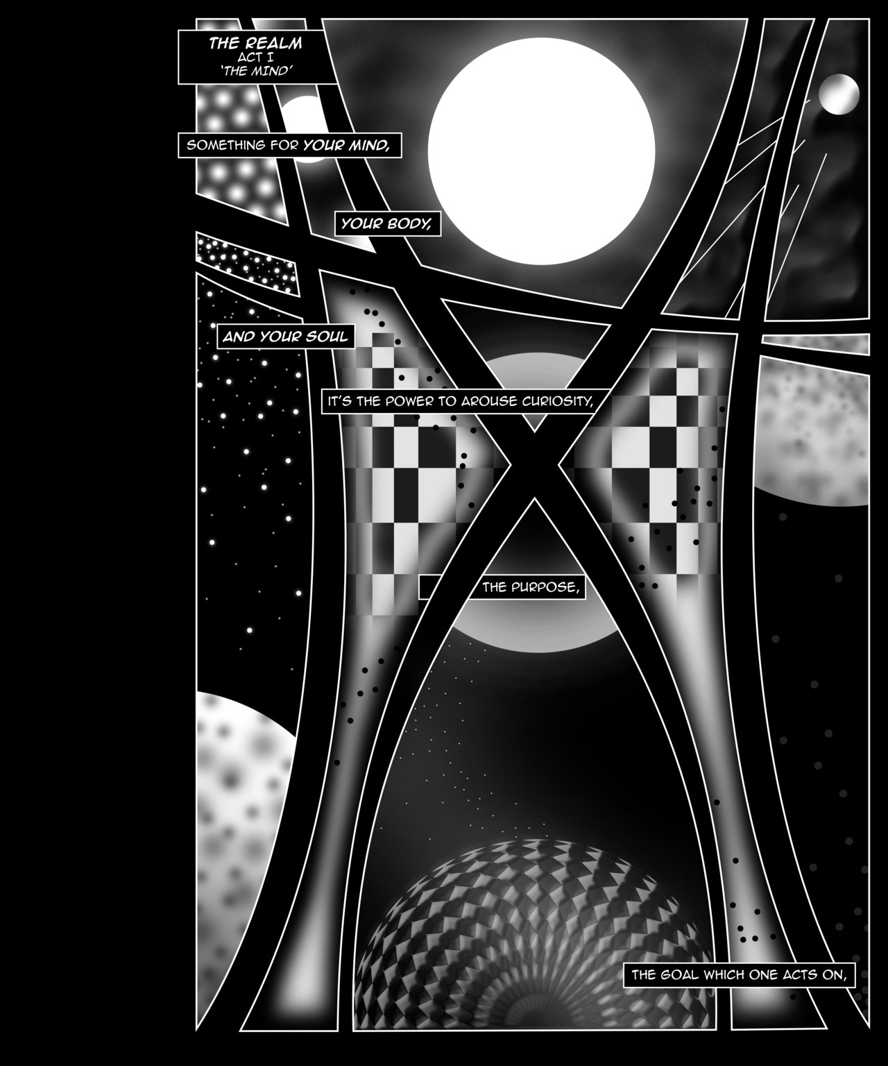
Image via Marielle Nicolas
Last question. If you were a ligature which one would you be?
I love QJ.
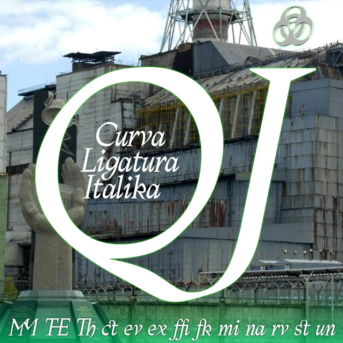
Discover Jules Durand's adventures in type here.
Tags/ inspiration, graphic design, glyphs, instagram, matthew carter, fonts, herb lubalin, edward johnston, ligature, letraset, moving posters, kinetic typography, type industry, jules durand, memes, nofoundry, student, type desifn, demo festival


