In Earth we trust: Ryman Eco is a sustainable font for all
Environmental sustainability may sound daunting yet all it takes is just some small steps into our daily routine of living and working to create a better, sustainable, eco-friendly world.
Use less, reuse across the value chain, track impact transparently, repeat.
As typography is the tool of a universal visual language we totally approve of a beautiful crafted sustainable font as a meaningful and utterly appealing product. Enter Ryman Eco.
The environmentally sustainable typeface launched by UK stationery retailer Ryman uses an average of 33% less ink than standard fonts.

Designed by Monotype Type Director Dan Rhatigan, in collaboration with Grey London, the objective was to create the world's most beautiful, sustainable font.
"Eco friendly design often means compromise to aesthetic desirability. Mindful of this the ambition for Ryman Eco was to find the optimum balance between saving ink, legibility and beauty. The font has been received positively by environmentalists and the design community alike" notes Grey London.
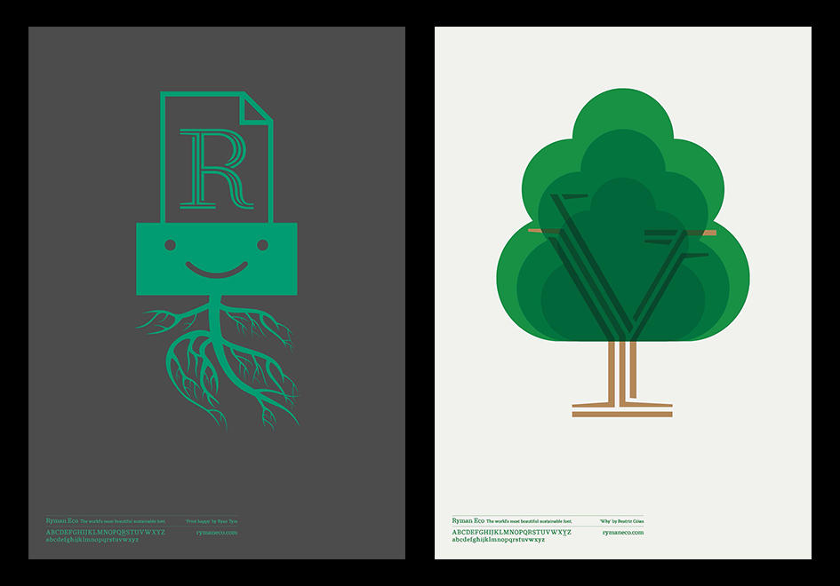
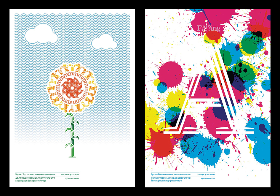
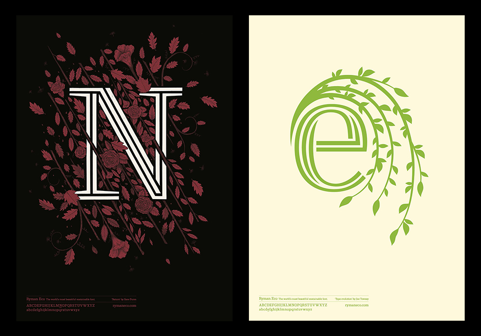
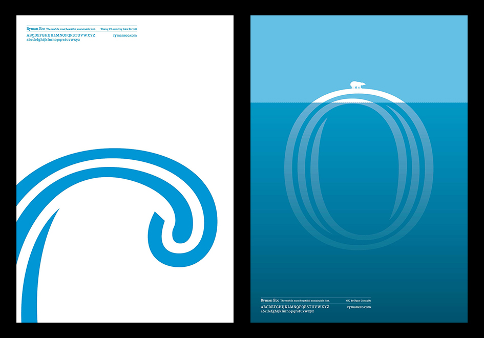
Ryman Eco takes advantage of how ink bleeds on paper to create a less ink-intensive font as each character form is a series of fine lines, "so at smaller sizes (10 to 14 point size) the lines appear to merge from ink bleed, whereas at larger sizes, the lines become an interesting visual characteristic of the typeface" notes Fast Company.

"Since Ryman Eco was the result of an internal process, Grey London could have simply rolled it out through the agency–which it still intends to do by installing it as the default font for all printers across it’s 96-country network–Leonard says they wanted to release it with a client partner that could give the idea scale and reach.
Nils Leonard reached out to Ryman chairman Theo Paphitis (who is also a celebrity entrepreneur and judge on Dragon’s Den, the U.K. equivalent to Shark Tank) over Twitter and set in motion a partnership that would give it the clout they were hoping for...

Leonard says the creation of Ryman Eco is more than a frivolous exercise for the agency. Instead he sees it as a crucial responsibility for companies like Grey London that have the ability to use their skills to effect positive change.
“We all know we should be saving the world but not enough people are looking at the small but powerful changes that might actually make things better. The student looking at the benefits of Garamond is a powerful lesson, but brands and institutions should go further. Recognizing small changes with big impacts is one thing, but why aren’t more brands commissioning in this area? Type and fonts sit across our lives. They tell us where to go and entertain us in every medium. For Grey London, Ryman Eco is more than just a sustainable font, we hope it’s the start of a category of font that others will invest in and be inspired by” he adds.

Tags/ typography, inspiration, font, printing, monotype, print, sustainability, ink, eco-friendly, grey london, ryman, environment


.jpg)


