When lettering meets letterpress miracles will happen
Girl meets boy; North meets South, and opposites attract in this typopairing that happened almost immediately the moment TypographHer’s Nicole Phillips saw Craig Black’s beautiful lettering online. She was immediately drawn to his craftsmanship and skill of this typographer and designer, based in Glasgow who demonstrates expert appreciation for positive and negative space in his work. High contrast, killer curves, and big impact are all hallmarks of Craig’s style. Nicole Phillips - a kiwi typographer, living in Australia - loves to work analogue in pencil or ink. She honours process over product, builds her business model around a practice of creative play and has always had a philosophy of working in collaboration not opposition with her peers to champion the work of other typographers she admires.
After corresponding back and forth on social channels, a friendship between these two Type enthusiasts grew - and a collaborative process was the natural next step.
“We brainstormed ideas for a series of work. We wanted to explore the juxtapositions in our relationship - we may contrast in styles - but we are cohesive in our passion and approach!”
After developing a number of options via Skype, the pair exchanged rough concepts via email. Using Dropbox to add, amend and annotate the ideas as they developed.
“We settled on two ideas to get the collaboration underway - we had a deadline as wanted to exhibit part of the series at ING creative in Dubai - which Craig was traveling to in just eight weeks.”
From the outset, Nicole and Craig understood shipping and the logistics of moving the artworks would be challenging. So while they were awash with ideas, they agreed on some constraints on format and size to get them started.
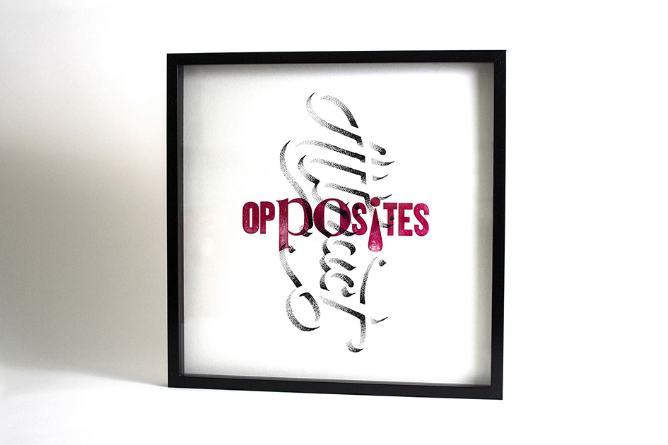
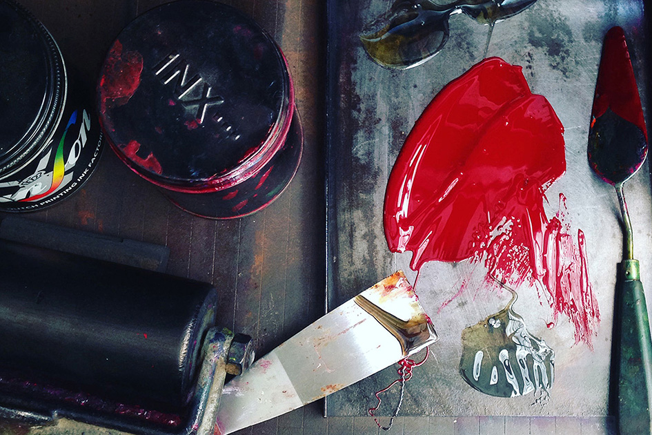
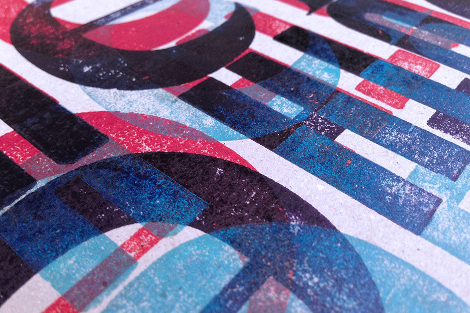
“Once we had identified the 500x500mm scale of the frames I proofed and measured some of my wood type collection, selected the paper stock and decided to compose and print the form on ‘Frank’ - my Farley No 25. I chose not to use the self-inking mechanism or feed board as was keen to hand ink and the form. I wanted the printing to be as manual as possible.”
After the prints were dry Nicole packaged the edition of six + some proofs to ship to Craig in Glasgow. After an anxious wait, they arrived at Craig for him to work his magic.
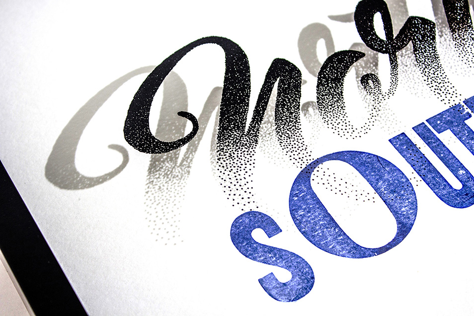
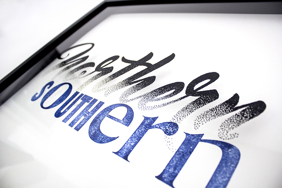
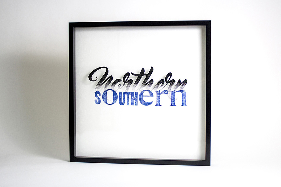
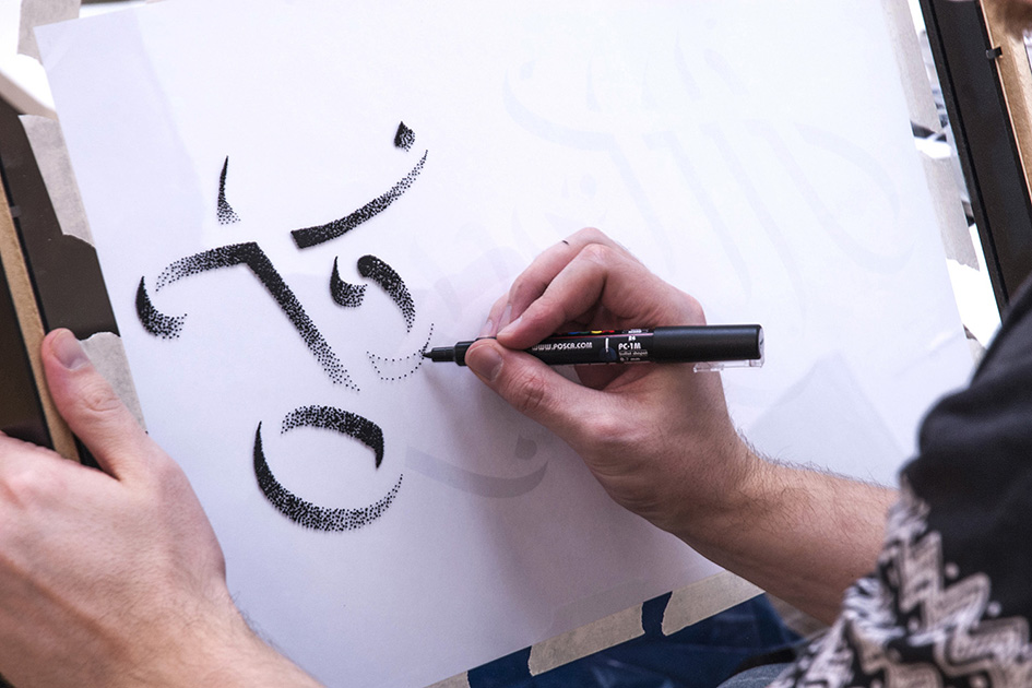
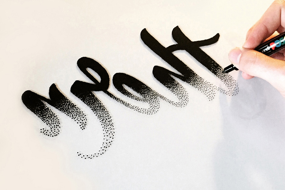
He began by using a wrong reading pencil outline on the front face of the glass to guide him to stipple the backside using a paint pen. Once complete Craig layered the lettered glass on top of the letterpress prints and made six custom frames.
The artworks were then shipped to Dubai “Our collaboration project got the best response as people wondered how we came together and how we made the works from opposite sides of the world.”

After returning to the Uk, they shipped two pieces back to Australia. Nicole had hoped to show the pieces as a demonstration of the power of community and collaboration at the Design Conference in Brisbane. Unfortunately, despite very careful packaging one of the artworks did not survive the journey back to the southern hemisphere. Although after talking about the collaboration showing the artworks before and after transportation it seemed the enthusiastic crowd could definitely relate to ‘being fed up with FedEx.’
“Just as Craig had experienced in Dubai, the community here was super curious (and excited!) that we were able to make an analogue collaboration work long distance.”
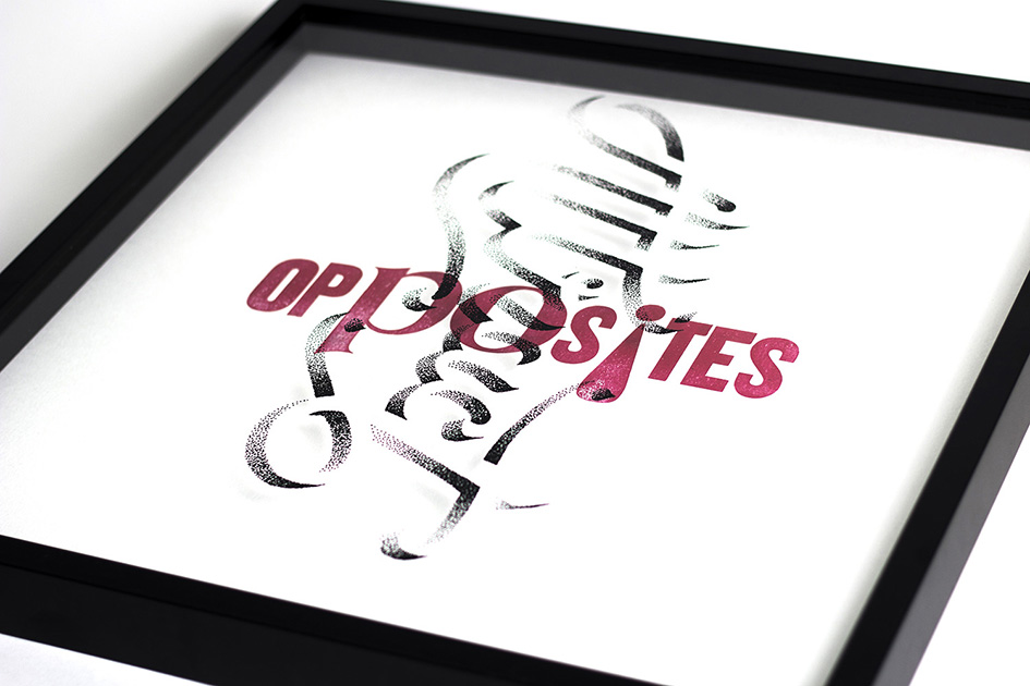
Northern/Southern and Opposites/Attract are the first two in what will be an ongoing exercise in collaborative typographic matchmaking by Craig Black and Nicole Arnett Phillips. The pair is really looking forward to their continued cross-continental creative play.
Are you in for the game?

Tags/ inspiration, lettering, letterpress, australia, craig black, nicole arnett phillips, collaboration, ing creative, typopairing, glasgow, brisbane, dubai


