What the Guardian’s tabloid format says about print today
People don’t know what to say of it yet but The Guardian is a tabloid now and this is a significant change to the acclaimed paper’s identity and format.
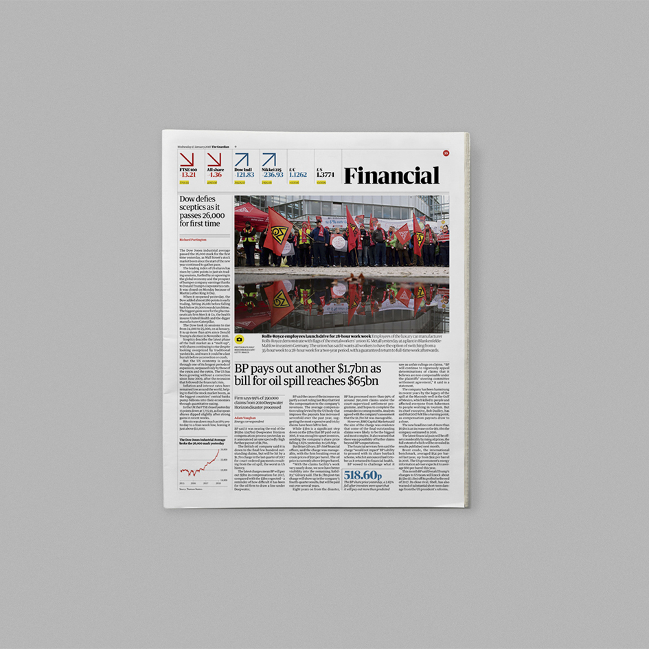
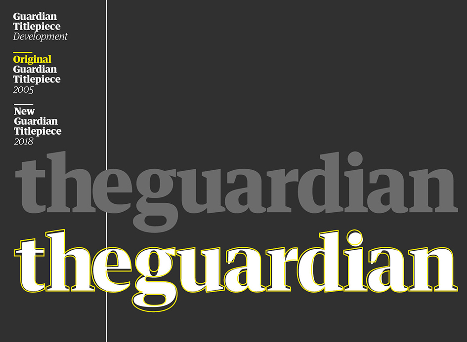
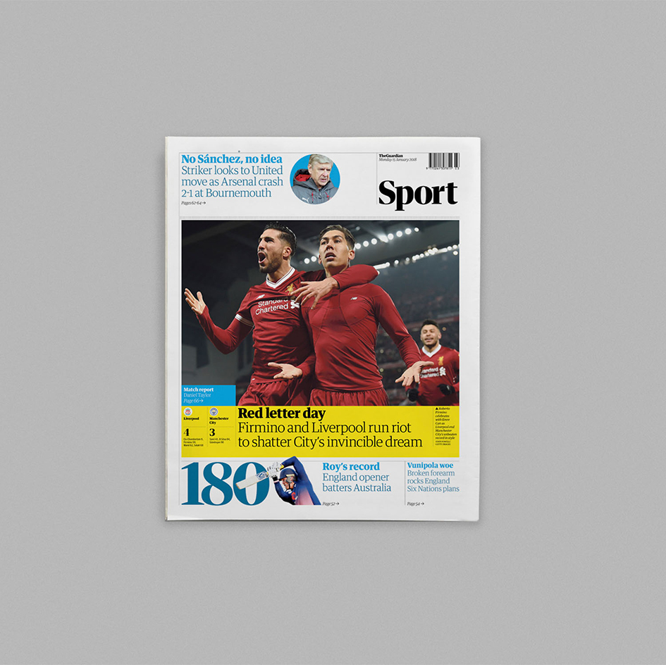
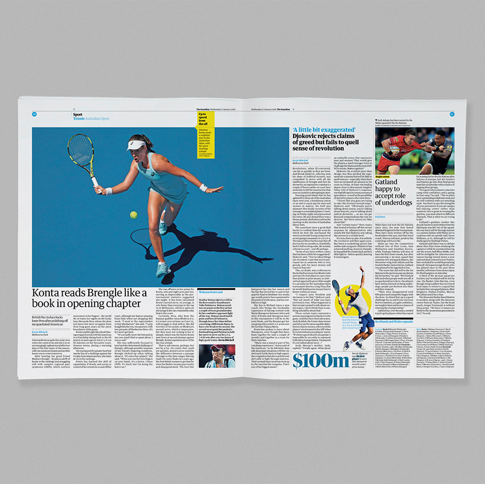
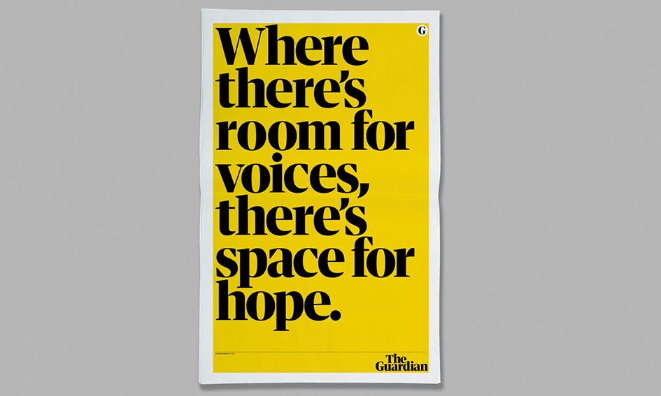
Earlier this month the acclaimed British newspaper The Guardian has unveiled a simplified and smaller tabloid format, as well as a website redesign that includes the launch of a new logo and font. The newspaper's smaller tabloid format has been rolled out across all sections and supplements of The Guardian and The Observer.
"It's been an exhilarating period of creativity, imagination and focus, and we’re thrilled with the result," said Guardian editor-in-chief Katharine Viner, in a piece featured in the newly designed paper’s debut edition.
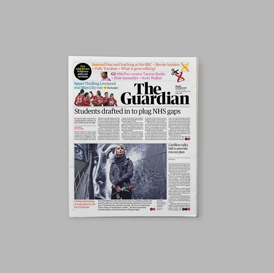
"For several months, a team including our exceptional creative director Alex Breuer and senior editors and designers have been discussing and refining The Guardian's new look, as well as gathering invaluable feedback from readers," she continued.
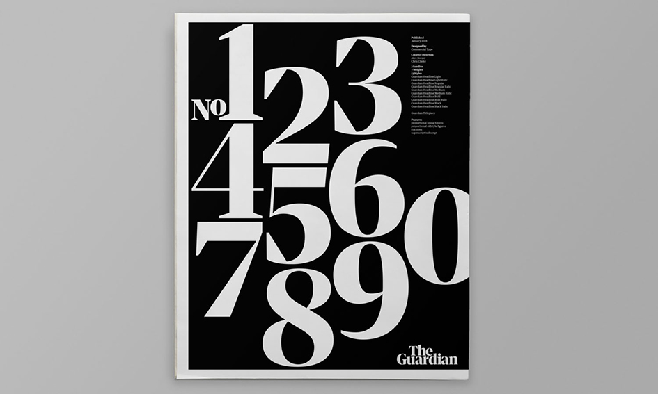
The redesign features a new font and logo designed by New York- and London-based studio Commercial Type, which also created the original Guardian Egyptian font. Guardian Headline is designed to be easier to read and is described by Viner as simple, confident and impactful “We’re using a range of energetic colours, and the much-loved Guardian visual wit and style remain at the heart of the look" she adds.
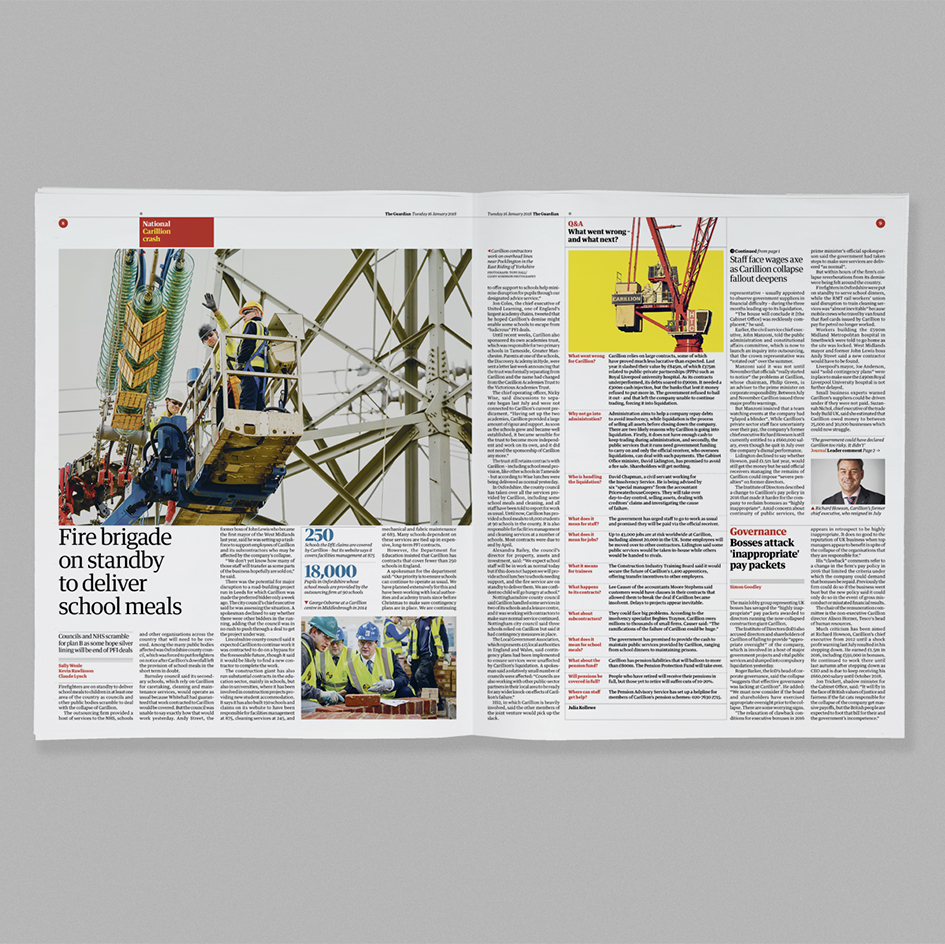
Despite the smaller format, the main text font remains the same with marginal changes to size, line spacing and overall typesetting in a bid to improve readability.
The decision to move the newspaper to a tabloid format was taken seven months ago as part of a three-year plan to generate significant savings and break even at an operating level by April 2019 reports Dezeen. Per The Guardian “the move to tabloid printing will save several million pounds”.
The design team led by creative directors Alex Breuer and Chris Clarke worked months for the new version of The Guardian and “the design overhaul will be rolled out across desktop, apps and mobile and a new tabloid print format”.
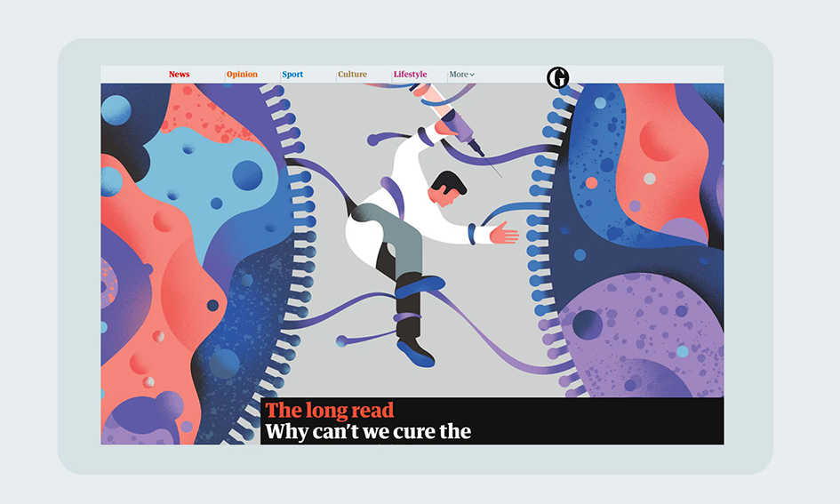
“With a more flexible page layout in print and online and enhanced use of photographic journalism and graphics, our new design is simple, confident and stylish – providing readers with the best possible experience across all our platforms” added Breuer.
“At first glance this redesign is a great success with just a few gripes. I’m intrigued to see how it settles down over the coming weeks, and how the Saturday issue and Sunday’s Observer will adapt the format” notes MagCulture’s Jeremy Leslie.
“Ironic that the new Guardian logo is too far right” tweeted Charlotte C Gill on The Guardian’s updated visual identity and format.
The new Guardian launch has only speaks of one truth. Print is not dead.
Tags/ inspiration, graphic design, printing, logo, magculture, the guardian, katharine viner, alex breuer, commercial type, chris clarke, jeremy leslie, charlotte c gill


