Variable fonts galore! TwoPoints.Net on their highly curated road-trip to variable typography
From Monotype's Avenir Next through Parachute's Grand Gothik and beyond, variable fonts are reshaping the typographic industry at a glance and this is when it all started. On Friday, the 16th of September 2016 Adobe, Google, Apple, and Microsoft announced a new update to the OpenType specification which allows for fonts to be variable. Through the update, designers have the freedom and flexibility to use a wide variety of styles, ranging in extremes to include everything in between. Although the technology has yet to be fully implemented, variable typography is already becoming an unstoppable force in contemporary graphic design and this book, aptly named "On the Road to Variable” explores this new typographic genre.
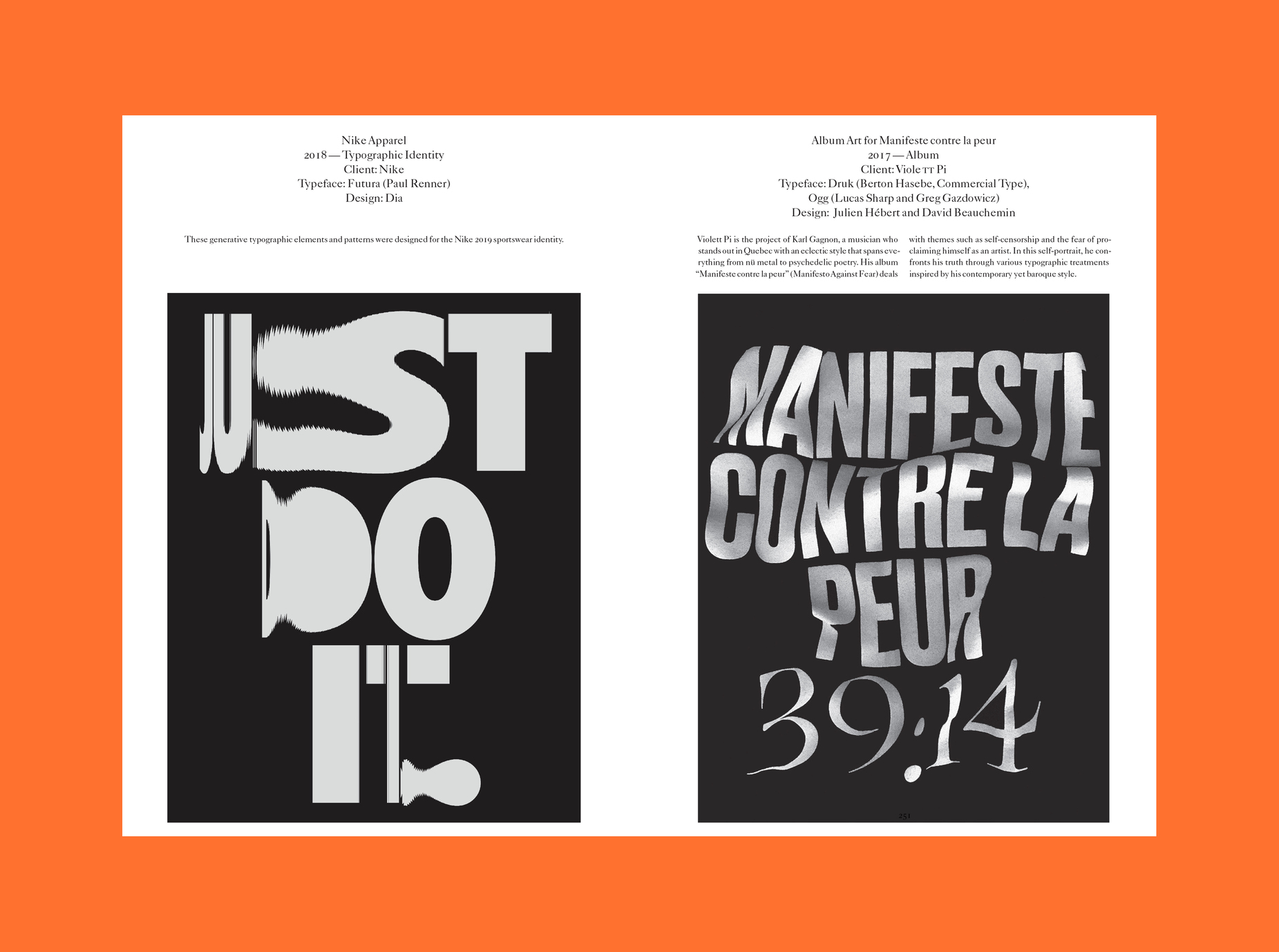
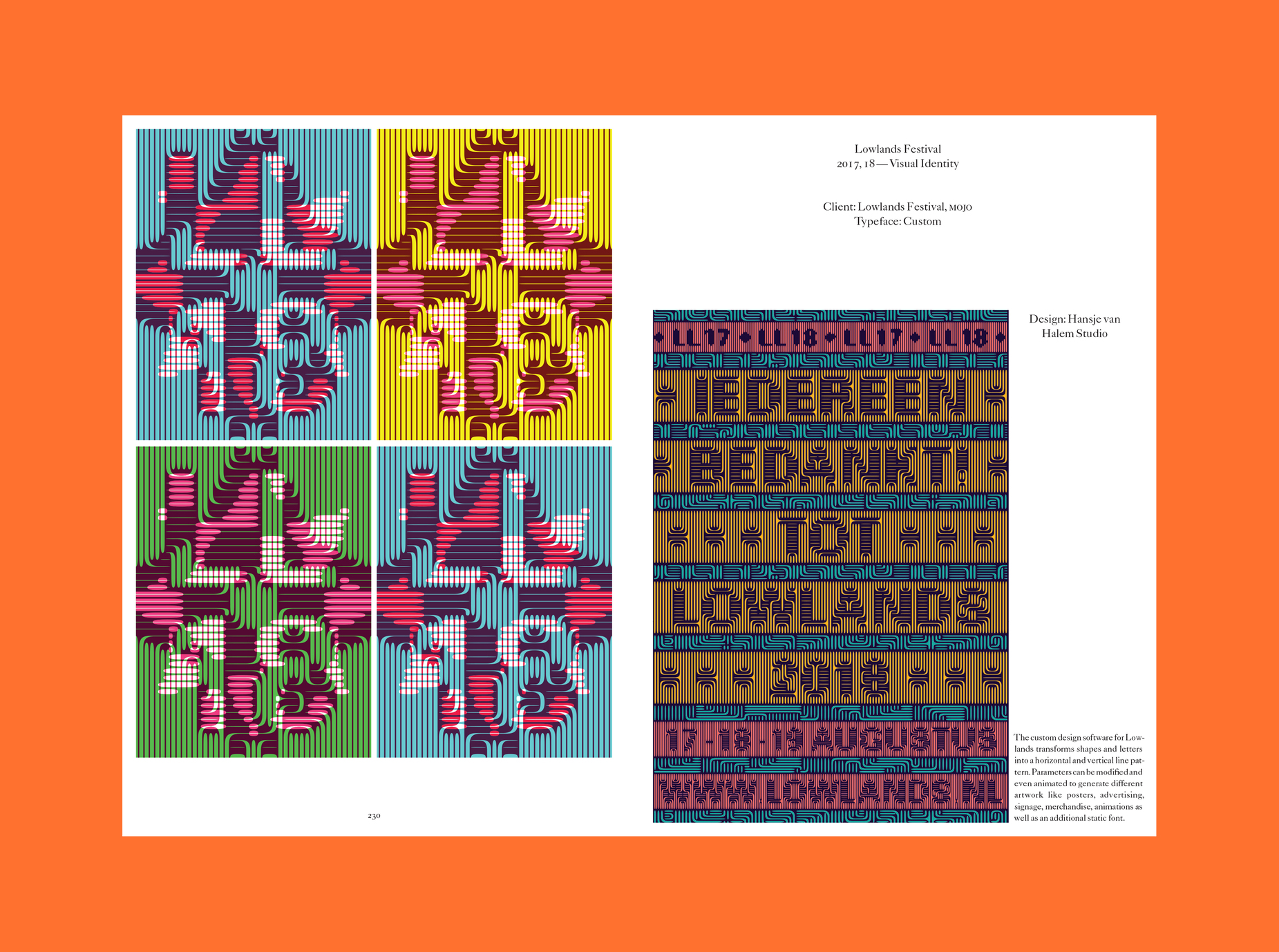
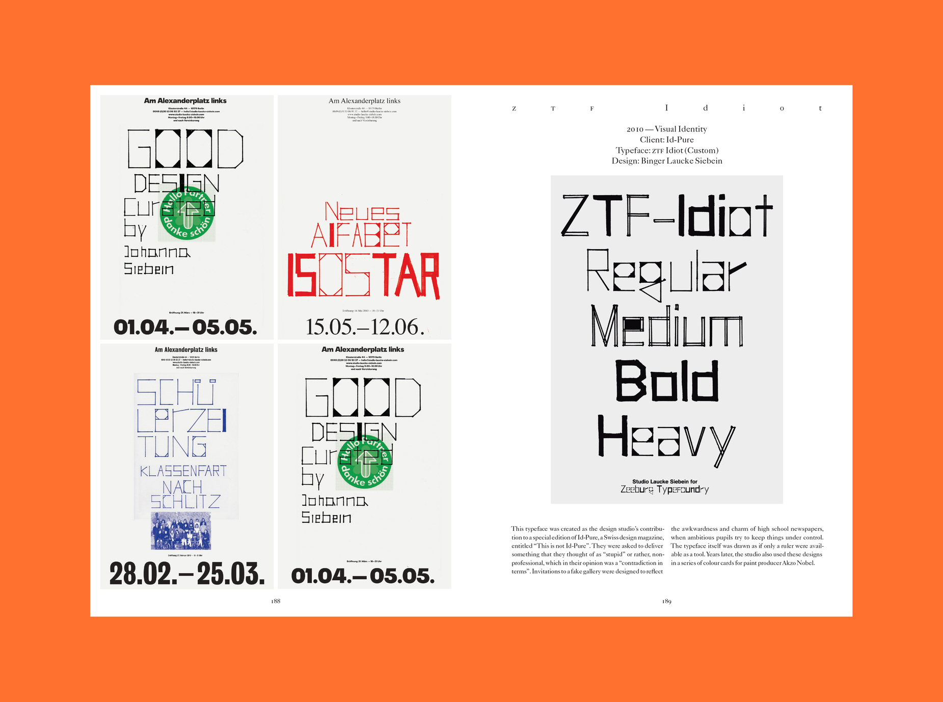
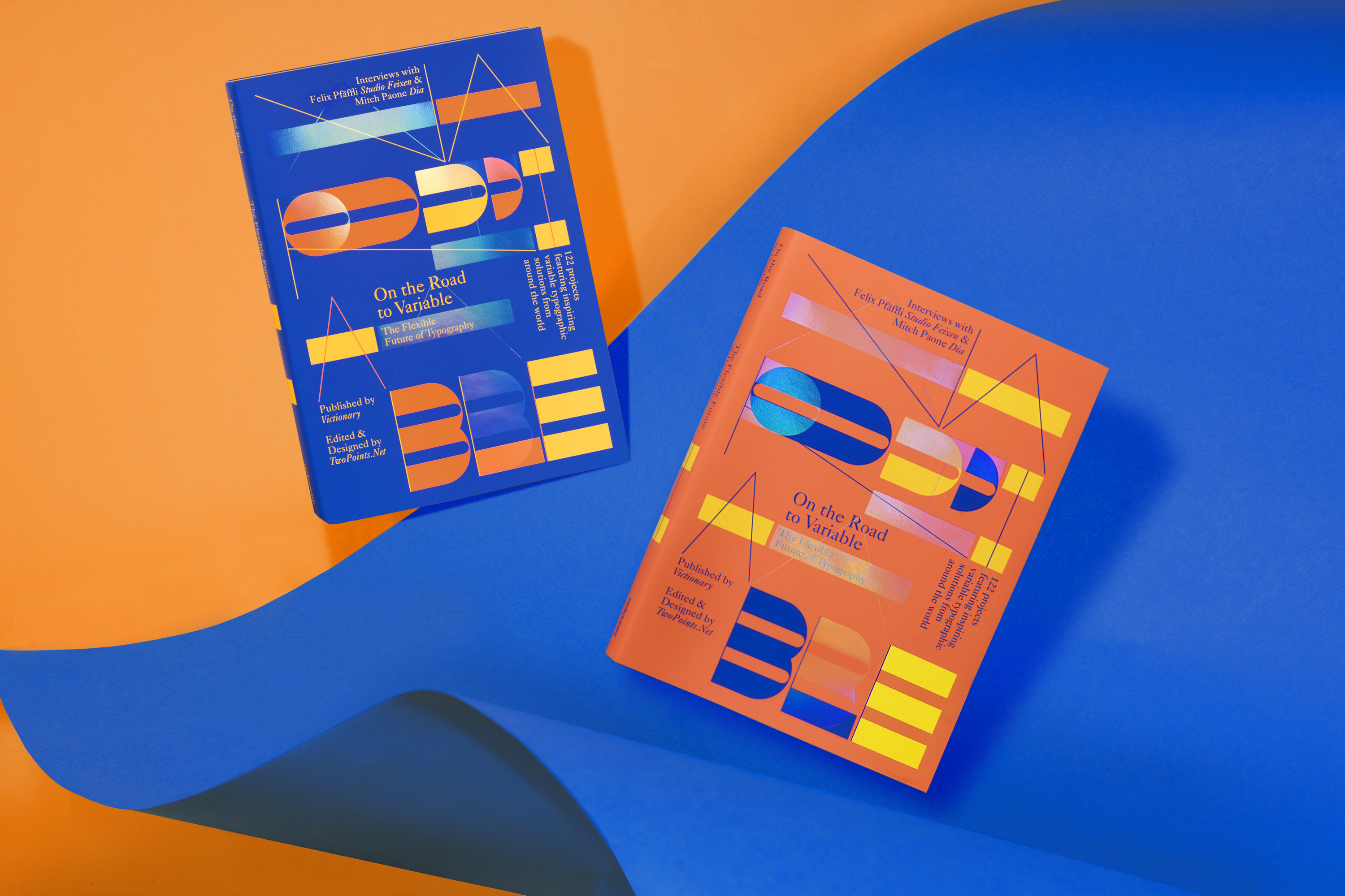
In riding the wave towards the new frontier of type, renowned design agency TwoPoints.Net has curated over 122 projects for this book in hope of inspiring the next generation of creatives. Edited and designed by TwoPoints.Net and published by Viction:ary the publication explores an eclectic and exciting collection of work that experiments with the modification of existing typefaces as well as the creation of new ones for a fascinating glimpse into the future of type with many creatives sharing their journeys, thoughts, and visions for variable typography in time to come.
“On the Road to Variable has evolved many times, and while this may not be unusual when it comes to publishing, the reasons behind its changes shed an interesting light on the subject matter at hand. In sharing them, we first need to go back to 2009, when the idea for I Love Type (ILT) was born” note the editors. “ILT was a series we developed with Viction:ary to honour famous typefaces like Futura, Avant Garde, Bodoni, DIN, Gill Sans, Franklin Gothic, Helvetica, and Times. It was created out of our interest to explore how classic typefaces were being used in contemporary graphic design at the time. As students in the late 1990s, we were taught to stick to the ‘all-time classics’ in order to become good typographers. As we became teachers ourselves later on, we began to understand the benefit of limiting typeface choices for the untrained eye, and saw a deeper reason for it than just to limit potential ‘damage’. It was a credible design approach, in that using an often-seen, less expressive typeface actually gave one more freedom and room for creativity because the audience’s eye would not be instantly drawn to the typeface itself, but rather, to what was done with the typeface or the space around it.”
“The term „Variable Typography“ describes a new quality of flexibility, a next step in the evolution of typography. Not just in type design, but as well in the application of type”
“When we published ILT, many design studios had been working with the same typefaces for decades. Even though these typefaces were typically attached to specific time periods, the ways with which they were treated to look contemporary surprised and excited us. As such, it was important for us to introduce the typefaces’ histories at the beginning of each book before revealing the creative work to evoke the same emotions in readers. The series had to come to an end after eight volumes, not just because we had finished covering the most popular typefaces out there, but due to the fact that designers everywhere had begun changing their approach to typography. Instead of sticking to the all-time classics, they started becoming more experimental by using and making new typefaces. Distinctiveness began to rule over perfection, and instead of perceiving it as a negative development, we saw it open up a whole new playground in the design world. Typography has never been as flexible as it is today, and we are proud to have made a book on a subject matter that deserves to be delved into, no matter how many changes it went through” adds TwoPoints.Net.
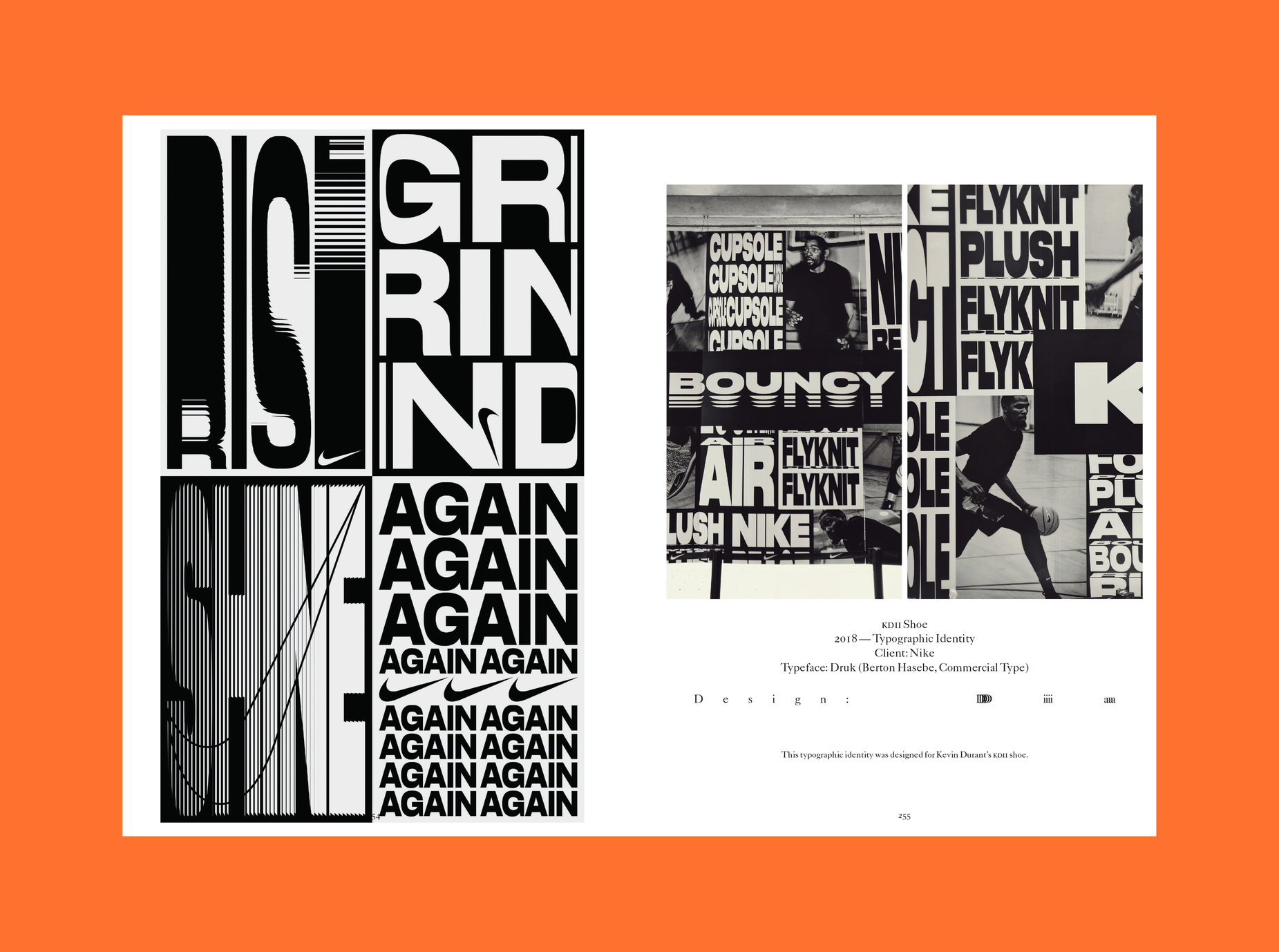
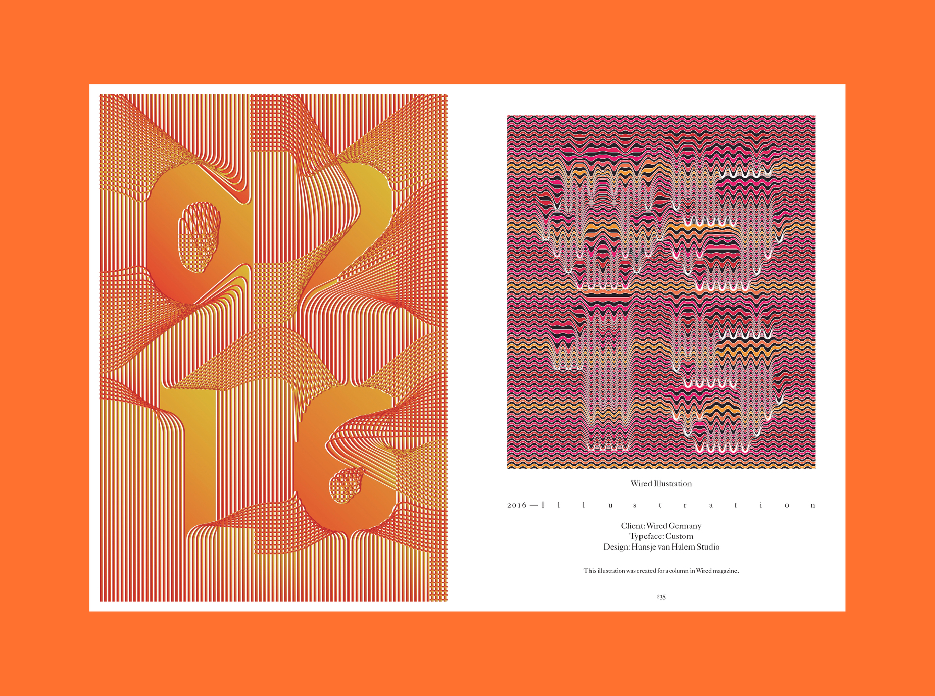
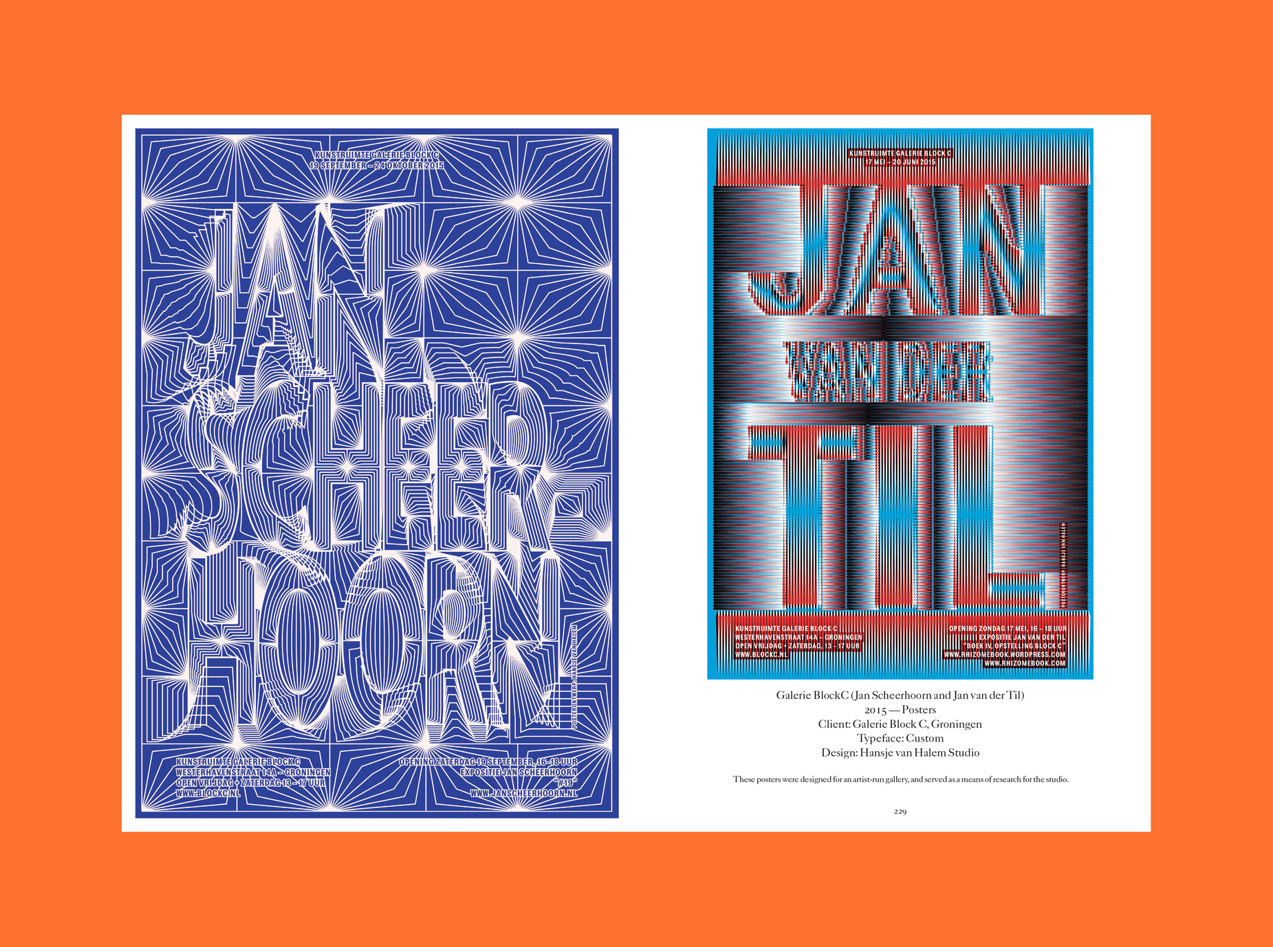
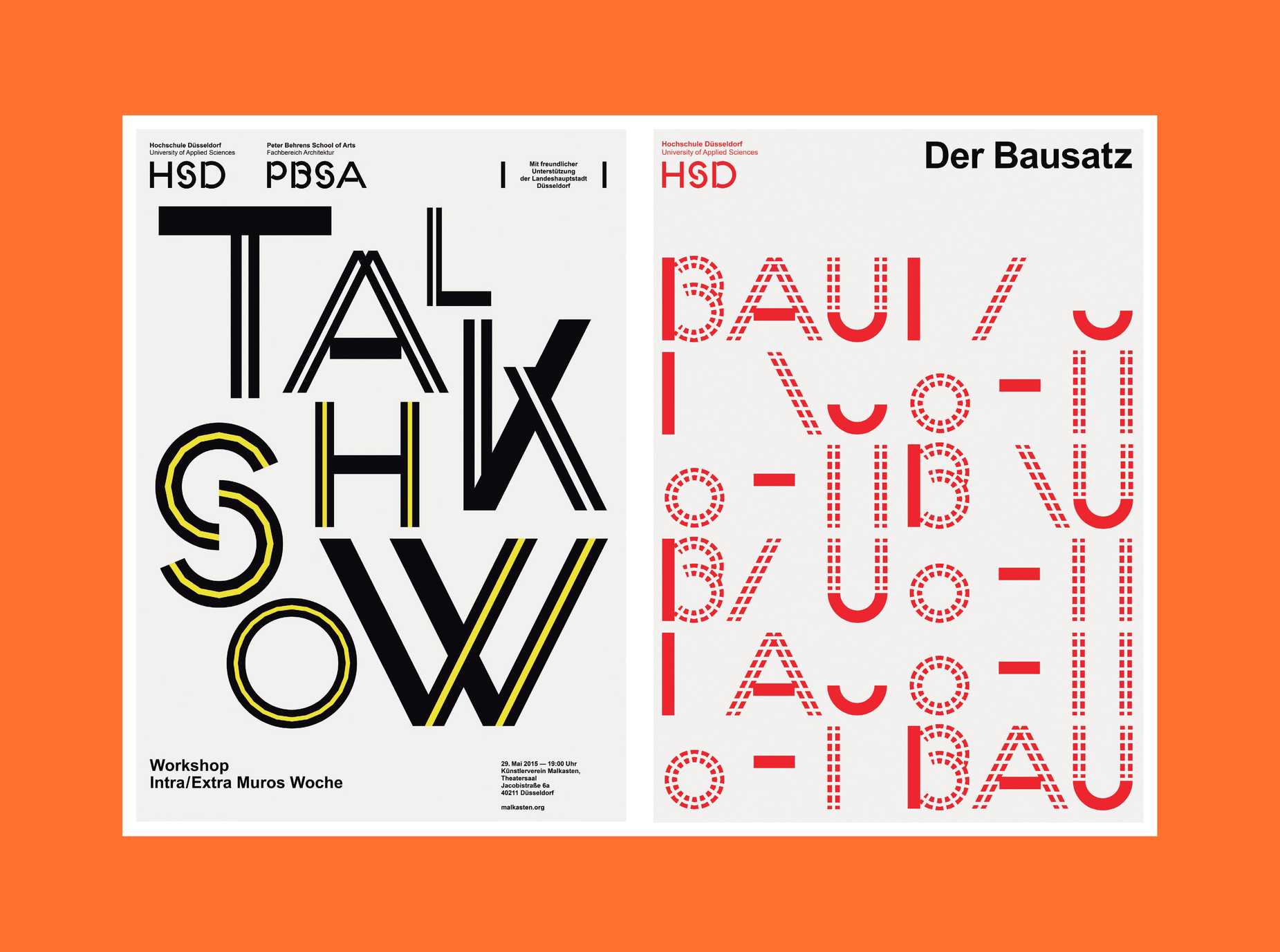
With insightful interviews with Felix Pfäffli from Studio Feixen and Mitch Paone from DIA along 122 inspiring works by Artem Matyushkin, Atelier Tout va bien, Dinamo, Ines Cox, Lamm & Kirch, Pouya Ahmadi and more and this is a publication filled with inspiration for the variable type designer in all of you.
Typeroom's Loukas Karnis talked with Martin Lorenz on this tome of variable possibilities which explores the more than exciting future of typography with more and more designers pushing the boundaries of type design after that 2016 update.
Typeroom: First things first, what is variable typography?
Martin Lorenz: Good question. Typography in itself is already a variable system. From the architecture of the letters to the composition of text with letters. As such, combining the words „variable“ and „typography“ can be seen as repetitive. But the term „Variable Typography“ describes a new quality of flexibility, a next step in the evolution of typography. Not just in type design, but as well in the application of type. Especially kinetic typography in 2D and 3D has become a big thing in graphic design in the last years.
“Movement, responsiveness and interactivity are the new standards. Static images (or typography) start to seem unnatural on our devices”
Typeroom: Why’s everyone suddenly talking about variable fonts?
Lorenz: On one hand because on the 14th September 2016, Adobe, Google, Apple, and Microsoft announced a new update to the OpenType specification to introduce variable fonts. Similar to the multiple master concept, it will allow for custom styles to be generated from a single font file, so that designers have a tool that lets them choose any weight between two extremes. On the other hand because everything seems to be flexible and moving nowadays and variable fonts satisfy this need. Movement, responsiveness and interactivity are the new standards. Static images (or typography) start to seem unnatural on our devices.
Typeroom: Why has typography on the web been neglected for so long?
Lorenz: I am not sure it has been. Designers always felt the urge to improve typography on the web and push its limits. But when the resolution of the screens and the implementation of type improved, designers were given better tools to make better typography. This is when typography on the web made a huge step forward and improvements became more visible.
Typeroom: When did you first start acknowledging the potential and the dynamics of this typographic evolution?
Lorenz: Twenty years ago, when I studied at the KABK. Obviously, variable fonts were not around at that time, neither was kinetic typography, but type, as a flexible system in itself was a concept that was always present in any subject at the KABK. If you reduce the idea of variable fonts to a seamless interpolation from one extreme to another, the „typographic universe“ by Gerrit Noordzij could be seen as a theoretic blueprint for variable fonts.
“The real potential is the change of perception of what fonts can do”
Typeroom: Which was the first variable font you ever encountered?
Lorenz: I do not recall any specific font, but the first time I thought „Wow! This is going to be a game changer.“ was when I saw the page http://letterror.com/dev/mathshapes/ by Erik van Blokland. The type on it was variable, responsive, animated and on top of that, it loaded very quickly. Conceptually, I guess, it has been the „Kombinationsschrift“ by Josef Albers from 1928. Albers designed and produced a modular font which, by rearranging its modules, could have different weights, heights and widths.
Typeroom: How is variable fonts technology breaking new ground in typographic terms?
Lorenz: At the moment everybody seems to be wowed by technology. Instagram is full of looped animations of letters changing their shape. I guess this is the natural response to any new tool, to experiment with them. Although I love formal experiments, I do not think that they show the real potential of variable fonts. The real potential is the change of perception of what fonts can do. Instead of considering it a stiff design element, fonts could be seen as a responsive design element which can change according to the context they are used in, semantically and morphologically, and/or the person they are read by.
Typeroom: Would you consider variable technology a Pandora's Box or a blessing?
Lorenz: Every new tool is a blessing. The question is how it is going to be used.
Typeroom: How did you decide to write a book on variable typography?
Lorenz: Variable typography is basically about the evolution in typography from static to flexible, if not in communication design in general. In fact, I have been witnessing this change for quite some time now in the fields of generative design, liquid/fluid/dynamic visual identities, evolutive/living visual systems, and kinetic/responsive typography, where there are as many experiments as there are terms to describe them. When I finished my dissertation about flexible visual systems in 2016, variable fonts and kinetic typography have not been as strong as they have become in the last 3 years, which motivated me to research these fields.
Typeroom: Is there a specific way in which this publication is supposed to be read?
Lorenz: We initially structured the contents of this book around traditional typographic weights, but in the course of putting them together, we quickly realised that the light/bold (thin/thick), condensed/extended (narrow/wide), and regular/italic (upright/slanted) ranges were not the only extremes possible, and anything in-between could be interpolated. As such, we ended up re-evaluating and re-organising the work we received from all the featured design studios into the following sections:
Variable Position
Variable Position, Width
Variable Position, Width, Height,
Variable Position, Width, Height, Styles
Variable through Transformation
In variable typography, we are typically able to see a sequence of events – a before and an after. For example, visiting a responsive website on a mobile device and then a desktop makes the rules of variability become clear through comparison. With kinetic typography, it becomes even more obvious, as we are forced to follow an animation frame by frame to understand the font’s variability.
On the other hand, a book can be read both in sequence or as a single image if one were to be looking at a double-page spread as a whole. As readers, we get to decide how to flip the pages and how to move our eyes over each page, whether we start from the beginning to the end or from the end to the beginning. We can even speed it up or slow it down to create so-called ‘animations’ at our own pace.
Typeroom: Which is your most beloved quote of all the interviews contacted for the book?
Lorenz: I loved talking with Mitch (Paone) about the similarities between music and Design. Mitch said: Music is probably the most important influence for me. It is difficult to explain this to designers who are not composers, but the way our creative process is set up, models what I do when I compose. While a traditional designer is mostly concerned with the final output, a musician focuses on the process. He works on the vocabulary of the underlying craft. The mastery of that vocabulary allows him to have a conversation, using an instrument. Music provides me with a specific structure, like chord progressions, rhythm, tempo, groove or beat, which I use as my foundation before I decide how I want to work on harmonic structures and instrumentation. If I have a specific looping chord progression that serves as an underlying system, I can be very creative on top of that. That is exactly how we work when we do kinetic typography or motion design. It all goes back to rhythmic looping, pretty much like a chord progression. Music and design are the same to me. One works with sound and the other, with visuals.
Typeroom: What are you working on now?
Lorenz: I mentioned before that I wrote my dissertation about flexible visual systems. Now I am working on a book based on my findings. My idea is to make it less theoretic and more hands-on -basically, a guide on how to build flexible visual systems for visual identities. I can’t say much more, because I am still in the middle of making it. Which is a good thing, because I am still open to suggestions on what should be in this book. Curious to hear your thoughts.
Share your thoughts with Martin here and explore the variable typographic evolution as it happens here.
Tags/ inspiration, parachute, type design, book, monotype, variable fonts, twopoints.net, martin lorenz, dia studio, ines cox, variable typeface


