UK Parliament's new typeface and visual identity is all about clarity
Over the past several months, members of the British Parliament have been working with design agency SomeOne to develop a new visual identity for UK Parliament. "One subtle but significant element to a visual identity is the typeface. If you’ve visited the UK Parliament beta website you may have noticed that we’ve been using it as an early test bed. So how did we choose a typeface and why is it important anyway?" asks Jack Craig who explains if full detail why typography matters.
"Being able to easily read and comprehend information is important. The UK Parliament website has to display a lot of text. Imagine reading the Hansard transcript for one of the longest single sittings in the House of Lords, which lasted over 32 hours on the 10 March 2005. It’s therefore crucial that we use a typeface that can provide a good reading experience. We also know the way people interpret text is influenced not just by what they read, but also how it’s written. The shape of the letters and the way they’re displayed can affect our understanding of content, from picking a genre of film to choosing the cheapest place to eat out" he notes.
UK Parliament Responsive Logo from SomeOne on Vimeo.
"An example of this is a New York Times experiment that showed how using different typefaces affected the reader’s level of trust in the content they read. This was important for us to consider as the Parliament website is the authoritative source of information for what’s happening in the House of Commons and the House of Lords" he adds.
"Three important factors we looked at when choosing a typeface were its personality, readability, and accessibility. In 2012, GOV.UK introduced GDS Transport as the typeface for their online services. Originally designed for Britain’s motorway signs in the 1960s (and still used on roads today), it was later modified and updated for digital use. Being primarily used by drivers travelling at high speeds, it's been thoroughly tested and optimised for legibility over the years. It was a great choice for GOV.UK. Not only is it designed to maximise clarity and legibility, but it also has a lovely connection with the history of public services in the UK. So why shouldn’t Parliament also use Transport? Although we share similar design principles to the Government Digital Service (GDS), it’s vital to make Parliament distinct from government. In our research, we’ve found that there's widespread confusion around the very separate roles of government and Parliament" notes Craig.
Therefore SomeOne explored a number of options for typefaces. "It was important that the chosen typeface could portray Parliament’s vast heritage as well help to reflect it being an inclusive and modern organisation. So we decided on two typefaces, Register and National, which work well as a combination or individually. Register is a modern, serif typeface originally designed for newspapers and magazines. It has a range of typographic features making it versatile for a huge variety of material Parliament produces, from the Parliamentary Archives to the many exhibitions we hold. National is a simple, sans serif typeface that has subtle details that give it a personality. It reads well for long form text and is distinctive when used larger for headlines. It also looks great on screen, even at small sizes, so it would be a natural choice as the primary typeface for the website. As part of the decision making process, we also wanted to make sure that it would work well for people with different access needs" notes Craig.

Simon Manchipp on Behance
Also typography and accessibility was another great issue for the appropriate letterforms of UK Parliament.
"We started by consulting the British Dyslexia Association (BDA) typography guidelines. National has several features referenced in the guidelines that improve readability for people with dyslexia. It has distinguishable characters for the capital I, lowercase l, and the digit 1. It also benefits from having an extensive character set. By default, National features a double-barrelled lowercase ‘a’ and ‘g’. The BDA guidelines recommend a single-barrel (or schoolbook) ‘a’ and ‘g’ which National has available as alternative characters. To get more insights, we created type specimens and sent them to the Digital Accessibility Centre for review as their analysts have a variety of impairments. The specimen text we provided was set out in Helvetica (our previous typeface for the beta website), National, with the double-barrelled lowercase ‘a’ and ‘g’ and National with the schoolbook ‘a’ and ‘g’. We also supplied the same specimens with inverted colours for analysts with low vision impairment. The clear preference was for National and the schoolbook characters. Based on this feedback, we’ve worked with the typeface foundry to make the appropriate character substitutions for both digital and print" adds Craig.

Simon Manchipp on Behance
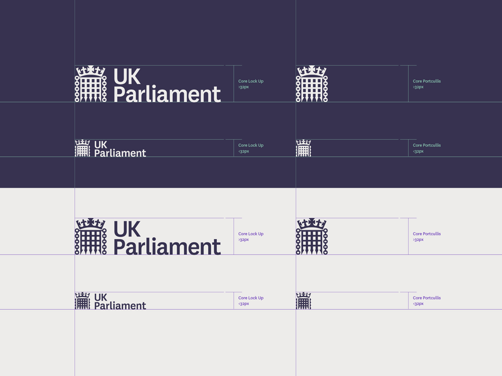
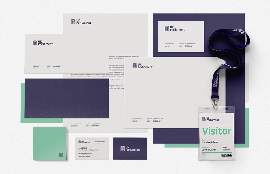
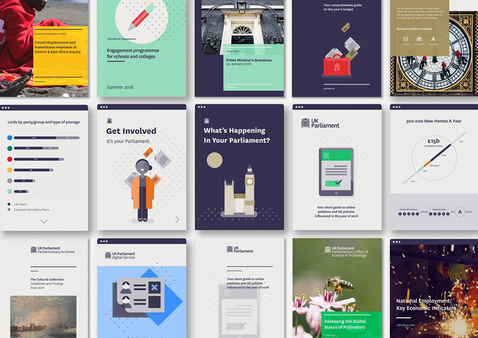
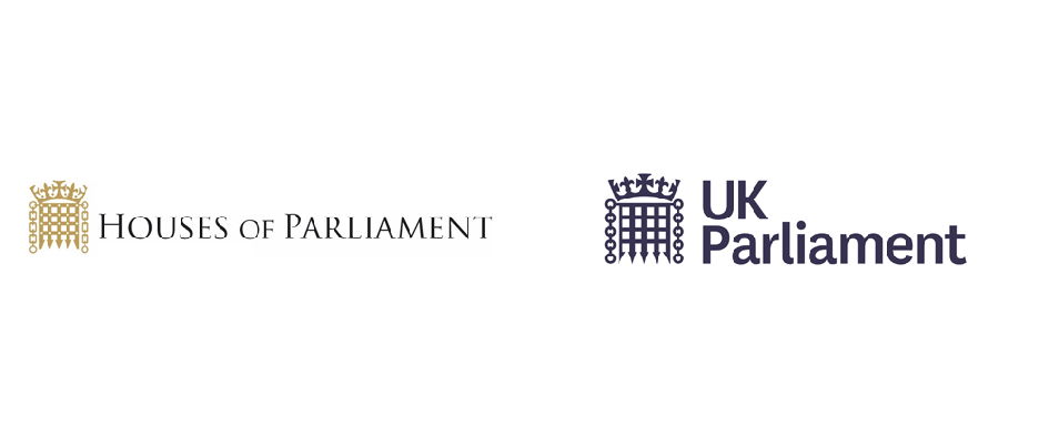
"The new visual identity has been designed to provide the consistency and coherence that was previously lacking, and to enable faster, clearer visual communication, primarily across digital platforms" notes SomeOne. Greater simplicity and clarity has been a priority, particularly online where the existing assets did not reproduce clearly at smaller sizes on mobile devices.
"Clarity, Simplicity and Efficiency all drive the new design work, so that anyone can get to the information they want, when they want and how they want it" adds Simon Manchipp, co-founder of SomeOne.
UK Parliament Templates from SomeOne on Vimeo.

Simon Manchipp on Behance
Tags/ design, typography, inspiration, typeface, helvetica, letters, visual identity, digital, type foundry, letterforms, visual communication, new york times, britain, national, typographic, someone, uk parliament, jack craig, simon manchipp, accessibility, legibility, clarity, specimens, register, gds transport, government digital service, british dyslexia association, digital accessibility centre


