Typography at its best: Last call to enter Communication Arts Award of Excellence competition
Since 1959, Communication Arts has published the best in visual communications from around the world. “Ask any creative director which competitions rank as the most influential, and they'll place Communication Arts at the top of the list” states CA of its call for entries in this year's “CA's Award of Excellence” competition.
One of the most-coveted awards in the industry, the competition awards the best in both in print and online. Art and creative directors, graphic designers, Web designers, copywriters, photographers, and illustrators find these competitions a priority for worldwide promotion and a valuable resource for potential clients and colleagues.
If chosen, the award places you in the highest ranks of your profession. Winners are selected by a nationally representative panel of distinguished visual communicators.
Past judges have included such luminaries as Saul Bass, Michael Bierut, Lee Clow, Hillman Curtis, Louise Fili, Milton Glaser, Jeff Goodby, Hal Riney, Sam Scali, Paula Scher, Michael Vanderbyl, Lynda Weinman, Fred Woodward and Jeffrey Zeldman.
The CA Annuals are must-have references for creative excellence in visual communications and have furthered numerous careers through the worldwide exposure they provide.
Each winning entrant will receive a personalized Award of Excellence, milled from solid aluminum.
The competition awards the best of the best in six categories. Typography, Interactive, Illustration, Photography, Advertising, and Design.
CA's Award of Excellence is one of the most-coveted awards in the industry. If chosen, winning places you in the highest ranks of your profession.
Winners are selected by a nationally representative panel of distinguished visual communicators.
2020 Typography Competition is on
Past judges have included such luminaries as Saul Bass, Michael Bierut, Lee Clow, Hillman Curtis, Louise Fili, Milton Glaser, Jeff Goodby, Hal Riney, Sam Scali, Paula Scher, Michael Vanderbyl, Lynda Weinman, Fred Woodward and Jeffrey Zeldman.
This juried competition celebrating the best use of typography as the primary visual element in design and advertising, plus new typeface designs, calligraphy and hand lettering. Categories include collateral, packaging, media, motion, environmental and unpublished/experimental.
Any typographic project first published or produced from September 2018 through September 2019 is eligible. Chosen by a jury of leading design professionals, the selected entries will be distributed worldwide in the Communication ArtsTypography Annual, in print and digital editions, and on commarts.com, assuring important exposure to the creators of this outstanding work.
Creative director Nancy Campbell at McCandliss and Campbell, Jeremy Mickel, the founder of MCKL and Alisa Wolfson, EVP and head of design at Leo Burnett Chicago are this year's 2020 Typography Competition's jury.
Following are this year's 2020 Typography Jury categories. The entries will be judged by the Typography jury and will appear in the Typography Annual.
Advertising: print/out-of-home advertising, advertising posters, direct mail, etc.
Brochures: annual reports, brochures, catalogs, corporate literature, etc.
Posters: concert, performance, exhibition, theater, gallery, etc.
Ephemera: invitations, announcements, greeting cards, etc.
Packaging: labels, shopping bags, audio/video/software packaging, etc.
Books: covers and complete books.
Periodicals: magazines, newspapers, newsletters, etc.
Digital Media: websites, blogs, mobile applications, etc.
Environmental: signage, environmental graphics, museum/tradeshow graphics, etc.
Identity: logos/trademarks, business papers, collateral, etc. Motion: movie/network/program titles, television commercials, web videos, animations, etc.
Typeface Design: commercially available typefaces and type families. Calligraphy/Hand Lettering: hand-drawn type for commercial purposes.
Miscellaneous: apparel, products for sale, etc.
Unpublished: experimental/personal work not published.
Student Work: work created for school assignments.
Entries must be registered no later than Midnight (Pacific Standard Time), September 6, 2019. Entries registered after that date require a late fee of $10 per entry. No entries can be registered after September 20, 2019.
CA's six tips for success
1) Only send one version of each entry. If you upload digital files, we will not show the judges a printed version or video to go along with the digital images.
2) If you enter a project in multiple categories and wish to submit printed samples, you must send an additional sample for each entry with the corresponding form attached.
3) For multi-page projects (i.e.: brochures, books, etc.) please send the actual printed piece.
4) Digital files must be RGB in JPG format with a maximum width of 1024 pixels and a maximum height of 768 pixels at 72 dpi. Do not rotate vertical images to be horizontal.
5) All physical entries, printed pieces or entries on disks must have an entry form attached to the back. Do not send any work without an entry form attached. Entry forms will be automatically generated for you at the end of the submission process.
6) Pack entries carefully. Do not send work in poster tubes as they are frequently damaged in transit.
To inspire you for your entry in this year’s fest of excellence we present you with three winning entries released by our very own Parachute Typefoundry. PF Regal Text Pro, PF Das Grotesk Pro, and PF Adamant Sans Pro are three typefaces which have gained worldwide recognition by winning one of the most prestigious juried competitions in visual communications in the past, aka CA's Award of Excellence.
PF Regal Text Pro, Communication Arts Annual Competition 2012 Winner
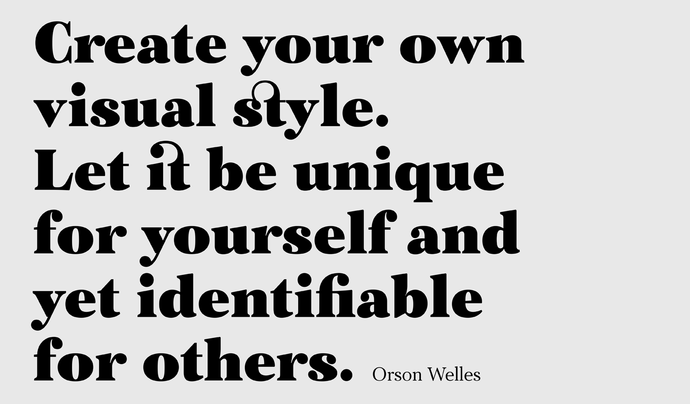
The objective of this project was to design a new typeface series for Grazia magazine. First published in 2010, Regal was later revamped and redesigned for commercial use, evolving into a type system with five related superfamilies.
According to the brief, this typeface had to be elegant, luxurious, sexy, vibrant, reflect the female sensitivity and take into consideration a modern woman who is more proud, more connected, more spontaneous, open-minded and eager to try a whole host of new products and services.
Targeting this consumption-wise and well-educated woman, required a typeface that is not strictly based on classic forms, but incorporates several distinct elements that express a modern woman’s personality and the products she consumes.
In that respect, a whole series of 5 related superfamilies was designed, which not only emphasize femininity but also reflect both the romantic as well as the dynamic side of the female personality.
For that matter, elegant curvy details were introduced in order to create a link to the female figure; teardrop terminals which reflect a woman’s sensitivity; pronounced quirks on upper and lower arms for her eyelashes; high-contrast, sharp corners at thinning terminals for her high heels; alternate glyphs for the woman who prefers to express her individuality -rather than slavishly follow trends- by using various accessories which can dramatically change her appearance; elegant endings and long curves to reflect her predisposition to dream; bell-shaped serifs with an inward rather than outward direction which recall streamlined seventies fashion.
This series of typefaces is diverse in its construction as it consists of five related superfamilies i.e. text, display, finesse, swash, and stencil.
There is a variety of weights which range from regular to ultra black for each one of the five families. These families share common attributes but they differ in content according to each one’s usage.
The whole superfamily type system is comprised of 47 weights with an average of 898 glyphs per weight. It supports simultaneously Latin, Cyrillic and Greek and comes with many alternate glyphs.


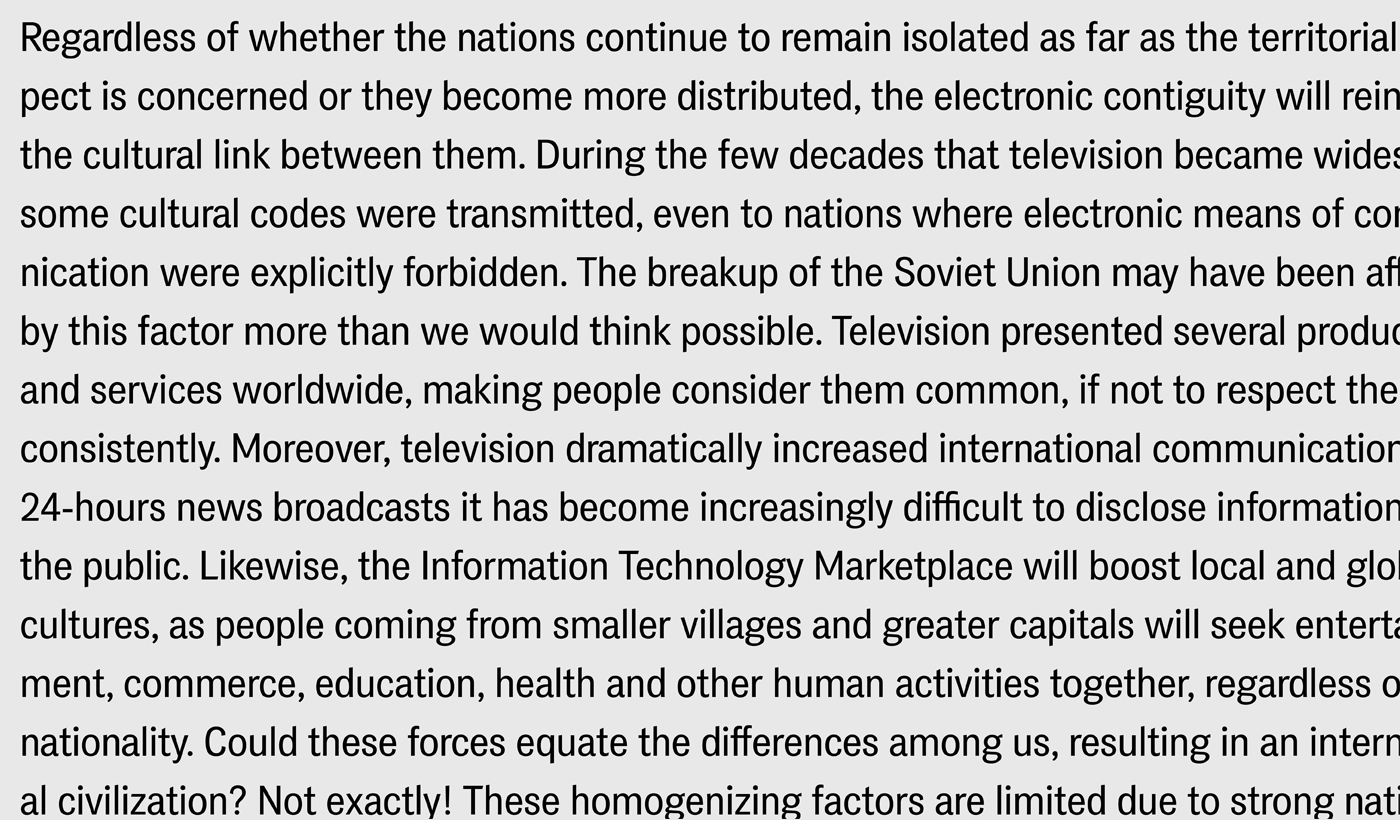
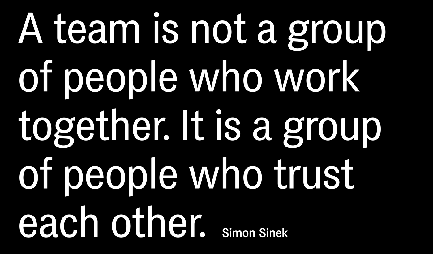
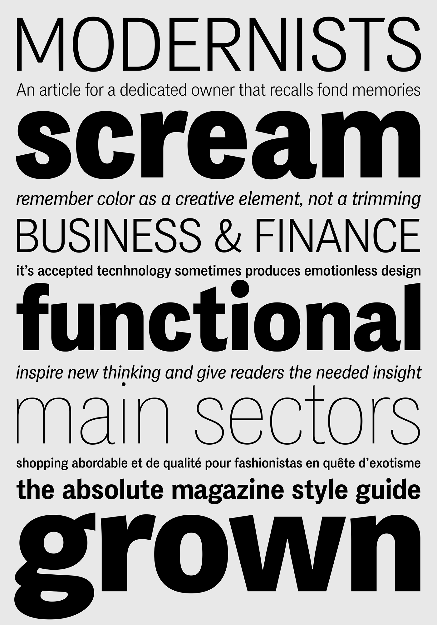
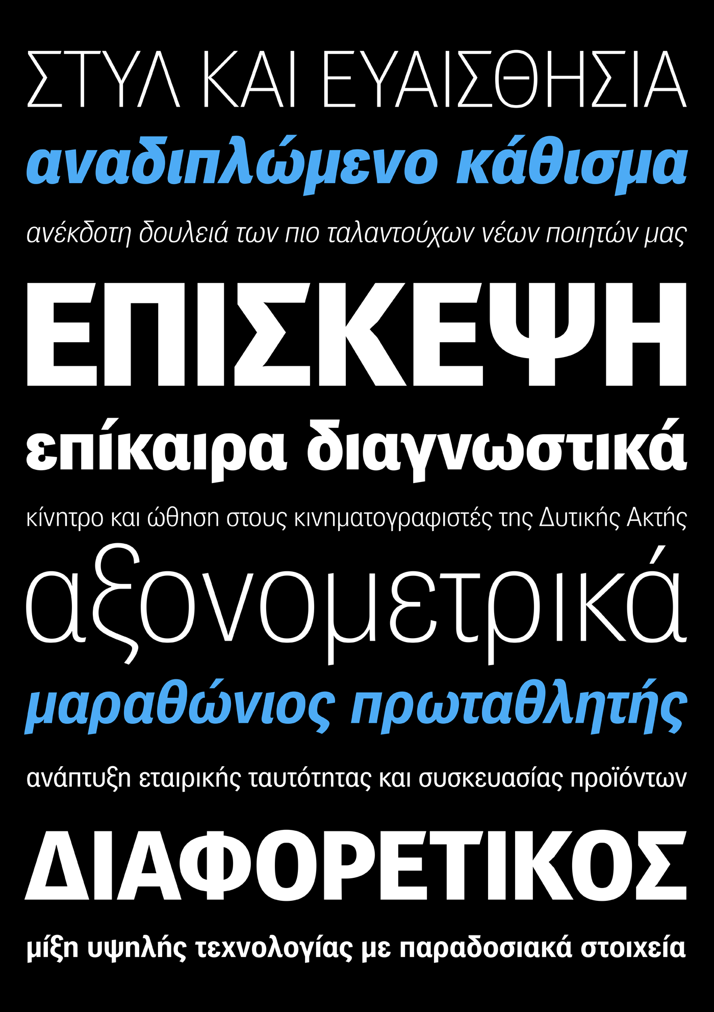
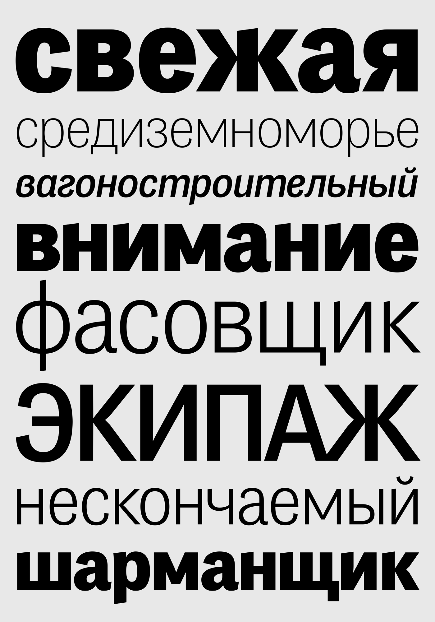
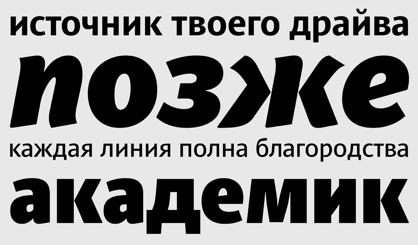
PF Das Grotesk Pro, Communication Arts Typography Competition 2015 Winner
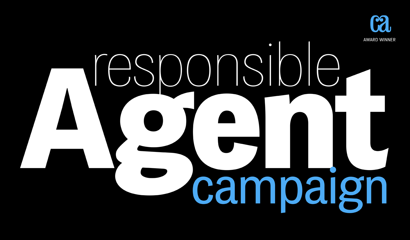
Das Grotesk was inspired by earlier nineteenth-century grotesques, but it is much more related to American gothic designs such as those by M.F. Benton.
Due to their pure geometric structure, most grotesque typefaces tend to have a rather monotonous and lifeless appearance, thus failing to express the ideals of the modern creed.
Das Grotesk, on the other hand, is a lively design with several distinguishable characteristics which attract attention when set at large sizes, whilst they become subtle and blend evenly at small sizes, fostering a neutral identity.
This is a very legible and space-saving typeface with a narrow structure. It was designed with slanted curved ends and sheared terminals applied on several straight strokes. It has two-storey ‘a’ and ‘g’ but includes single-storey alternates.
The family consists of 14 weights ranging from Extra Thin to Black (including true-italics). It provides simultaneous support for Latin, Cyrillic and Greek and is loaded with several advanced typographic features such as small caps.
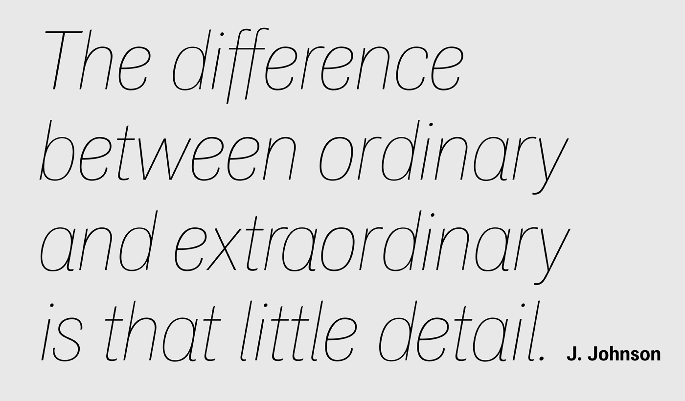

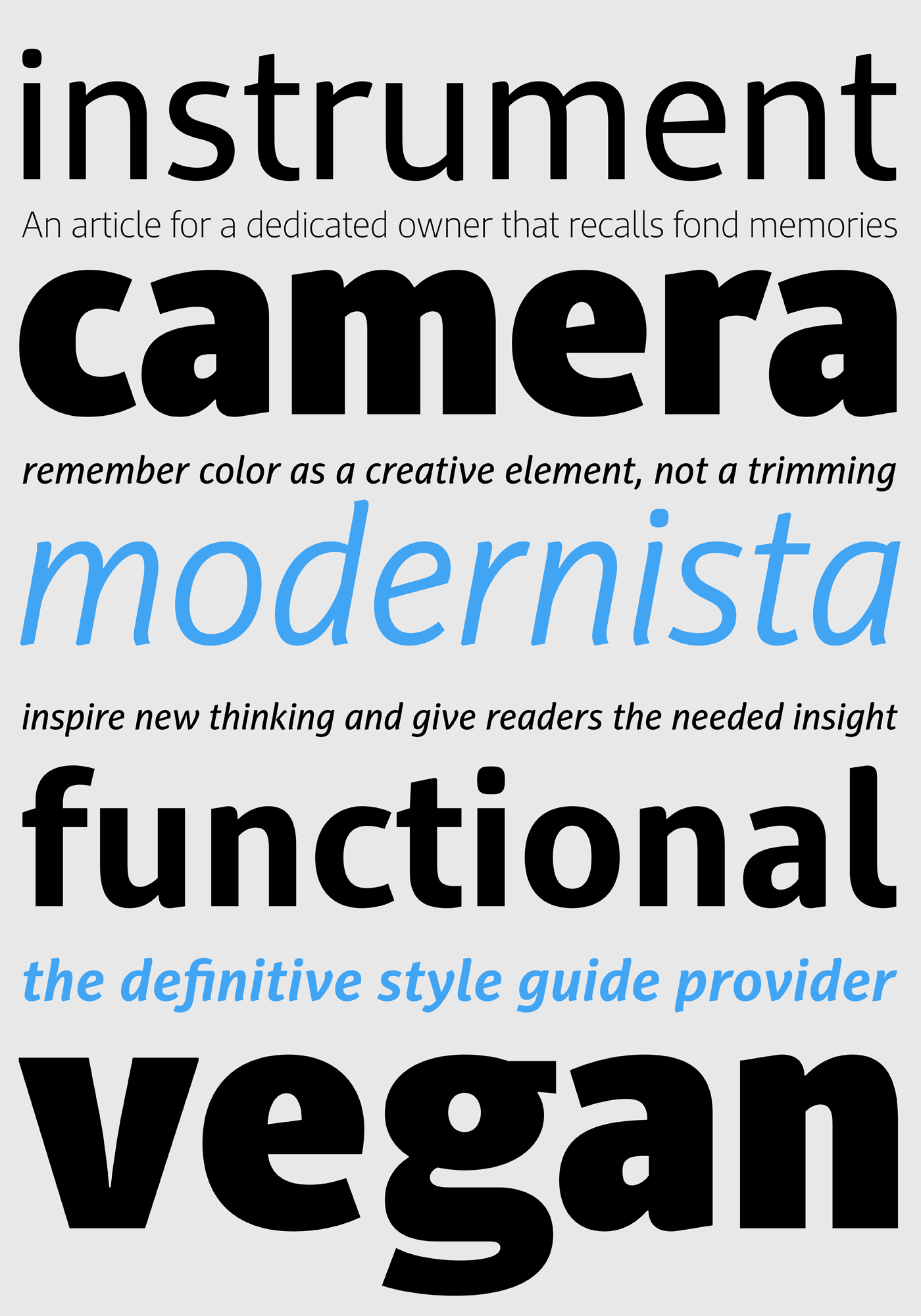
PF Adamant Sans Pro, Communication Arts Typography Competition 2016 Winner

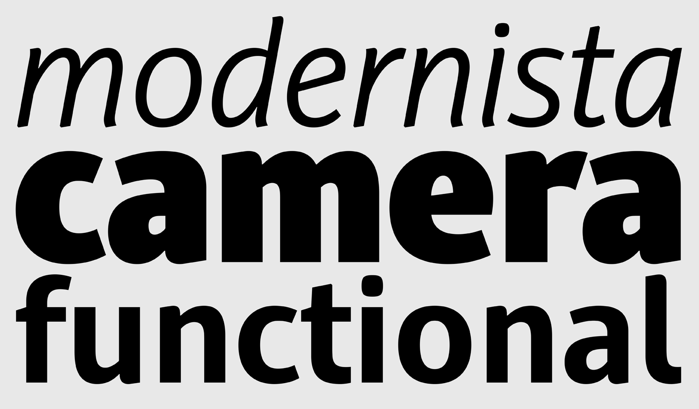
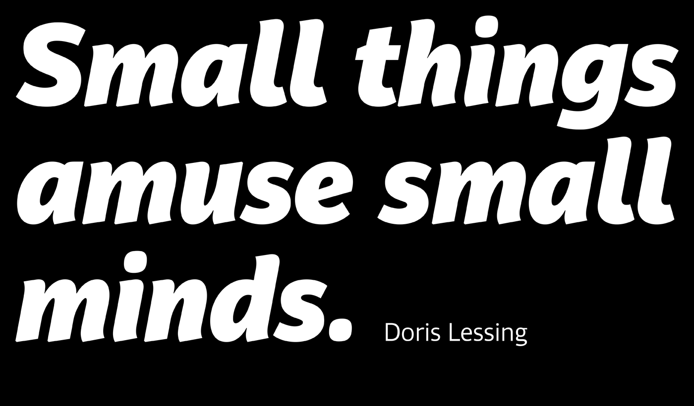
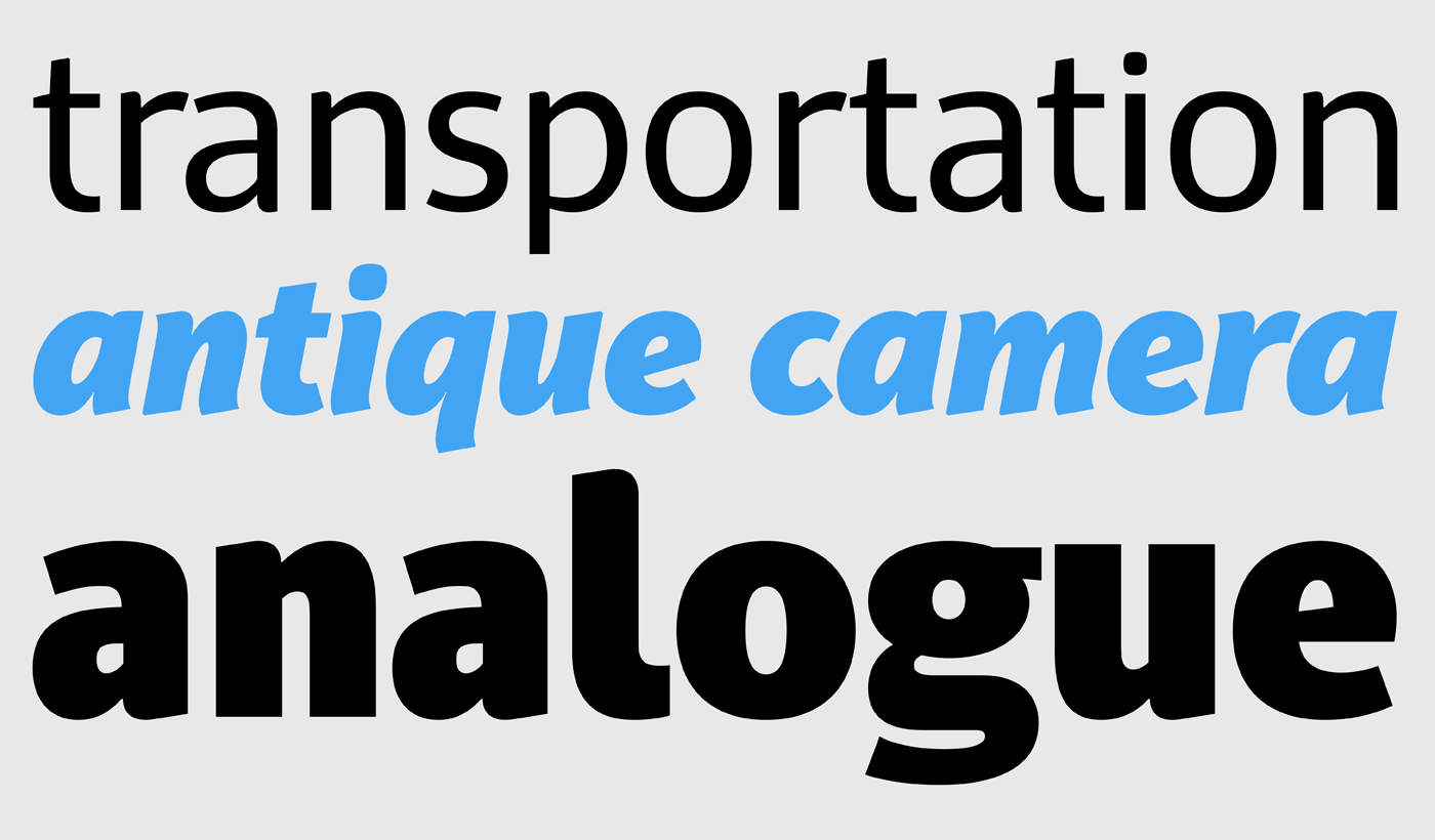
Adamant Sans Pro is a very functional contemporary typeface which stands out from the crowd with its uniquely designed rounded corners and beautiful italics.
Adamant Sans is the ideal companion of the Adamant serif version, but it can also be used alone as the perfect alternative to other older sans.
This carefully designed family consists of 18 fonts, including true italics. Its extreme weights, such as hairline and black are ideal for setting big and powerful headlines, while intermediate weights work very well in long texts at small point sizes.
Weights are finely balanced so that they can be easily combined, depending on the type of paper and other conditions. Thanks to its proportions, high x-height and wide apertures, this typeface is very legible and suitable for setting books, magazines, newspapers, but is also valuable for use in large sizes, as well as for complex corporate projects.
It supports advanced typographic features such as small caps, lining and old-style figures in proportional and tabular widths, fractions, ligatures, etc., and provides simultaneous support for Latin and Cyrillic as well as kerning for these languages.

Check more of these awarded typefaces over at Parachute type foundry's site here.
Tags/ typography, inspiration, parachute, typefaces, fonts, milton glaser, saul bass, competition, communication arts, award, call for entries, pf regal, pf das grotesk, pf adaman sans


