Typodarium 2020: a writing system for diplomacy and tolerance revealed
Compiled by Lars Harmsen and Raban Ruddigkeit and published by Verlag Hermann Schmidt, Typodarium 2020 -“a writing system for diplomacy and tolerance, a writing system that brings down the walls in concrete heads and tears down political or military boundaries” is more relevant than ever.
“Brexit and Trump’s Wall—it seems that borders around the world are currently being closed rather than permeable. It’s a good thing that more and more font families are mediating between languages and cultures at the same time, so you can use one font for multiple font systems” note the editors of this ideal gift to any typophile out there.
“The Typodarium 2020, therefore, shows the latest font trends, the ‘weirdest’ display types, the latest bread fonts and other proofs of the vital type community as well as a bi-script font family every Sunday. There are differences between Arabic and Hebrew, Japanese and Latin, but visually there are also many similarities."
“Communication overcomes borders. Communication needs writing. Type designers react to the wishes of their customers. And these customers from business and society think more globally and further than some headlines might suggest. The Sundays of the Typodarium 2020 define the silver lining on the time horizon: We are one world!”
“Communication overcomes borders. Communication needs writing. The Sundays of the Typodarium 2020 define the silver lining on the time horizon: We are one world!”
“The front pages of the Typodarium turn it into a calendar, the back pages, on the other hand, are a current font sample book camouflaged as a calendar. If you like a font very much, but you don’t see any possibility to use it at the moment, you might want to keep the font cheat sheet. Because that’s the way many people do it, we have packed the typodarium in a solid collection box. In the course of the year you will collect your typo inspiration here, always ready for use, because of course the font designer and source are on the back as well as a sample alphabet and information about the degree of development of the font.”
In this year's edition Parachute Typefoundry contributes with three typefaces.
The newly released humanist typeface PF Marlet (25 February), PF Melon (16 March) and the ultra variable PF Grand Gothik (28 August).
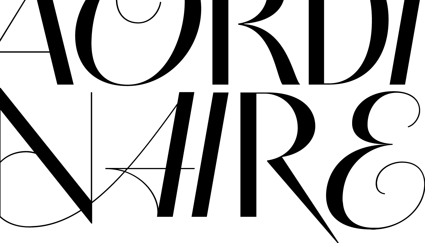
Made for timeless elegance through numerous combinations diverting from passing trends in type design PF Marlet is Parachute Typefoundry’s latest type system. Inspired from the roaring 20s and 30s, decades that embraced women’s independence both socially and politically PF Marlet takes intricate hints from the era whilst maintaining approachability, the contemporary dynamic version of this humanist typeface evolved with modulated strokes.
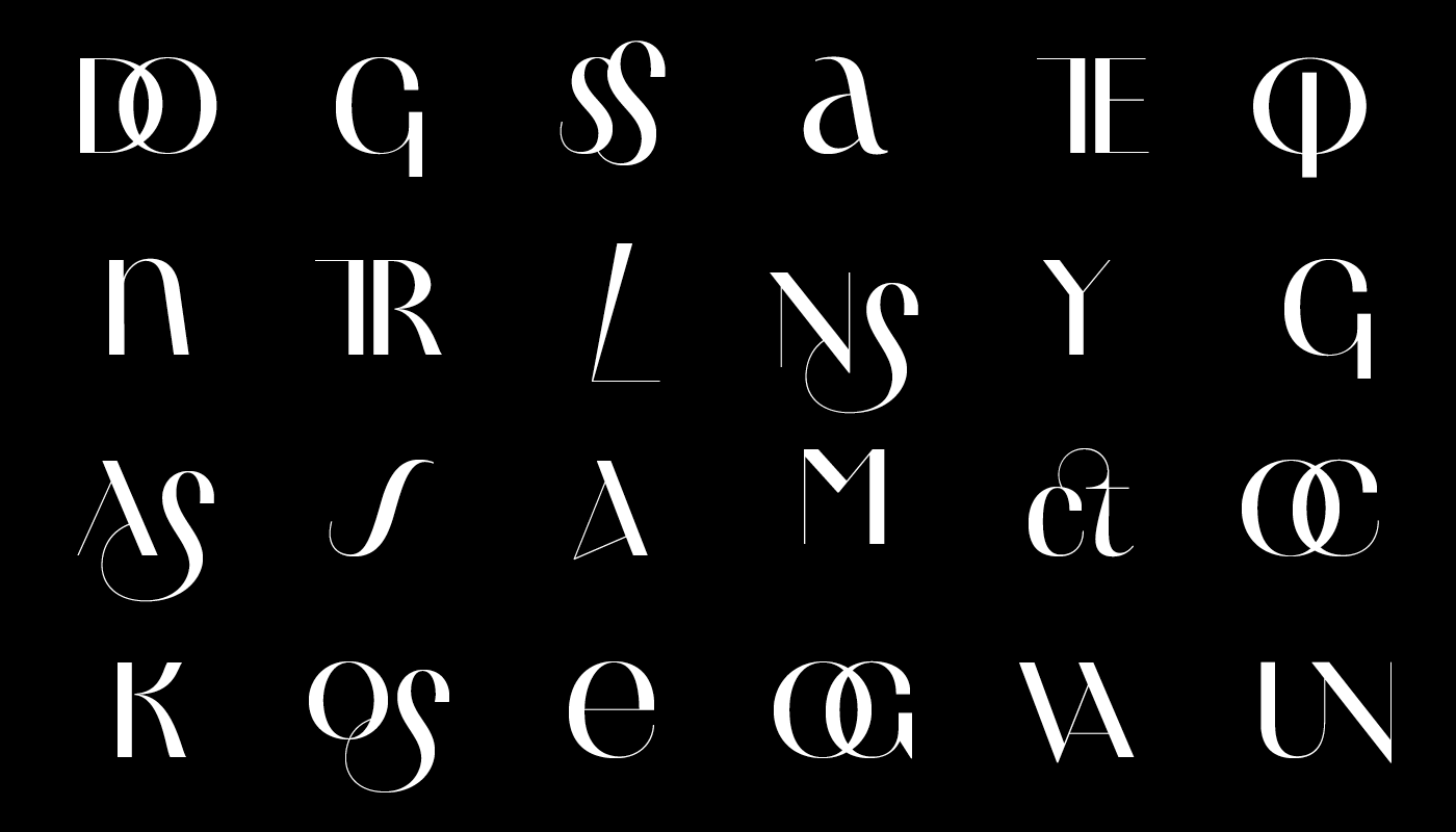
A type system with contrast progressing from low (Text version) through medium (Display) to high (Finesse), with differentiated letter widths (Titling), extravagant letterforms (Swash) and finally 64 eclectic patterns (Motifs), Marlet evolved from a single typeface into a comprehensive type system in various weights which support Latin, Greek and Cyrillic. Find more here.
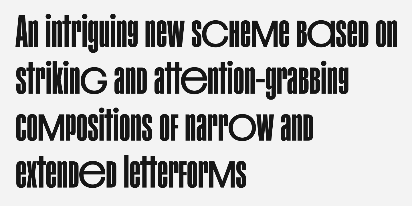
PF Mellon is a modernist variable grotesque with mixed roots. Its unconventional aesthetic is the product of an exploration into the art of emphasizing titles, headlines and text in captivating and unpredictable ways. Contrary to conventional practices of highlighting text with heavier weights, PF Mellon proposes an intriguing new scheme based on striking and attention-grabbing compositions of narrow and extended letterforms- even when set in lowercase.
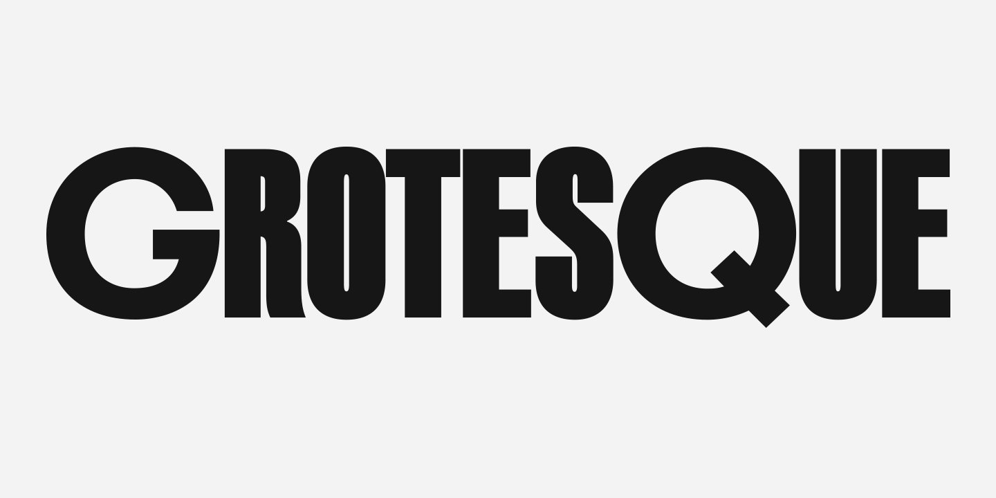
Part geometric and part grotesque, PF Mellon’s expressionist alphabet and extravagant style challenge conventions of visual culture in an Art Deco-like manner. Available also as a variable font format free of charge once you purchase the whole type family, discover more of PF Melon here.
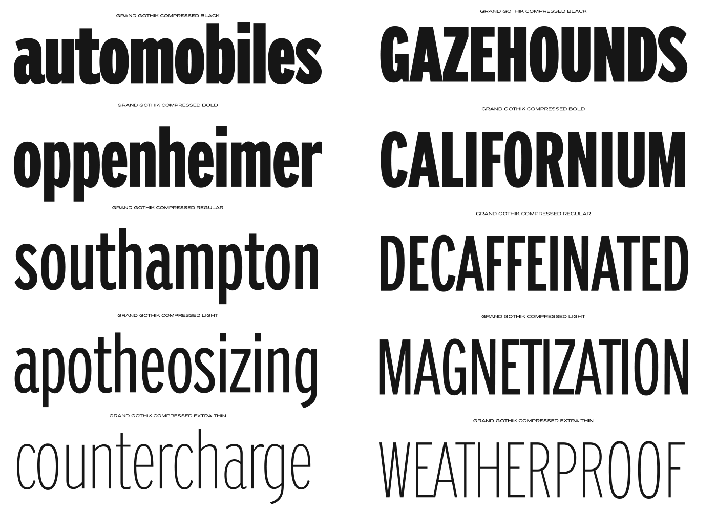
PF Grand Gothik is a postmodern, multiscript, multifaceted and variable type system that pays homage to the development of grotesque (gothic) typefaces over the years. Taking late 19th and early 20th century European and American grotesques as a starting point, it traces this typeface genre up to mid-century movie theatre marquees, new wave cinematography, American highway signage, and telephone directories, adding some historical references for good measure.
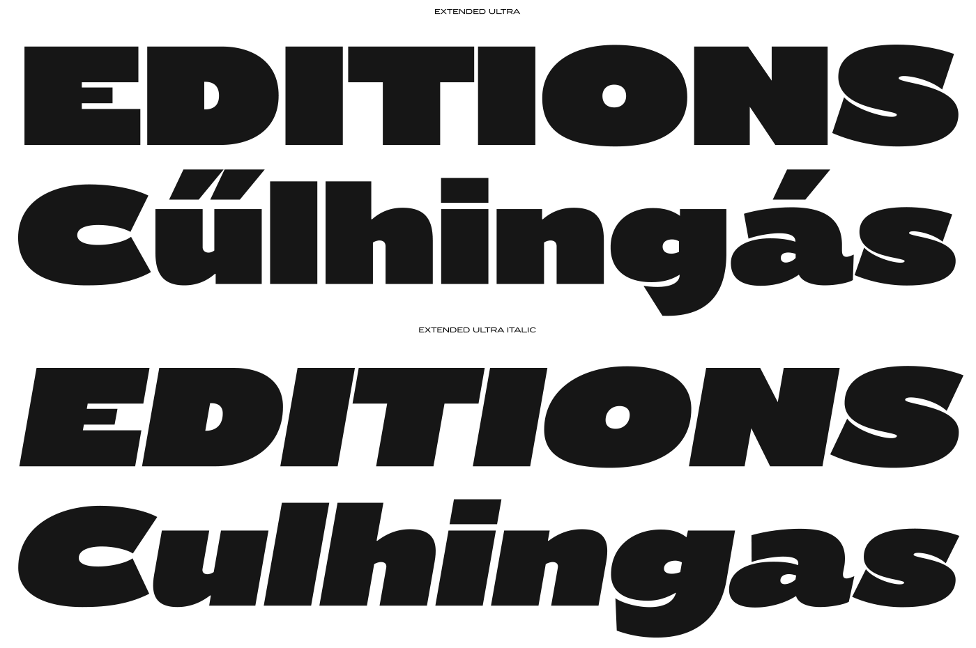
Originally designed in 2017 as a bespoke typeface for a bilingual, black and white magazine on surfers, waves and landscapes, it was later reimagined and redesigned leading to the release of its commercial version. Enter the variable realm here.
The 365 day tear-off calendar with a fresh font for every day by 244 Designers from 33 countries, Typodarium shows a bi-scriptual font family every Sunday in addition to typedesign from all over the world. Buy your own Typodarium 2020 here.
Tags/ inspiration, type design, typefaces, fonts, gift, typodarium, bespoke typeface, variable fonts, parachute typefoundry, tolerance, pf grand gothik, pf marlet, pf melon


.png)


