Tien-Min Liaos' bilingual lettering project unites the world
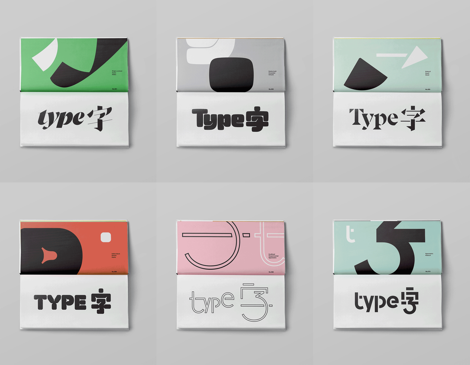
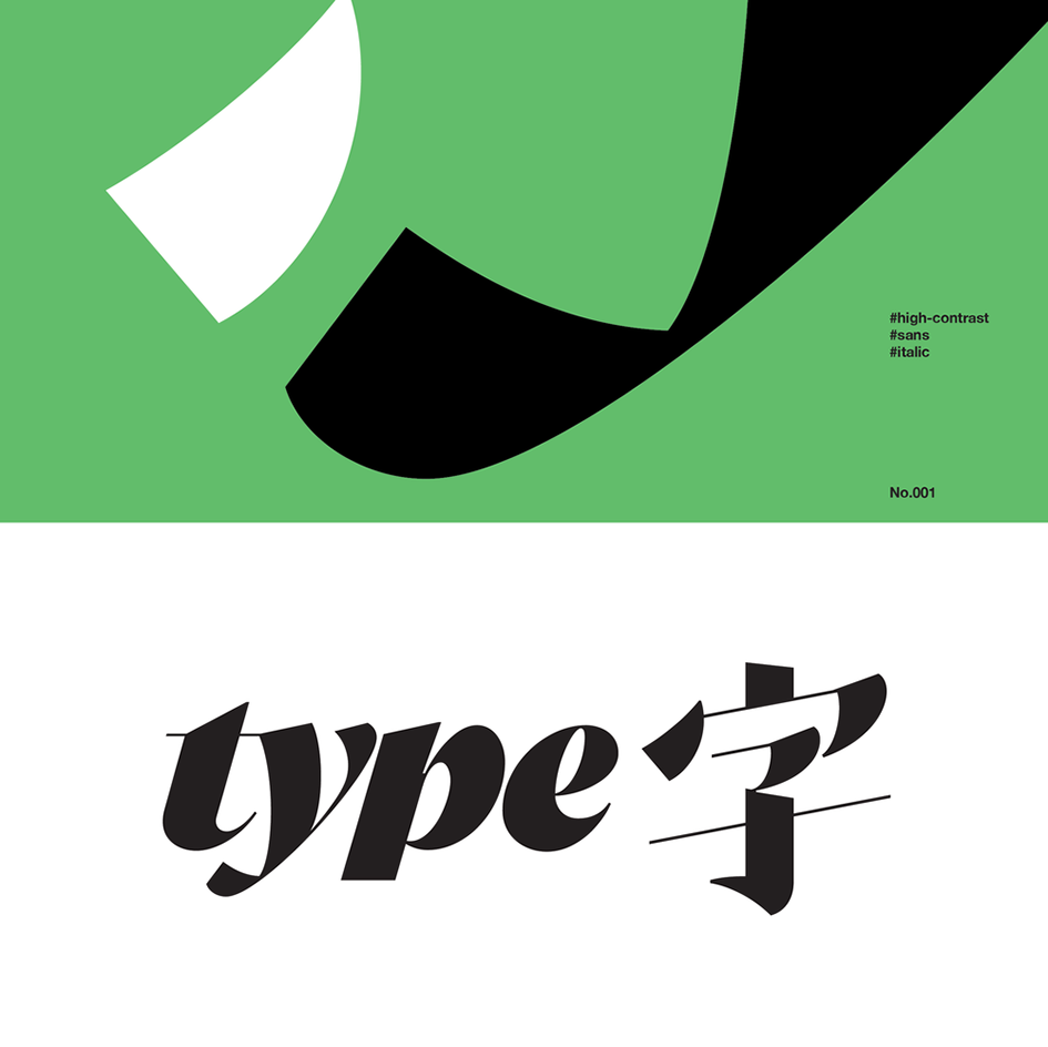
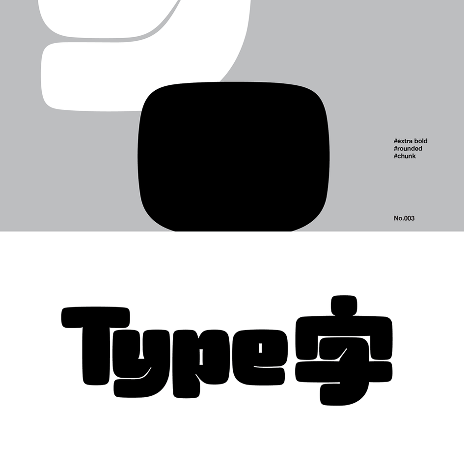
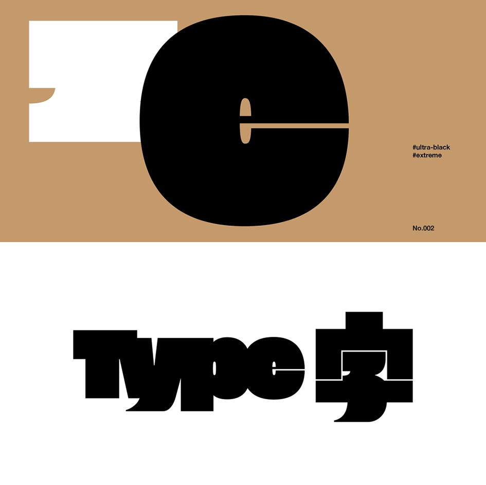
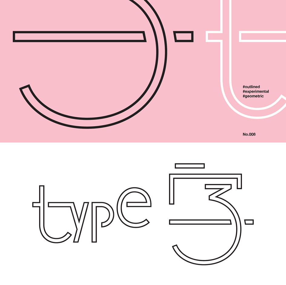
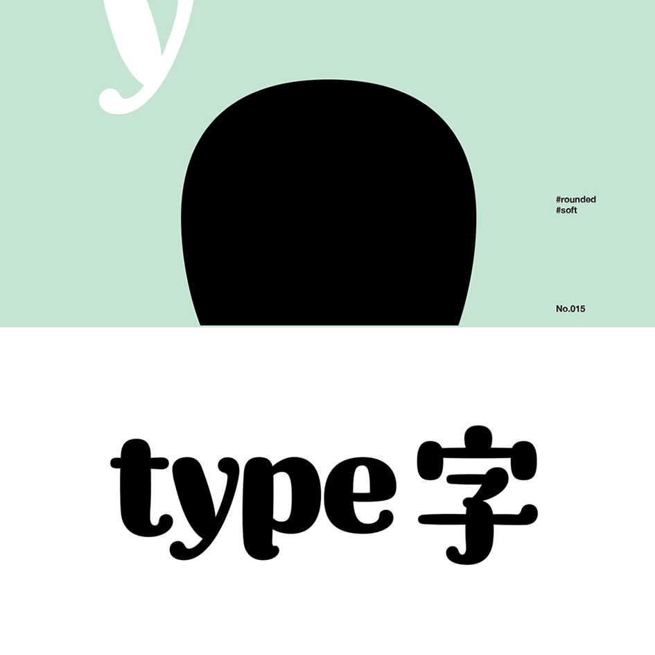
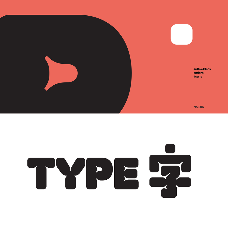
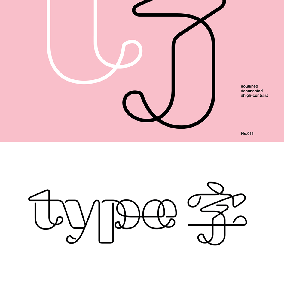
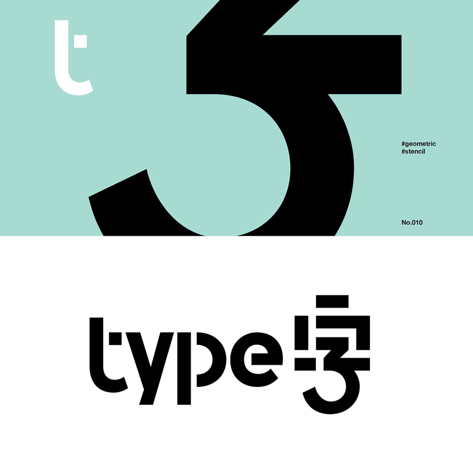
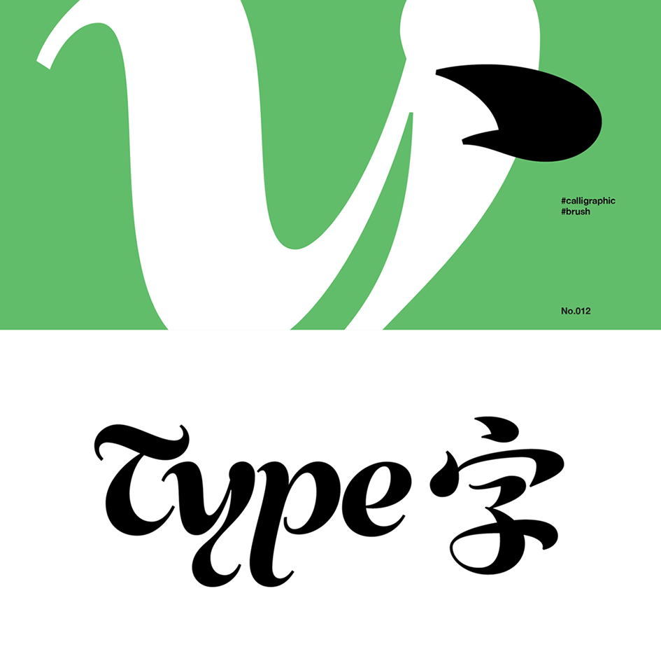
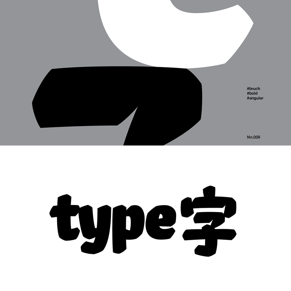
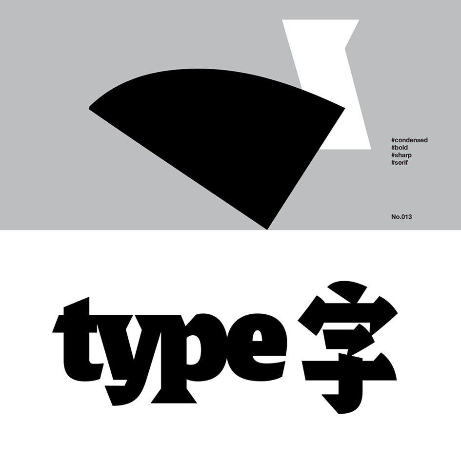
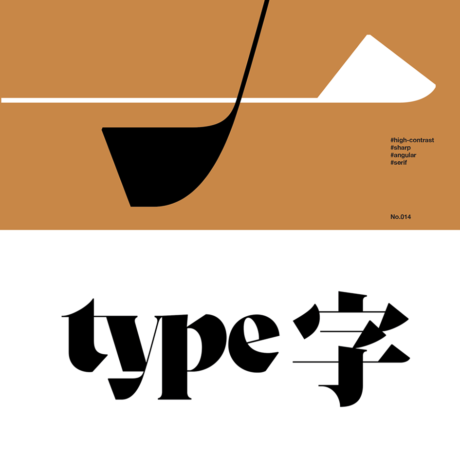
The challenge was simple, yet extremely intriguing. “As it gives the first impression of a brand, how does a logotype remain its brand personality and carries the same ‘look and feel’ when it is recreated with different writing system under different cultural backgrounds?” Tien-Min Liao (廖恬敏), a New York based graphic designer with a focus on bilingual lettering and logotype design was more than ready to accept it with her ongoing project “100 Lettering type 字”. Featuring 100 styles of bilingual lettering with “字” meaning “type” in Chinese and Japanese, Liao’s work has been featured in many design portals, magazines and design annuals and has been profiled in “Asian Creatives: 150 Most Promising Talents” by PIE Books, in Japan, for projects like this.
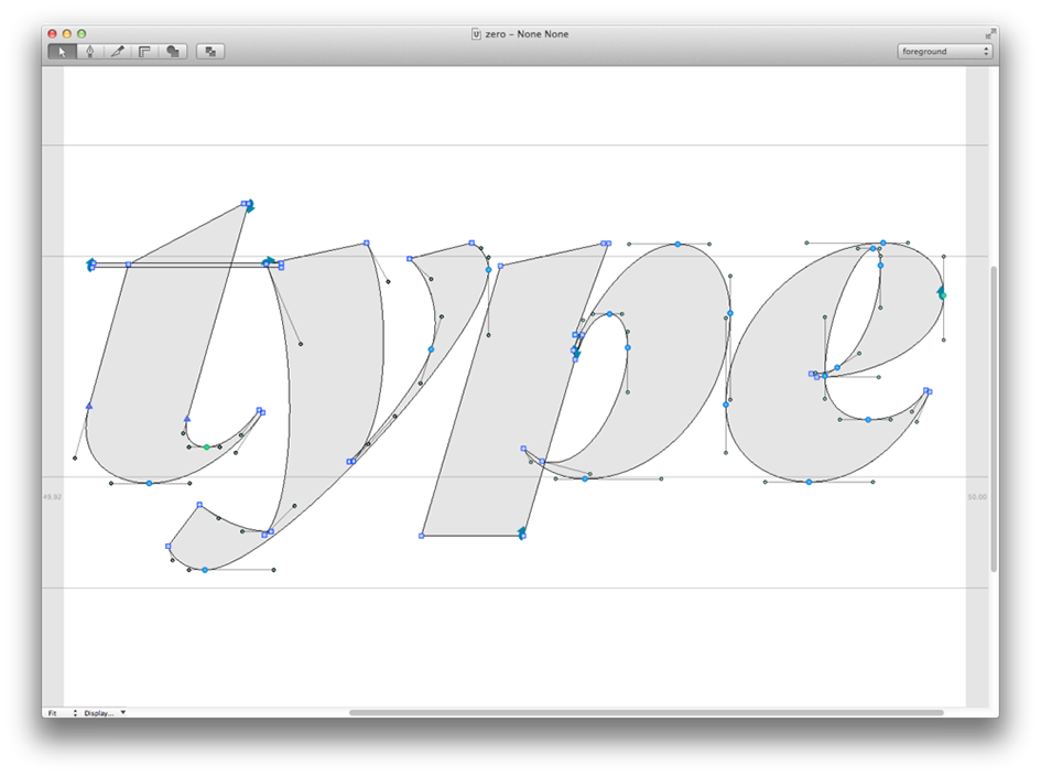
“The bilingual lettering examples shown here are not the solutions for developing systematic typefaces, but the results of customizing the word ‘TYPE’ and ‘字’” Liao says to Typeroom.
“Since these two writing systems are traditionally drawn with different tools, when a certain feature needs to be applied onto the other writing system, sometimes compromise is inevitable. Every single lettering is a custom solution” she adds, on her ever-expanding adventure where type collides in magnificent ways.
Check more of her experimentations in bilingual letterforms here.



Tags/ inspiration, lettering, new york, japanese, graphic designer, letterforms, tien-min liao, bilingual, brand, 100 lettering type 字, styles, chinese, pie books, experimentation


