Type that sound! The many typographic symphonies of music in five examples to embrace
From Reid Miles' stunning visual design that defined the very typographic language of jazz with his iconic work for Blue Note records through FS Benjamin "field recordings" to PF Venue's typographic ode to "a rocker at heart", typography and music don't collide. They merge into one another, proving that crafts are an inspiring melting pot as long as you have the ability to be inspired.
Recently AIGA's Eye on Design Emily Golsing reported on a series of graphic designers who not only are inspired by music but they produce it as well. Here TYPEROOM reminds you the ongoing love at first sight between sounds and type in five examples.
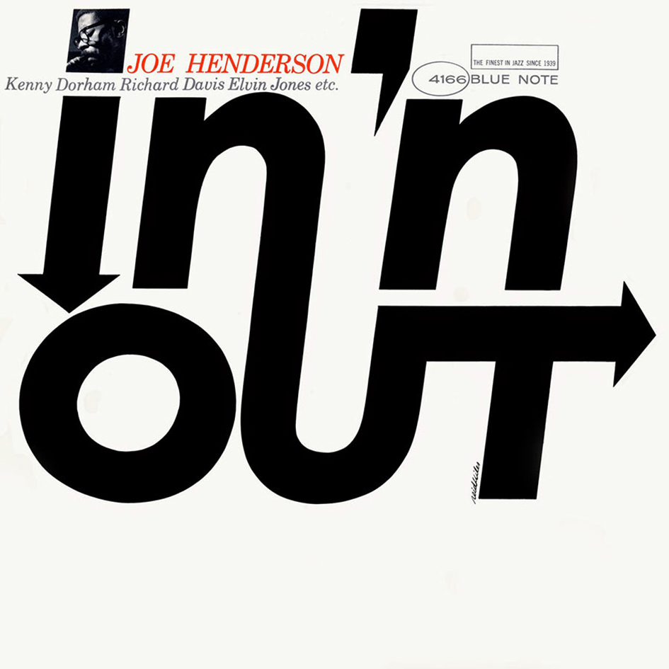
The feature has to start with Miles, the Chicago born graphic designer and photographer who brought the typography into the jazz back in the 50s when he was hired by Francis Wolff of the jazz record label Blue Note to design album covers when the label began releasing their recordings on 12" LPs. His legacy had just begun and over the course of the years Miles designed over five hundred covers.
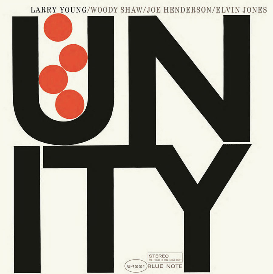
Miles’ artistry made Blue Note Recordings a case study for stunning record sleeves design. “Miles made the cover sound like it knew what lay in store for the listener: an abstract design hinting at innovations, cool strides for cool notes, the symbolic implications of typefaces and tones” writes Felix Cromey in Blue Note: The Album Cover Art. His tight designs were an experiment of his, a unique way to play jazz with the letterform in an abstract, yet genius way.
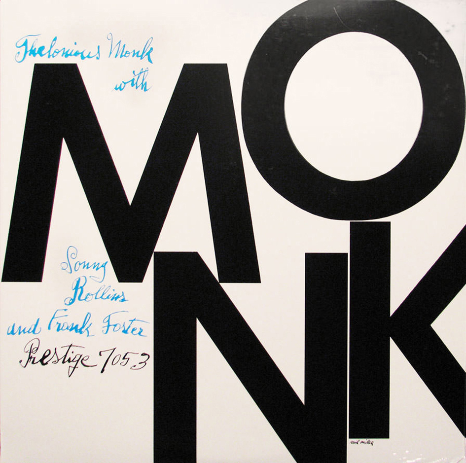
He “never settled into a typeface or system”, notes Richard Cook in Blue Note The Biography. Paul Bacon, John Hermansader, even Andy Warhol made a cameo appearance in the label’s gallery of music but it is thanks to Reid Mile’s stunning dynamic typographic treatment that made Blue Note Recordings the B.B. King of Album Covers. And so the story goes.
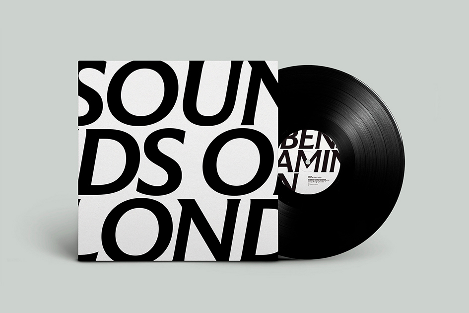
“The clash of people, cultures, and energy which makes London so unique is hugely inspiring. And it was this diversity, contrast and eclectic quality that we wanted to capture” note the creators of FS Benjamin. "We took to the streets to capture the ‘field recordings’ from all across London" notes the design team. "The idea of London – with its contrast and diversity, immersive and visceral energy – as a symphony of noise, unexpected contrasts and vibrant expression inspired the font from its conception" they add.
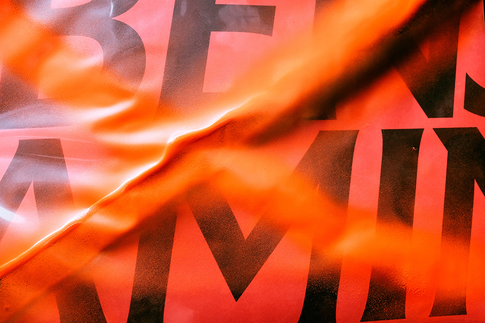
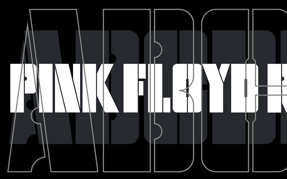
Pentagram's Harry Pearce and team have created a logotype for Pink Floyd Records. “Pink Floyd’s impact on music is immeasurable, and is only seconded by their impact of visual culture. Famed by their relationship with the design collective Hipgnosis, their LP covers are part of the cultural consciousness, creating moments of shared experience for millions of people around the world. “Harry worked closely with Aubrey Powell of Hipgnosis to create the visual identity for the label. Taking inspiration from the original lettering on 1977’s ‘Animals’ record cover, Harry and team build a complete alphabet based on the album's stencilled lettering in both outline and solid form. This lettering has been used to make a unique mark and headline font for the band and business”. Last but not least, the iconic typography on Pink Floyd’s Animals forms the basis of the typeface used in Pink Floyd Record’s identity.


In the case of Ran Zheng's LOOK/HEAR typographic experiment the relationship between visual identity and sounds is something which demands to be explored.
A creative thinker at large, the Chinese graphic designer is bold and passionate about letterforms and sounds, two realms that give birth to one another in her LOOK/HEAR project which explores the relationship between scenes and soundscapes, looking and hearing.
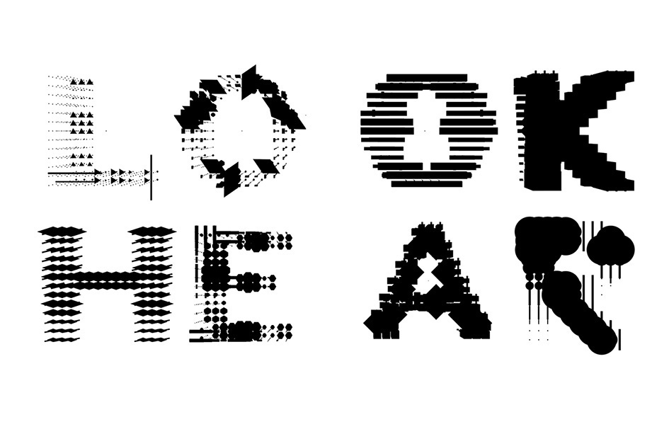
“A system of aural and visual signals generates shifting typographic forms and triggers associations about people and environment. I call architecture frozen music and I like to call type forms frozen sound. In order to built a connection between typeface and sound, I designed a complete visual system based on the sound data. You can see how different sounds manifest as dramatic shifts in shape which then change the appearance of the actual letter" Zheng says TYPEROOM.
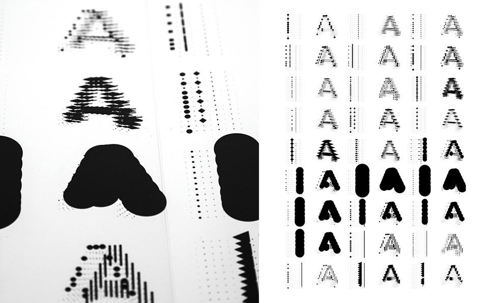
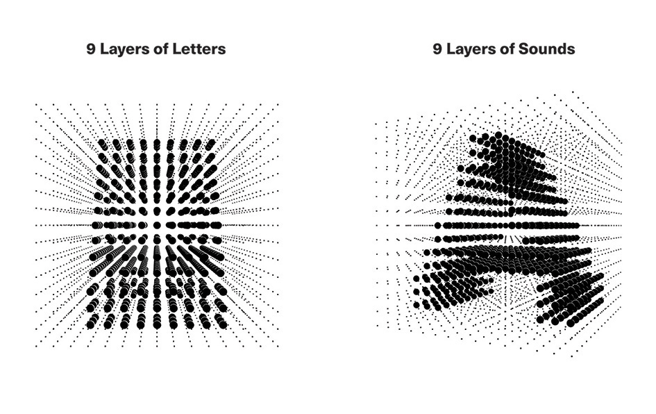
"I created a 15 by 15 two-dimensional square grid and drew letters on the grid to create one single letter, and then used a 3D software to draw letters into a 3D space, repeating the letter into 9 layers, and then, I input the different 3D shapes to the letters into the grid. When the sound started, each point would affect the size and forms of the specific point on letters, and then, when the 9 layers of letters mixed together based on each sound, it would show different styles of the forms based on real time and situation. In order to show how different the letters could be based on different situations, I chose 5 sound scenes from our familiar everyday life: a park, a street, a cafe, a subway and an office. And then selected the pair of word: 'look and hear' to show the change of letters" she notes.
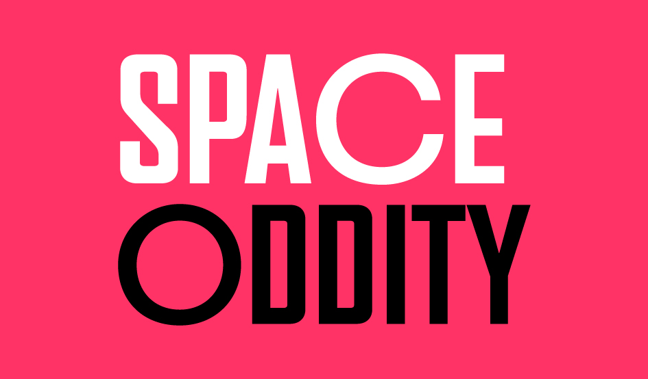
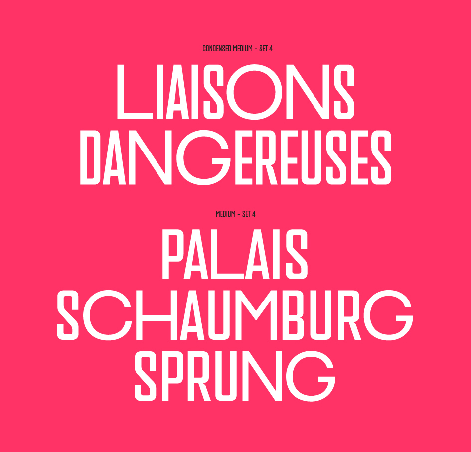
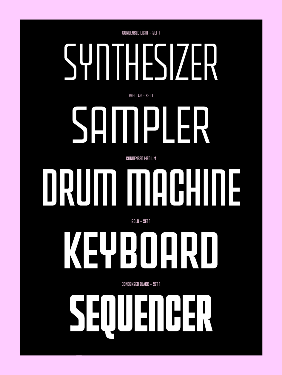
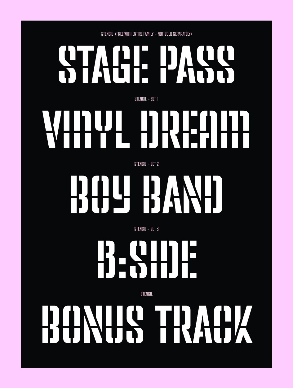
Last yet not least is PF Venue and PF Venue Condensed, a type family which takes its cues from several sans serif type styles of the twentieth century particularly but is pure rock at heart. The daring combination of non-uniform structures such as the normal narrow forms with the alternate wide forms in PF Venue "exudes a striking eye-catching personality. Consider using these for posters, ads, book covers and imaginative fashion editorials".

It is evident that PF Venue and PF Venue Condensed draw inspiration from numerous condensed grotesques used by music album covers since the fifties and for several decades to follow. Underlined by the avid necessity of the underground music scene for non conformity, expression, freedom of spirit, rule breaking and challenging preconceptions, the typeface pays tribute to a musician at heart.
Tags/ typography, inspiration, london, music, album covers, lettering, logotype, pentagram, blue note, reid miles, ran zheng, andy warhol, harry pearce, pink floyd records, hipgnosis, aubrey powell, jazz, john hermansader, paul bacon, richard cook, felix cromey, francis wolff, typographic, fs benjamin, field recordings, pf venue, pf venue condensed, record sleeves design, blue note: the album cover art, blue note the biography, look/hear


