Thunderbirds are go: typography blasts off with NASA, Sawdust & more
In the event of Font Sunday's space theme this week we enter the world of NASA and it's stunning branding circa the early ’70s. The Worm is obviously a case study which blasted off the graphic design as we know it back in the 70s.
Back then U.S. government departments were asked to raise the standard of design and communications with the National Endowment for the Arts Federal Graphics Improvement Program and, eventually, NASA’s fragmented, old-fashioned visual identity was one of the first cases to be examined.
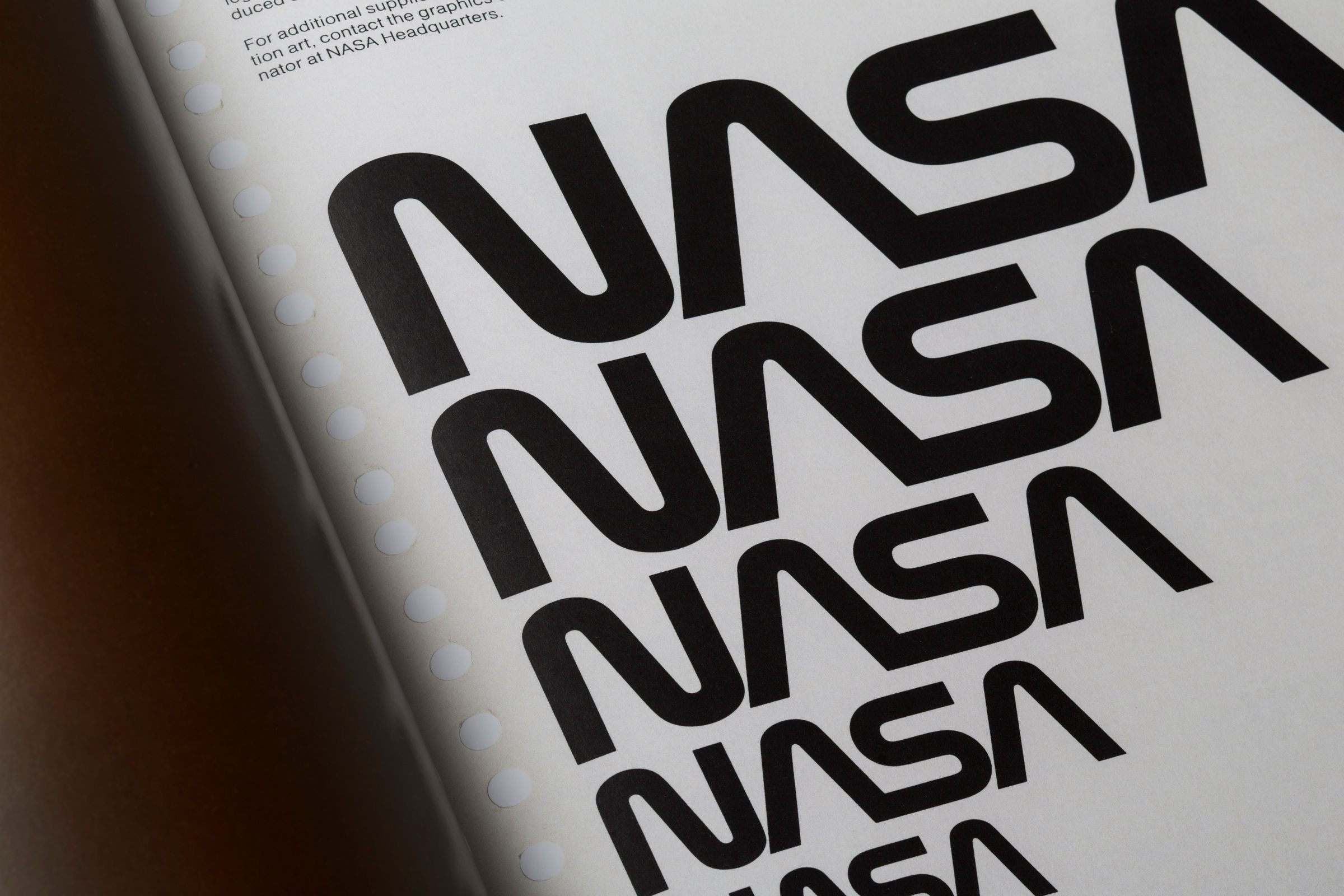
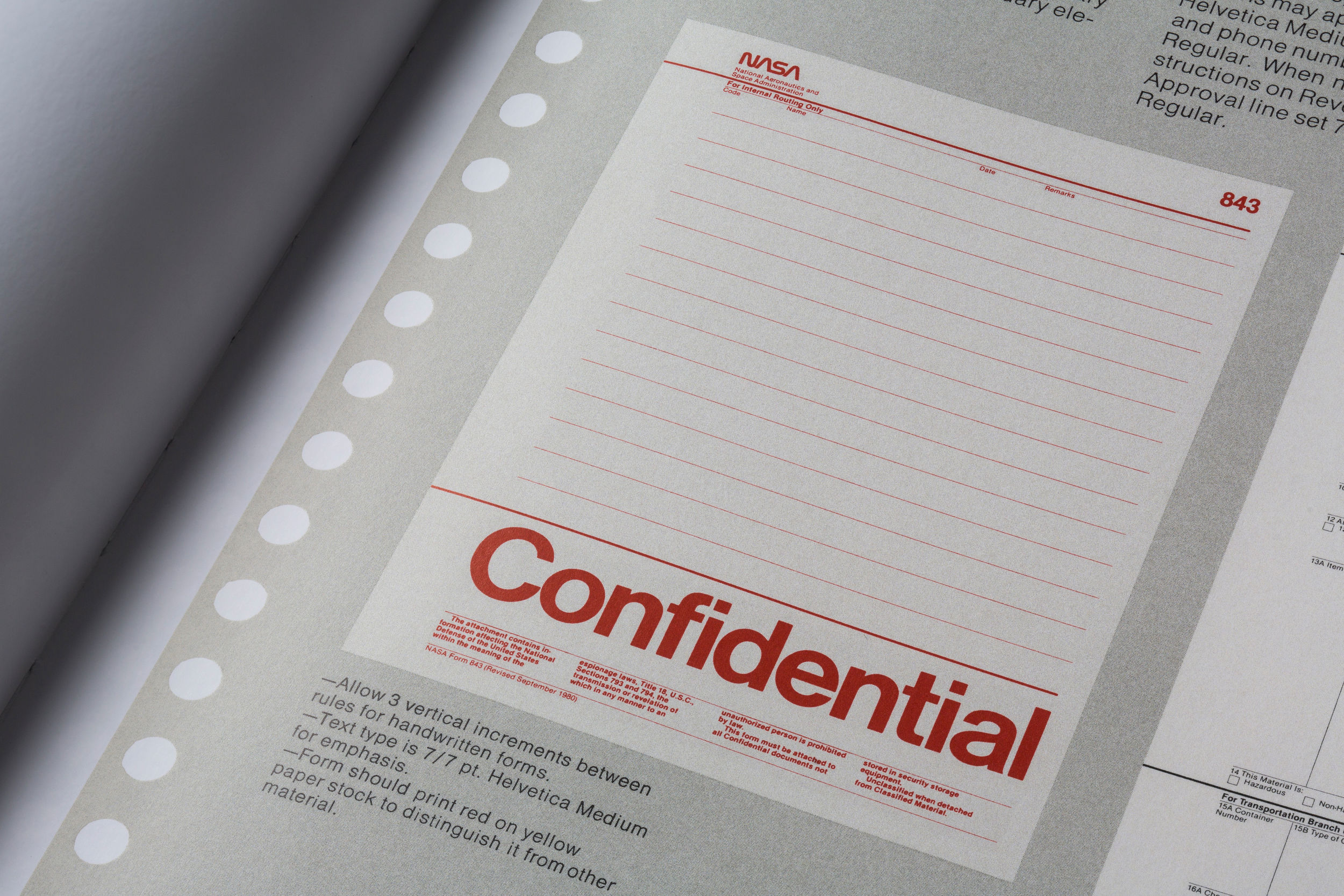
“The agency approached a young, small New York City-based firm run by Richard Danne and Bruce Blackburn to present a proposal for a brand-new visual identity for NASA, and in 1974, their work—the NASA Graphics Standards Manual, with instructions on designing everything from letterheads to space shuttles—was approved” writes Slate’s Kristin Hohenadel. “The signature of NASA’s visual identity was the memorable logo known as The Worm which was jettisoned in 1992 and replaced with NASA’s original logo, known as The Meatball.”
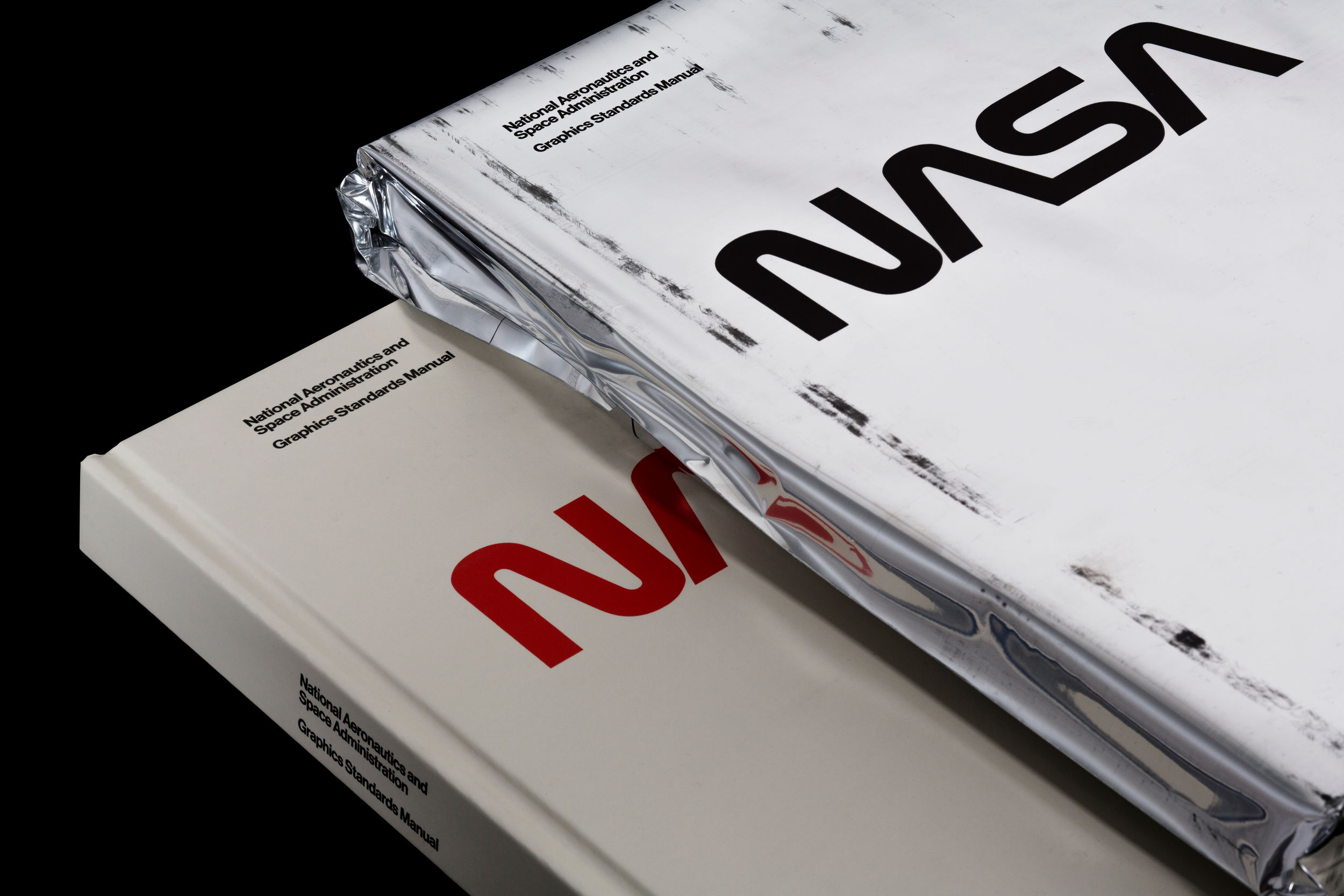
It is thanks to Pentagram designers Jesse Reed and Hamish Smyth that the former ring-binder manual has been reborn as a hardcover book through a very successful crowdfunded campaign for all to explore, if not to celebrate, the work of Richard Danne and Bruce Blackburn (of Danne & Blackburn) aka their partnership to form the 1975 NASA Graphics Standards Manual or The Worm.
“As design nerds, we think the Worm is almost perfect, and the system behind it is a wonderful example of modernist design and thinking” comment the duo. “The Worm and its design system represent an agency whose goal is to explore space and push the boundaries of science. Where the Meatball feels cartoon-like and old fashioned; the Worm feels sleek, futuristic, forward-thinking. All good things for a space agency at the bleeding-edge of science and exploration.”
“We think this manual and others like it—regardless of the organization—are a beautiful example of rational, systematic design. The NASA manual is one of those examples that sets the standard for design excellence—a document well worth preserving for the future as a learning tool, a gorgeous object, and a moment in design history” they add of a manual which has been hailed by many as “superior design thinking.”
NASA’s Worm “consists of NASA’s initials portrayed in super-simple letters stripped to absolute essentials. There aren’t even any crossbars on the A’s, which are depicted as upturned V’s, rather like rockets ready for liftoff. Each letter is composed of a tube, with the first A flowing into the S, as if speeding off into space. The wordmark is in a confident shade of red, occasionally with NASA’s full name written below in black Helvetica, the default typeface for any 1970s corporation with aspirations to modernity. Everything about the Worm is seductively new, optimistic and futuristic, declaring that NASA is leading us toward a brighter, bolder future” wrote NYT’s Alice Rawsthorn on the controversial, thick-lettered branding.
After the launching of the crowdfunding campaign, NASA also released a PDF of the document which you can download here for free.
Purchase your own copy of NASA's design treasure here.
“The Worm feels sleek, futuristic, forward-thinking. All good things for a space agency at the bleeding-edge of science and exploration”


“Everything about the Worm is seductively new, optimistic and futuristic, declaring that NASA is leading us toward a brighter, bolder future”


Slider images captions: From the newspaper ads designed by Lou Dorfsman for the NYTimes which showcased the CBS News coverage of the John Glenn space flight (1962) and Project Gemini (1965) missions via MHD / Graphic Design to the Polish movie poster for Solaris in 1979, submitted by Alice Fukushima, or the Thunderbirds Are Go title design, submitted by Elaine Caldwell, and the Daleks who inspired their own font, submitted by Tig, or Sawdust's CommUNITY print that pays paying homage to an excerpt from Carl Sagan’s book Pale Blue Dot that was inspired by an image of Earth taken by Voyager 1 on February 14, 1990, submitted by Daniel Cookney the Twitterverse was blasted off for this Font Sunday solar system exploration, guest-hosted by JAStokesNJ. Check more on Design Museum's official Twitter account here.
Tags/ origins, font, book, nasa, poster, publication, sawdust, design museum, design manual, usa, space, font sunday, seventies


.png)


