From Star Trek to Stranger Things: how Ed Benguiat's iconic font haunted us forever
Stranger Things, the Netflix sci-fi series is premiering for its third season following Eleven and her boys into the darkest realms of the alternate dimension, the Upside Down, circa mid-1985. The typography and visual branding of the hit series are two reasons to be obsessed with the multi-awarded tv phenomenon.
Beyond Winona Ryder and the eighties hits featured in the series Stranger Things sparked a love for the retro font featured in its title sequence, ITC Benguiat, the decorative serif typeface designed by legendary Ed Benguiat and released by the International Typeface Corporation (ITC) in 1977.
Loosely based upon typefaces of the Art Nouveau period the font face follows ITC's design formulary of an extremely high x-height, combined with multiple widths and weights. The original version of 1977 contained numerous nonstandard ligatures (such as AB, AE, AH, AK, AR, LA, SS, TT) and alternate shapes for some letters which were not carried into the digital version. The font family consists of 3 weights at 2 widths each, with complementary italic.
Matt and Ross Duffer, brothers and creators of the hit tv series cited a “two-fold inspiration” to Vulture on the choice of the title sequence font.
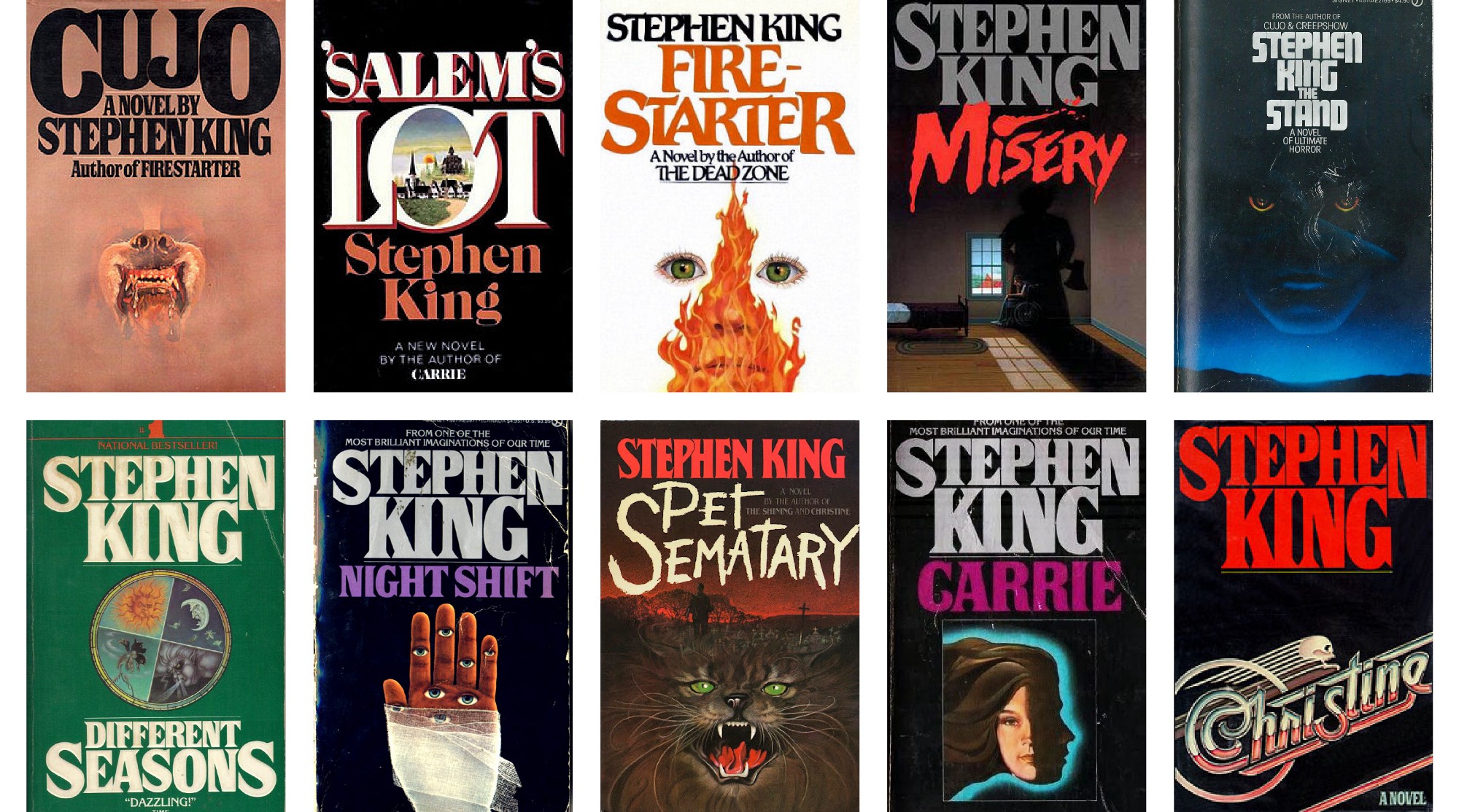
“There was a two-fold inspiration. One was, in terms of the font [ITC Benguiat] and the title design, going back to those old vintage Stephen King books. We sent 12 different old covers to Imaginary Forces, who were designing the titles — we wanted it to be in the style of these novels. There’s something about when we were kids, when you would open up one of these big fat Stephen King novels that we loved. We wanted the show to have that sort of feeling every time you got to a new chapter. So that was for the font.”

“Then for the actual design, we’re pretty obsessed with this designer Richard Greenberg who did so many great title sequences back in the day, whether it was Alien or The Untouchables or The Goonies or Superman. Altered States. What he specialized in was using just graphics: title graphics, titles over titles. That’s something we really wanted to do. Part of it was, it felt it represented the show well.”
“Title sequences are so great nowadays, but it’s almost like they’re getting more and more elaborate and trying to top each other. As opposed to trying to top these amazing title sequences, what if we just go back to the simplicity of these great titles we loved growing up? There’s something to us that feels epic about those titles. Something like The Untouchables which is just basically just a font. It’s so epic and memorable, so we wanted to go back to that simplicity.”
Imaginary Forces chose to reveal ITC Benguiat in all its red glowing glory through animation. “We could concentrate on the type—the counter of the A and the serifs. We had to find the most beautiful combinations” explained to Wired Michelle Dougherty, the Imaginary Forces’ creative director who oversaw the project.
“A disjointed version of the Stranger Things title starts the sequence which typographically sets the tone for the show. Imbuing the opening with a sense of unease, the music informs the movement of the type as the letterforms slide together to form the title. The Stranger Things main title mimics an optical look which reflects the time period of the show, it also seems as if light is passing through film, creating a lush haptic quality” states IF.
“It merges, it moves in and out, it’s very good. It’s rather pleasing and comfortable too. And yet exciting at the same time” the designer of the font, the legendary Ed Benguiat, told The Telegraph when the outlet asked him of the show’s title sequence. “It’s rather appropriate, if I might say. It lends itself to the feeling of the titles, it has a look. It’s like food – it’s hard to describe what something tastes like, or identify a good smell.”
Ed Benguiat’s font has a long history in the showbiz. It has been used on the cover of numerous 1980s Stephen King novels and it is featured also in The Smiths album Strangeways, Here We Come, in the book covers of the Choose Your Own Adventure series, in The Bitmap Brothers game The Chaos Engine, as well as in the logos of both the National Assembly of Quebec and the Melbourne Knights. The typeface is also featured in the main titles of the Star Trek films, Star Trek Generations and Star Trek: First Contact, as well as video game Nier: Automata. Paramount's FBI warning, from 1995–present, also uses ITC Benguiat.
An iconic font made by a living legend in the graphic and type design industry, Ed Benguiat -the American typographer and lettering artist has crafted over 600 typeface designs and is widely known for his designs or redesigns of the logotypes for Esquire, The New York Times, Playboy, Sports Illustrated, AT&T, A&E, Coke, Estée Lauder, Ford, and others- is glowing in red once again. But don't be fooled. Benguiat is no stranger to the entertainment industry himself. Before Stranger Things his designs have graced the logos of the original Planet of the Apes film, Super Fly and The Guns of Navarone.
One of the most prolific lettering artists ever Ed Benguiat was inducted into the Art Directors Hall of Fame in 2000. A very prominent jazz percussionist playing in several big bands with the likes of Stan Kenton and Woody Herman once, Benguiat X Stranger Things is a haunting match made in heaven.
Tags/ typography, typeface, origins, font, ed benguiat, stranger things, art nouveau, netflix, richard greenberg, itc, itc benguiat, stephen king, tv series, 80s, decorative serif


![Slider image caption: ITC Benguiat as it was first shown in U&lc, Dec. 1977 [PDF]. The alts and ligatures were lost in the digital version via Stephen Coles @ Flickr](assets/original/photographs/article/165/201907/Screen Shot 2019-07-04 at 17.54.31.png)


