Spanish Western pays homage to the Wild Wild West with wood type
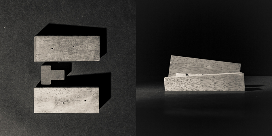
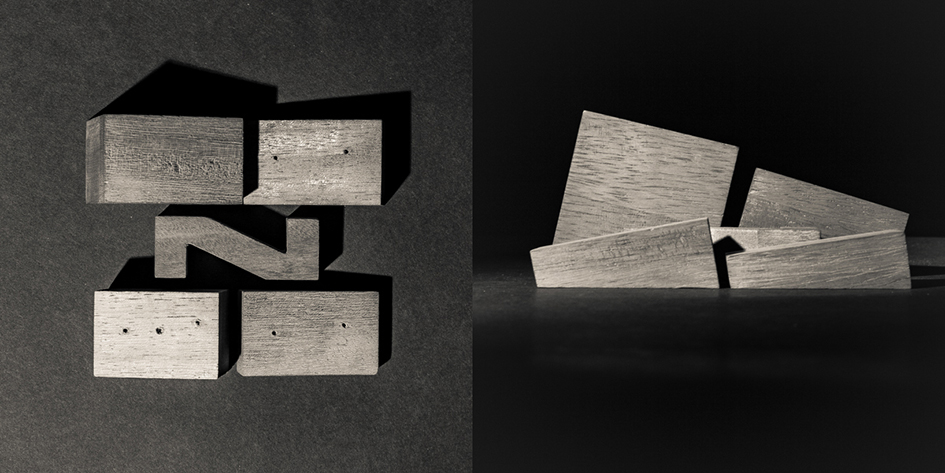
How do you pay homage to one of the movie industry’s most iconic genres? With wood type. Spanish Western, a one-off project from Madrid design studio Dosdecadatres, is a set of 3D lettering commissioned as titles for Alberto Esteban’s public television documentary of the same name.
“Turn on a TV at nap time in Spain and you’ll see a Western for sure. I grew up falling asleep with these movies,” says Quique Rodriguez, creative director of Dosdecadatres, to AIGA’s Eye on Design. For him Westerns are part of his heritage as numerous cowboy films –even Sergio Leone’s epic The Good, The Bad, and the Ugly (1966)- were filmed in the rugged, Mediterranean countryside which looked like a Wild Wild West scenery, yet cheaper in terms of movie production costs. “John Ford is God but really, the only thing I need to enjoy a Western is Clint Eastwood appearing on the screen” he added.

“In all Westerns, you’ll see at least two things: a sunrise over a stunning landscape and wood—a lot of wood” say the studio of their shadowy project.
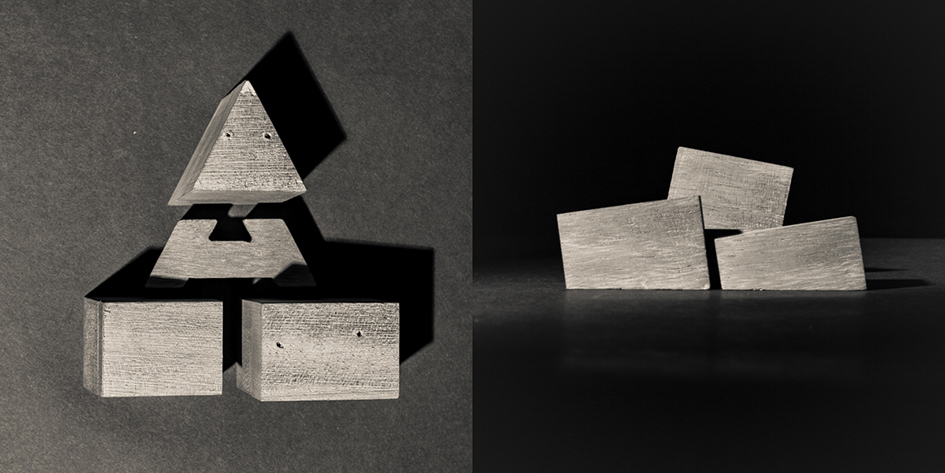
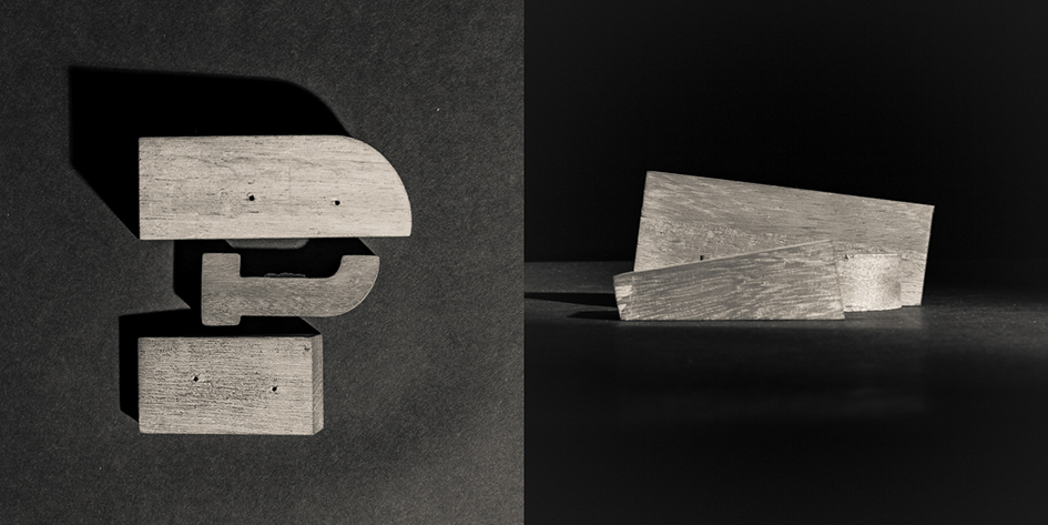
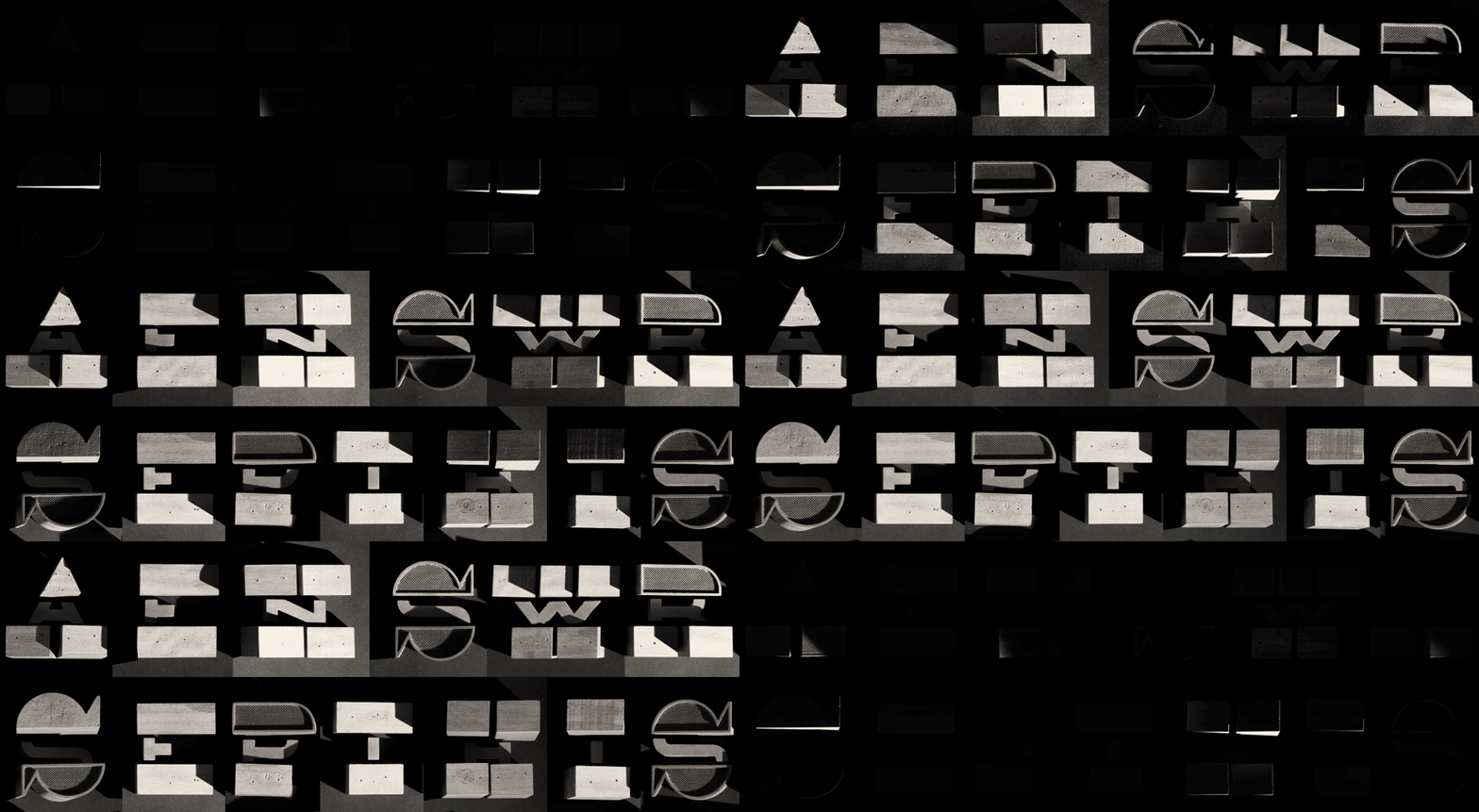
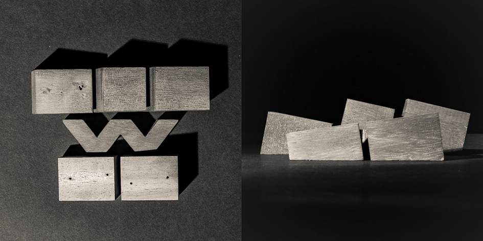
“We wanted to pay homage to those films creating a sunrise over a wooden typographic landscape. Starting from ‘Morricone’ font, we developed some modular letters (fyi YWFT Morricone is a combination of egyptian and italian slab serifs from the 1800s, with also simple geometric forms continuing from mid-century modernism. The design is a unicase setup, with alternates for the uppercase in the lowercase options. Although similar to some recent predecessors such as YWFT Black Slabbath, “Morricone is a new gun with its own song”. YWFT Morricone was named in honor of the famous Italian composer Ennio Morricone, who composed numerous classics for the spaghetti western movie genre). We used 3D to make volumetric pieces and we created the landscape by playing with the top angle of each piece. With CNC cutting we got the wooden pieces. We used two techniques during the shooting: video and stop motion. We shooted Rafa Martin, a craftsman master, working with wood. And, to shoot the typographic landscape, we used stop motion to capture the changes in light position. Each of these takes is made up of 500 photos”.

Madrid based Dosdecadatres is a small creative studio focused on graphic design, data visualization and moving image ever since its launch, back in 2004. Dosdecadatres aims to communicate good and well told ideas. “We are in love with typography and can't avoid to put special attention into any detail” says the team behind this typographic project which you can devour whilst eating spaghetti.
Yet Spanish Western is an exceptional case study created for TV. “Releasing it was not the idea; we designed only the letters necessary for the title of the documentary,” says Rodriguez. “We love typography so much, but we’re not type designers, and to create a whole typeface would be a big deal for us. If anyone reads this and wants to develop Spanish Western, please feel free to shoot us an email.” Shoot the breeze anyone?

Tags/ inspiration, type, graphic design, spanish western, dosdecadatres, 3d lettering, quique rodriguez, ‘morricone’ font, data visualization, stop motion


