Russia's suprematism legacy is the real star in the country's massive visual branding
Tourism branding as a communication platform aims to create a relevant image of the country's tourism market among both foreign tourists and its own citizens. Many counties use tourism branding, and their visual identities are not always based on their most well-known images. Great Britain does not use Big Ben, for example, while France does not exploit croissants and Eiffel Tower. Russia does invest in art.
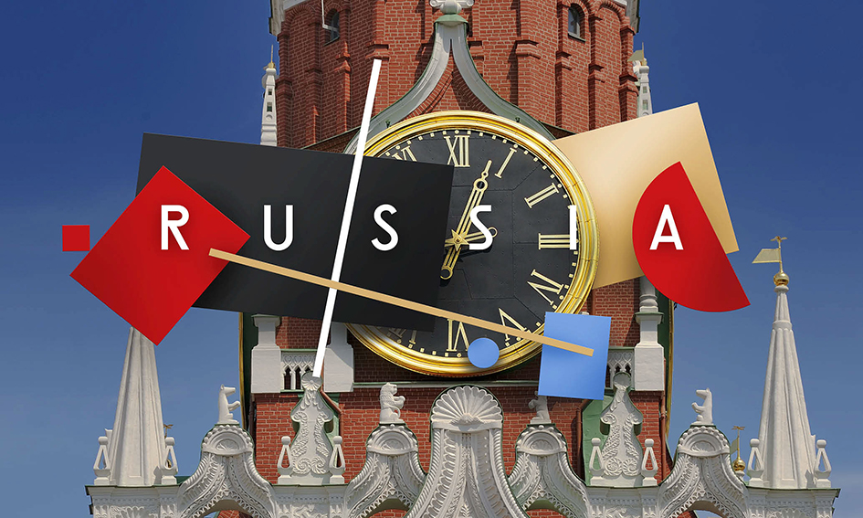
"A tourism brand and its symbol need time for people to familiarize with them and for the right associations to begin shaping. Suprematism – one of the directions of Russian avant-garde artistic movement – originated in our country in the early 20th century and represented advanced thinking, not only on the scale of Russia, but for the whole world" notes the team behind Russia's latest visual rebranding, just in time for the FIFA World Cup extravaganza.

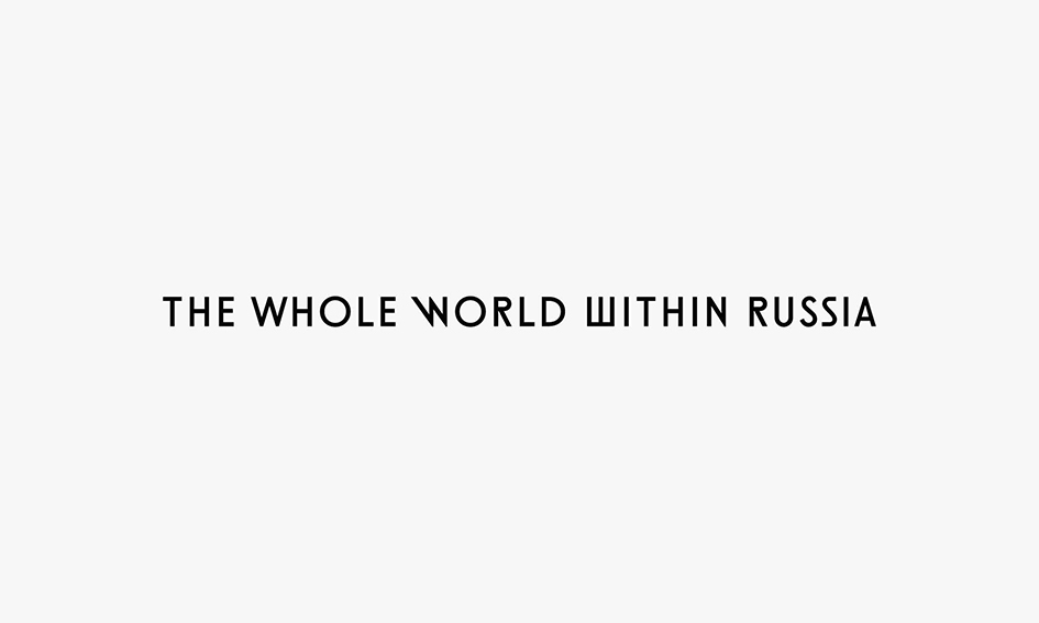
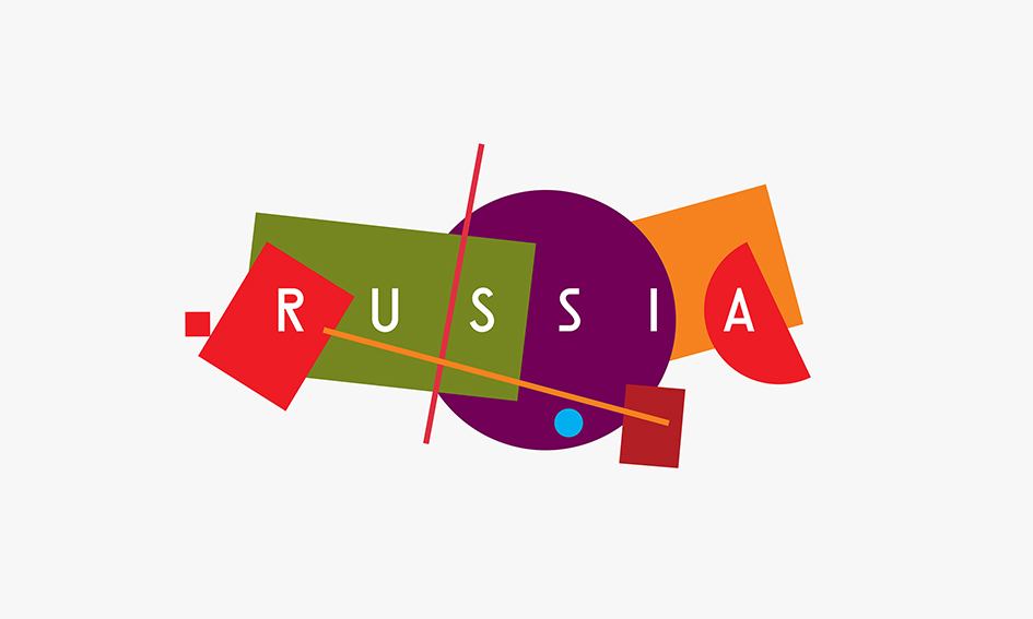
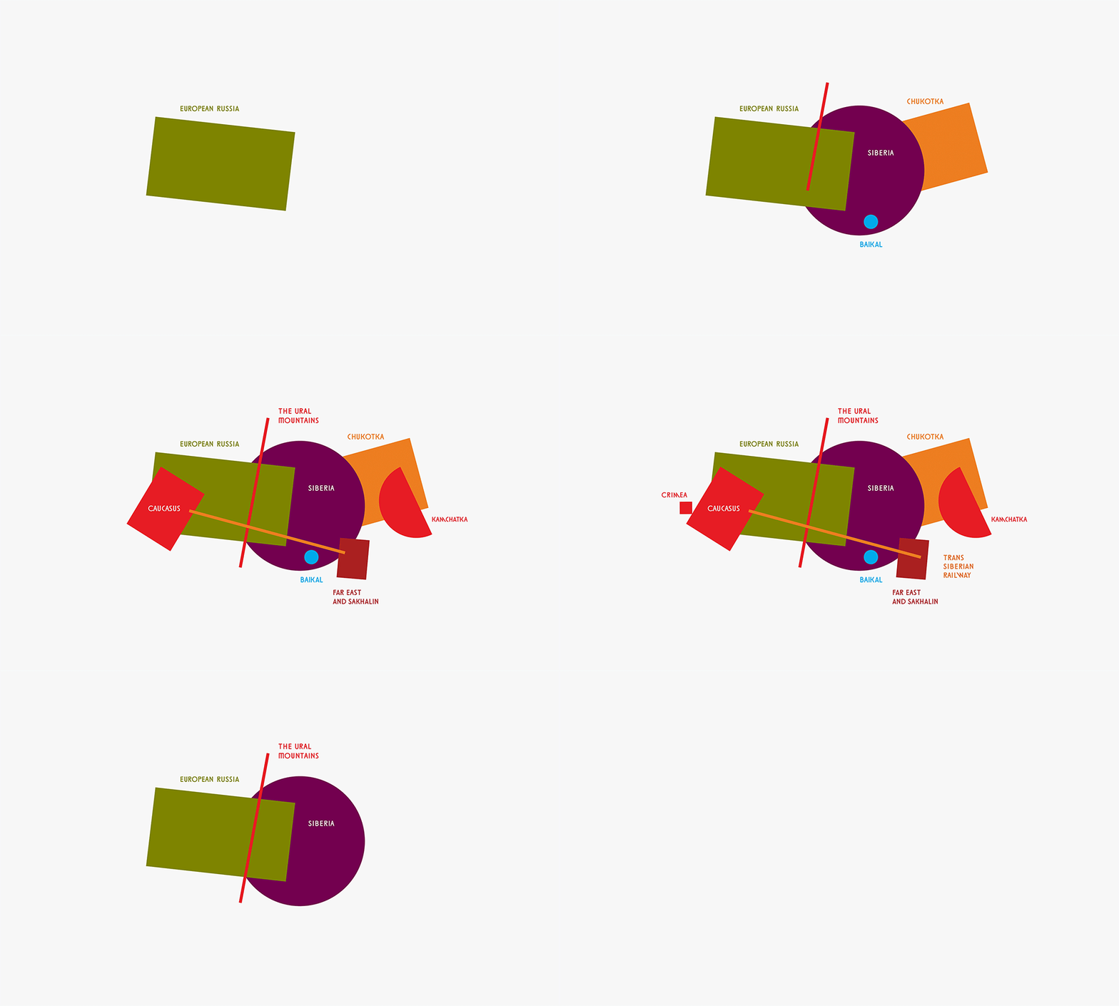
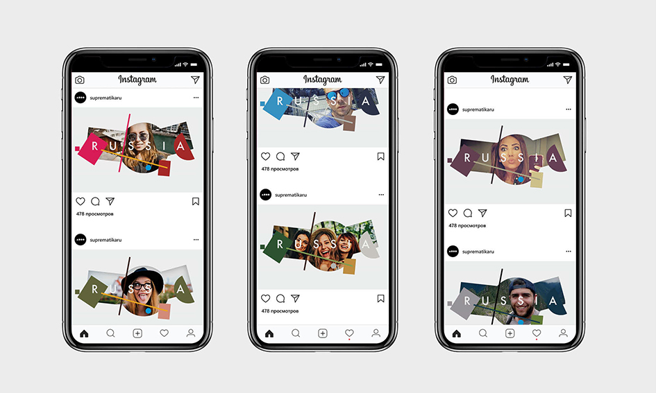
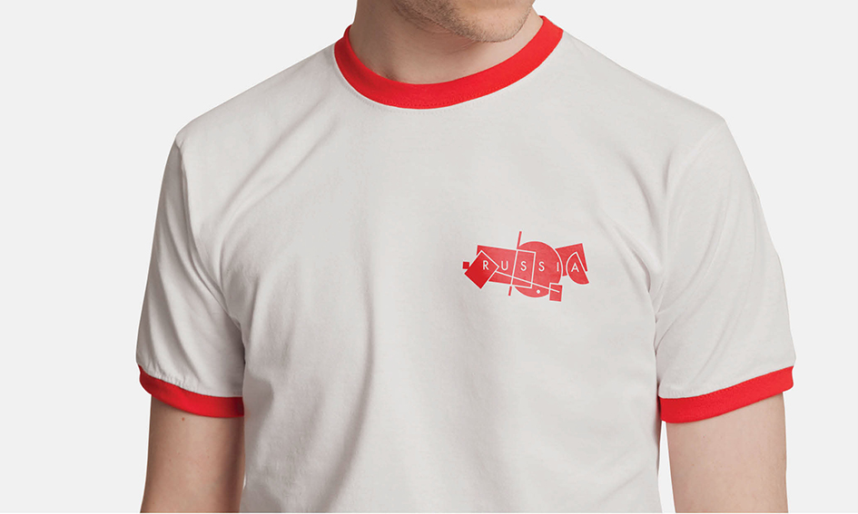
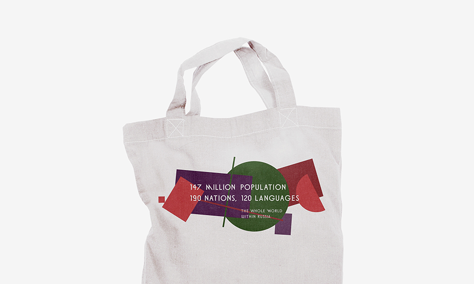
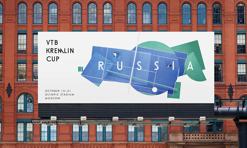
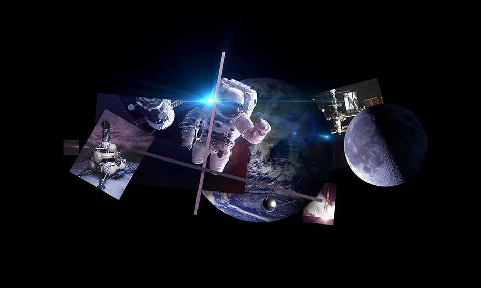
"This cultural phenomenon stood the test of time to evoke strong associations with Russia, and today serves as its icon in visual aesthetics. The Russian tourism brand's graphic solution is a stylized map of Russia. The map's elements represent our country's specific places and territories, convincingly communicating its character and depth" adds the official statement.
A competition was launched in 2015 and anyone could participate. Experts went through 480 logos and 600 slogans. Then in 2016, the Federal Agency for Tourism of the Russian Federation organized the second round of the competition with the support of the Ministry of Culture of the Russian Federation and the Association of Branding Companies of Russia. Branding industry professionals then developed 30 different concepts for Russian tourism brand identity.
A mass audience was given the opportunity to vote for one of ten pre-selected concepts. Each concept consisted of an idea description, slogan, and visual identity. Participants voted for the concept that better communicated Russia's unique qualities and built the perception of a great place to visit. In November 2017, a committee selected the winner among the three top vote-getters. The Russian tourism brand identity is based on the winning concept.
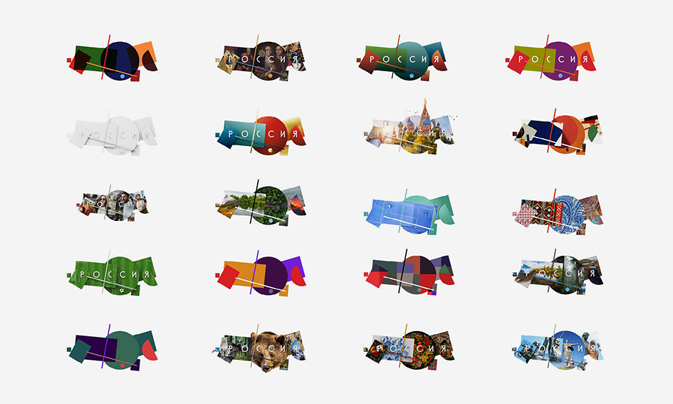
"This is a pretty simple graphic approach that shows the country's diversity – sometimes complicated and bulked, sometimes totally empty, like an incoherent patchwork quilt. Not always pretty, not necessarily smiling, but actually friendly and kind-hearted. This concept is a good example of how anyone can express his perception of a homeland. This is how I see it: complicated mixed with simple, monochrome and colorful, round, and angular" notes Vladimir Lifanov, the creative director of the Suprematica branding agency.
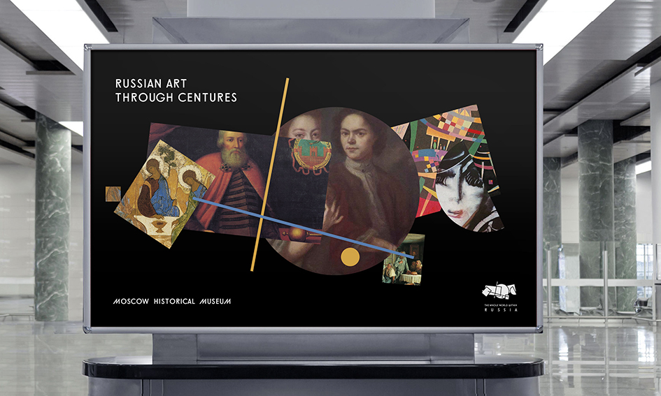
"It's not that easy to come up with an image of Russia as a tourist product. Partially because every one of us historically identifies himself with this "product" on a genetic level. Meanwhile in branding, it is crucial to abstract oneself from the promoted object and take a detached view. The Russian avant-garde reference in visual identity provides the right level of detachment. Through this lens, we see our country as a territory of endless interaction between the past and the future that allows every visitor to find something new. And these findings never end. Every new day, new place, and new glance provides new discoveries. And it doesn't matter whether you look from outside or from within adds Denis Shlesberg, chief creative firector of the Artonika branding agency.
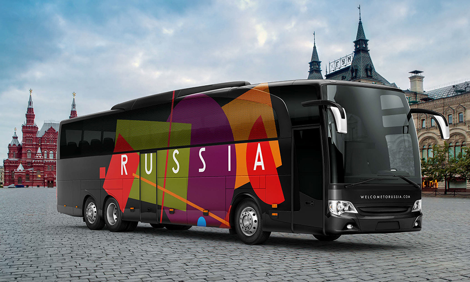
"It is manageable to create a typeface for a company. To create a typeface for a city is a more difficult task. To create a typeface for a country is next to impossible. Especially, for such a diverse country as Russia. However, to create a typeface for Russia the tourism brand is a doable task and it's been done. Designers have managed to find distinctive, strange and not quite ideal but authentic letterforms which convey the feeling of modern Russia and its spirit" commented Sergey Rasskazov, director of Type Design School and ZEH.DESIGN association.
Explore more of "The whole world within Russia" concept here

Tags/ typography, inspiration, typeface, art, visual identity, russia, brand identity, france, competition, letterforms, avant-garde, tourism branding, great britain, big ben, eiffel tower, suprematism, fifa world cup, visual aesthetics, vladimir lifanov, suprematica, denis shlesberg, artonika, sergey rasskazov, type design school, zeh.design


