For LOVERS typography and graphic design is a love affair
There’s a lot to like about Lovers, the London-based creative agency that only takes on clients it’s head over heels about, writes AIGA’s Eye on Design of the studio that fell in love with typography and graphic design, hence the name.
This collective of designers “that fluctuates from three to ten core studio members, to upwards of 90 collaborators” are changing the way we see through numerous stunning projects in a diverse portfolio that is ever-expanding. The LOVERS rebranding for the Royal Court Theatre is a case study to adore.
“When a brand has Royal Court levels of heritage it can often find itself tempted to get nostalgic; preserve and restore. But commendably our brief was bolder — "show the world that we've always been playing on the edge, confirm who we are, but help us push into the future". We were invited to embrace 'paradox', 'anarchy' and even a 'no logo' attitude towards the exercise. We accepted gladly” says LOVERS.
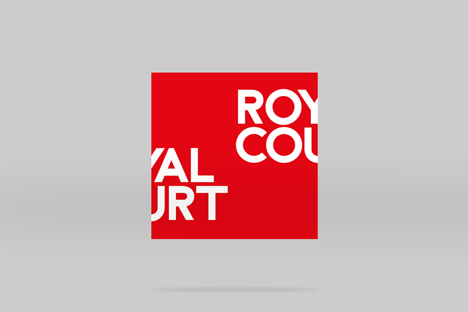
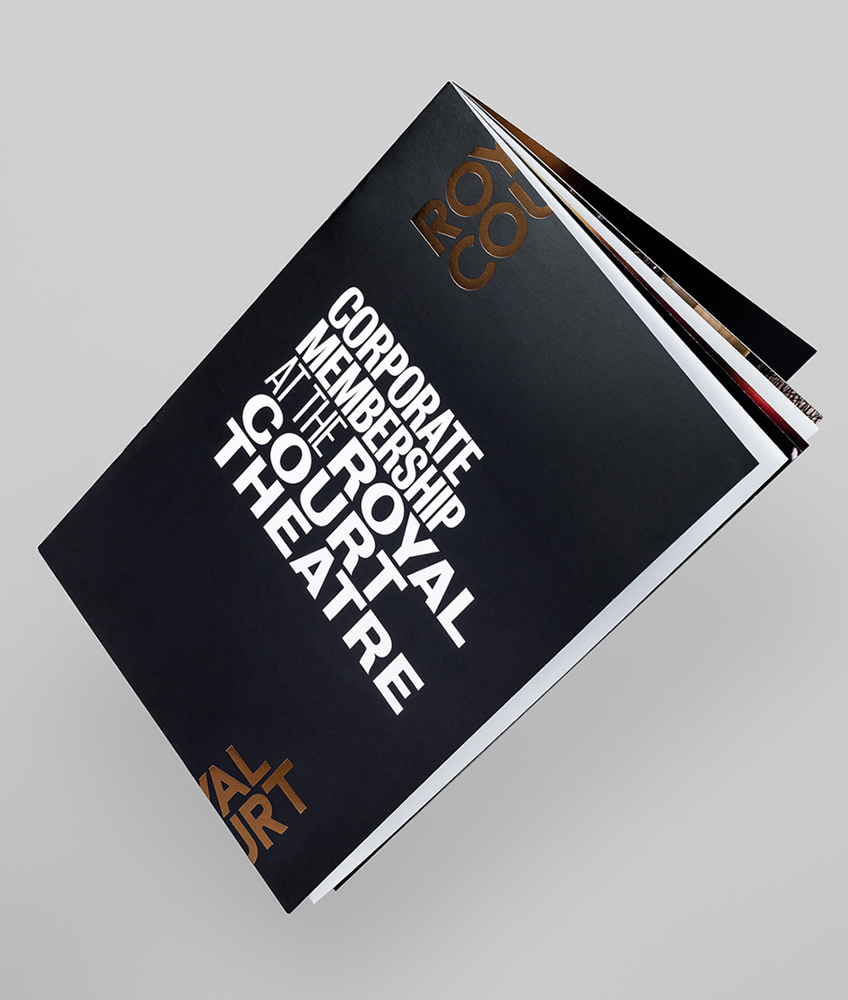
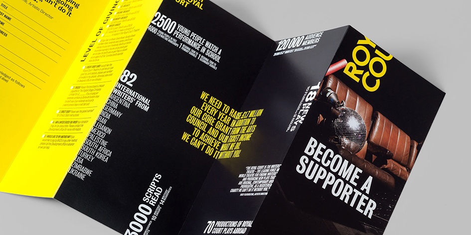
“Our early research highlighted the iconic significance of the Royal Court's front of house presence, its 'Royal Court' letters staring defiantly out into Sloane Square from the balcony. But we had an urge to rip out the red neon inlines and get those letterforms singing more clearly. This destructive spirit got the ball rolling. We went ahead with ripping out the neon, and proceeded to tear apart the cleaned-up wordmark itself. We wanted to see it running amok over and beyond edges, teleporting itself from A to B, to Z, to Q, to R without apologising once along the way.
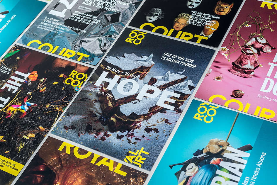
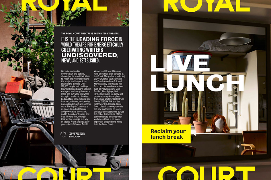
With the newly stripped-back lettering on our chopping board, we started pushing the Royal Court's presence right to the edges. Rather than creating a contained logo with a fixed position and traditional exclusion zone, we set about creating an open set of conditions governing radical and flexible application of the logotype across communications. The idea was to suggest a restlessness at the heart of the Royal Court’s direction, pushing at the edges and scaling differently for different applications.
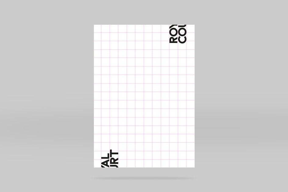
The attitude of abruptness was also translated into a 'gutterless' grid with no safety barriers between columns. Carving space in this way offered the logo permission to appear, disappear and reappear anywhere it fancied, at any moment.
With 'Royal Court Red' burned onto the public's retina, we stuck with it, also incorporating urgency yellow and dramatic black. Next we needed a punch-packing typographic sparring partner for the new Royal Court wordmark.
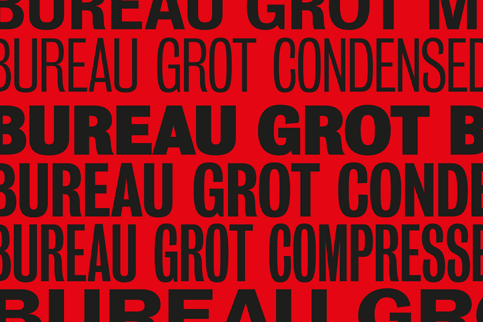
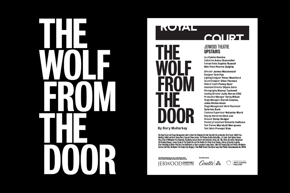
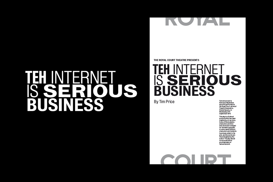
Bureau Grot brought us the diversity of voices we were looking for, a broad family of hench sans serif typefaces that could work hard across the multitude of tones required by the theatre's many plays. These different typefaces would sometimes be permitted for use interchangably within a headline or sentence, bringing abrupt changes in tone and creating an almost confrontational aesthetic to certain communications.
Clear rules were established as to which weights of Bureau Grot were allowed to be used for which applications, including body text, play titles, writers' names, dates, URLs and other different types of information.
With the brand emboldened, we made certain the Court’s ‘Revolution’ season would visually confront the public.
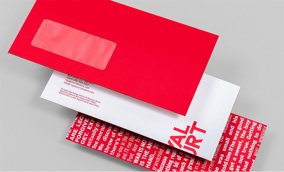
In search of provocation we poured over the play scripts themselves, full of unusual ideas, disturbing juxtapositions and challenging imagery. Exactly what we needed.
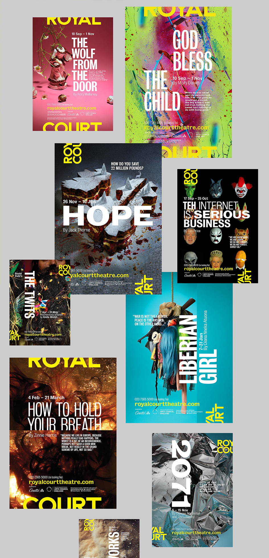
Given the Royal Court's fame for putting on new and original work, we wanted to help the theatre move on from using stock imagery to promote plays. Ambitions were raised to match the level of quality, impact and energy that visitors enjoy on stage every night. We made photography our medium, commissioning bold new images.
Our 'playing on the edge' grid became key to handling play images flexibly. For seasonal promotions presenting more than one play, the grid enables multiple slices from different posters to come together, offering intriguing glimpses of each play involved in the season.
The technique can also be put to creative effect in video content, where titles and headings can appear from these ‘seams’ within the whole, suddenly revealing edges where there were no edges previously, in perpetual restlessness.
Each play in the season was given its own typographic identity, carried across all marketing collateral for its duration. The poster images scale across different communications, offline and online, working in a variety of practical crops” writes LOVERS who found numerous ways to continue the ‘playing on the edge’ approach throughout the theatre’s signage and wayfinding system in a rebranding with no drama and lots of wows.
“The signage and wayfinding in the theatre needed refreshing visually, but it also needed some structural reconsideration. We split the system into three tiers; impact-level splashes of 'on the edge' typography, a second more directional level, and also a pictographic langugage to lead people where they need to go. Applications ranged from impact-led display signage, to directional and also inter-floor wayfinding” they add.
Fall in love with the LOVERS here
Tags/ typography, inspiration, graphic design, lovers, creative agency, royal court theatre, bureau grot, typographic identity


