Pentagram's stencilled new visual identity for Pink Floyd Records
Pentagram's Harry Pearce and team have created a logotype for Pink Floyd Records, a new record label that is releasing already beloved and previously unheard music by of the world’s most iconic bands. “Pink Floyd’s impact on music is immeasurable, and is only seconded by their impact of visual culture. Famed by their relationship with the design collective Hipgnosis, their LP covers are part of the cultural consciousness, creating moments of shared experience for millions of people around the world” says Pentagram.
“Harry worked closely with Aubrey Powell of Hipgnosis to create the visual identity for the label. Taking inspiration from the original lettering on 1977’s ‘Animals’ record cover, Harry and team build a complete alphabet based on the album's stencilled lettering in both outline and solid form. This lettering has been used to make a unique mark and headline font for the band and business”.
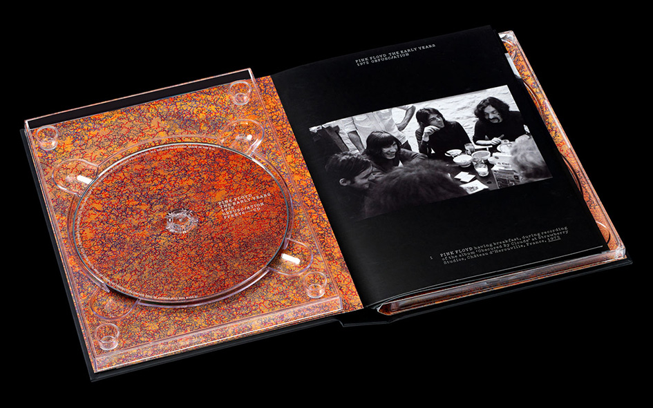
Alongside the identity, Harry and team have designed ‘The Early Years 1965-1972’. This comprehensive 27-disc boxed set pulls together material from the Pink Floyd archive, as well as licensed Radio and TV recordings, to comprise a deluxe package that includes seven individual book-style volumes. The box set features previously unreleased material, including the first CD to feature the band's first recording from 1965.

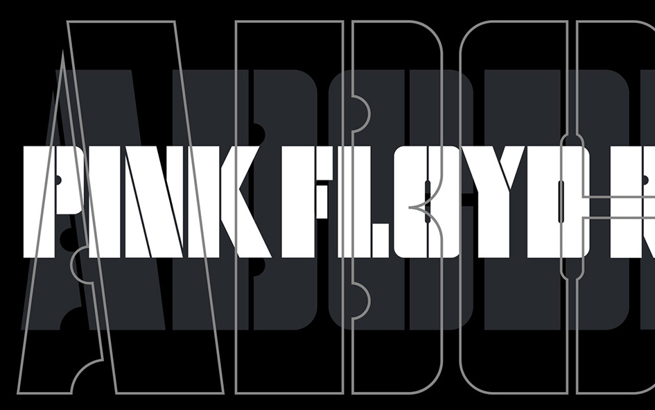

The iconic typography on Pink Floyd’s Animals forms the basis of the typeface used in Pink Floyd Record’s identity.
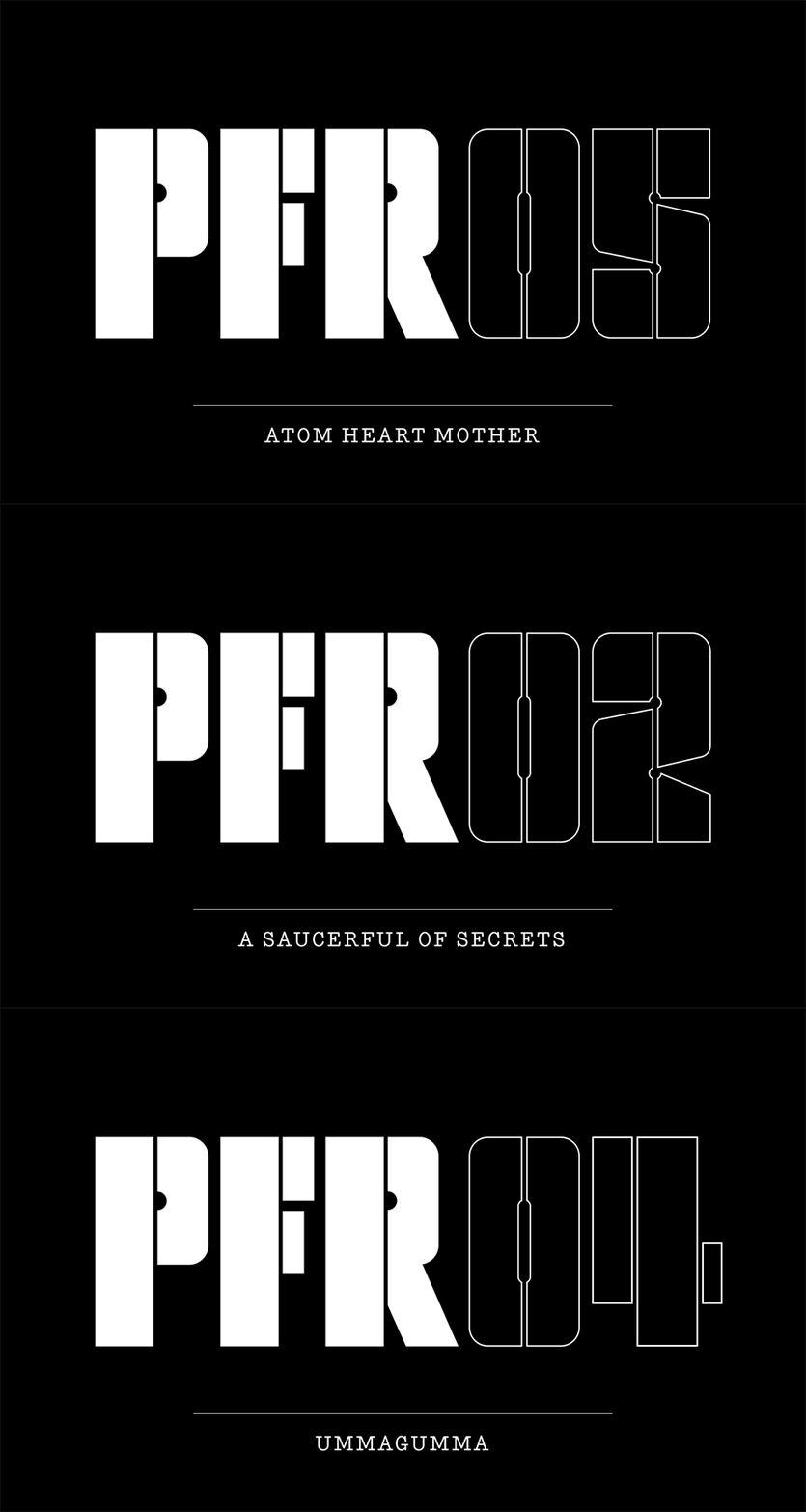
Edition numbering for record label releases.
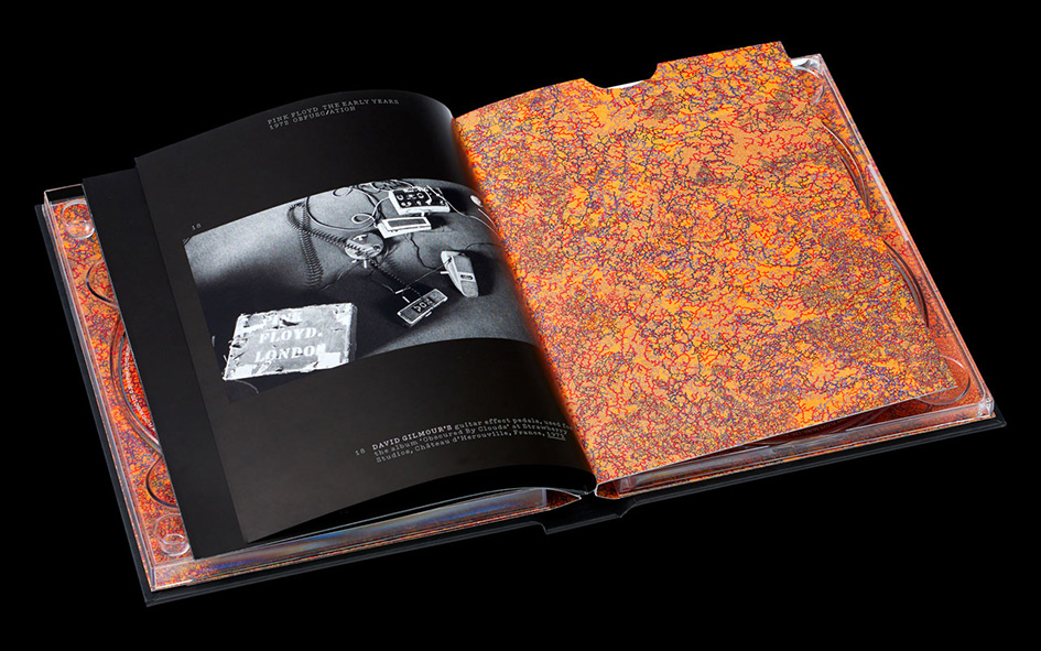
Each of the seven CD booklet covers carry an original artwork by John Whiteley, in distinct psychedelic oil on paper style.The box sets follow a simple one column grid and uses typewriter-esque typography to create an archival aesthetic, which is built upon through the careful arrangement of historical photographs of the band.
With Aubrey Powell and Storm Thorgerson’s record sleeves for Pink Floyd already an iconic portfolio of work in the record industry and Pink Floyd’s music and visual output the subject of a major retrospective opening at London’s V&A Museum this May, Pentagram just became a part of music history made of type.
“The stencil somehow feels evocative of the stencilling on all their equipment and their boxes…. It’s such a wonderful, idiosyncratic bit of type that we just felt it deserved a bigger life than it had already” Pearce told Creative Review. “[The band and Powell] loved the idea and it’s right in the middle of the canon of all of their work.”
“It was originally made to be on a 12″ LP … when you take that typeface and make it very small, which it often had to be, all of the inter-character work, the huge contrast between the stencil cuts through the lettering was so narrow that you reduce it down and it just sort of closes up,” he adds of they challenge to create a complete alphabet based on the design was quite a challenge.
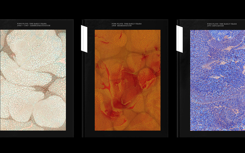
Each set features an original artwork by John Whiteley, in a distinct psychedelic oil on paper style.
“That was one challenge and the fact was that we just didn’t have that many letters, so we did an analysis of the forms of letters that were there and built a system on that” comments Pearce, a long time fan of Pink Floyd’s himself who describes the project as “a complete joy”.
“When I was a teen in the 1970s listening to that stuff, holding that 12″ sleeves in my hands, never did I dream I’d one day be working with some of that material,” he says. “Some of that music was founding stuff for me back in the 70s, so it’s a very precious thing to do and we took immense care on this project.”
“That’s probably another reason why we honoured the lovely lettering on that original Animals album [for the identity],” he adds. “We could have imposed our own style on to this … we could have invented a new logo, but this just seemed to resonate so much more – the fact that we were honouring and using things that already existed and giving them a new and extended life.”
Harry has also written for the ‘Outro' of the upcoming book by Thames & Hudson, which will be titled 'Vinyl. Album. Cover. Art. : The Complete Hipgnosis Catalogue’ to be published in April.
Check more here
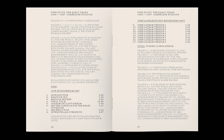
The archival aesthetic of ‘The Early Years 1965-1972’ is carried through the entire boxset, from cover to credits.

Pentagram established a set of rules to extend the Animals’ typography to include an entire alphabet.

The new alphabet was created in both solid and outline versions.

The full alphabet used in the Pink Floyd Record’s identity.
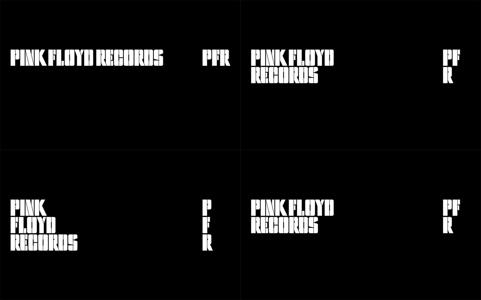
Different configurations of the logotype.
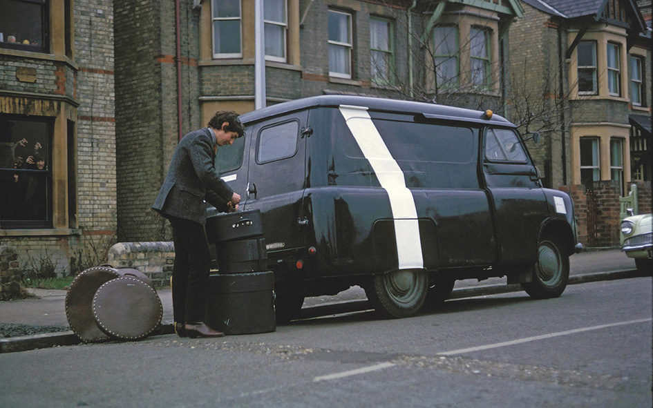
Nick Mason with Pink Floyd’s famous Bedford van in 1965 (photo courtesy of the Pink Floyd Archive).

The Bedford van influenced the design of the ‘The Early Years 1965-1972’ boxset.
Tags/ design, typography, inspiration, visual identity, branding, logos, pentagram, harry pearce, pink floyd records, iconic bands, pink floyd, hipgnosis, aubrey powell, john whiteley, storm thorgerson, v&a museum


