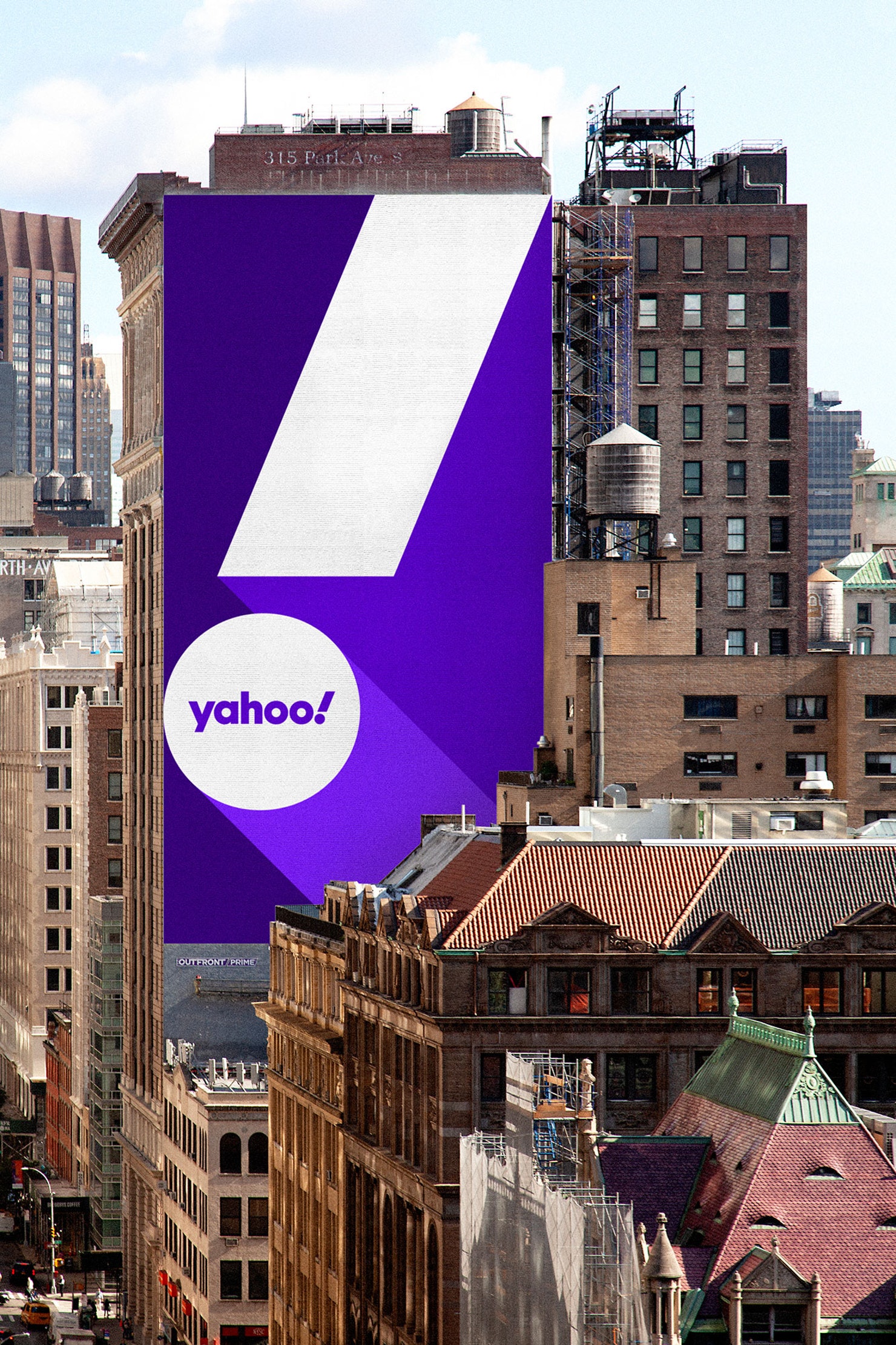
Pentagram X Yahoo! Will a Project Purple monogram bring yodeling back in business?
The idea is neatly visualized in Yahoo’s exclamation point, a punctuation mark that literally stands for amplification” notes Pentagram of its latest rebrand of one of the world's pioneering web portal and search engine.
“Pentagram has worked with Yahoo on a refresh of its visual identity that captures the exuberant personality of the brand and reimagines it for the future adds the creative mega-force of this rebranding that goes (!) and is the company's first significant change to the brand since the previous logo was introduced six years ago.
The identity reflects a new brand strategy for Yahoo that focuses on helping users find a more personalized, customized experience online.
“In the decades since Yahoo first launched, the internet has grown to be so big and ubiquitous, it’s easy to become overwhelmed with information. With its new products, Yahoo will empower users to better sift out irrelevant parts of the digital world, giving them more control of what they see and when they see it. The strategy positions Yahoo as an 'amplification brand,' amplifying the things that matter, helping to 'amplify you'” adds Pentagram.
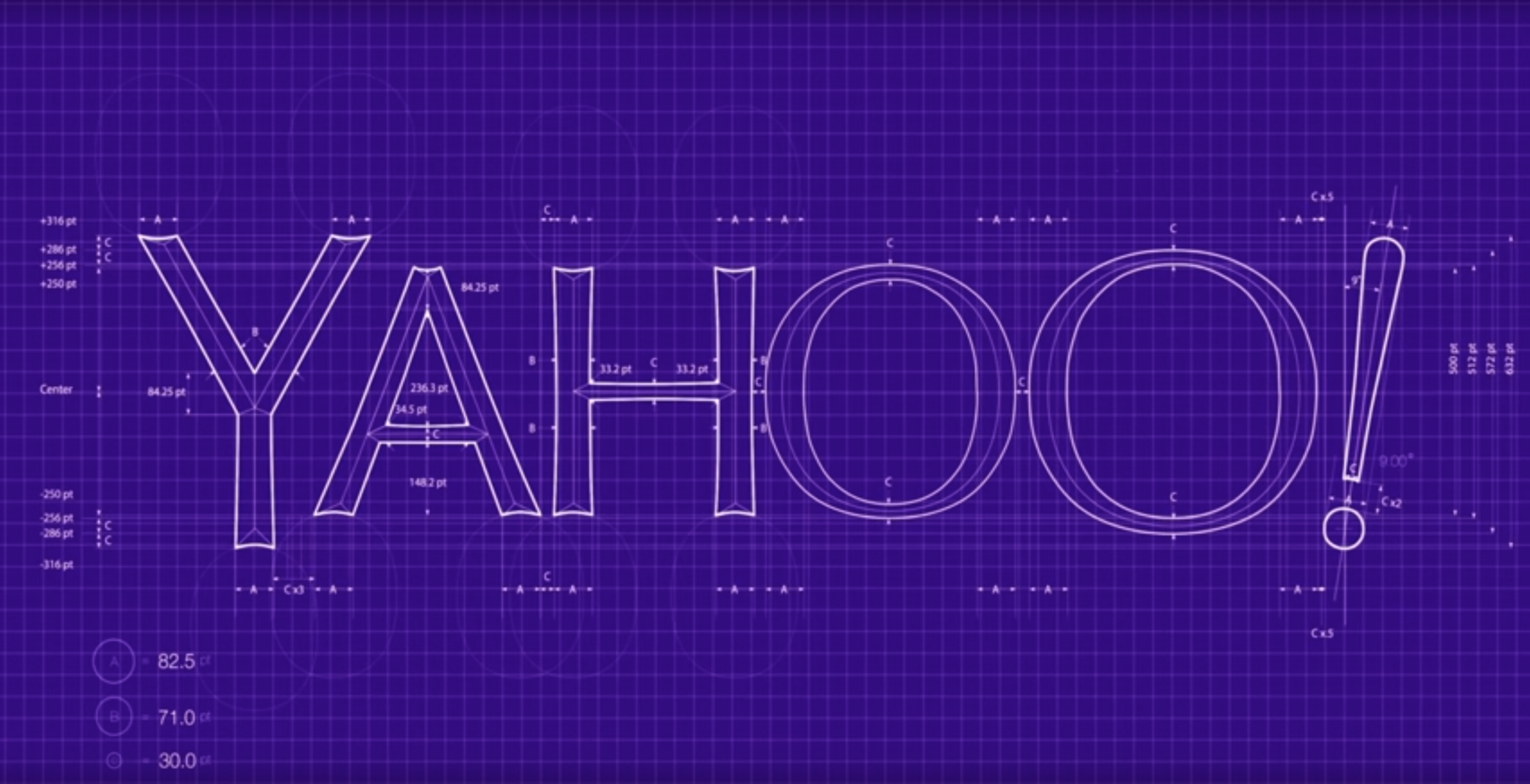
“The new wordmark is set in Centra No. 2 Extrabold, and the letters of the logotype have been modified to be more geometric and compact.
The exclamation mark has been italicized for emphasis, as it has been in every iteration of the logo since the company’s founding.

“The new wordmark is set in Centra No. 2 Extrabold, and the letters of the logotype have been modified to be more geometric and compact”
The 'y' and '!' of the logo are both set at an angle of 22.5 degrees, a forward tilt that suggests a sense of momentum and excitement.
The angle––precisely 1/16th of a circle––is the basis for visual language built around angles and incremental slices” adds Pentagram whose designers, led by Michael Beirut, worked with Yahoo to evaluate a wide range of options, either referencing the brand's massive past or the brand's massive future ahead in the digital realm.
“As with the original logo, the new identity captures the voice of a brand named after an exclamation of joy and discovery and still looks like it should be shouted or yodeled ('yahoOOOOoooo!'). The repeating circles of the 'a,' 'o's and the dot on the exclamation point echo of the audio mnemonic of the yodel” adds Pentagram, one of the world’s largest independently-owned design studio.
Yahoo's new logo is ultra-flexible and is a welcoming throwback to the original and rather quirky 1996 logo.
Super optimized to work across a variety of applications the new logo does magic either on a smartphone or the side of a building and the secret to its inevitable popularity is one very simple monogram aka “y!”.
“The monogram is also the foundation for a cohesive brand architecture that locks up the “y!” with various channels to create sub-brands for Yahoo Finance, Yahoo Sports, and Yahoo Weather” notes Pentagram of Project Purple.
The identity's palette is obviously purple -Yahoo’s signature color ever since 2003- and the update coincides with the launch of new products and enhancements, including a “reimagined Yahoo Mail app, and signals a strategic change for the company as it prepares to introduce other products and services over the coming year.”

Back in 2013 Yahoo unveiled its logo after a month-long campaign that showed a new variant each day leading up to the big reveal. That logo, always purple but a different shade of it, in uppercase and with Yahoo's signature exclamation point playing a vital role in branding as ever, was set in a bespoke sans-serif typeface which Yahoo created specifically for it.
Per Marissa Mayer, Yahoo's former CEO, the “whimsical, yet sophisticated” logo reflected Yahoo as a company which was “modern and fresh, with a nod to the company’s history. It needed to have a human touch, personal. The end result is something they are proud of” suggested Mayer who managed to turn a simple logo change into a worldwide marketing effort thanks to that “30 days of change campaign.”

Since then the embattled former CEO of Yahoo, Mayer, launched the next phase of her career in Palo Alto -where Mayer began her massive career working for Google since 1999 after graduating Stanford University with bachelor’s and master’s degrees in computer science- and the company which is owned by Verizon Media -the media unit of Verizon which was formerly known as Oath, and is housed alongside other brands such as TechCrunch and HuffPost- is off to a fresh start -yodeling as always.
Tags/ inspiration, google, monogram, pentagram, bespoke typeface, sans serif, search engine, design agency, yahoo, web portal, exclamation


.png)


