Pentagram’s Michael Bierut on Poetry Foundation’s new typography
May the great poet we are looking for never find it shut, or half-shut, against his ample genius! To this end the editors hope to keep free of entangling alliances with any single class or school. They desire to print the best English verse which is being written today, regardless of where, by whom, or under what theory of art it is written”. Founded in Chicago by Harriet Monroe in 1912, Poetry magazine began with the "Open Door" and since then it reintroduces the poetry to a whole new crowd. Our minds.
Poetry is the oldest monthly devoted to verse in the English-speaking world. Monroe’s Open Door policy, set forth in volume 1 of the magazine, remains the most succinct statement of Poetry’s mission: to print the best contemporary poetry, of any style, genre, or approach. The magazine established its reputation early by publishing the first important poems of H.D., T.S. Eliot, Marianne Moore, Ezra Pound, Carl Sandburg, Wallace Stevens, William Carlos Williams, and other now-classic authors. In succeeding decades, it has presented—often for the first time—works by almost every major contemporary poet.
Poetry has always been independent, unaffiliated with any institution or university—or with any single poetic or critical movement or aesthetic school. It continues to print major English-language poets and emerging talents in all their variety. In recent years, more than a third of the authors published in the magazine have been writers appearing for the first time. On average, the magazine receives more than 150,000 submissions per year from around the world.
To celebrate the legacy of the magazine and the poetry it preserves Pentagram has brought a new typographic look to the Poetry Foundation in Chicago –an organization which has evolved from the Modern Poetry Association (founded in 1941) and continues the publication of Poetry magazine always ready “to discover and celebrate the best poetry and to place it before the largest possible audience” and its long-established publication magazine, which explores the visual possibilities of this unique written form.
"The Poetry Foundation is an independent literary organization with the mission to celebrate its namesake form and raise it to a more visible and influential position in our culture, chiefly through Poetry magazine, published since 1912. Pentagram developed a brand identity for the Foundation, including a new design for the publication, that reinforces it as a vital platform and helps attract the attention of new audiences" writes Pentagram.
"One of the oldest and most innovative literary forms, poetry can be simple or complex, and is also peculiarly visual: The way the words of a poem are arranged on a page has an effect on how they are read, and the “design” of verse conveys the underlying structure of set forms like the haiku, the limerick and the sonnet, which in turn provide the basis for endless variations. Typography is also hugely significant to poetry, and the medium has inspired radical experiments in type for centuries.

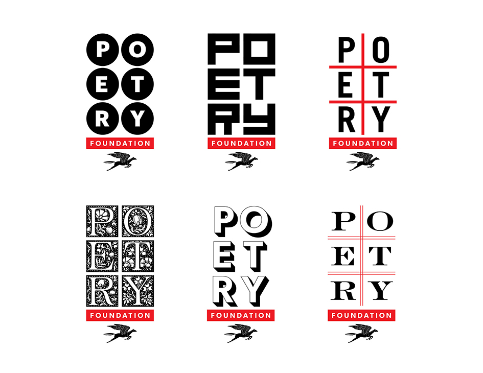
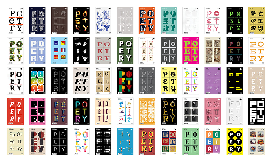
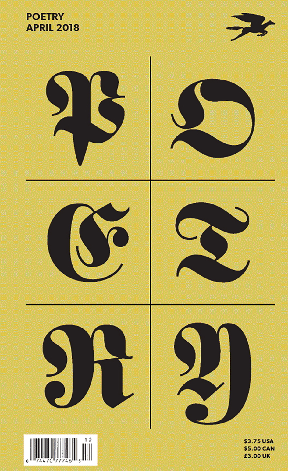
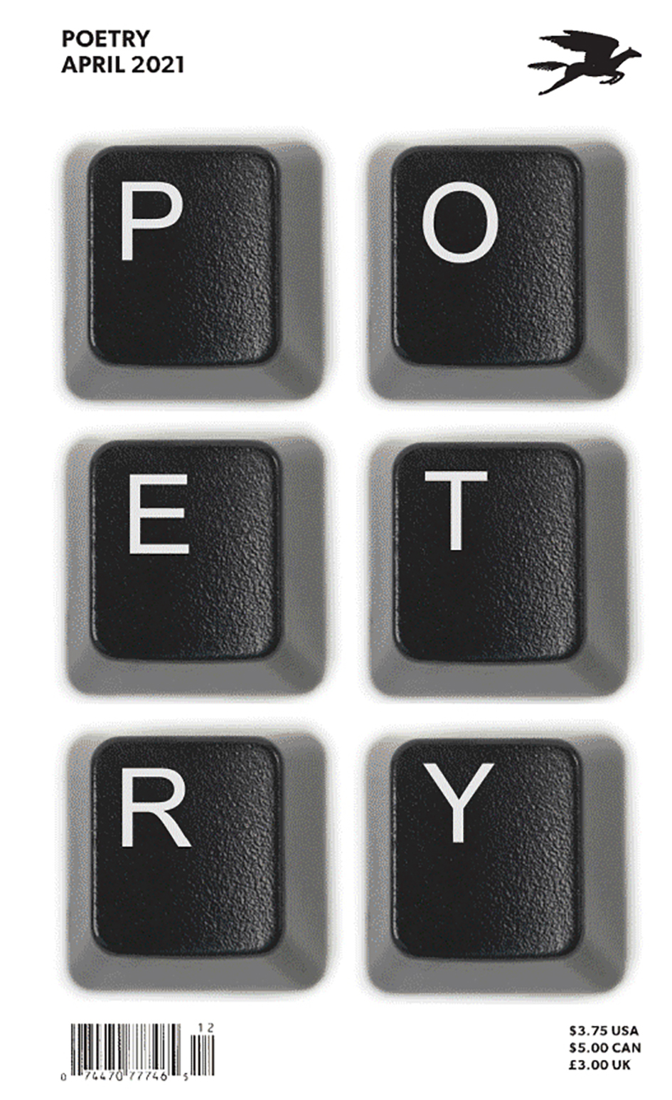
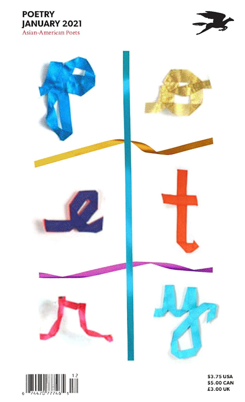
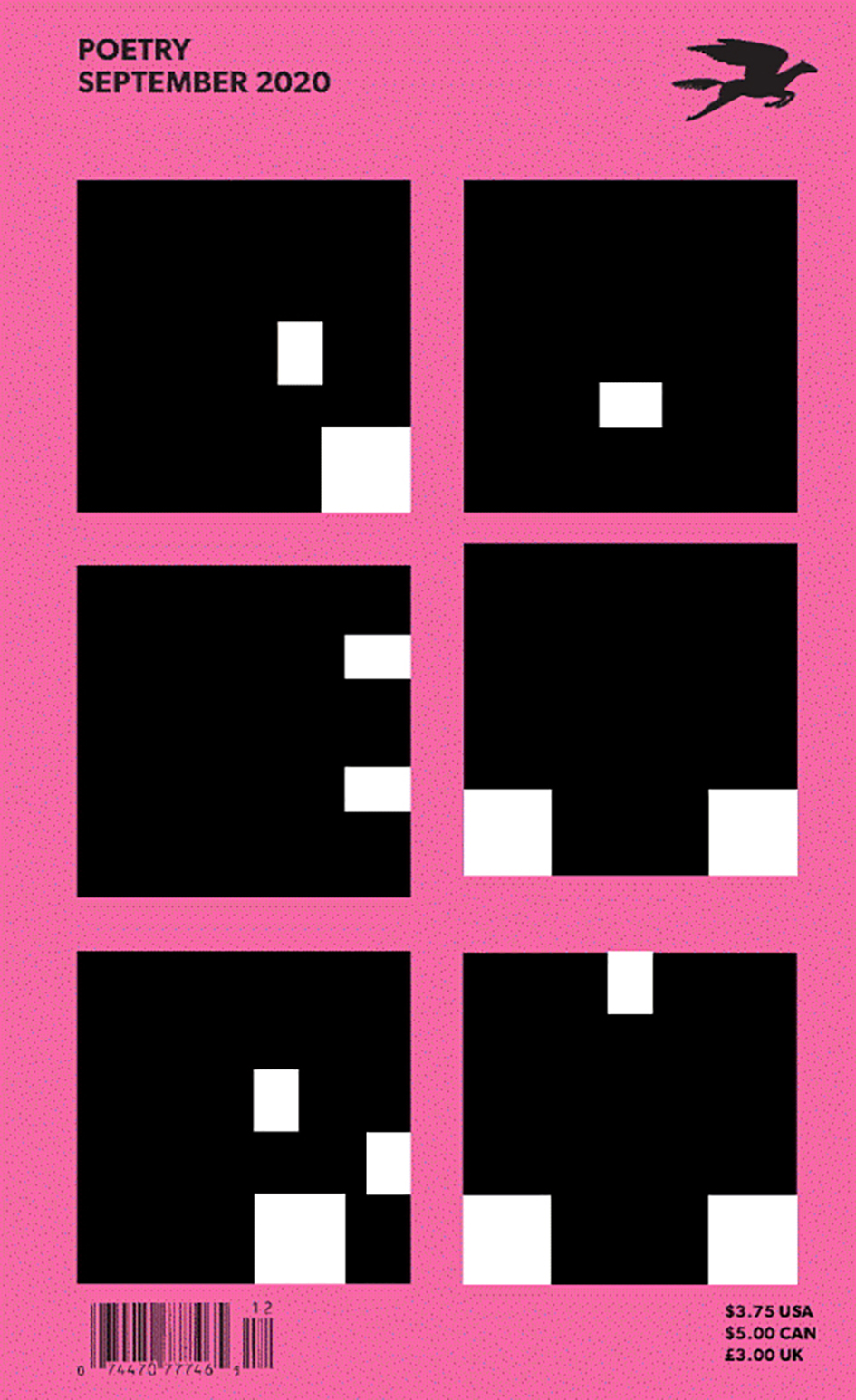
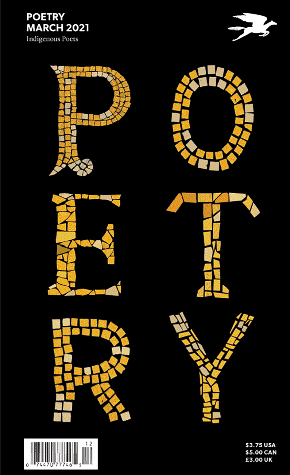
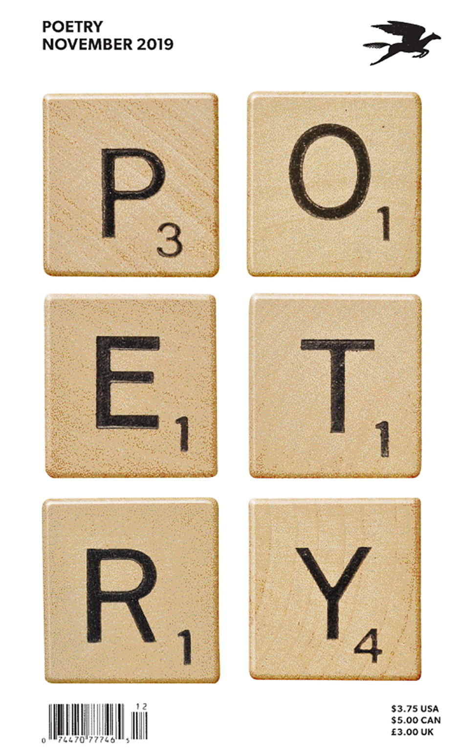
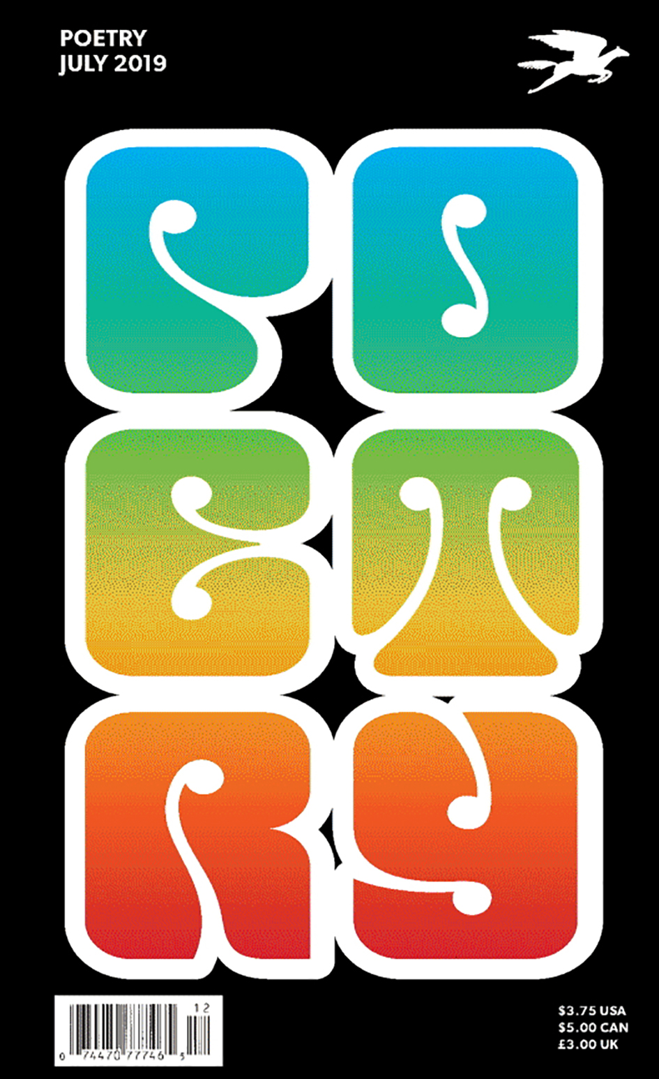
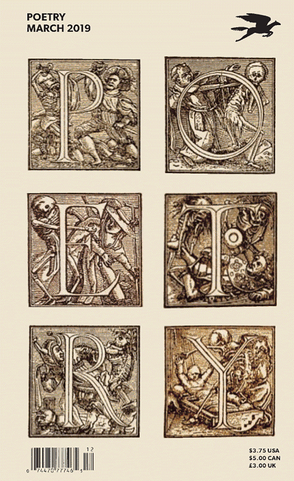
The identity of the Foundation and magazine is based in a similar set of rules. The six-letter word 'poetry' is arranged in a distinctive two-by-three letter configuration that, within the structure, is endlessly changeable. The name can appear in every style. For decades the cover of Poetry was often purely typographic. The redesign continues this approach, but puts the dynamic identity front and center.
The distinctive look is carried throughout Foundation materials with display typography that breaks apart single words like lines of verse. The identity is set in the forthright sans serif Gibson and Pietro, previously utilized by the magazine for its poems, has an expanded role as a supporting typeface for collateral. The redesign coincided with an update of the Foundation’s website, led by the agency Fuzzy Math".
“I’m not a poet. I’m a graphic designer who has developed a specialty in branding” writes Michael Bierut on his introduction to the new visual identity of this stunning project which uses type as image. “Many people find branding a vaguely unsavory bit of jargon, but it puts a name to something familiar: the way that institutions and organizations communicate who they are. Of course, corporations have brands, but—in a more abstract sense, at least—so do political parties and religions and even individual people. And so does the Poetry Foundation.
When I was asked to evaluate and reconsider how the Poetry Foundation communicates with its many audiences, I was struck immediately by two main things.
First, there’s a rare one-to-one correspondence between the organization’s name and its mission. The Poetry Foundation and its primary face to the world, Poetry magazine, leave no doubt about what they’re about. This is no small advantage in a world where the competition for attention is so fiercely unrelenting. Everyone knows that Poetry is about poetry.
Second, most people think they know what poetry is. Often, they formed an opinion about it in elementary school, sometimes good, sometimes not so good. There lies a challenge: retaining the longstanding and enthusiastic support of people who know and love the magazine and the Foundation while asking for the attention of new audiences and those who think they’ve already made up their minds.
We know that poetry can be many things. It can be simple and complex. It is one of the oldest and one of the most innovative of literary forms. It can provide solace, and it can be profoundly disturbing. And—of particular interest to me as a graphic designer—it is a peculiarly visual art form. Even the way the words of a poem are arranged on a page has a profound effect on the way we read them. As a result, poetry has inspired radical experiments in typography for centuries.
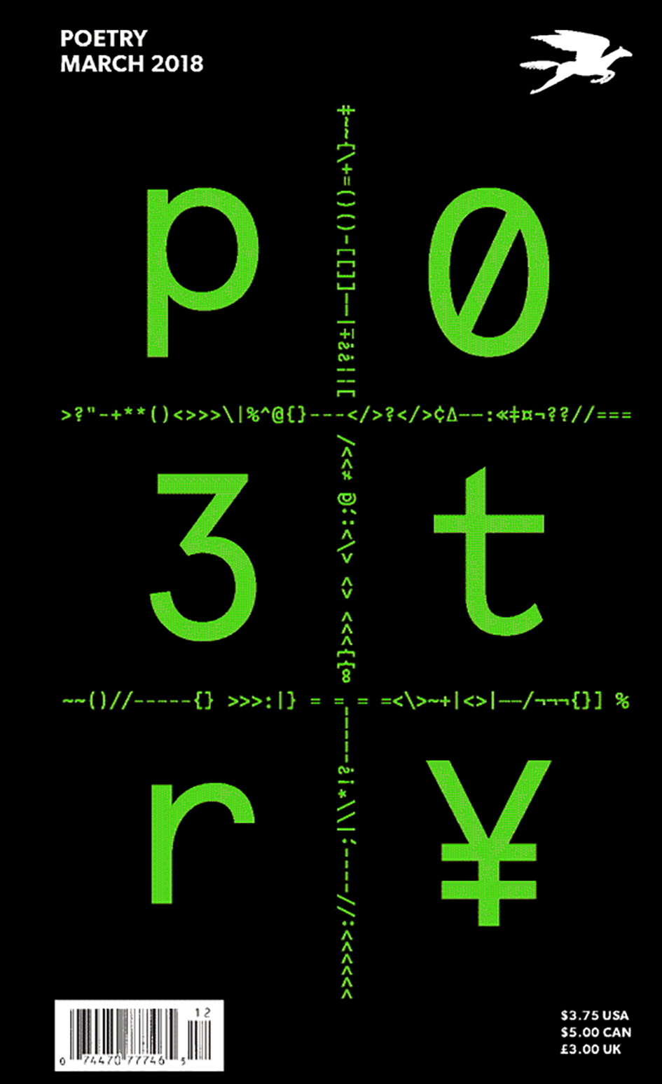
The combination of the familiarity of a simple six-letter word and its capacity for endless surprise led us to a new way of thinking about the poetry brand. What if the name could be the brand, and the presentation of the name could be ever changing? So we began with the word poetry and arranged it in a distinctive two-by-three letter configuration. We then began writing the name in every style we could think of, formal and informal, conventional and radical, bold and delicate, straightforward and fanciful. The result is a visual treatment we hope goes right to heart of what poetry, and what Poetry, is: always evolving and forever new. We hope it is worthy of this great art form and one of its most ardent champions”.
Michael Bierut is a partner in the New York office of the international design consultancy Pentagram, where his clients have included the New York Times, Saks Fifth Avenue, Mastercard, MIT Media Lab, and Hillary Clinton. He is a co-founder of the website Design Observer and the author of several books on design, including Seventy-nine Short Essays on Design (2012); How to use graphic design to sell things, explain things, make things look better, make people laugh, make people cry and (every once in a while) change the world (2015); and Now You See It (forthcoming, fall 2017).
Bierut’s first job after graduating from the University of Cincinnati was with legendary designer Massimo Vignelli, where he worked for ten years before joining Pentagram. He is a past president of the American Institute of Graphic Arts (AIGA), a member of Alliance Graphique Internationale and the Art Directors Club Hall of Fame, and he has received the AIGA Medal and a Cooper-Hewitt National Design Award. He teaches at the Yale University School of Art and the Yale School of Management.
Explore more poetic typography here.
Tags/ typography, inspiration, graphic design, pentagram, brand identity, michael bierut, poetry magazine


