Patrick Thomas' typographic Instagram is pure genius
He has been described as an “iconographiste” for good reason. British born and Berlin based Patrick Thomas is no stranger to pushing the envelope with his visual instinct. “His work combines and re-purposes iconic imagery to create bold, conceptual prints and editions, which aim to provoke and question, but with ambiguity still playing a part” says Creative Review for the man who is interested in process, typography, art, image-making and obviously Instagram. A Berlin lover since 2011, where he has established his studio in Neukölln, the answer to London’s East End where he lived as a student, Thomas is becoming a viral sensation for the graphic design community by using his Instagram feed as an archive of the city’s ever-changing typographic elements.
“Anyone who has visited Berlin will remember the proliferation of posters. They are an integral, ever-changing part of the cityscape, giving oxygen to the streets” he says to It’s Nice That.
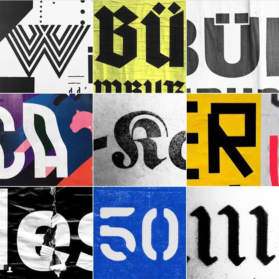
“Very simply, since moving to Berlin five years ago I have started walking a lot more. Logically, slowing things down permits you to observe details that you might otherwise miss on a bike or a bus, and posters — like a city’s DNA — deserve closer scrutiny. Instagram seems to be the perfect way to share this material.”
Liverpool-born Thomas is a multitasking citizen of the world. He co-founded multidisciplinary Studio laVista in 1997 after relocating to Barcelona and almost 20 years later he discovers the typography of Berlin whilst printing, exhibiting and contributing to publications such as the New York Times Book Review.
Urban environment is a constant inspiration for Thomas. Just a couple of years ago, for part of his show Multiples at Galarlie T in Düsseldorf, he found inspiration “from the urban detritus and everyday ephemera that surrounded him, and recycled discarded cardboard to create multiple artworks with multiple meanings. For Thomas, part of the appeal of creating multiples, or editions, is that he sees it as a more democratic process, meaning that the work can reach more people, be more accessible and more affordable” comments Creative Review, of a graphic designer who has been printmaking on and off for about thirty years.
From editioning via linocutting to monoprinting, etching, silkscreening and Instagramming, everything about him is about type. Hands on, its Instagram genius in its own right! Explore his word here.


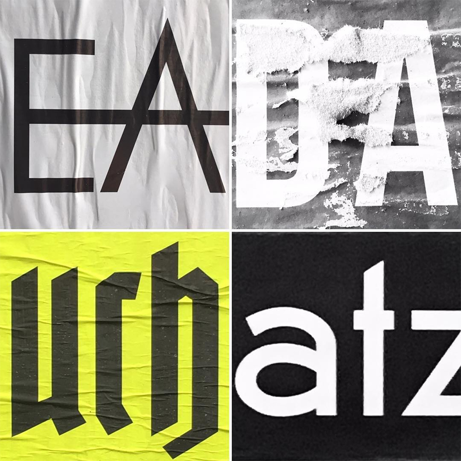

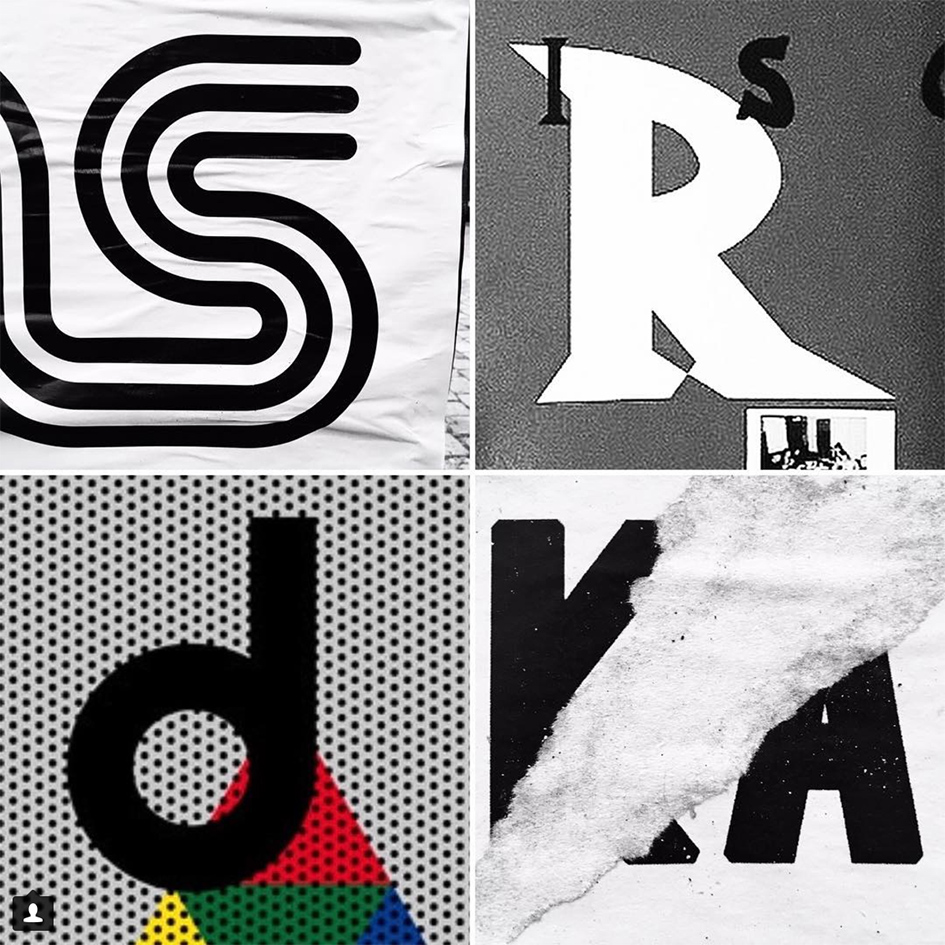
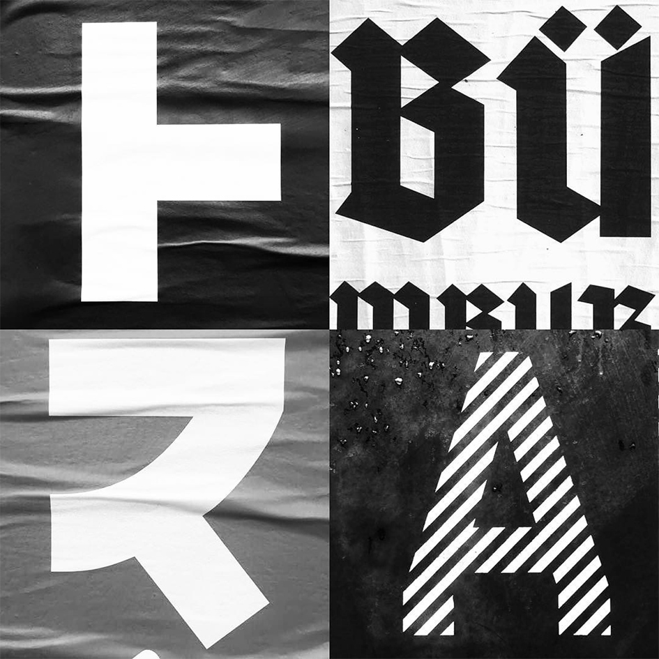
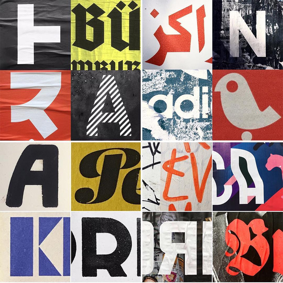
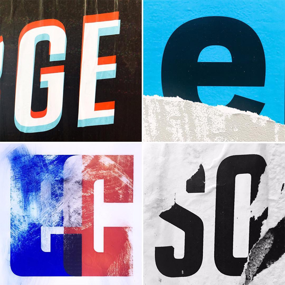
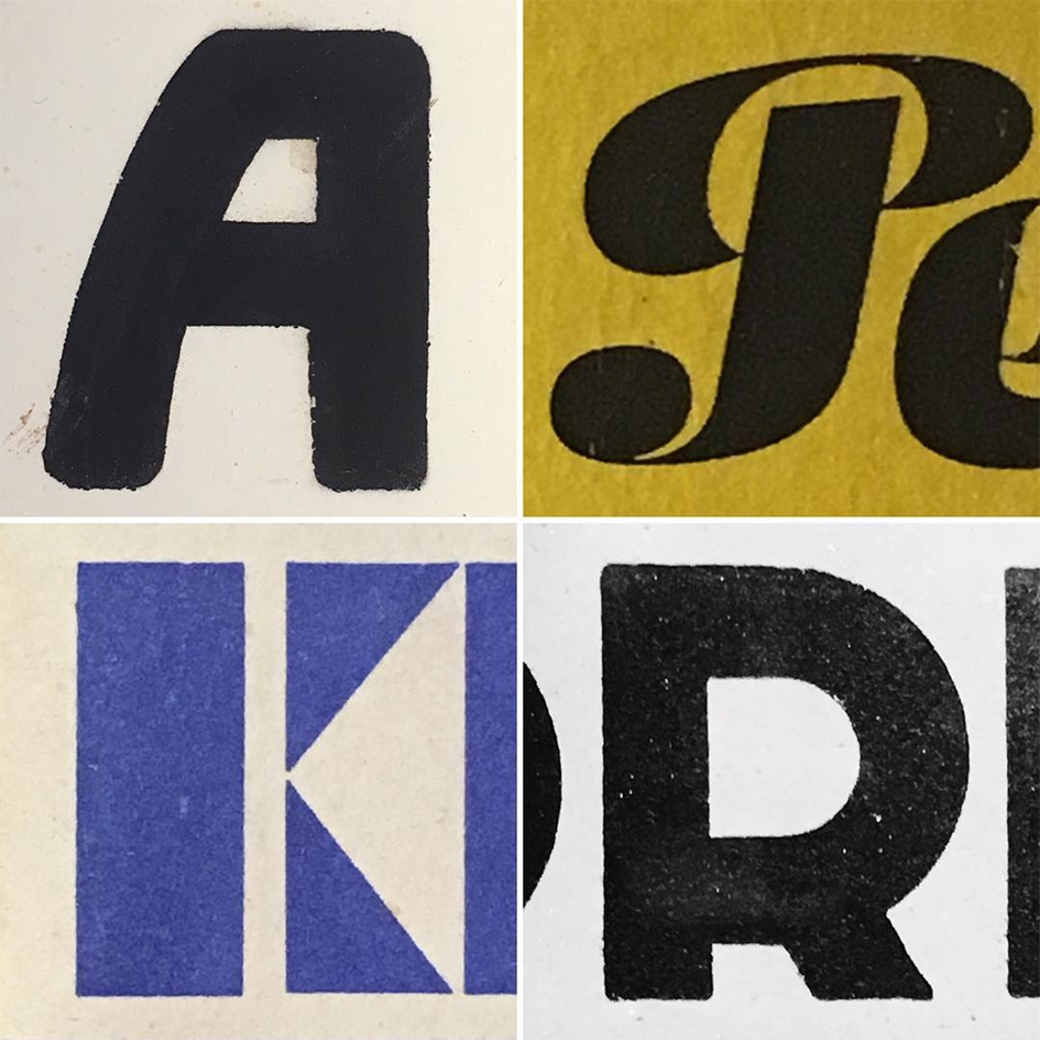
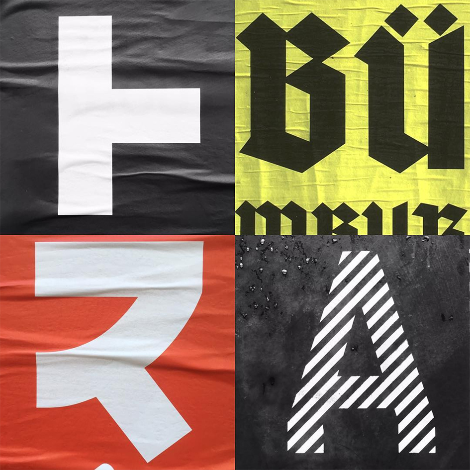
#streetgraphics #berlin #foundinberlin #typecollage #berlinstreetgraphics @berlinstreetgraphics
A post shared by Patrick Thomas | Graphic art (@xpatrickthomas) on Feb 13, 2017 at 10:55pm PST
Tags/ inspiration, graphic design, art, instagram, british, berlin, creative review, dusseldorf, iconographiste, patrick thomas, image-making, neukölln, galarlie t, monoprinting, editioning, linocutting, etching, silkscreening, instagramming


