Octavo Redux, the iconic typographic publication is back with a vengeance
Graphic design is full of creative acts that changed the course of design. The publication of eight issues of Octavo, International Journal of Typography, in the 80s and 90s, was one of those creative acts” writes Unit Editions on their Kickstarter campaign, to bring one of the most iconic projects of design studio 8vo.
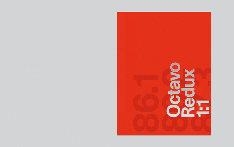
“Octavo has acquired mythic status. Copies sell for exorbitant prices and only rarely become available. If you want to see issues, you must hunt them down online, and if you want to own them, be prepared to pay big money. Until now, that is” adds Unit on the 384pp book, designed and edited by Mark Holt and Hamish Muir, two of Octavo’s original designers and editors.
“Nobody placed an order with Mark Holt, Hamish Muir, Simon Johnston and Michael Burke to do and go through all this; they are publishers, authors, designers, and fund providers, all in one. They are exemplary: sixteen pages of pride, courage, and love of typography can mean a lot” said Rolf Müller back in 1991 on the journal that was designed by 8vo, a design studio formed in 1984, comprising Mark Holt, Simon Johnston, Hamish Muir, and later Michael Burke.
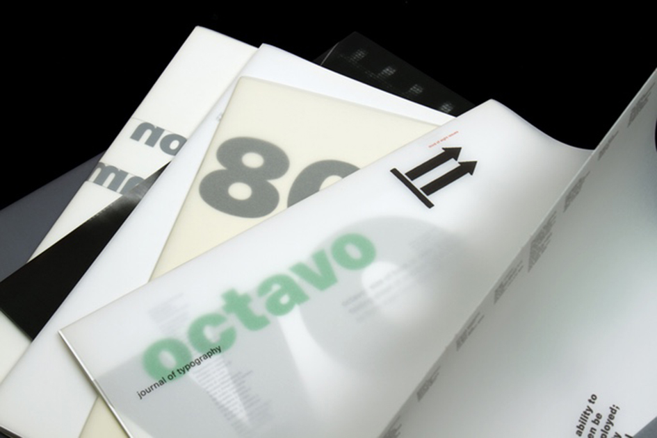
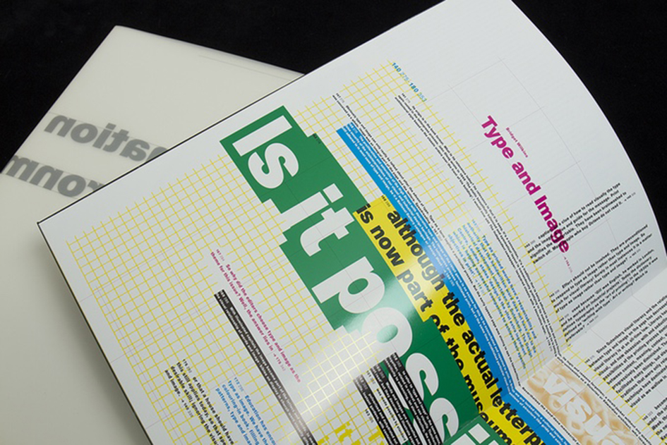
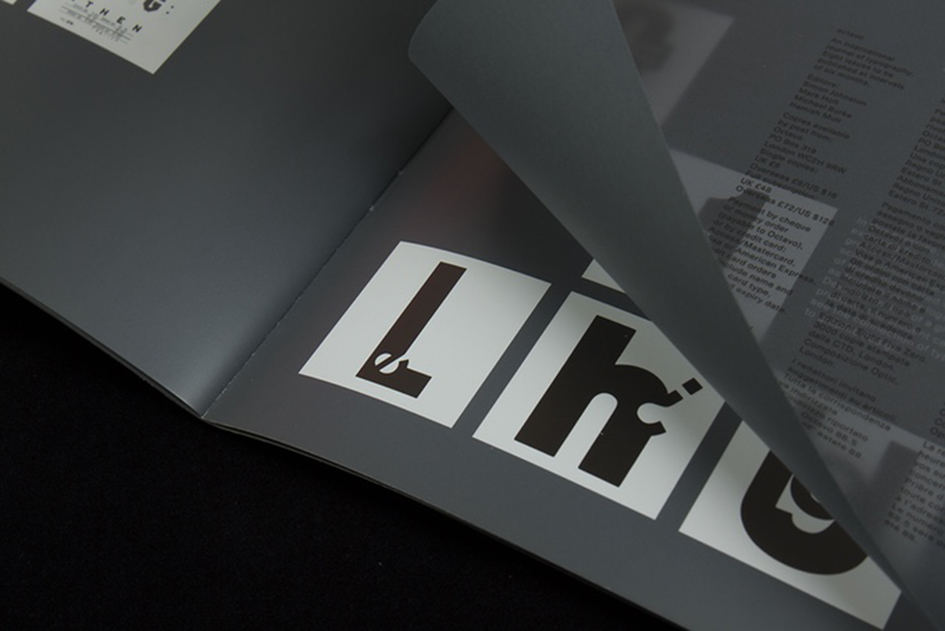
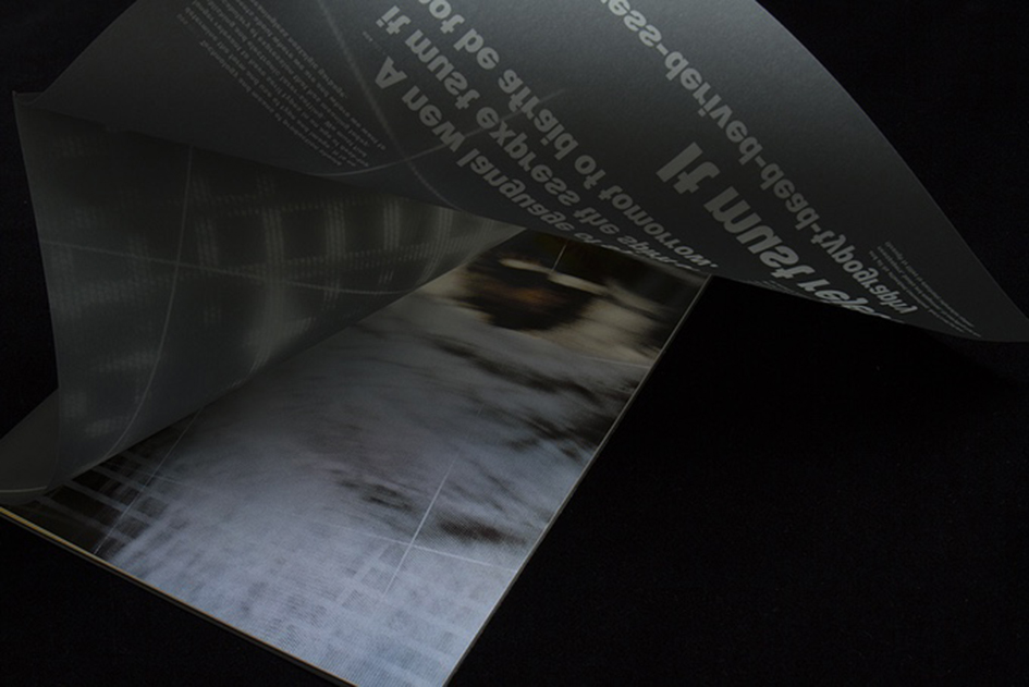
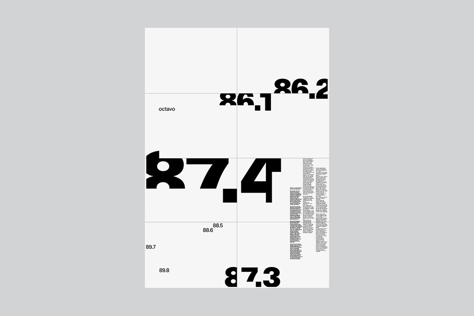
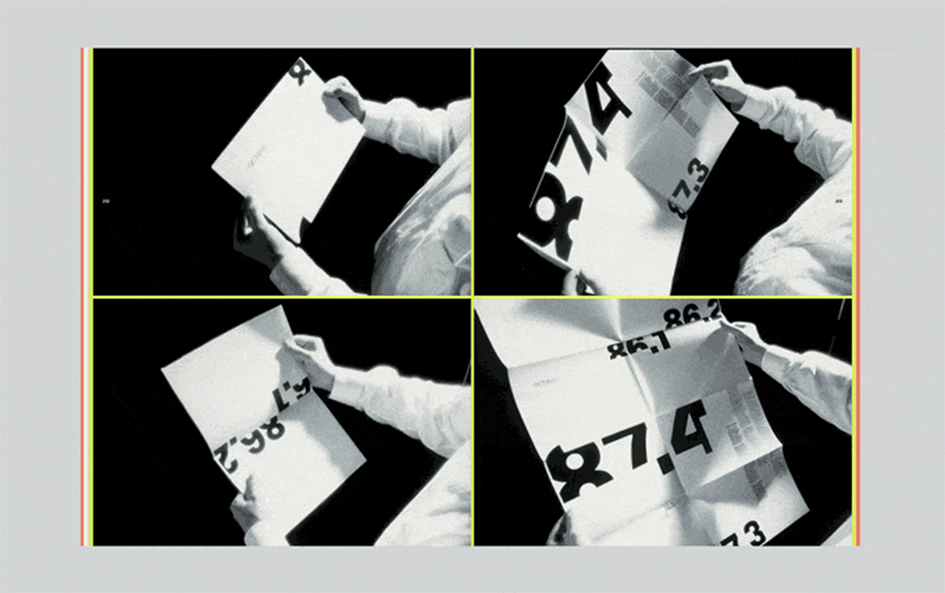
“Octavo, International Journal of Typography, was a ground-breaking event in the evolution of graphic design. It was a stinging riposte by a group of British designers to the complacency and traditionalism of the UK graphic design scene. It was a maverick gesture that challenged the prevailing graphic formalism of the 80s and 90s. It sought, above everything else, to foreground typography as a solution in itself. It did this at a time when illustration was the dominant mode of graphic expression. And if all eight issues of Octavo prove anything, they prove that typography can be as expressive as image. Octavo also showed that by challenging the prevailing technical constraints of the time, it was possible to create a body of work that was genuinely ‘ahead of its time.’ Octavo was a publication that spanned the paste-up to desktop era, and is an encapsulation of late 20th century typographic developments. To contemporary eyes, the later issues look as if they were designed on the computer. They were not. They used production techniques from the pre-computer era. Octavo also demonstrated that designers can function without clients. Self-funded and self-distributed, the journal was launched when the debate around ‘graphic authorship’ was raging. But 8vo took the decision to disengage from theoretical posturing and instead made what they believed in”.


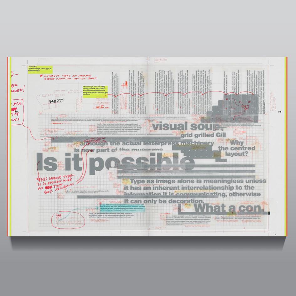
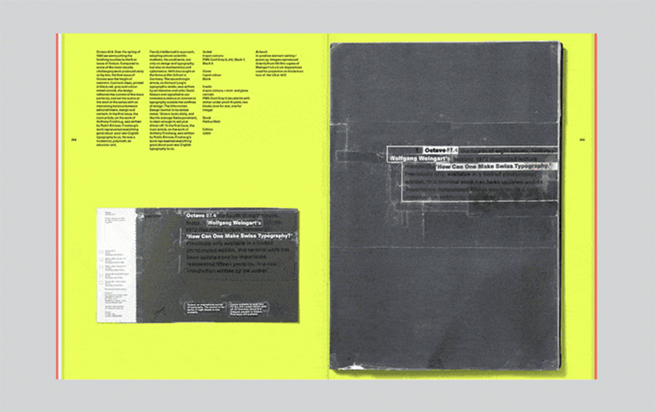
“Octavo Redux is as close as you can get to the originals without holding them in your hands” say the editors of the publication which features all the covers and spreads from each original printed issue of Octavo, reproduced at actual size (1:1), in full RGB spectrum Kaleido® Japanese inks. The book also documents covers and spreads from the full-scale working prototypes made by 8vo during the design process for each issue of Octavo.
Although 8vo disbanded in July 2001, Muir and Holt have reunited to design and edit Octavo Redux. Unit Editions, the independent publishing company formed in 2010 by Tony Brook, Patricia Finegan (both Spin) and Adrian Shaughnessy continues to spread the word of good, immaculate design with a crowdfunded publication that deserves our attention. This is Unit Editions’ third Kickstarter campaign to date.
Support the task here
Tags/ typography, graphic design, origins, unit editions, hamish muir, octavo, international journal of typography, 8vo, mark holt, simon johnston, michael burke, octavo redux, kickstarter campaign

