Southbank Centre’s “brutal”rebranding in a decade
In 1948, the Labour Government of Clement Attlee announced plans to hold the Festival of Britain. It was meant to be a "Tonic to the Nation" following the ravages of the Second World War.Three years later Southbank Centre was built in 1951 as part of the Festival of Britain and the concert halls were originally funded and managed by the London County Council and their successors, the Greater London Council.
The Centre became an independent arts organisation in April 1988 after operating for two years as a constituent part of the Arts Council. The 17- acre site — the UK’s largest arts centre —on the South Bank of the Thames is home to the Royal Festival Hall, Queen Elizabeth Hall, Purcell Room, and Hayward Gallery, presenting over 5,000 events that encompass art, theatre, dance, classical and contemporary music, and literature and debate, hosting 6.25 million people a year.
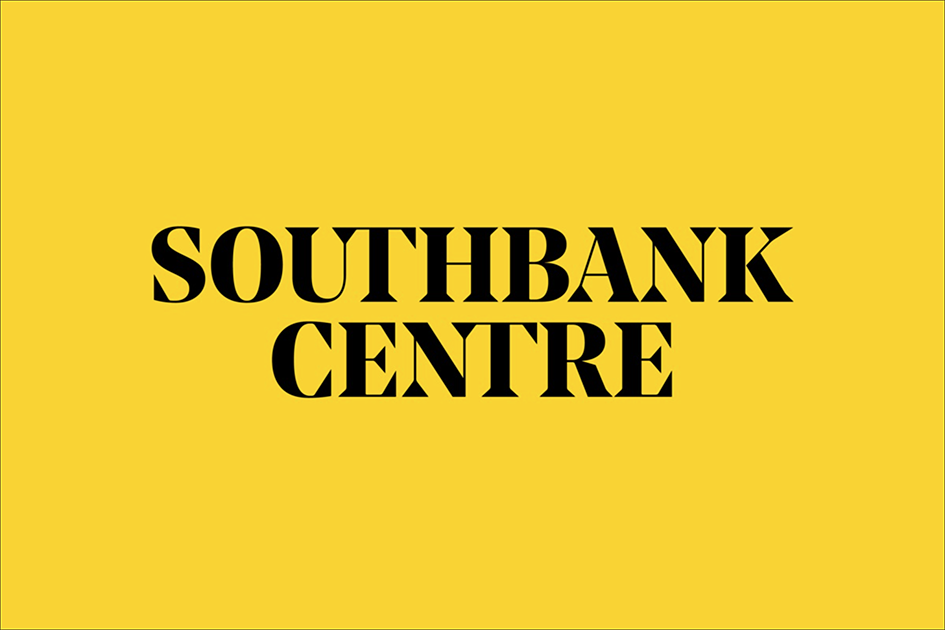
With three of its key buildings reopening this year to the public after almost two years of renovations Southbank Centre has introduced a new identity designed by London-based North. It is the first change in the visual language of the institute in ten years - the old identity, designed by Wolff Olins in 2007 is now part of the institute’s history.
“Through research and discussion it became apparent that the previous identity had proved to be overly complex to apply and that a number of challenges had arisen in identifying that the Southbank Centre brand was the ‘parent’ brand across the site. The inconsistent use of the old brand and the lack of guidelines about how the main brand should be reflected, had led to a weak and confusing visual language in online and offline communications and across the physical site” explains North.
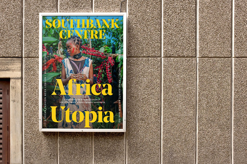
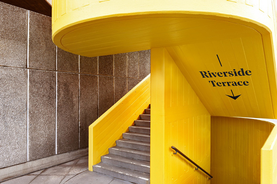
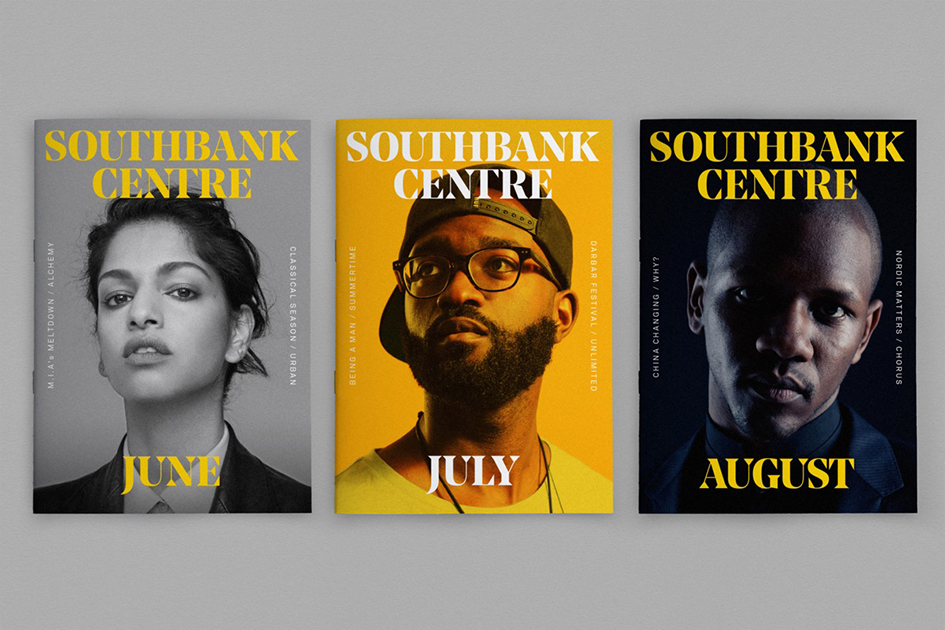
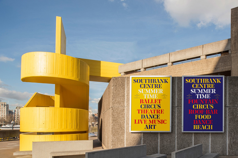
“Yellow will be employed with strength and confidence as the core identity colour. This will both help identify the boundaries of Southbank Centre’s complex site and help to create standout within the competitive cultural sector. New logotypes have been created for Southbank Centre and Hayward Gallery, using a customised version of the ‘Noe Display’ font by the type foundry Schick Toikka. This modern, high-contrast serif font was chosen to create an ownable, recognisable typographic tone of voice and visually reference the unique architecture of the Southbank Centre. The new identity is driven by a core strategic approach which elevates the scale and importance of Southbank Centre’s brand across all communications. The brand appears as a ‘masthead’, defining a consistent and recognisable design framework which allows individual festivals, performance and shows to be more freely expressed. This brand-led approach proudly signifies the role of Southbank Centre as location, author and presenter of world-class art and culture” adds the London-based creative agency.
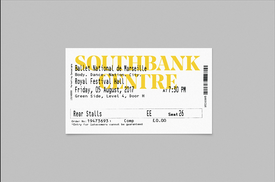
An iconic British arts district on the banks of the River Thames has rebranded with a new logotype, design framework and typographic expression.
The rebrand, which has been in progress since summer 2016, comes as the arts district is undergoing a massive venue restoration and building overhaul. Ranked as Europe’s largest cultural and arts centre, Southbank Centre is UK’s 5th most popular visitor destination.
In September 2015 Southbank Centre’s Queen Elizabeth Hall, Purcell Room and Hayward Gallery, were all closed to the public to carry out vital restoration work that would improve facilities for artists and audiences – the rebrand will link all the varying aspects of the centtre’s output together.
“The purpose of the identity change is to create an impactful and distinctive new visual language for Southbank Centre and our wide-ranging audiences and visitors – across all our communications” said Chris Denton, Southbank Centre director of marketing and communications. “The new identity will strengthen the awareness and understanding of Southbank Centre across its diverse 17- acre site, and beyond, and properly celebrate our brand position as one of the world’s leading cultural institutions.”
This brand-led approach will proudly signify “the role of Southbank Centre as location, author and presenter of world-class art and culture”.
“The new identity clearly, confidently and consistently communicates ‘Southbank Centre’ like a title of a magazine – everything else is the weekly, monthly features and highlights, the content” added North’s Sean Perkins.
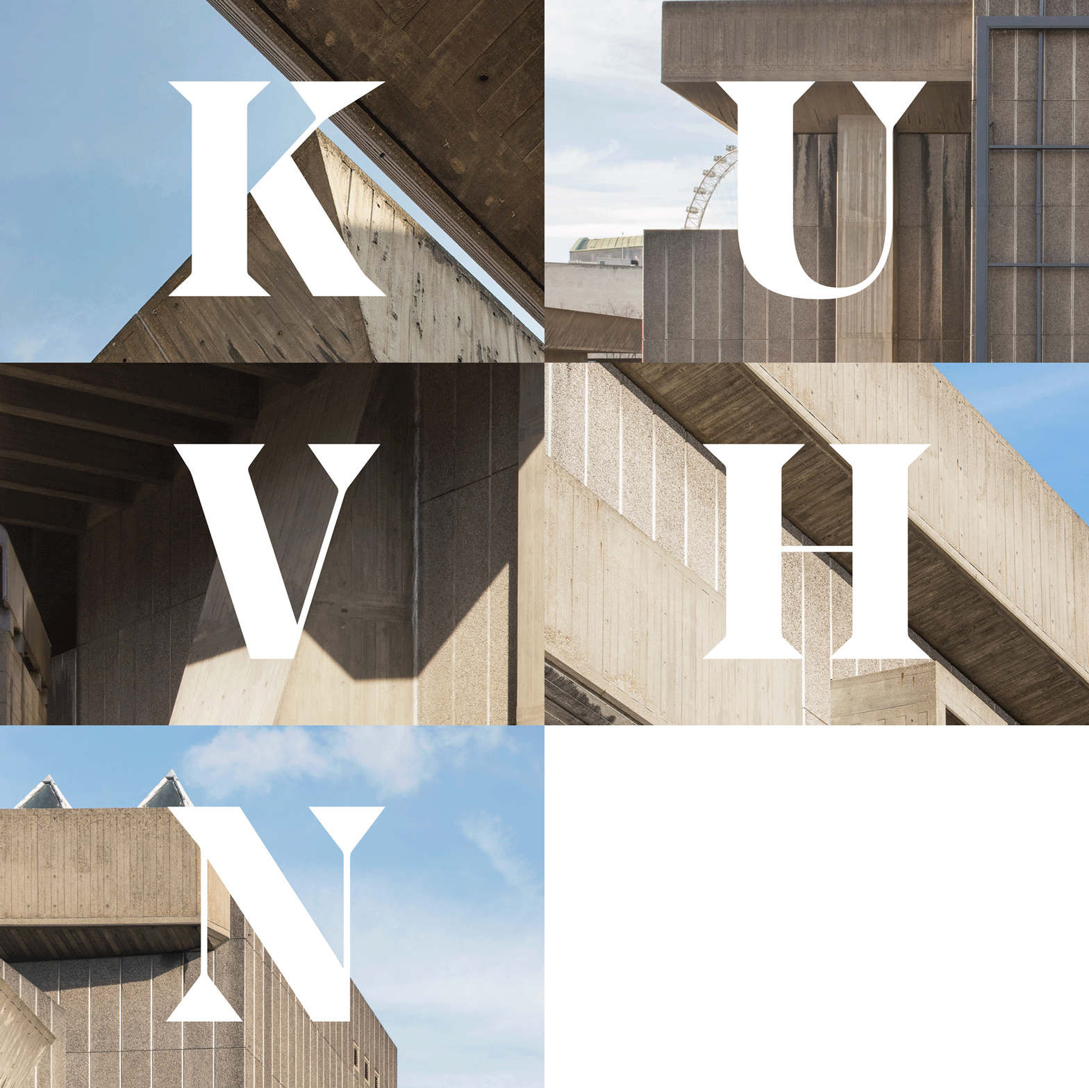
“The logotype design and serif font choice was inspired by Southbank Centre’s brutalist architecture and the original Festival of Britain identity. This visual language reference runs throughout the identity applications, typography and wayfinding elements” explained Charlie De Grussa, also of North.
The new branding will be rolled out gradually until the end of 2017 to reduce the wastage of existing materials and to reduce costs, reports International Arts Manager. “North will continue to work closely with Southbank Centre’s design team on a variety of materials leading up to the reopening of the Hayward gallery in January 2018, with the first major UK retrospective of the work of acclaimed German photographer Andreas Gursky.
Tags/ inspiration, logotypes, visual language, southbank centre, festival of britain, arts centre, new identity, north, brutalist architecture


