“Oslo” custom typeface for Nike is an ode to Nordic design
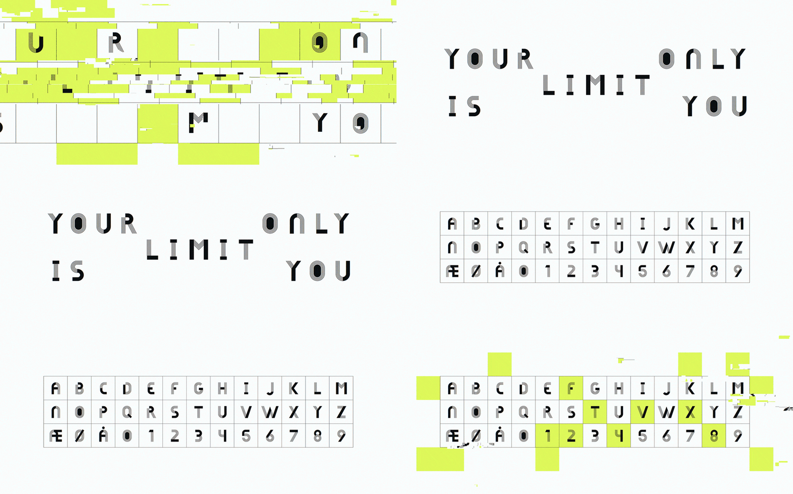
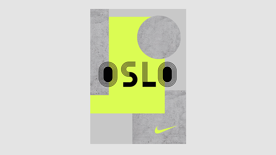
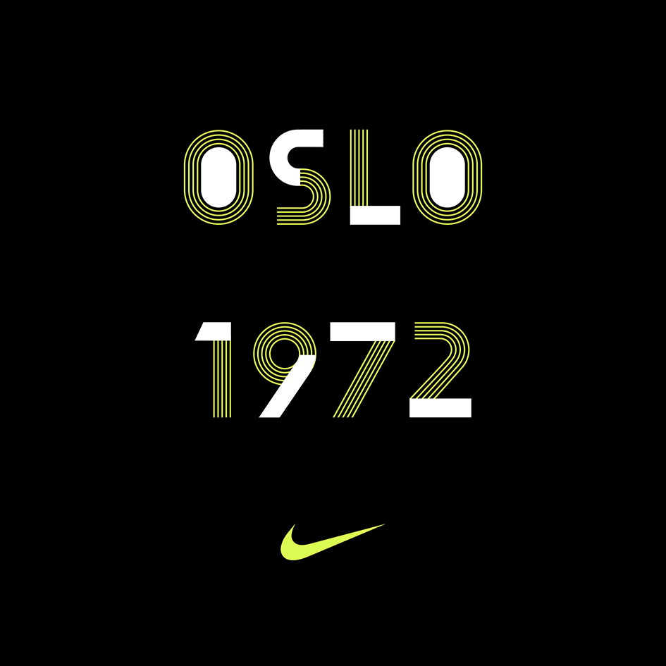
Can the identity of an entire city be captured in a font? The answer to the question comes in a variety of type with “Oslo”, the new custom typeface designed for Nike Concept Store in Oslo by Hans Christian Øren.
The founder of Oh Yeah Studio and Creative Director in Bekk shares some insights on his task. “Nike wanted to use a local artist to make a narrative thread through the store. The brief was to create a bespoke typeface for the word "Oslo" and the sentence "your only limit is you". Some of the guidelines were to use Futura Bold as a reference and the type needs to communicate Nike, sports, and Nordics in some subtle way that works with the boldness of the type. I also had to use objects or things that are iconic to the city Oslo, this could be a landmark or locations where sporting activities take place”.

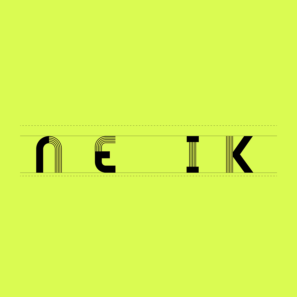
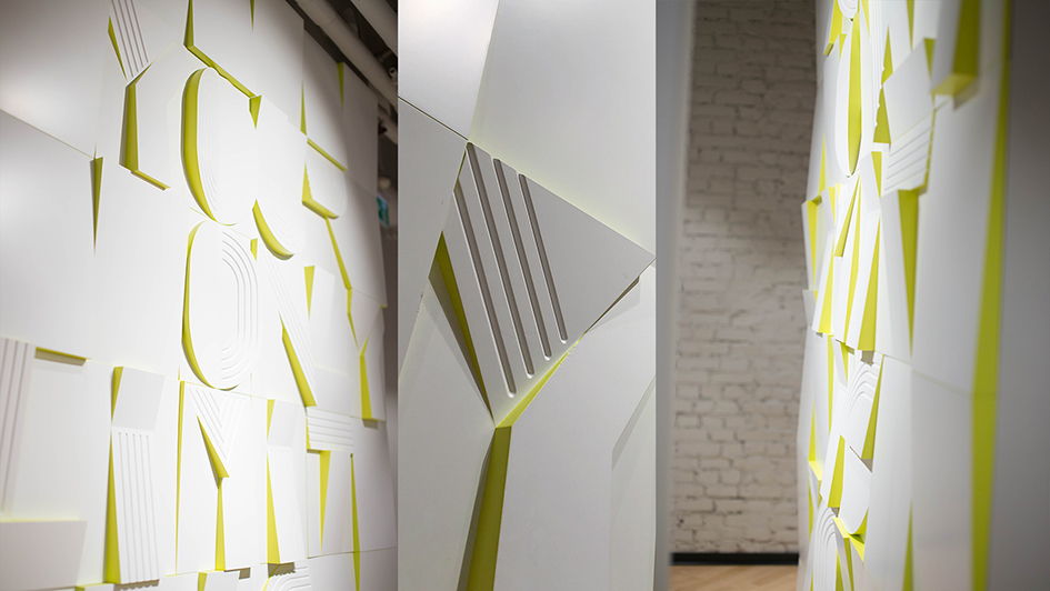
“The inspiration for the new style of Nike was found at the Bislett Stadium. After much scouting and thinking, there were the characteristic lines of the running track that became decisive for the creative expression. Bislett has a central place in Oslo's history as an international venue for sports and public festivals. The lines from the running track laid the foundation for the whole style” notes Christian. “Some of the most exciting with typography is that it can describe a company's values, the contents of a magazine, what the store sells or a product subconsciously, long before it has been possible to reflect on what the content is or what the store sells. The font is used on the background of a whole wall, a big installation behind the counter and graphics/shapes from the font around the store”.
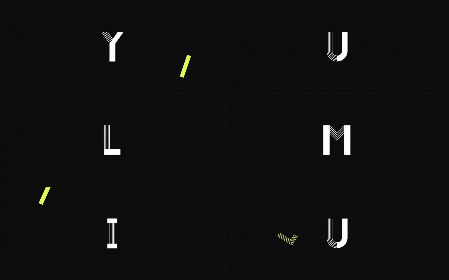
To accompany the font a movie guide us through this “abstract audio-visual journey through a race from start to finish”. By using design elements from the custom typeface the film, created by Babusjka motion studio, unfolds over a race from start to finish. “We are following someone who is giving it all to win. We get to see an outer struggle to achieve the highest possible intensity, energy and speed. At the same time we are dragged into an inner battle to maintain concentration, focus and peace. The race isn't happening on an ordinary track, but is occurring through line and elements being traced up, that in the end creates the word OSLO. As a small homage to Karsten Warholm's victory at the 400m hurdle in the 2017 World Championship, we set the final countdown to his winning time, which was 00:48:35. This made him the first male Norwegian athlete to win a running event at a world championship . With abstract animation and kick-ass sound design we get to see a presentation of the Oslo - font, and also take a deep dive at the design elements that constructs it” notes Babusjka.
Enjoy this Scandinavian ride here .


Tags/ inspiration, typeface, oslo, nike concept store, hans christian øren, oh yeah studio, futura bold, bislett stadium, babusjka studio, karsten warholm, world championship


