Museo Bodoniano's shapeshifting celebration of Giambattista Bodoni’s Manuale Tipografico should mesmerize you
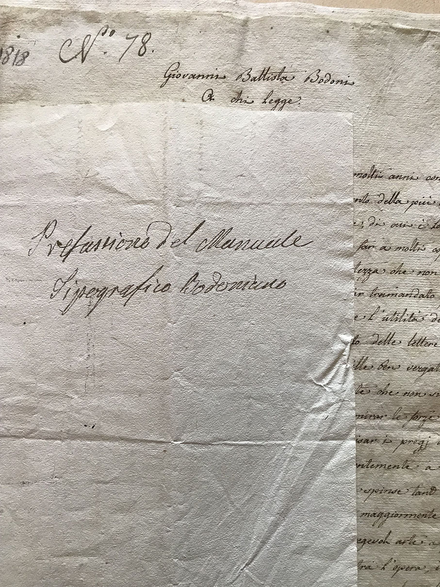
"I live cut off from the world, endeavouring to finish my Manuale tipografico which has kept me extremely busy for forty years, and be assured that you will receive a copy as long as it meets praiseworthy completion" wrote Giambattista Bodoni to Andrés Franco Castellanos in his letter, dated 29 December 1800.
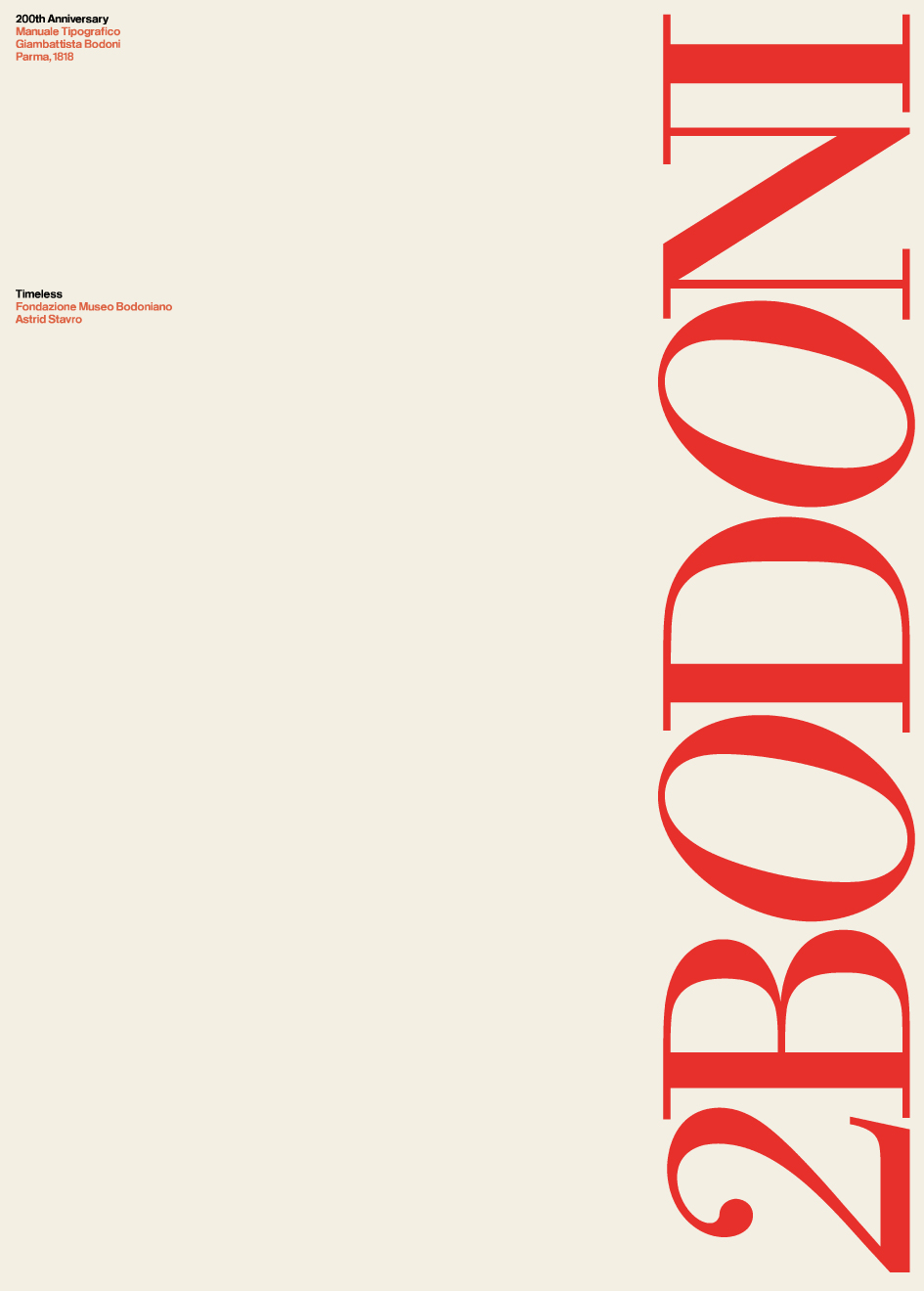
Two centuries later, his legacy is remembered in Museo Bodoniano's stunning Segni Esemplari exhibition.
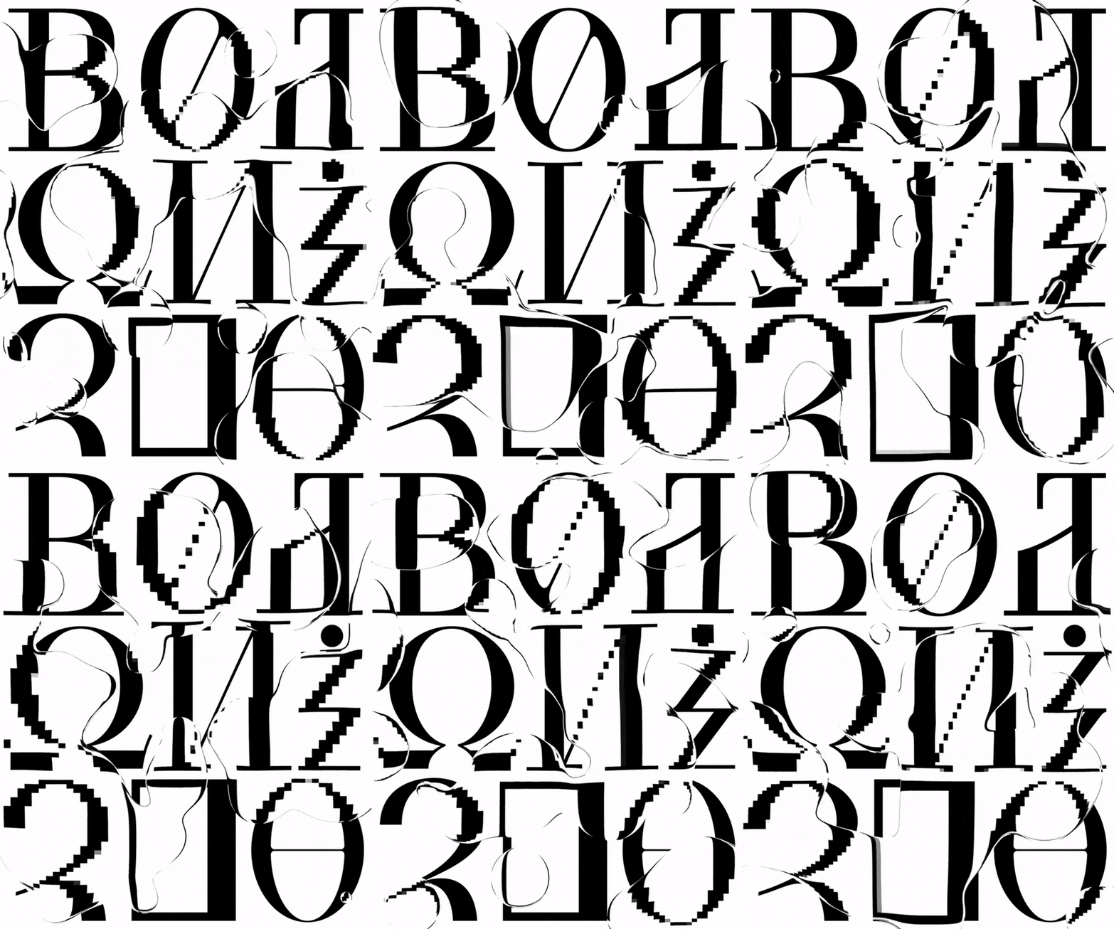
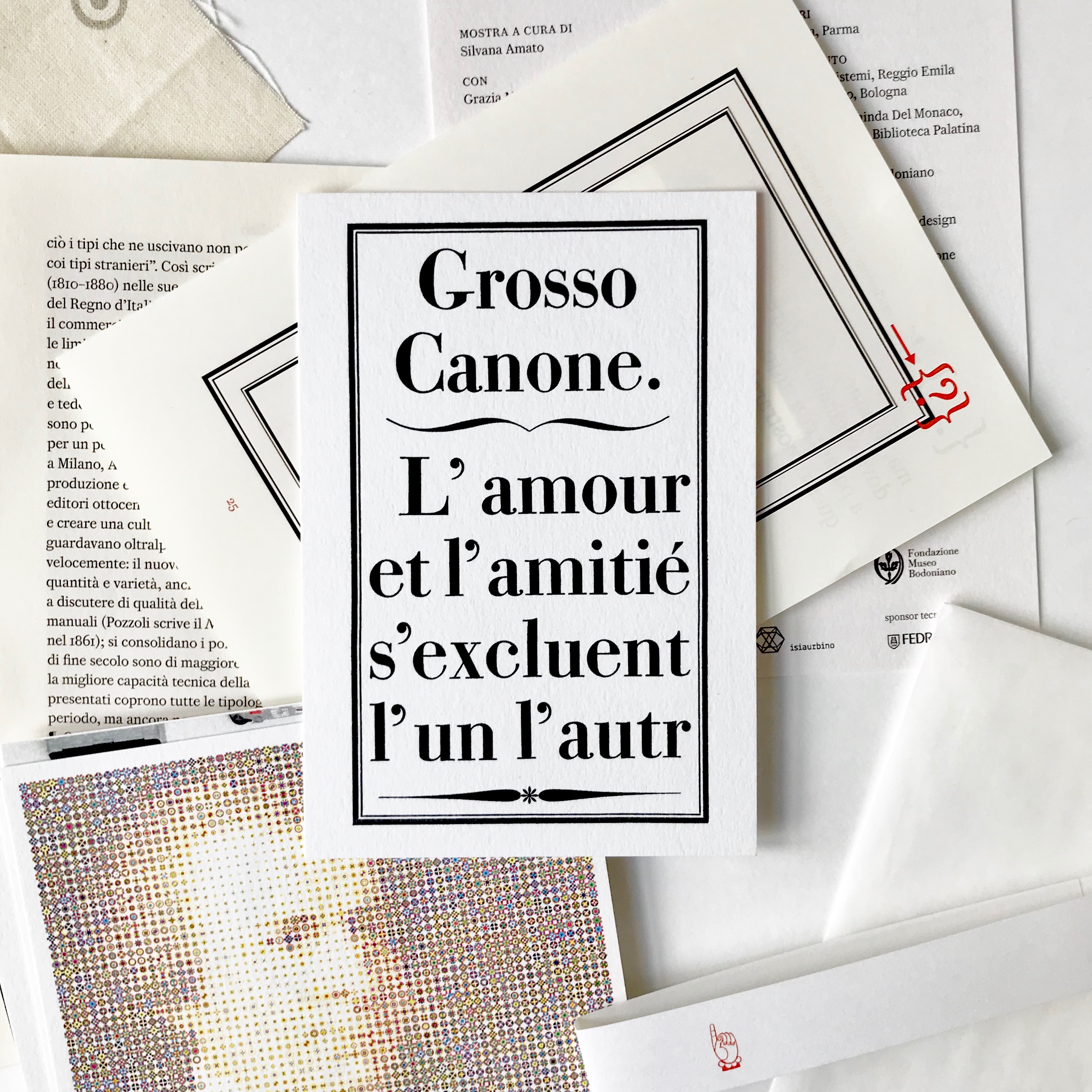
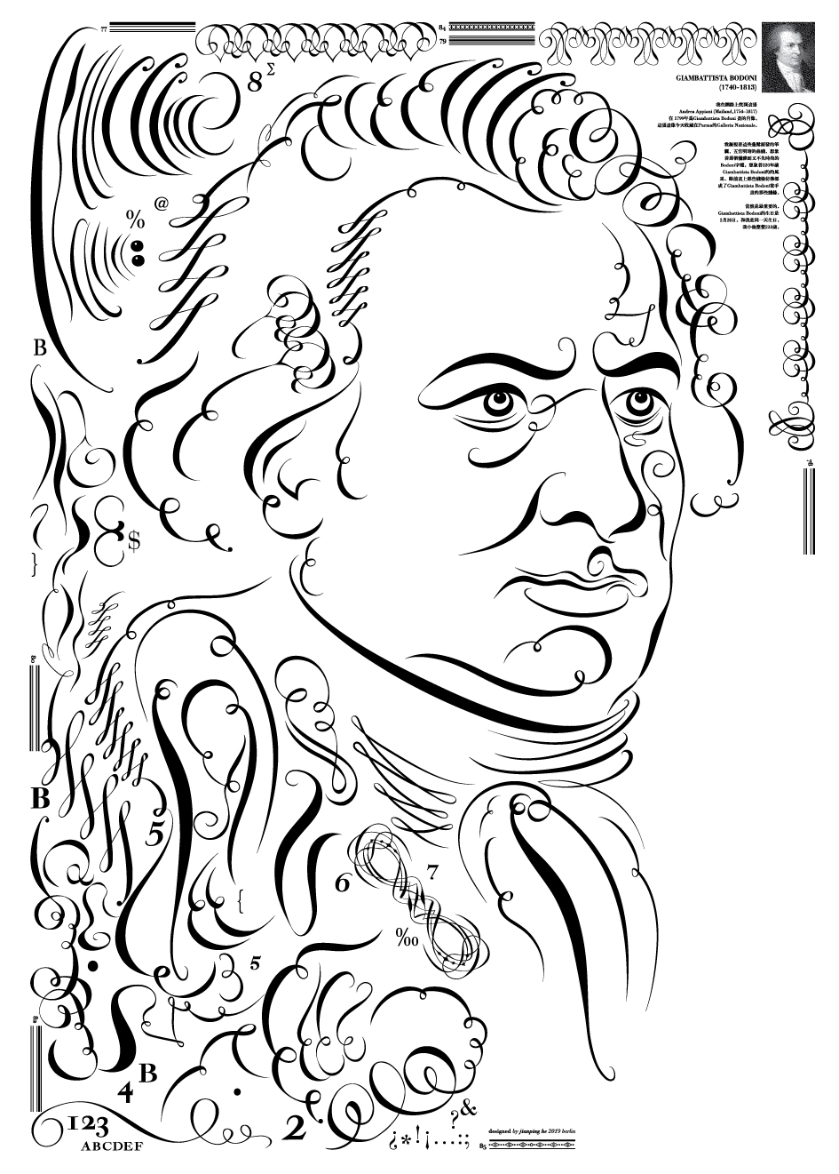
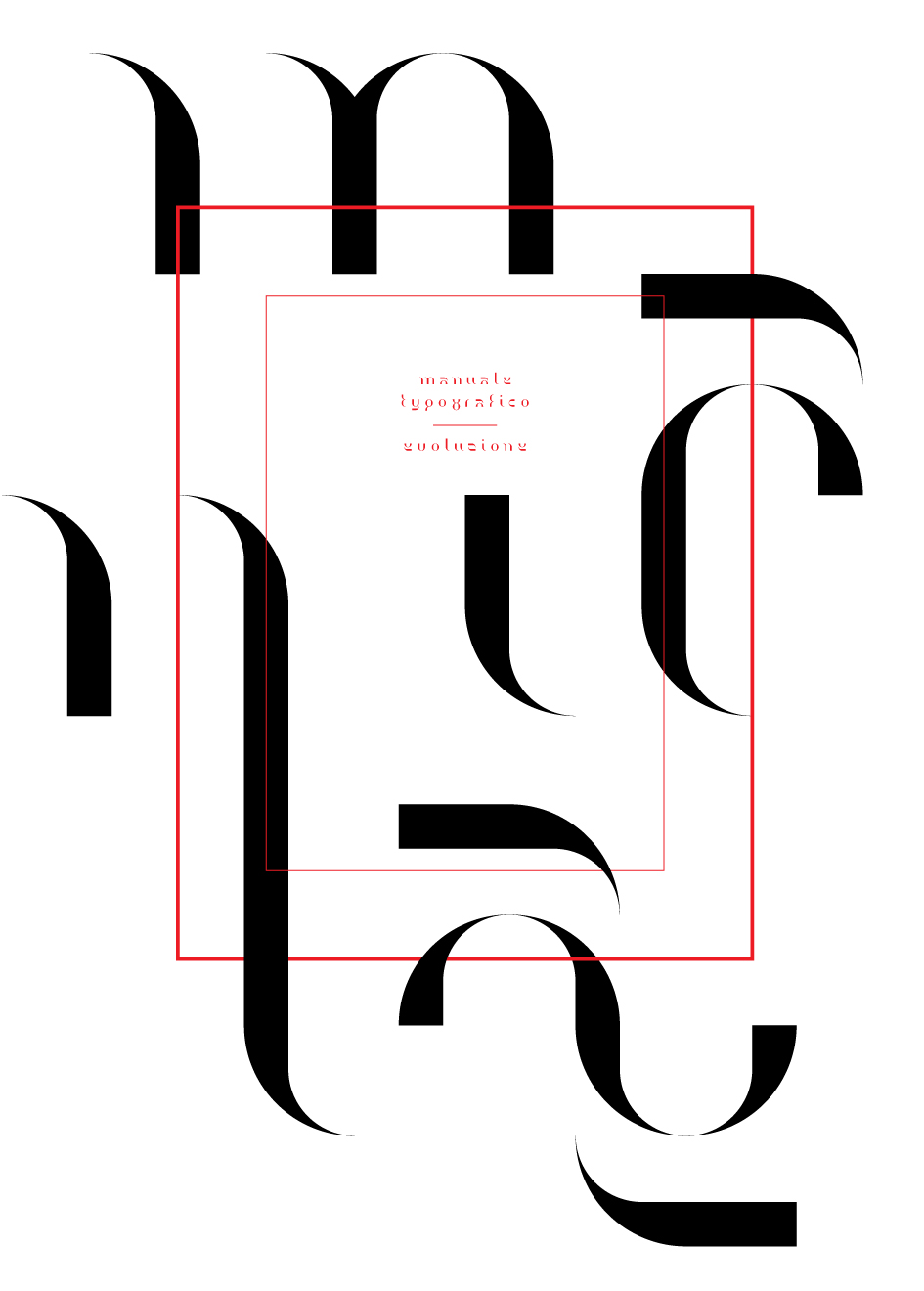
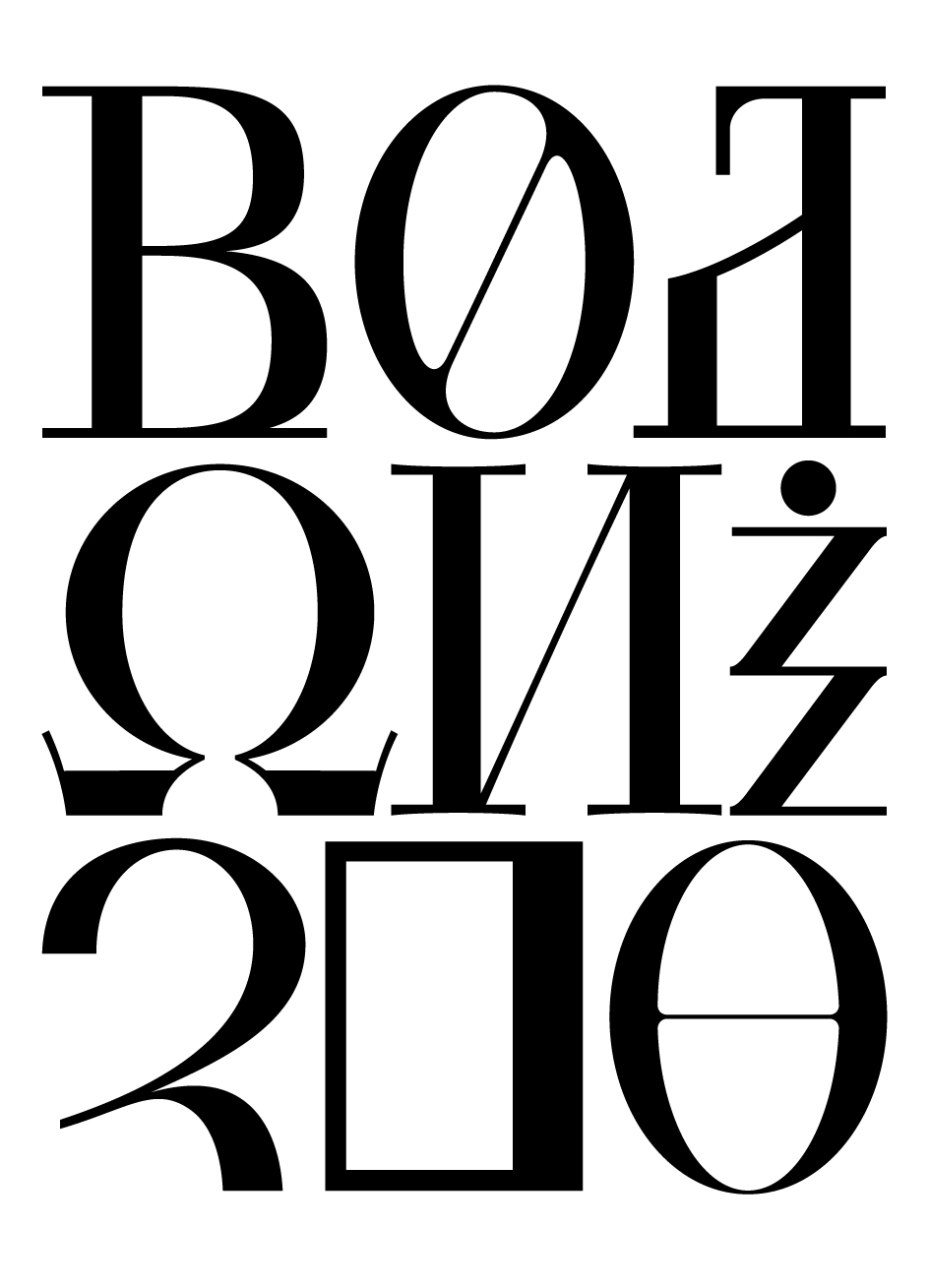
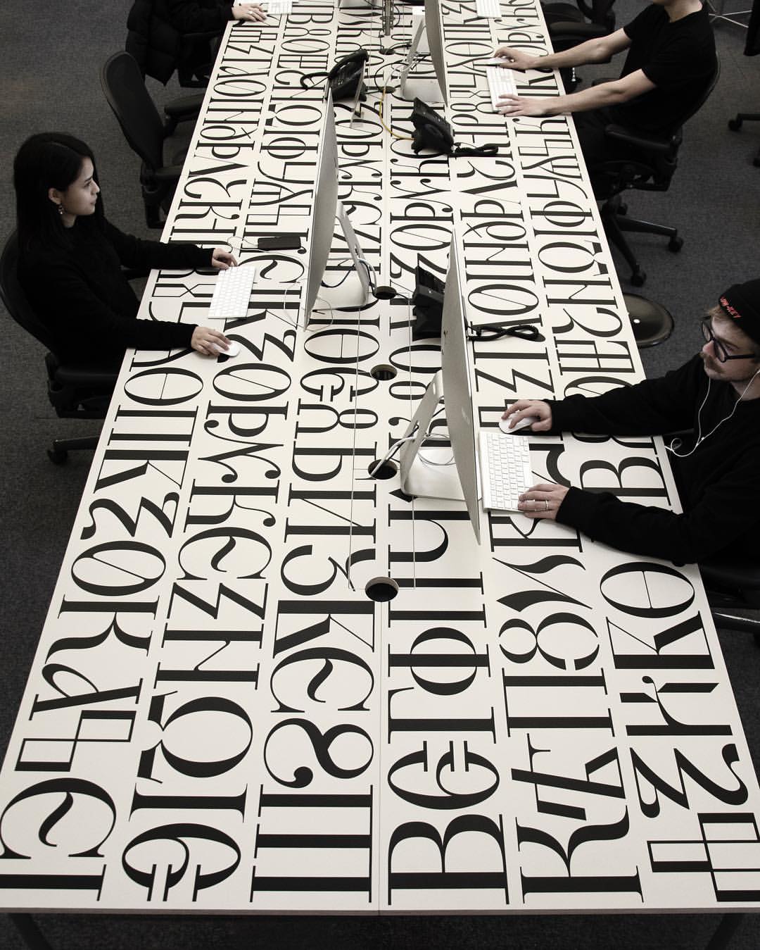
The exhibition, curated by Silvana Amato with Grazia Maria De Rubeis and Caterina Silva, is a must-see for the typophiles and the lovers of the visual supremacy alike. On top of the typographic treasures on display the Bodoni Museum invited the A-listers of the global graphic design and typographic community to contribute their own design manifestos in a typographic approach Bodoni would appreciate.
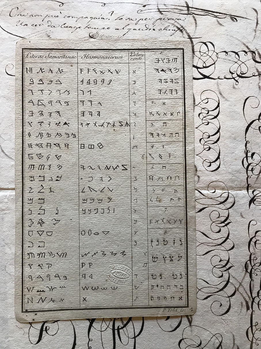
Exotic typefaces and exquisite typographic craftsmanship made by Patrick Thomas, Sascha Lobe, Matthew Carter and more are displayed alongside the museum's numerous exhibits.
"The year has just ended celebrating the bicentenary of the publication of Giambattista Bodoni’s Manuale tipografico; which has prompted the organisation of an exhibition and study day at the Palatina Library of Parma" writes Silvana Amato.
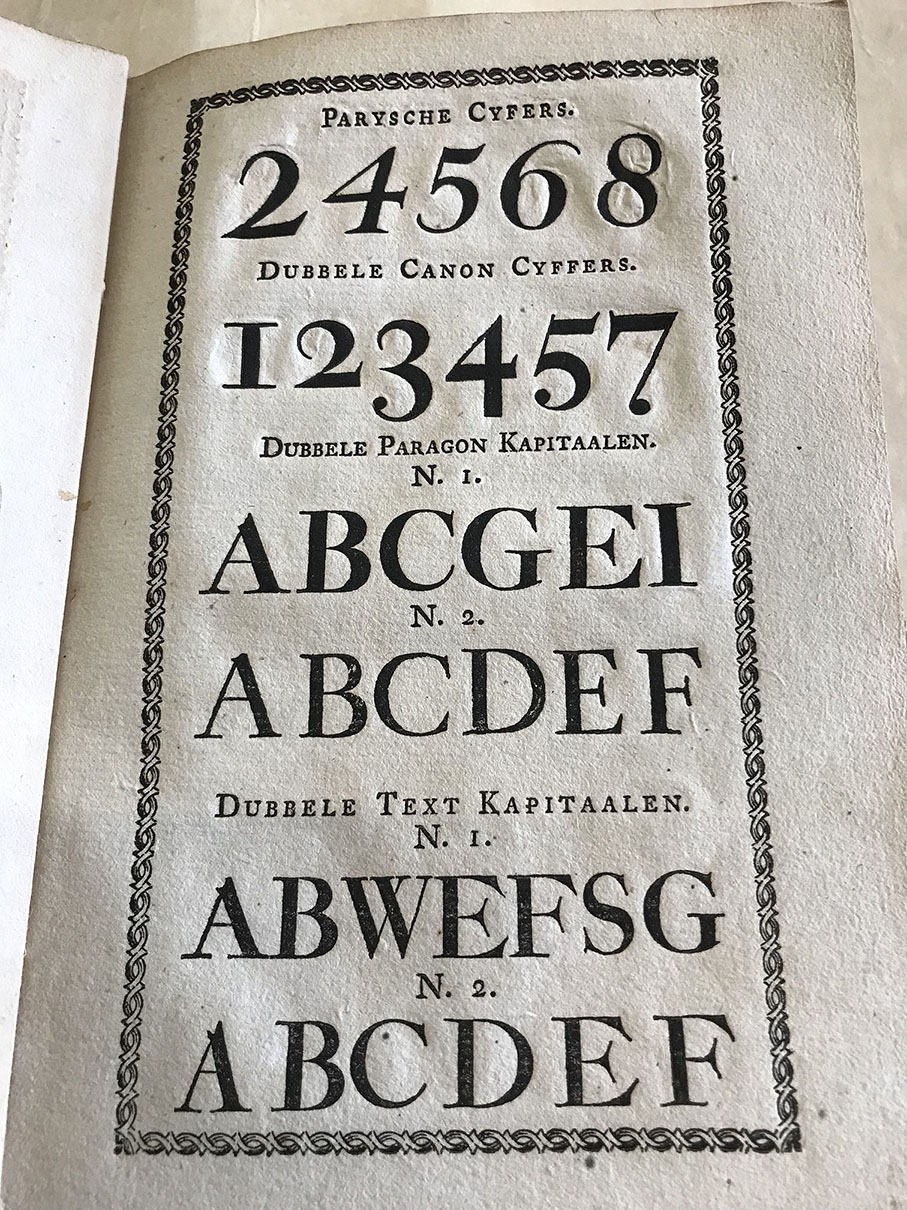
"As is generally known, the typographic manual was a project that he developed over a long period, later published posthumously by his widow. The manual contains a collection of 665 different alphabet letters and a series of about 1,300 decorations, as well as a preface in which Bodoni explains some of the criteria relating to his working methods.
There is an earlier collection of typefaces, printed by Bodoni in 1788, with no preface or explanatory text, which at the time was also entitled Manuale tipografico. The typographer from Parma had obviously borrowed the name that Pierre–Simon Fournier used for his small technical manual, the Manuel Typographique of 1764, but in reality the two volumes, although sharing the same title had different functions.
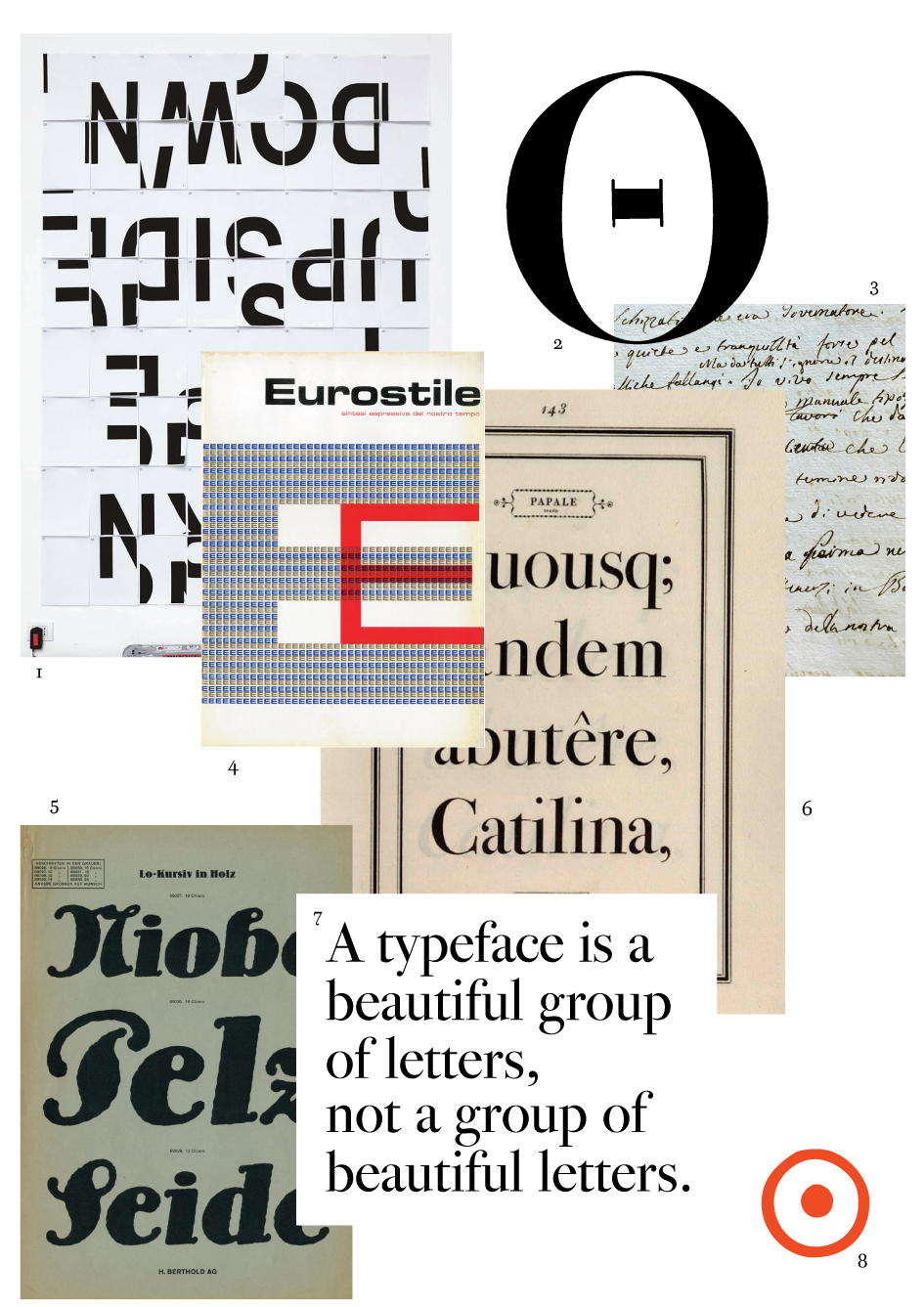
Fournier’s was a true manual in the sense that it was a didactic tool that described the essential elements of a complex activity, from punch cutting to creating matrices and the making of moveable characters. Whereas Bodoni’s manual was a sample book of typefaces designed by him, thus closer to what would generally be defined in the printing world of the time as a specimen book, printed by typographers in order to show all the glyphs available from their letter foundry.
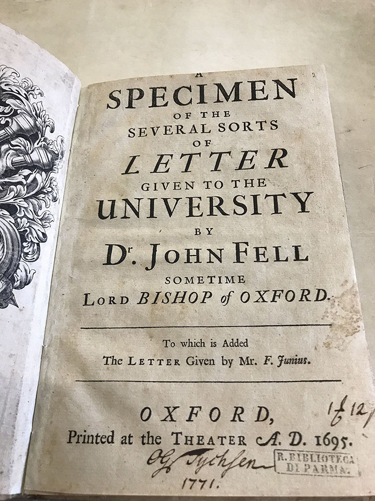
Illustrious precedents of this sort of publication can be found in the Index sive specimen characterum printed in Antwerp in 1567 by Plantin, the Specimen characterum printed in Frankfurt in 1592 and later the letter–founder Caslon’s sheet of characters printed in London around 1725.
In fact, it is clear that the 1818 Manuale tipografico, despite its name, is a hybrid that belongs neither to the field of manuals, nor to that of typeface sample books with a commercial aim. Rather it is a proud summary of his activity that Bodoni wished to conserve in time, setting it down in black and white.
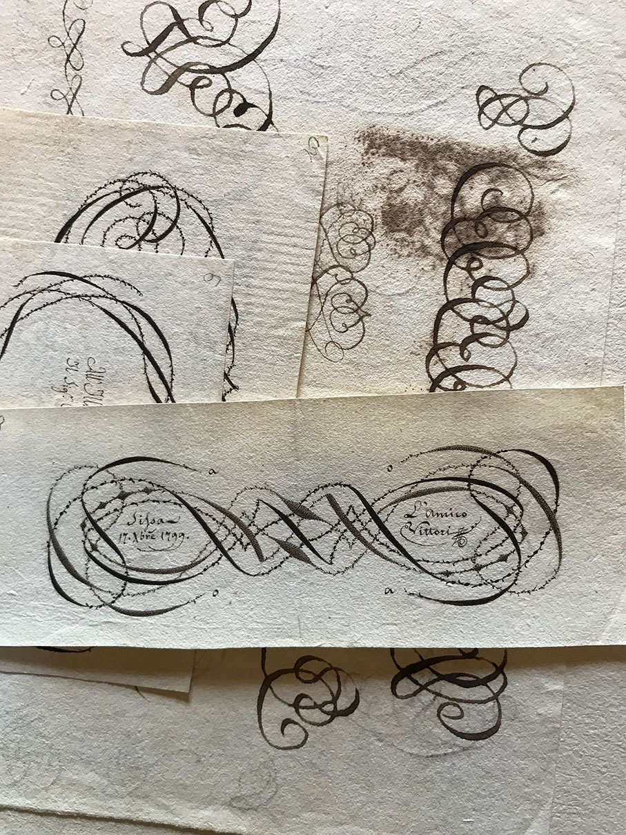
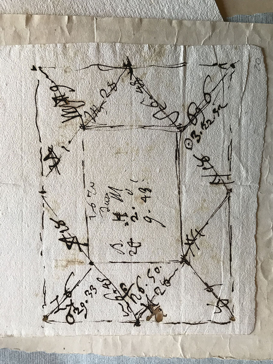
Given the above, we are taking this opportunity to exhibit alongside Bodoni’s volumes, his punches and matrices, handwritten works and archival documents, some manuals and typeface books from other printer (preceding and following 1818), with the aim of bringing these two distinct and little–known types of books to a less specialised public. What the books have in common is the object of the narrative, which is to say alphabetic lettering in its typographic form; writing that, as it spread, has had such a vast effect (in good ways and bad) on western culture over the last five centuries.
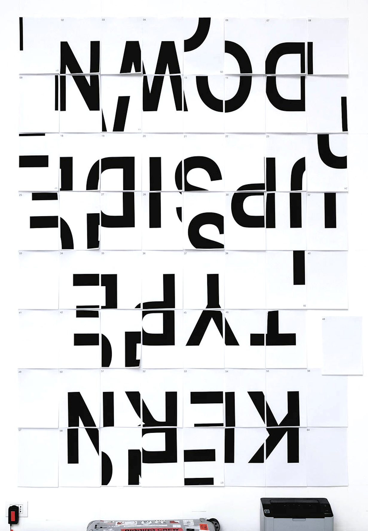
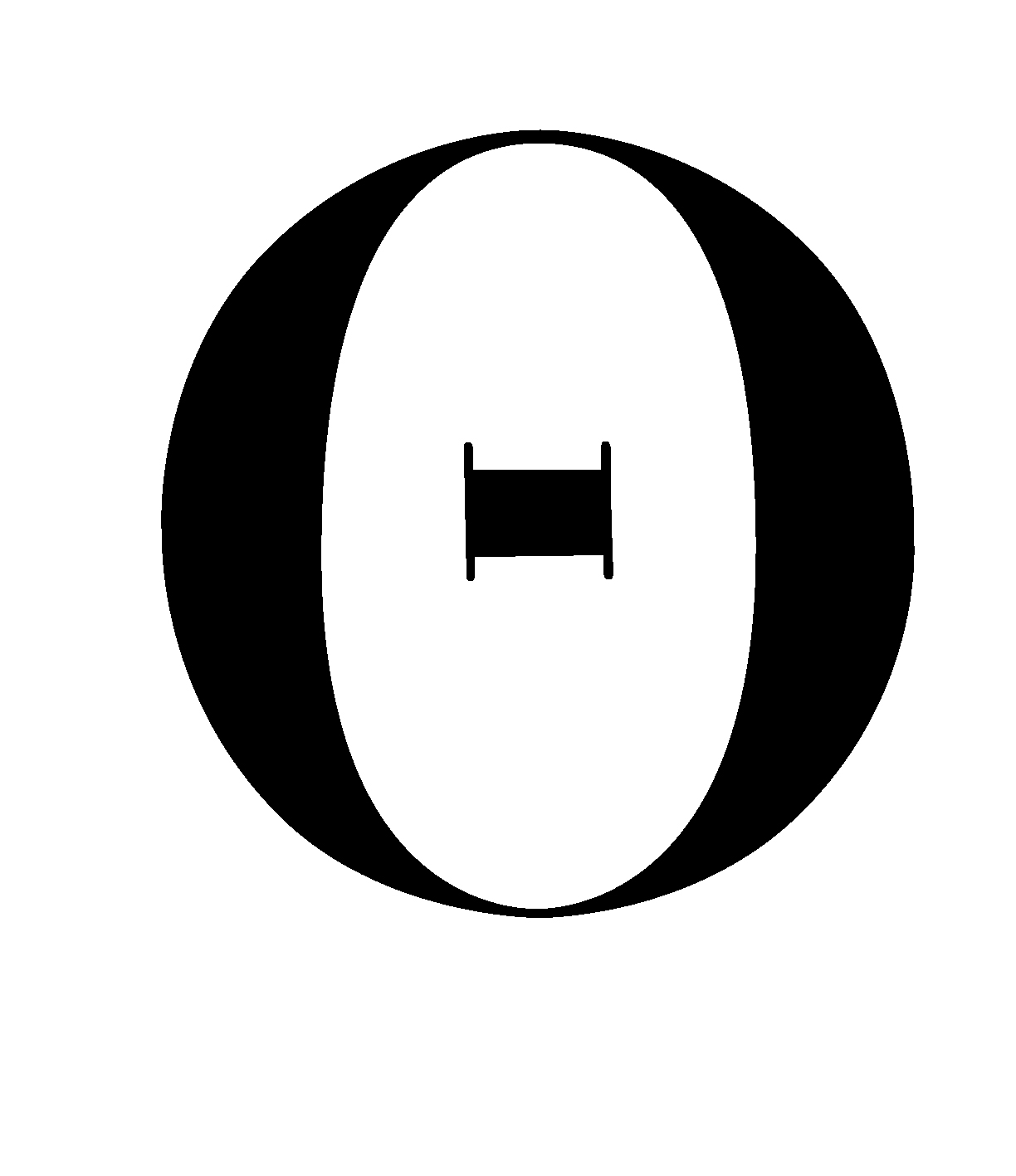
At the same time, a section has been dedicated to printing today. Graphic designers from around the world have been invited to contribute to a small typographical poster or design manifesto, each in the alphabet of their own language of origin but in line with Bodoni’s interest for exotic typefaces. The aim of this section of the exhibition is to set up visual recognition of concepts based on the potential of writing expressed by the graphic designers, who are known to have an outstanding typographic approach.
If the poster can also be defined a programmatic document that lays out rules and inspirational principles, in this case, it may be said that the object in question and its shape coincide, as do the designer’s creative principles and typeface.
Hence, Exemplary Signs stand as visual testimonies that allow us to trace the unfolding of our own history through the evolution of the shape of lettering, and to take the occasion to encourage new critical discussions on the theme of writing as a tool for knowledge."
The Museo Bodoniano is the oldest printing museum in Italy. Opened in 1963, coinciding with the 150th anniversary of the death of Giambattista Bodoni, the Piedmontese typographer that made Parma the world capital of the press starting from the second half of the eighteenth century, this institution reminds to the graphic design community the importance of this legend of the letterform.
Segni Esemplari (Exemplary Signs) is on show at Palazzo della Pilotta near Galleria Petitot in the Biblioteca Palatina till the 18th of May 2019. Discover the beauty of it all here.
All images via Museo Bodoniano.
Tags/ origins, exhibition, manual, matthew carter, anniversary, museum, italy, sascha lobe, giambattista bodoni, museo bodoniano, manuale tipografico, pierre–simon fournier, silvana amato


.jpg)


