MuirMcNeil on their impressive new variable data publication for London College of Music Examinations
Commissioned by London College of Music Examinations, MuirMcNeil, the graphic design studio founded in 2010 by Paul McNeil and Hamish Muir delivered what it was asked for and so much more.
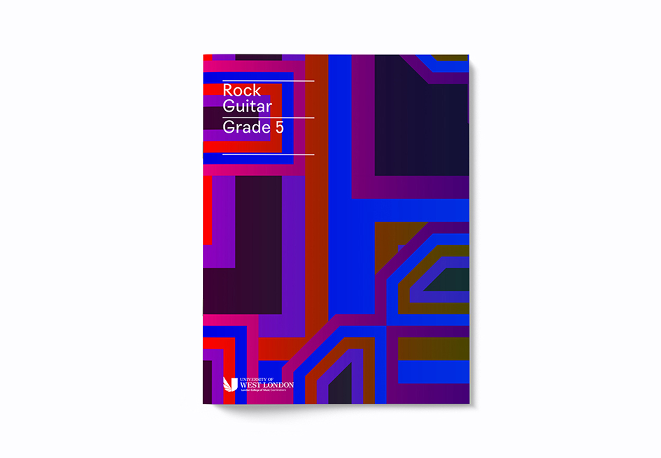
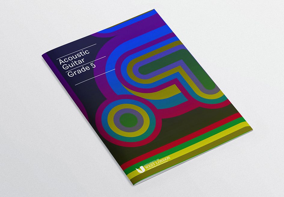
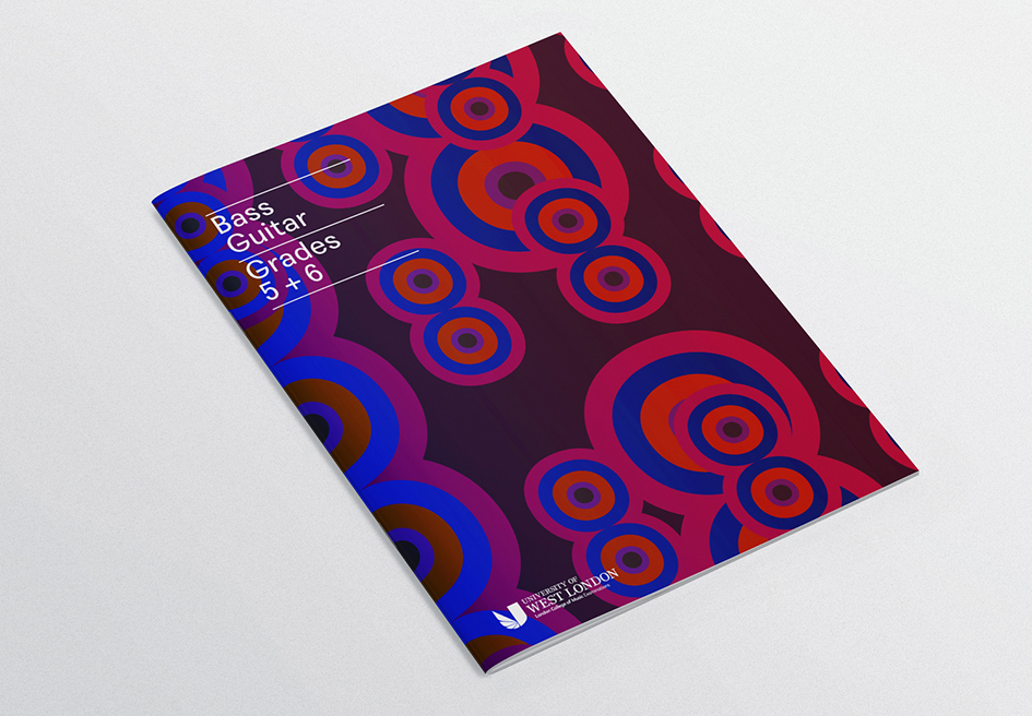
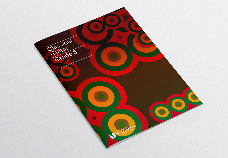
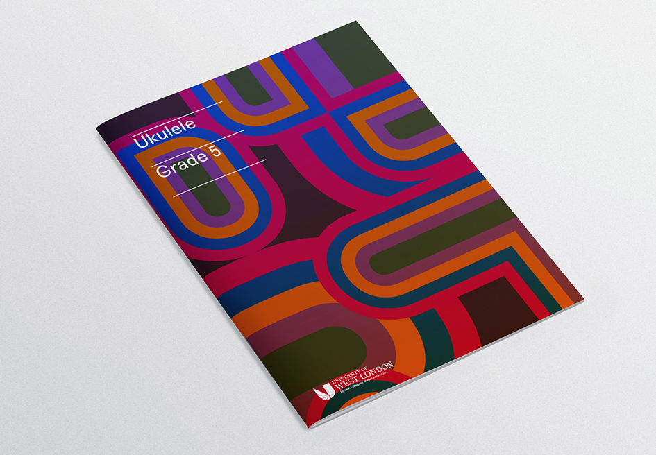
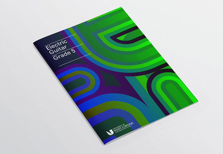
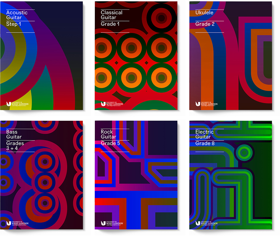
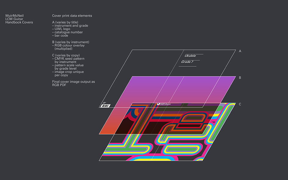
MuirMcNeil devised a variable data system to generate a unique cover for each copy of the fifty-four titles covering the six instruments in the 2019 LCME Guitar Handbook series and the final result is a cover design for each of the 68,000 publications in the series that is distinctive, identifiable and completely unique.
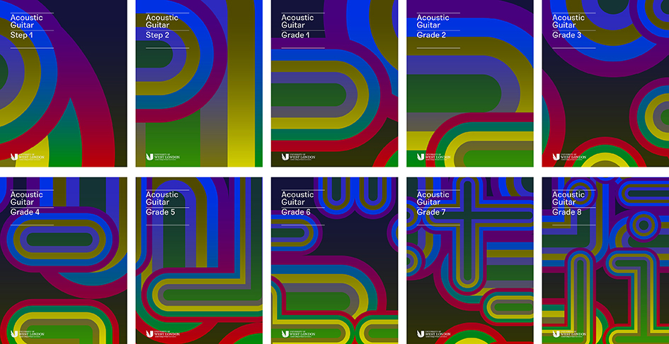
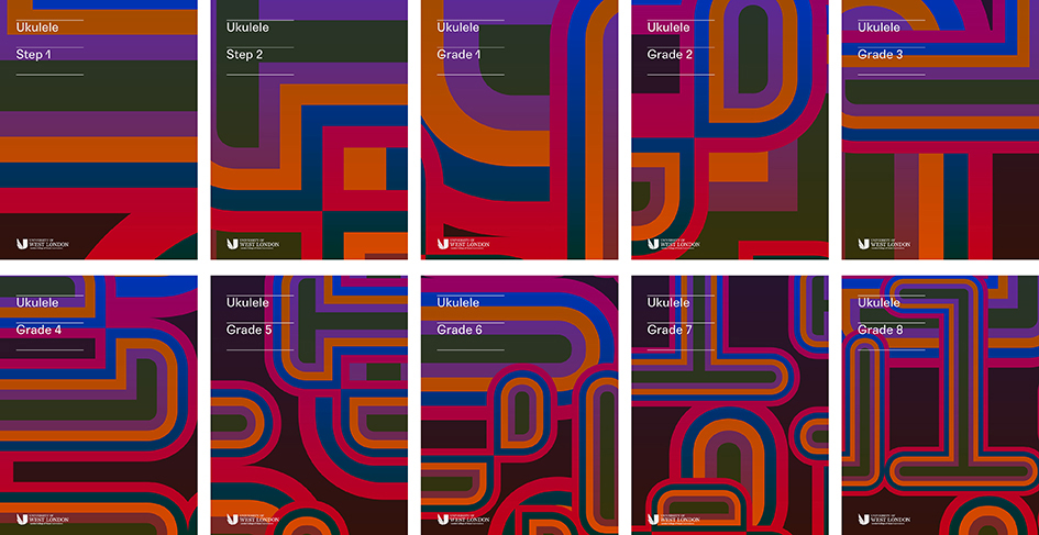
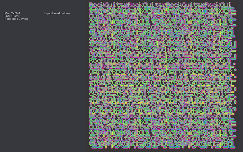
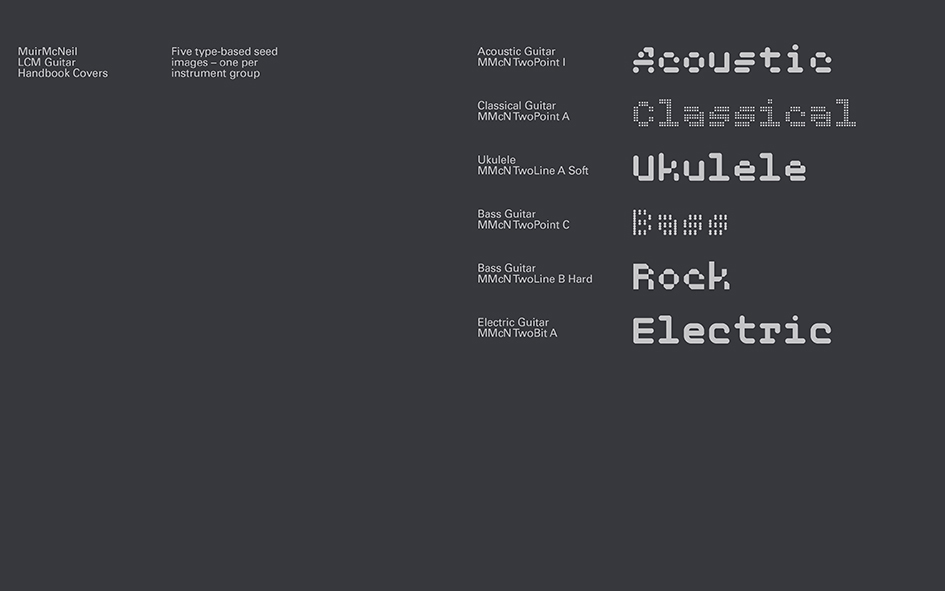
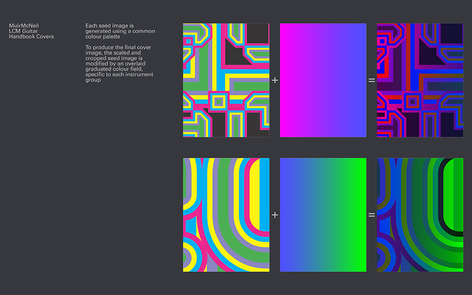
"The names of the instruments were typeset using interlocking fonts from MMcN TwoPoint, TwoPlus and TwoBit type systems to create a series of six multi-layered visual fields or ‘seed’ compositions. Sections of these compositions were then zoomed, cropped, colour adjusted and printed on an HP Indigo B2 press. To represent each skill level for the six instruments in the series, the seed compositions were scaled in calibrated increments, with early grades zooming deep into the artwork and higher grades revealing more of the textual basis of each composition. As a result, bold, abstract, geometric designs developed progressively in their complexity and detail through each instrument series" note the creatives who are always pushing their craft forward.
Typeroom has some more insights on this symphony of technology and graphic design with more variations than one could handle. Aren't you inspired yet?
TR: How long did it take to finish the project?
The project took about a year to come to fruition although the actual design and production stages were probably about a month. After publication of the Ukulele Handbooks at the end of January 2019, titles for the other five instruments will be published over the next few months.
TR: What is a variable data system?
Variable data printing allows each impression in a print run to be unique. This can be the design itself, as well as other information (such as bar codes, catalogue numbers, edition numbering etc). In the case of printing via HP Indigo, the image side of things is usually handled via ‘Mosaic’, a software tool developed by HP. Essentially Mosaic works with ‘seed’ patterns which can be scaled, cropped, rotated, distorted. Selective colour replacement is also possible.
We soon discovered during testing of the Eye magazine cover that more coherent results were obtained when the variable limits were strictly constrained. Although both the Eye and LCM Guitar covers each use multiple seed files, in both cases we limited variations to a set of specified enlargement factors. For Eye, specified scales were employed across the entire 8000 final covers. For LCM, each grade level uses one enlargement of the seed image across all titles at that level; the zoom factor decreases as the grade levels get higher.
TR: In what ways has technology changed the way you approach graphic design? Which would you name as the most prominent inspiration in your portfolio?
MuirMcNeil was founded to explore systematic, algorithmic and conditional approaches to design processes – both in the typefaces we develop and in their application in self-initiated work and in commissions for clients. We are not in the programming business – we ‘code’ organically, using simple number systems, progressions, and the harmonic frequencies of fixed integer series.
Working with technologies has of course increased the territory in which we can explore such an approach – the Indigo system being a good case in point. But our thinking is not dependent on technology per se. For example our identity for TypeCon 2016 builds a flexible identity from a set of rules with defined parameters for colour, scale, use of type etc.
TR: How is sound similar to graphic design? How is it different?
Mmmh. That old chestnut… In our view, there is no similarity. We certainly never try and make direct analogies between the two. The LCM project was not about visualising sound, but more about devising a visual system that could provide both differentiation and commonalities in appropriately balanced ways across the entire project. Having said that, the six instruments in the guitar series were considered in our choice of typeface for each set of covers.
Two Point/Plus/Bit are all geometric monospaced typeface systems with contour-mapped weight modulation. The typefaces are all built on a common core set of letterforms which explore form and stroke modulation in a number of ways. As a result each typeface within the range has its own distinct characteristics – some of which suggested themselves to be more appropriate for certain instruments.
For example Bass Guitar uses a version of TwoPoint which works with a reduced number of active grid points compared to the version used for Classical Guitar. This is only a nod to the inherent properties of each instrument and is intended to be neither an illustration of music, nor the instrument which makes it.
TR: What was the most difficult aspect of it in typographic related manners?
The integration of the client’s corporate typeface for the cover titling. We would have preferred to have used one of ours!
TR: Which qualities do you look in a font?
Systematic variation, geometric harmony, appropriateness to design contexts, extensibility, honesty.
TR: Your project is built on ideas and methods you developed to produce 8,000 unique covers for Eye #94 in 2017. Please remind us of that project.
We were commissioned by John Walters (editor) and Simon Esterson (art-director) to develop a system for producing 8000 unique covers for Eye #94.

This issue of the magazine was a type special which includes a section, ‘Mightier than the pen: systems of type’, devoted to parametric, constructed and geometric fonts.
One of the articles in this section was ‘Pleasure in the process' a feature on MuirMcNeil written by John Walters. It was Simon’s idea to tie one of the themes of issue #94 directly to the cover – Eye had been discussing a variable data option for covers with their printers for some time prior to our commission.
TR: What are you working on now?
A couple of long-term publishing projects but we can’t divulge for whom, or what they are about, although type features heavily in both. A number of smaller scale self-initiated projects are bubbling away as usual. Later in the year, we’ll be generating a series of moving image pieces for an invited submission to a public space event in the Netherlands.
TR: If your studio was an instrument which one would it be and why?
A tuba. It’s low-pitch. Perfectly sums up two slow-moving mammals.
TR: Which music related typographic project you admire the most?
Ursonate by Kurt Schwitters (1932). Blonk’s version with typography by Golan Levin is good, the original, better.
TR: Please share you ideal music to accompany your project.
Jor by Ravi Shankar (not the guitar, but stringed all the same), Twin Bleebs by PanSonic, Amber by Autechre.
Explore more here
Words by Loukas Karnis @https://www.instagram.com/whenitsoverwakemeup


Tags/ faces, hamish muir, paul mcneil, muirmcneil, mmcn twopoint, cover design, london college of music examinations, variable data system, 2019 lcme guitar handbook, interlocking fonts, twoplus, twobit


