Heller and D’Onofrio on the eclectic Modernists who defined an era
In their beautifully curated book two aficionados of typography, Steven Heller and Greg D'Onofrio, are paying tribute to the men and women who invented and shaped Mid-Century Modern graphic design in America.
In The Moderns, the acclaimed editors and scholars are introducing (or re-introducing if that’s the case) to us almost sixty designers whose magazine, book, and record covers; advertisements and package designs; posters; and other projects created the new world of postwar modernity.
The book is made up of generously illustrated profiles, many based on interviews, of all the iconic graphic designers who shaped our visual language as we know it. “Some were émigrés from Europe; others were homegrown—all were intoxicated by elemental typography, primary colors, photography, and geometric or biomorphic forms. Some are well-known, others are honored in this volume for the first time, and together they comprised a movement that changed our world”. We catch up with the editors of the book for a chat on the book, the influential refugees of the modernist movement and the homegrown Americans who worked on America’s brilliantly crafted modernist aspects of type.
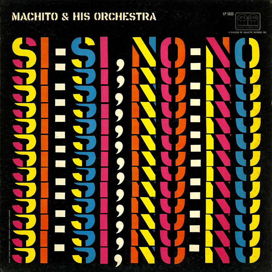
© Eliza and Rachel Brownjohn
Typeroom: How important was the graphic design scene in the shaping of American culture as we know it?
Heller: America is a nation of images but graphic design is something of a mystery. It was long seen but not heard. So, while everything is graphically designed - from packages to logos to record covers - graphic design as a discipline did not have an overt impact. The results of graphic design, however, had an incredible impact.
D'Onofrio: From a designer’s point of view or even the clients … The midcentury modern sensibilities of some American cities (New York City, Chicago, and Los Angeles) were a breeding ground for “good” design. Open-minded companies and clients attracted designers with new tastes, fresh thinking, and the freedom to express and experiment with the “new" growing economy. This must have been an enthusiastic period ripe with new innovations and optimism.
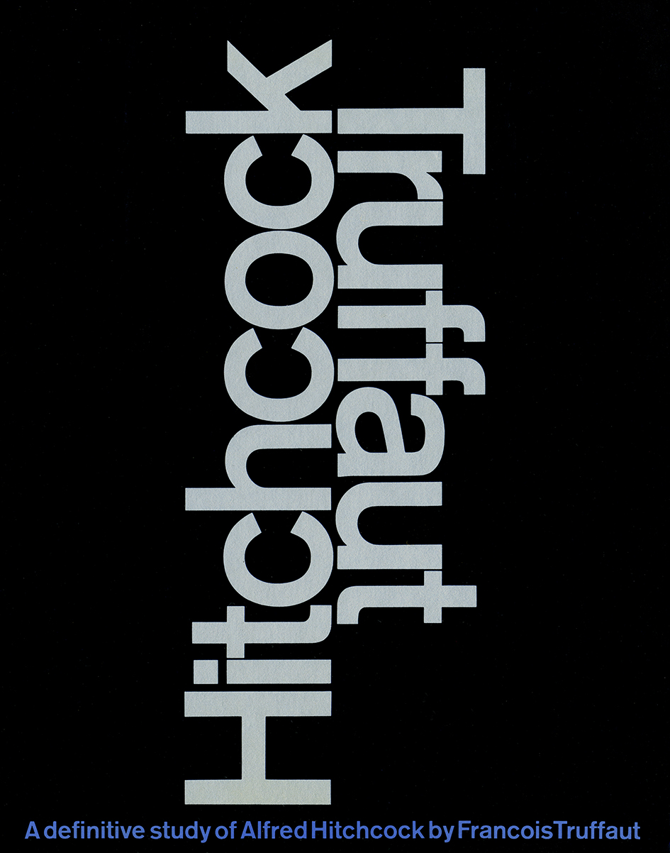
Courtesy of Mary Condon
Τyperoom: How long have you been working on this project?
Heller: A bit over a year and a half. But it has been percolating for longer.
D'Onofrio: Ι’ve been thinking about (and collecting) this period of design for approx. 10 years; it’s been approx. 2 years since we held our first meeting about the book.
Τyperoom: What was the most difficult aspect in the process?
Heller: Getting permissions to use a fair percentage of the material. This is a huge problem these days. For material as ephemeral as graphic design, it is incredible how many people and institutions make it difficult to chronicle its history.
D'Onofrio: In addition to the frustrating permissions process I found it difficult to determine the final list of designers to be included. And once we decided, choosing the work for each designer was tough. Telling a visual story about American modern meant choosing the most appropriate images. Fortunately, we discovered (and rediscovered) so much fantastic work. The Moderns includes 786 illustrations.
Τyperoom: Which elements defined the visual aesthetics of postwar modernity?
Heller: Geometric form, overlapping primary color, collage imagery, minimalist typography, white space, abstract art, these are among the defining traits.
D'Onofrio: Exactly what Steve said … yet, in addition to the form American modernism was bound by function, clarity, and simplicity developed with the new tools and advancements of the period – all resulting in a uniquely distinctive, experimental graphic language. American modernism was friendly and playful and had less to do with its’ political beginnings.
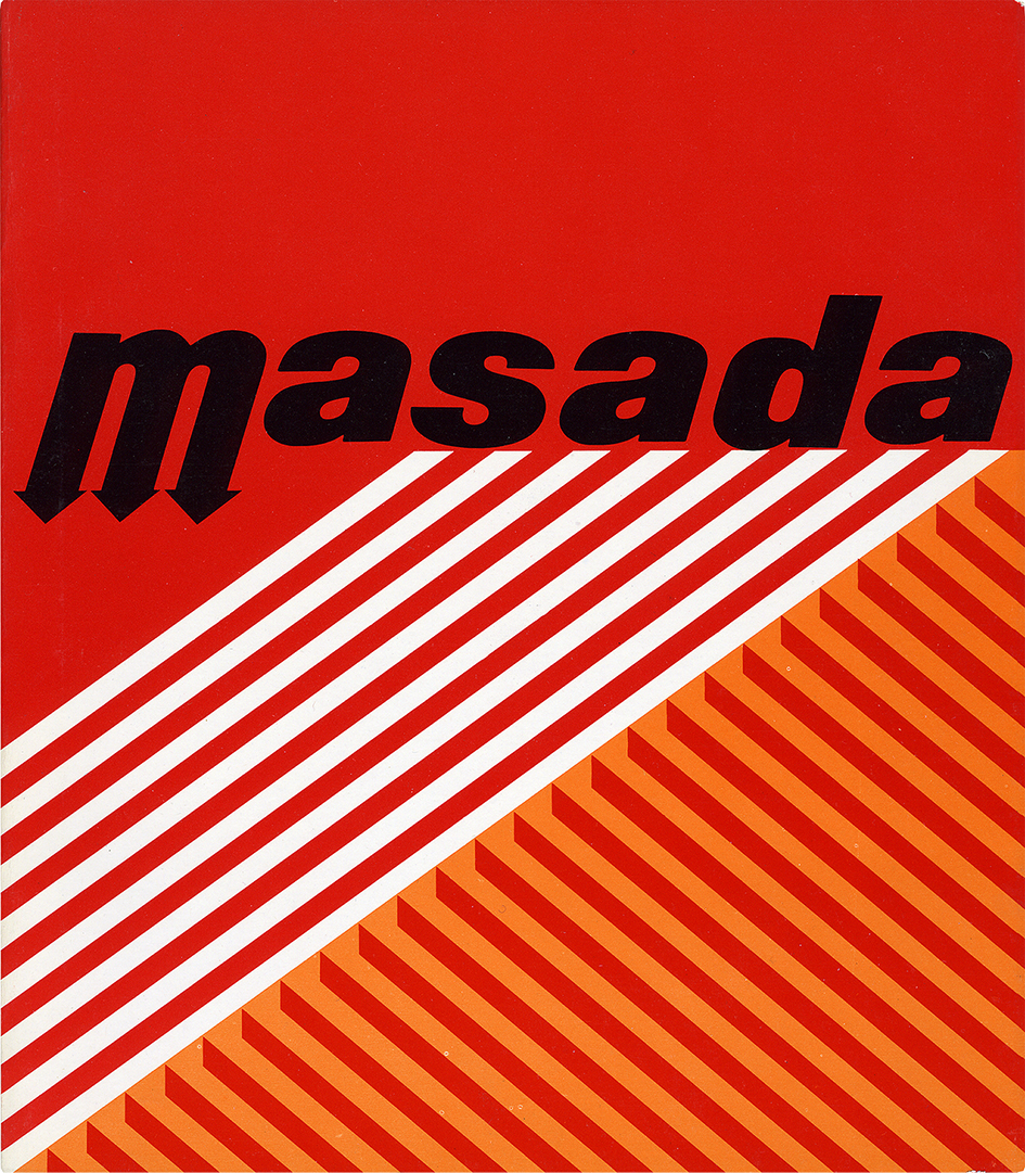
Permission of Elaine Lustig Cohen
Typeroom: Which do you consider the most underrated figure of the modernist movement?
Heller: This depends on who is doing the rating. There are many women in our book who did not get the same professional attention as the men. But in terms of cultural history its easier to say who received the most attention than who did not. The designers in this book who do not have monographs, like Roy Kuhlman, Burton Kramer, etc. you could say they deserved better.
D'Onofrio: This is difficult but if i had to choose a few: emigre Walter Allner, a Bauhaus-trained graphic designer; homegrown Matthew Leibowitz who nurtured his own style, influenced by European Modernism and American Eclecticism and pioneering graphic designer, artist, and archivist, Elaine Lustig Cohen — all three contributed significantly to the Modern landscape and would benefit by further research. also, George Lois who is known for his advertising and editorial covers and Herb Lubalin for his typography are both well-known, yet neither is often considered a Modernist; but they should be.
Τyperoom: If you were one of the many graphic designers that shaped Midcentury Modern graphic design in the US, which one would you be and why?
Heller: That’s a difficult question because the reasons are different. I wish I had the wit of Paul Rand, the humanity of Leo Lionni, the ingenuity of George Guisti. But I’d be happy with any method and talent of everyone in the book. I know that’s a cop-out answer, but its true.
D'Onofrio: The work of Dietmar Winkler for the Office of Design Services at MIT still feels fresh and relevant today. He worked with such rich content ranging from science to music to technology and produced designs that are both harmonious and free from embellishment. He said “the content provides the form and rhythm” and worked in an environment surrounded by other like-minded designers (Cooper, Casey and Coburn) including English, German and Swiss colleagues. Winkler developed a freedom that shaped and influenced the department's output — he was at the right place at the right time to and advanced Swiss and German principles and aesthetics in one of American’s best-known Modernist academic environments. That’s ideal!
Typeroom: How has the émigrés from Europe influenced the American typographic/graphic design scene?
Heller: The emigres were closer to the source of Modernism than the natives. But in coming to America they all adopted some aspect of American culture. There were Americans who admired the Europeans and did what they did. There were Europeans that were smitten with America and altered their respective styles. Erik Nitsche, for instance, was neither German nor Swiss nor American, he was a conglomeration of all influences, which made him distinct as well.
D'Onofrio: Οverall, the emigres in our book brought mostly practical and functional typography to the USA. Herbert Bayer, Alexey Brodovotich, Gyorgy Kepes, Herbert Matter, Cipe Pineless taught us both experimental and expressive typography while Ladislav Sutnar brought us a functional typography, yet it was Massimo Vignelli, who may have been the most influential as the primary figure responsible for exporting Helvetica and a Swiss/Italian modernism to the USA.
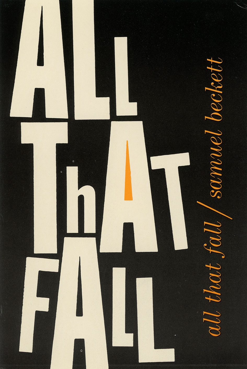
Arden Kuhlman Riordan
Τyperoom: Is Modernism in graphic design really over or long forgotten?
Heller: Not at all. It exists in every aspect of design, only its mixed with a healthy dose of eclecticism. Modern as a tool is anything that is ordered and refined. Modern as a style is contemporary and lively.
Typeroom: You are both aficionados of graphic design in America. Do you consider typography has the power to reshape our world in a more humane way?
Heller: Typography can make information more accessible and can speak to a subconscious part of our brain. Whether it is humane or not is dependent on the message. You can make Donald Trump’s typographic identity look classical or modern, but you’ll never make it humane.
Τyperoom: What is the state of America’s graphic design scene today?
Heller: Without being smart ass, the state is New York, Los Angeles, Minneapolis. Otherwise, it is very mixed, on the one hand artful, on the other functional. Graphic design is situational. It depends on the content.
D'Onofrio: Graphic design today can’t be pigeonholed; it’s not one-size fits all and is influenced by many movements/cultures including the new (old) emerging digital environment. Old or new, “good” design relies on its content, it is as much about practicality and function as it is about form; it’s both expressive and objective and often merges the fine and applied art. Then again, it depends on who you ask.
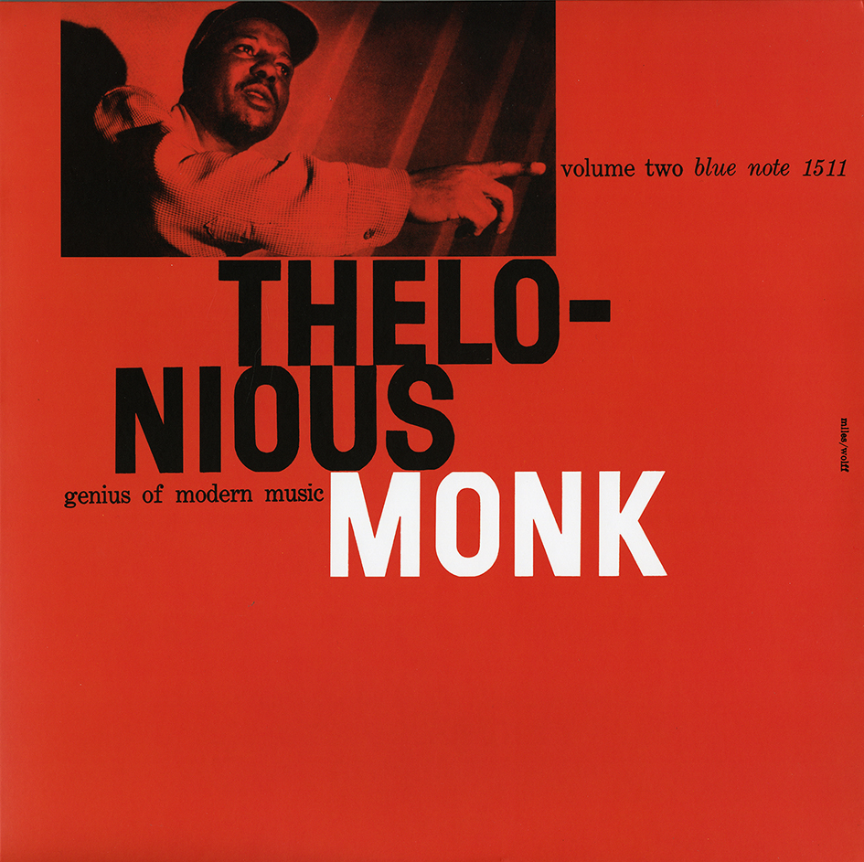
Permission of Wayne Adams, for the Estate of Reid Miles
Typeroom: Are there any typographic trends which are taking over the graphic design space nowadays?
Heller: There is a lot of hand lettering. A lot of revivals. A lot of vernacular. There are so many trends, that they are not even trends. Type like music is all over the map.
Steven Heller, America leading critic, and historian of graphic design is the author or editor of more than 100 books on design and popular culture, an influential design educator at the School of Visual Arts, and a lifelong magazine editor and art director.
Greg D'Onofrio is a graphic designer, writer, and a founder of Display, a web-based platform devoted to research in graphic design history. They both live in New York City.
Delve into the stories with The Moderns: Midcentury American Graphic Design by Steven Heller and Greg D'Onofrio (Abrams) here
Words: Loukas Karnis
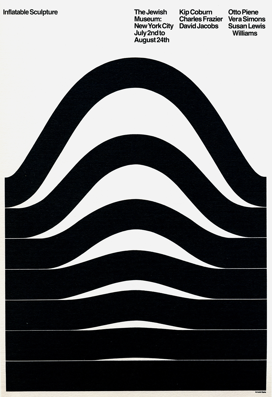
Courtesy of Arnold Saks
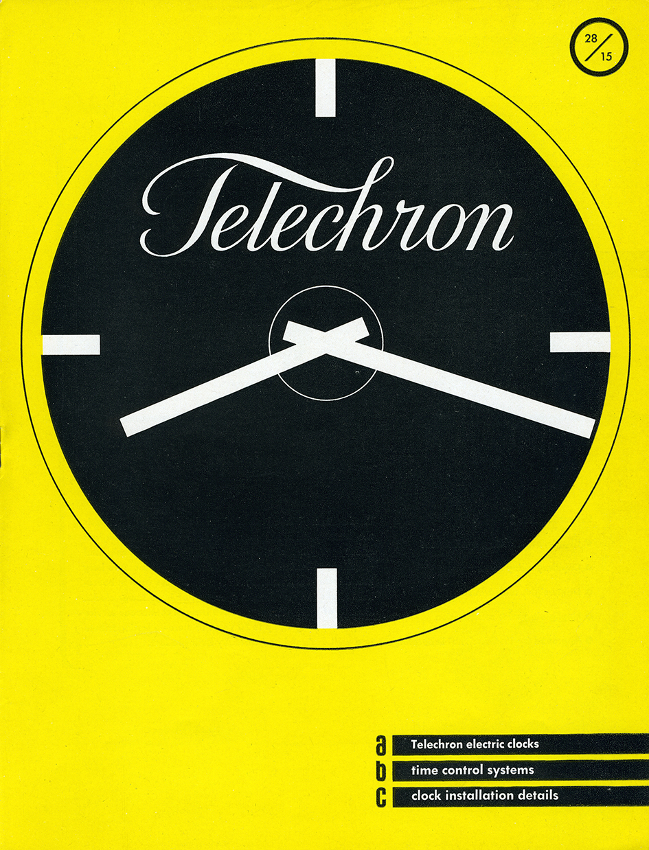
Copyrighted by Ladislav Sutnar, reprinted with the permission of the Ladislav Sutnar family
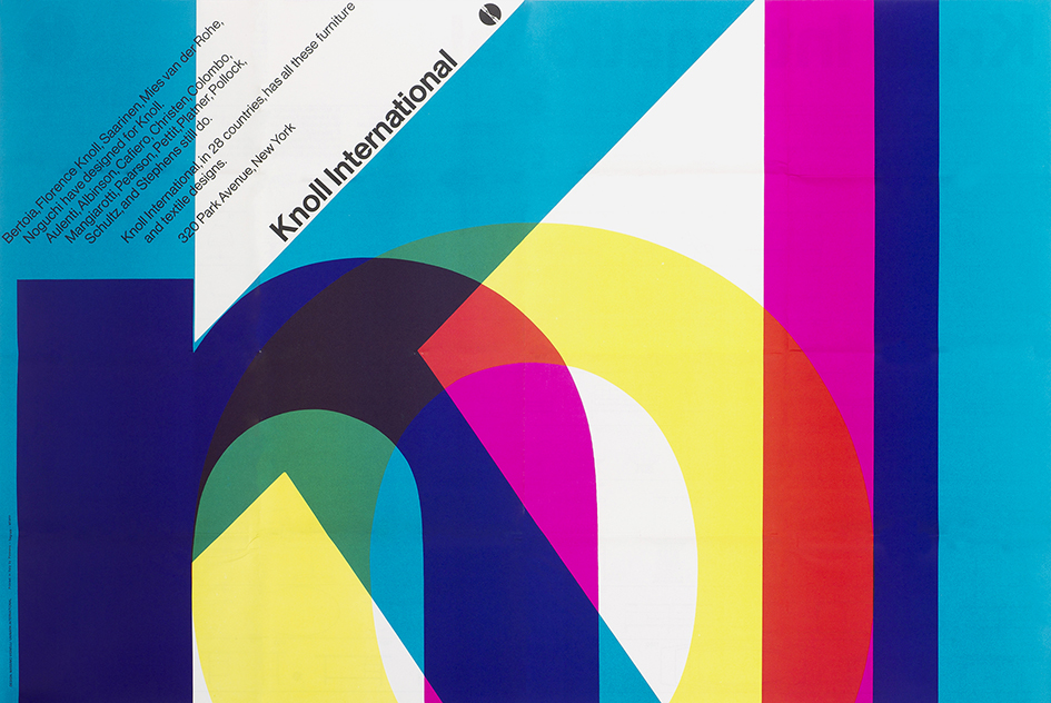
Courtesy of Beatriz Cifuentes and the Vignelli family
Tags/ book, faces, steven heller, herb lubalin, modernist, the moderns, greg d'onofrio, graphic designers, modernism in america


