An ode to the pioneer of typographic brilliance Karl Gerstner
Swiss National Library rightfully will regard Karl Gerstner as “one of the most important innovators in typography, commercial art and corporate design” for centuries to come after his passing at the age of 86, on the 1st of January, 2017. One of the foremost Swiss artists and graphic designers, for numerous ground-breaking reasons, Gerstner carefully divided his brilliance between being a painter and a graphic designer and became a pioneer in both pursuits.
Born on the 2nd of July, 1930 in Basel, Switzerland Gerstner studied design at Allgemeine Gewerbschule in Basel under Emil Ruder. As a young man, Gerstner completed an apprenticeship as a typographer. He set up his own graphic design studio in 1949, and by 1963 he had partnered with Markus Kutter, a writer and editor, to form the agency Gerstner + Kutter which then became GGK with the addition of architect Paul Gredinger.
GGK became one of the most successful advertising agencies in Switzerland, with offices in other European countries and the US. Gerstner’s pioneering work – in particular, his designs for Geigy, based in Basel - made him one of the most important exponents of modern commercial graphic design in Switzerland.

“He popularized the use of unjustified ragged-right text in typography,” writes History of Graphic Design on Gerstner’s body of work which transformed numerous forms of art.
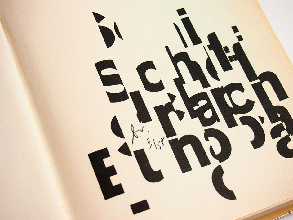
“He also proposed what he called Integral Typography which extended on Max Bill’s typographic ideas. A message in the form of text can convey a meaning or some information, however, when typography is used in an informed manner, Gerstner felt that it could greatly contribute to the connection between the words and the actual meaning. Gerstner saw typography as a way to express a whole greater than the sum of words and meanings. For example, the large headline in one of his Citroën advertisements stated ‘Don’t buy this car’ which was followed with ‘if you don’t expect something out of the ordinary in a car’ in smaller type. While this may seem commonplace or trite today, Gerstner + Kutter trailblazed the clever use of type to make a point. In other words, Gerstner knew that the aesthetics of typography can aid the communication of ideas and information and that was the foundation of Integral Typography”.
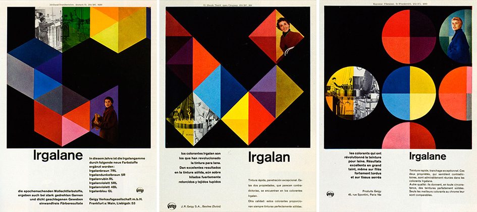
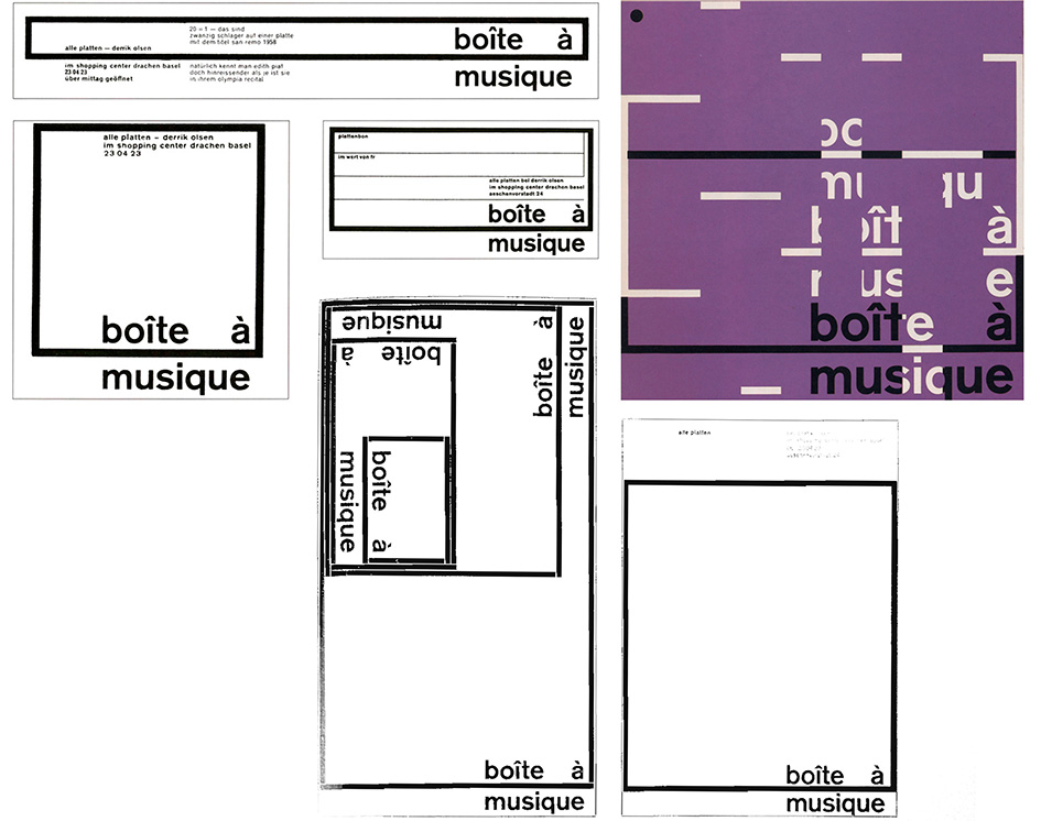
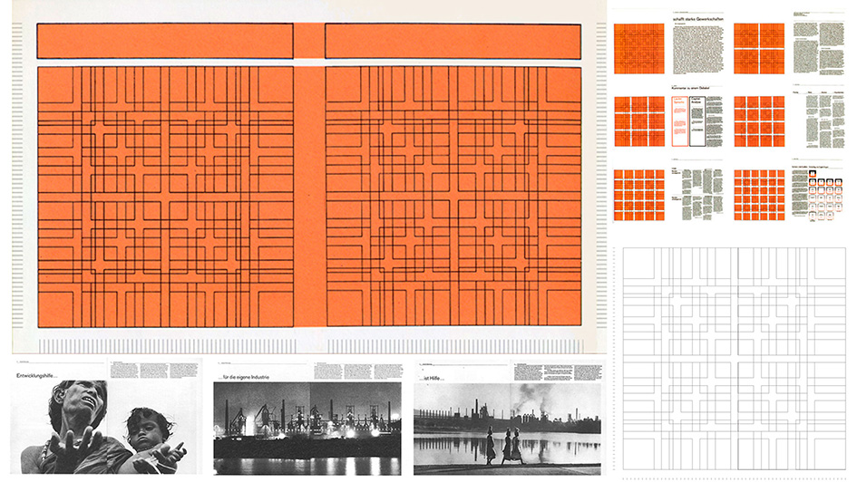
One of the first designers to truly exploit grids to create unmatched complex and flexible variations, Gerstner’s body of work is pure genius and had typography and graphic design transformed in systematic symmetry.
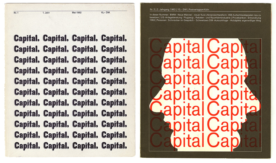
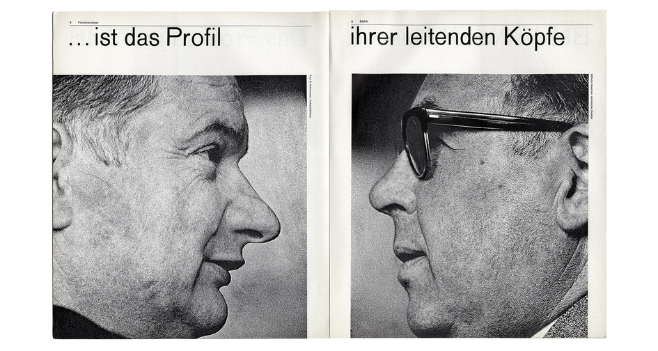
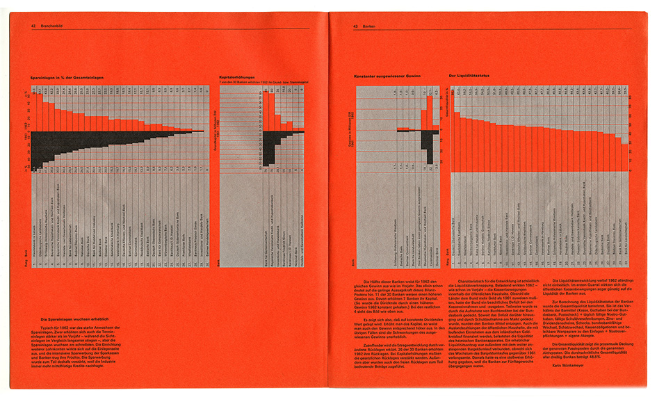
In 1962 his design of quarterly magazine Capital, a publication bold enough to put the ideas of economics into a human perspective, was clear and aesthetically pleasing. For Capital, Gerstner developed a complex grid which allowed rapid, creative and consistent layouts like a mathematical art form of some kind.
Gerstner’s best-known work includes his book ′Programme Entwerfen′, published in 1963 – containing four essays, in which he explains the basic principles of his design method. Instead of setting out step-by-step formulas, the book provides a universal system for developing individual solutions, anticipating technological developments at the very beginning of the computer age.

His corporate identities for such companies as Swissair, Burda and Langenscheidt, his attempts at optically distorting television images with lenses made of Plexiglas (one of his many visual experiments back in 1964) and his work as a world-wide identity consultant and designer for IBM, are some traces of his legacy that will keep designers eternally inspired. Karl Gerstner epitomized the excellence of Swiss graphic design and the beauty of precision like none other - before or after him.
Gerstner’s work has been honored in numerous publications all over the world and exhibited in several museums. In 1973, the Museum of Modern Art in New York ran an exhibition about the method and philosophy of his work entitled “think program”.
The Art Director’s Club New York nominated him for its Hall of Fame, and the Art Directors Club Germany made him an honorary member in 1992. In 2012, Gerstner was awarded the Grand Prix Design by the Federal Office of Culture for producing among “the most important exponents of modern commercial graphic design in Switzerland”.
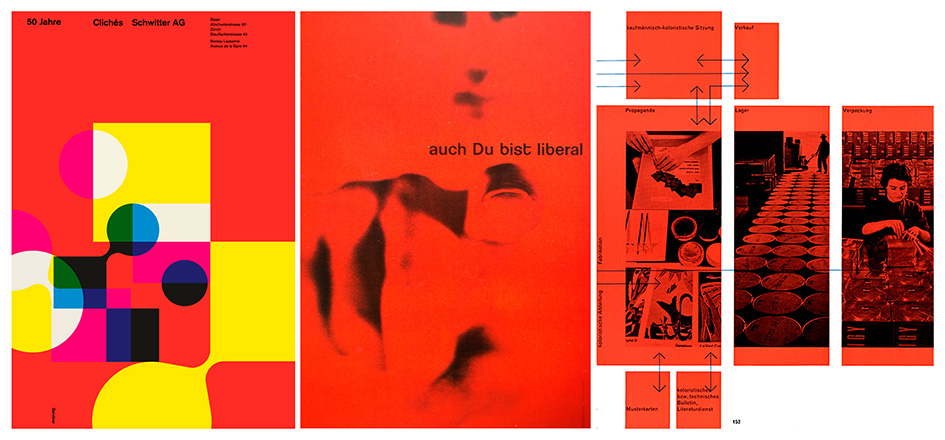
“Just as [Friedrich] Dürrenmatt disguised literature as detective stories, so I created everyday art without forcing people into museums,” Gerstner once said, looking back on his years as a graphic designer.
His earlier body of work, and no doubt a big part of his legacy, has been housed in the Graphics collection at the Swiss National Library since 2006. Furthermore, the Swiss Confederation honored Karl Gerstner for his pioneering role in graphic design – a phenomenon whose influence has extended far beyond Switzerland.


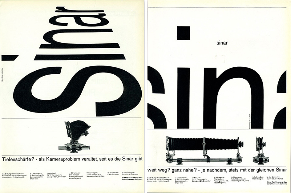
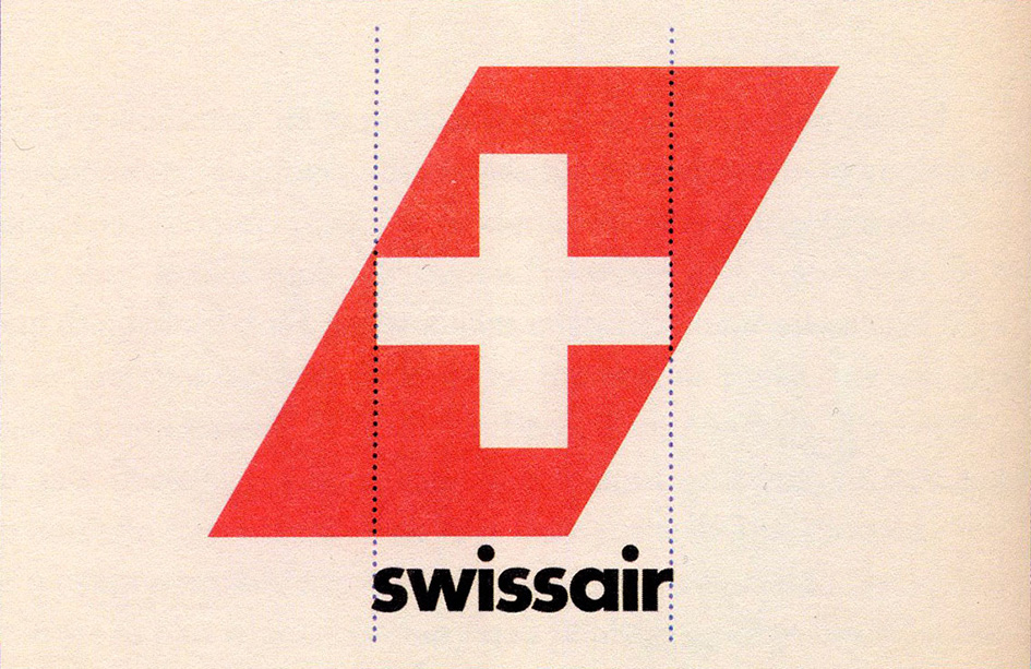
With info via History of Graphic Design, Swissinfo, and Swiss Design Awards.
Tags/ graphic designer, ibm, emil ruder, modern, karl gerstner, allgemeine gewerbschule, markus kutter, ggk, geigy, citroën, capital, mathematical art, burda, langenscheidt, museum of modern art in new york, hall of fame, art directors club germany, grand prix design, federal office of culture, dürrenmatt


