Lost and Foundry: Fontsmith & M&C Saatchi London will break the cycle of homelessness one font at a time
The House of St Barnabas has launched ‘Lost and Foundry’. Developed by M&C Saatchi London and Fontsmith, the campaign sees the crumbling typefaces of Soho recovered to be sold online as a collection of fonts, to fund its vital work with London’s homeless.
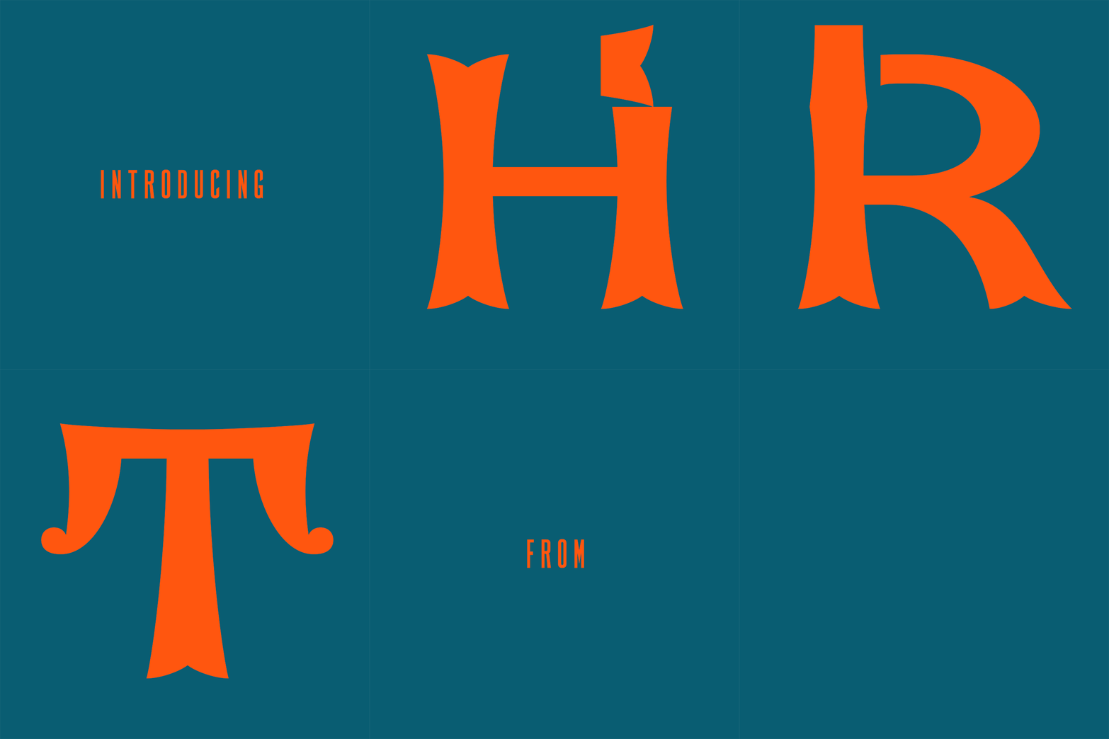
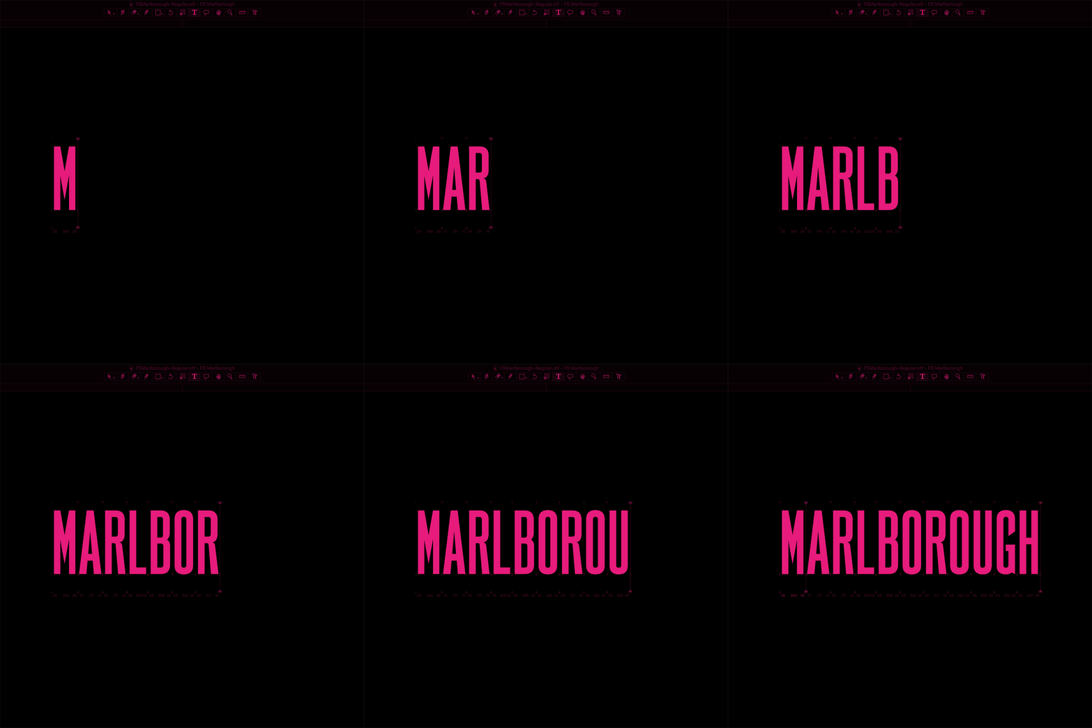
For this campaign M&C Saatchi London and Fontsmith have developed seven web fonts from crumbling signs around Soho, with each named according to the specific content or location relevant to them, such as Berwick, Cattle & Son and Marlborough.
To develop the fonts M&C Saatchi London collected images of this forgotten lettering in Soho, with seven selected to be hand drawn and turned into a fully functioning font by Fontsmith.
This involved adapting and extending the missing characters to make useful and crafted designs out of them, with it taking 3 months to digitise and design a workable series of fonts.
Furthermore, the fonts have inspired seven original artworks from seven UK-based artists and designers famed for their use of typography. Each artist has used a different font from the collection.
GIF via Marketing Communication News
The artists contributing are Morag Myerscough, Anthony Burrill, Steven Wilson, Dangerous Minds, Smile, Supermundane and I love dust. Funds raised from the sale of artwork which were available to buy from the House of St Barnabas at the font launch event, on Tuesday 10th July, are being donated to the House.
“The House of St Barnabas has existed in one form or another since 1846. That’s quite a legacy to build on. We’ve been operating as a social business and charity since 2013, and are proud of our innovative model which helps to support people affected by homelessness back into lasting work” noted Sandra Schembri, Chief Encouragement Officer at The House of St. Barnabas.
“But, for us to keep supporting people in this way, we need to keep innovating too. Lost & Foundry is the culmination of a unique partnership between the House, M&C Saatchi and Fontsmith which taps into Soho’s history, creativity and originality to help us raise vital funds and support more people back into paid work.”
“When you buy the Lost & Foundry Soho collection you will not only get seven fantastic typefaces that will inject Soho into anything you create, you will also be supporting an organisation that is making a real difference to people who are rebuilding their lives” commented Justin Tindall, chief creative officer at M&C Saatchi.
GIF via Marketing Communication News
“I once heard a radio DJ saying to look up when you walk around London. That’s exactly what we did for this project” said Jason Smith, Fontsmith’s founder and creative director. “In Soho you see this mix of architecture and lettering, plaques, neon, and an abundance of weathered signs. We’ve restored these with the aim of raising awareness of the House, and with the hope that the creative community of Soho and beyond purchases the fonts with this worthwhile charity in mind” he adds.
This unique collection of 7 typefaces is based on the disappearing signs of Soho, at risk of being lost forever due to the ever changing landscape of the area.
By re-imaging the signage as complete fonts, we have rescued this rich visual history from the streets and present the typefaces into a contemporary context for a bright optimistic future.
Here are the seven fonts with good karma.
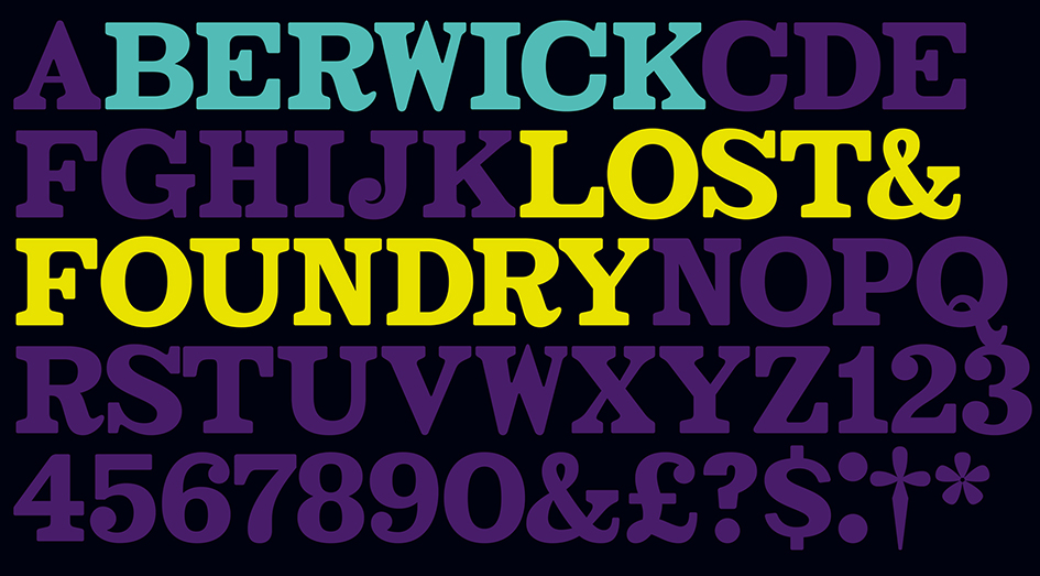
FS Berwick
Thanks to its humble tiled origins, this Egyptian serif type maintains a uniform character width, creating the irregular letter proportions found in the final alphabet. Broad-shouldered, the bracketed serifs firmly ground the font, whilst its extreme hairlines become a necessity due to the uniform width. Of note is the upside down ‘S’, to be found on the original sign on Berwick Street. Perhaps due to its ceramic origins, there is a surprising ‘slippiness’ to its final appearance.
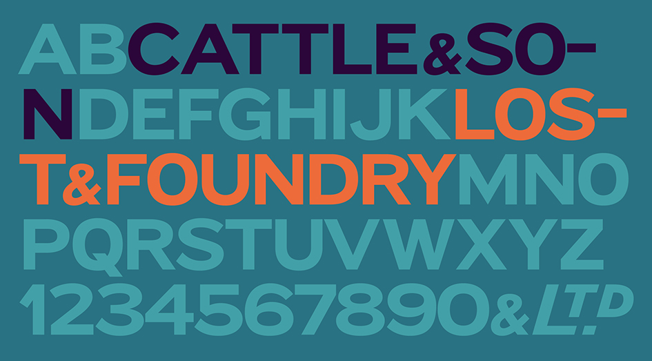
FS Cattle
Cattle & Son is best described as a wide, but not overly extended, grotesque-style sans serif, showing a uniform width and carrying a robust strength to its form. Whilst lightly functional overall, the purposeful diagonal legs of the ‘K’, ‘R’ and the tail of the ‘Q’ add an urgency to its appearance. The reduced size of the ampersand gives away Cattle & Son’s hand-painted origins, and the oblique compacted ‘LTD’ found on the original sign is also included in the final set. This beautiful sign is tucked away under an arch in Portland Mews, sheltering from the weather. Perhaps this is why it has lasted so long.
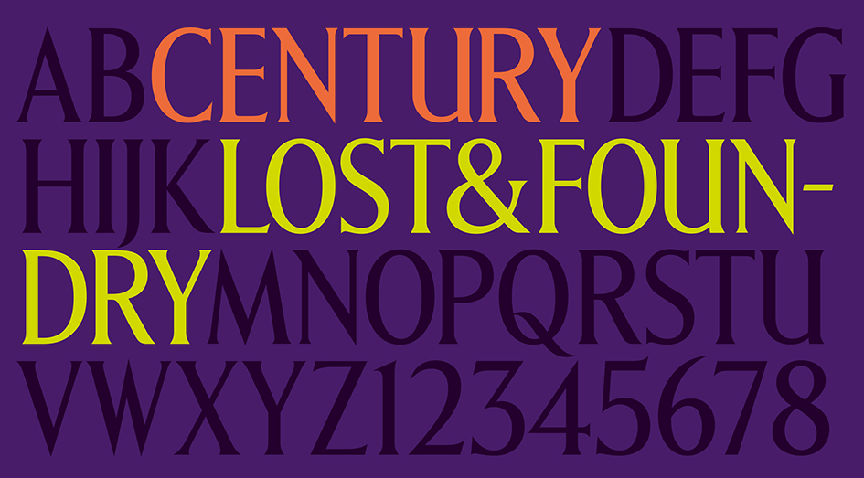
FS Century
This somewhat elongated set of Roman capitals was originally rendered in paint circa 1940, but its roots trace back to the Trajan Column in Rome. Witness the slightly unbalanced ‘W’ and the painter’s hand is revealed. Century’s flared serif style is extremely short, sharp and bracketed. The ‘M’ is splayed and has no top serifs. Century has a uniform appearance of width, probably due to its sign-written origins. Yet is elegant, classic and exudes sophistication.
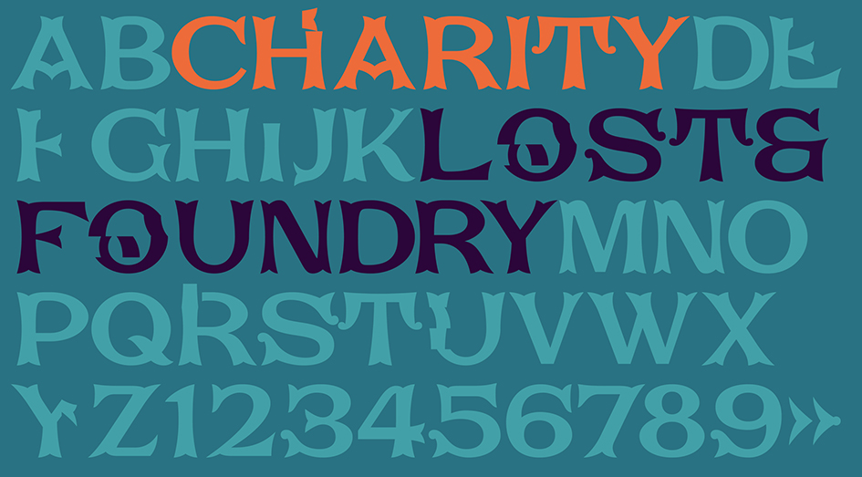
FS Charity
A true Tuscan letterform, the original is located on The House of St. Barnabas in ceramic tiles and was revealed in all its broken glory in 2014. FS Charity retains the option of using these incorrect characters (try typing lowercase in the test drive above and compare with the more uniform uppercase characters). FS Charity features fishtailed terminals on its strokes, a curious branched ‘T’ and the ‘S’ displays tear-drop ends to its serifs. Almost uniform in width, the ‘A’, ‘M’ and ‘W’ are the widest characters in this set.
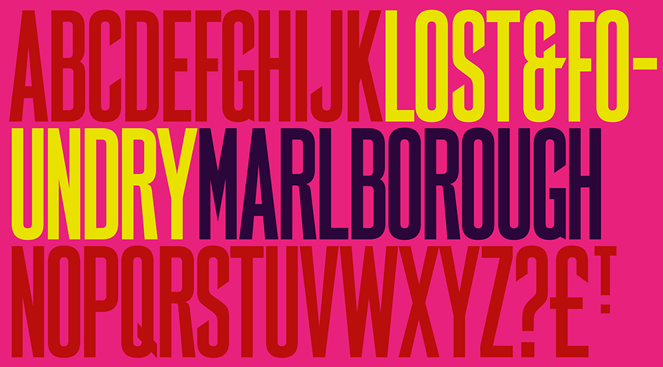
FS Marlborough
The elongated Marlborough features diagonal terminals to some characters and numerals. Also retained is the space-saving contracted ‘T’ glyph from the original sign, while the ‘R’ features a distinctive wedge-shaped leg. Highly individual in this form, similar signage appears around Soho, but featuring a variety of widths in their design.

FS Portland
The sister type to Cattle & Son, Portland is oblique rather than italic. The serifs are not overly long, yet still enhance its rather rigid cap height and baseline appearance. Its ‘A’ has a top serif, the ‘M’ is square and the ‘G’ foregoes any spur. Particularly delightful is the open ampersand. Numerals align to encourage the horizontal flavour of the oblique style. Overall, Portland is both confident and graceful.

FS St James
A lineal Continental style, St James also displays a true sense of ‘Londoness’ in its titling form, perhaps influenced by early Underground signage. Irregular letterforms display a continental flavour, particularly evident in its Deco style ‘W’, ampersand and numerals. The rather high cross bar in the ‘A’ is also reflected in the raised middle strokes of the ‘M’. Noteworthy are the distinctive unions found on all of the characters and the additional small caps. The original lettering is still located on Greek St.
Each purchase comes with a one month membership to The House and 100% of the proceeds from sales of fonts go directly to the charity to help their essential work.
The House of St Barnabas is a social enterprise that aims to break the cycle of homelessness through its Employment Academy, a programme that works with people who have been affected by homelessness and supports them into lasting work. It does this by operating as a member’s club, with all profits from the club going to the Employment Academy.
Tags/ typography, inspiration, signs, london, typefaces, lettering, characters, fonts, uk, charity, anthony burrill, letterforms, morag myerscough, supermundane, soho, awareness, house of st barnabas, lost and foundry, m&c saatchi london, fonsmith, homeless, homelessness, partnership, fs berwick, fs cattle, fs century, fs charity, fs marlborough, fs portland, fs st james, steven wilson, dangerous minds, smile, i love dust, sandra schembri, justin tindall, jason smith, employment academy


