Recapturist is a man on a mission to please our eyes on pure USA vintage
The most visually pleasing parts of American design are fading away. The glorious neon signs that once lined our roadsides are nearly extinct. Mid-Century modern architecture is increasingly hard to find among non-residential structures. And products that used to come branded with machine-stamped chrome badges and hand-drawn typographical elements are now made overseas and marked with plastic decals”. This is the introduction to Recapturist aka Bill Rose manifesto who is on a mission of beauty driven by a blast from the past.
“This tragic state of affairs is widening the gap between the golden age of design and the present day. So I’ve spent the last decade-plus on a mission to capture the finest examples of what’s left. I travel the back roads of America looking for neon signs, junkyards, yard sales, antique stores, estate sales–anywhere evidence of these endangered designs can still be found” he says.
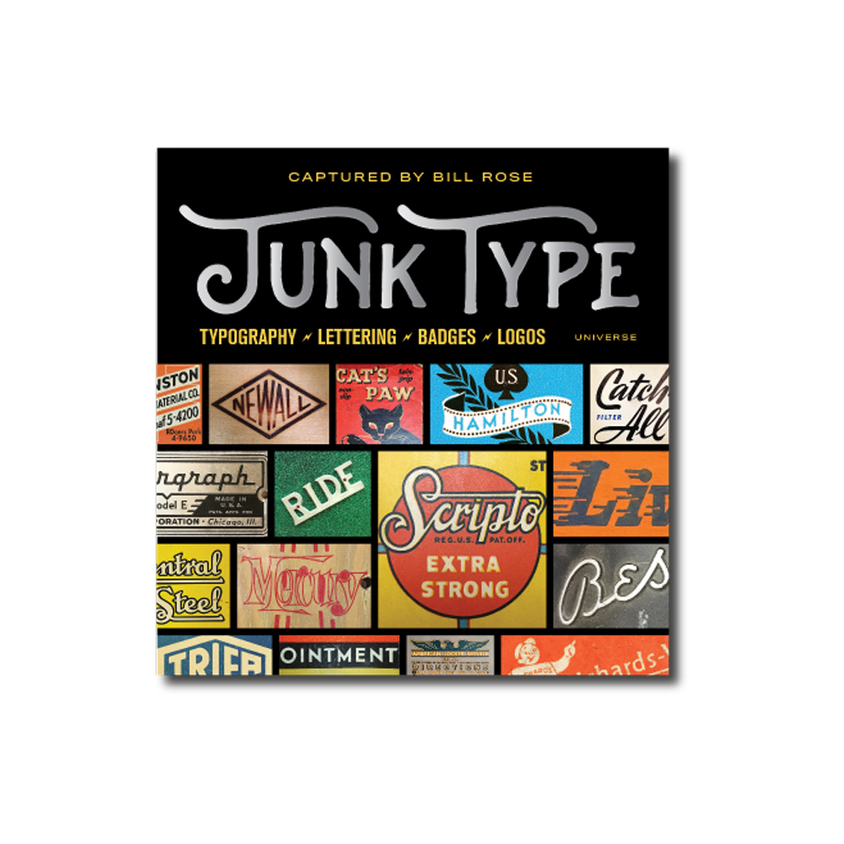
“The result is a graphic collection of design and typography from an era that predates the computers and specialized software used by modern-day designers. These images depict forms that were conceived, created, and produced manually on a drawing table using tools and techniques that are nearly obsolete today. These designers were true craftsmen. My hope is that this site can serve as a reference guide–a resource that helps bridge the design and typographic styles of the past with those of today–and perhaps even be a source of inspiration for whatever comes next” adds Bill Rose whose latest graphic compendium of vintage American design and typography titled Junk Type, is a publication to adore.
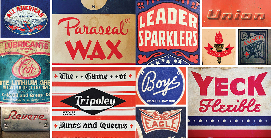
Bill Rose—aka Recapturist—is a photographer and designer who has spent the last decade traveling across America looking for junkyards, yard sales, antique stores, and other unlikely sources of inspiration to capture examples of postwar American typography and design before they’re lost forever.
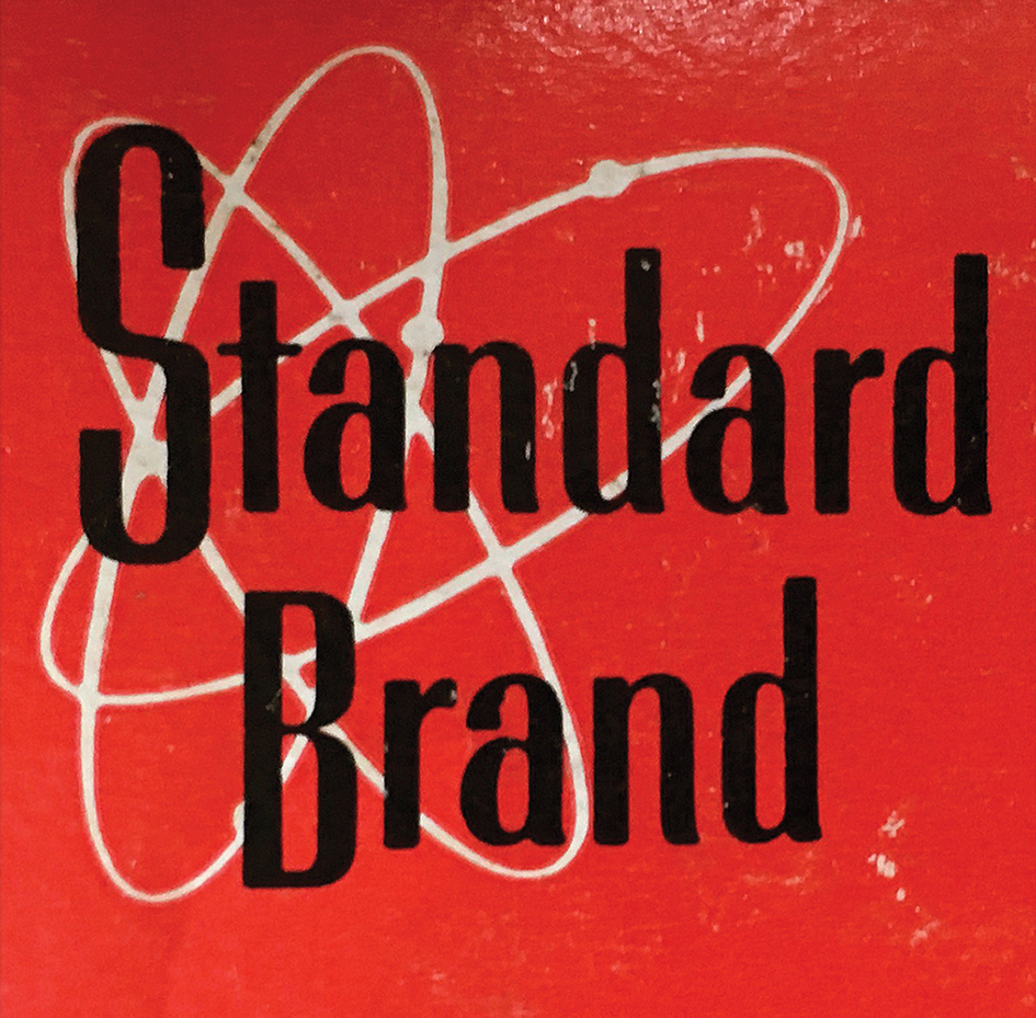
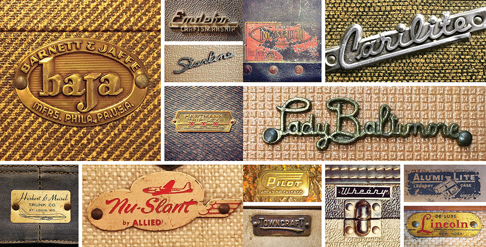
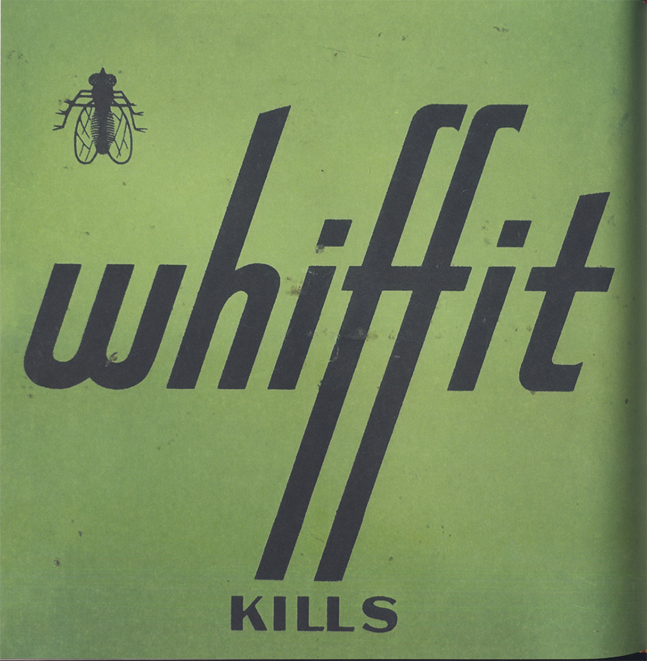
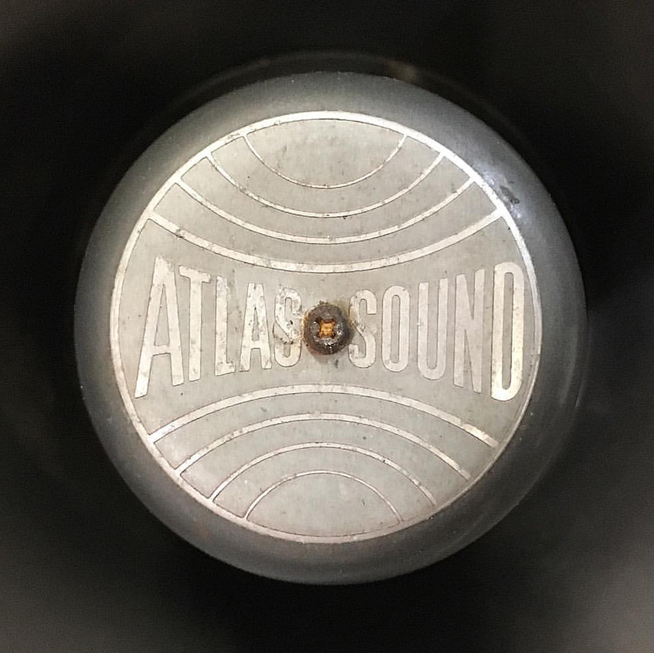
Bringing together more than 400 images, this invaluable book is a visual history of postwar America, told through the distinct typography, icons, badges, and branding of the country’s industrial heritage. From Art Deco–inspired fonts and unique handmade cursive lettering to illustrated insignia and clean graphic logos bearing the influence of European design of the 1960s, these pictures together represent an encyclopedic reference of creative typefaces and graphics.
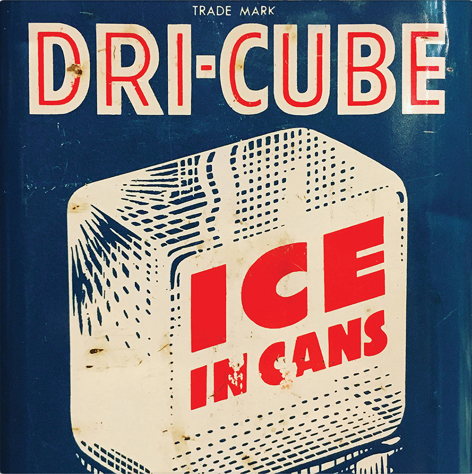
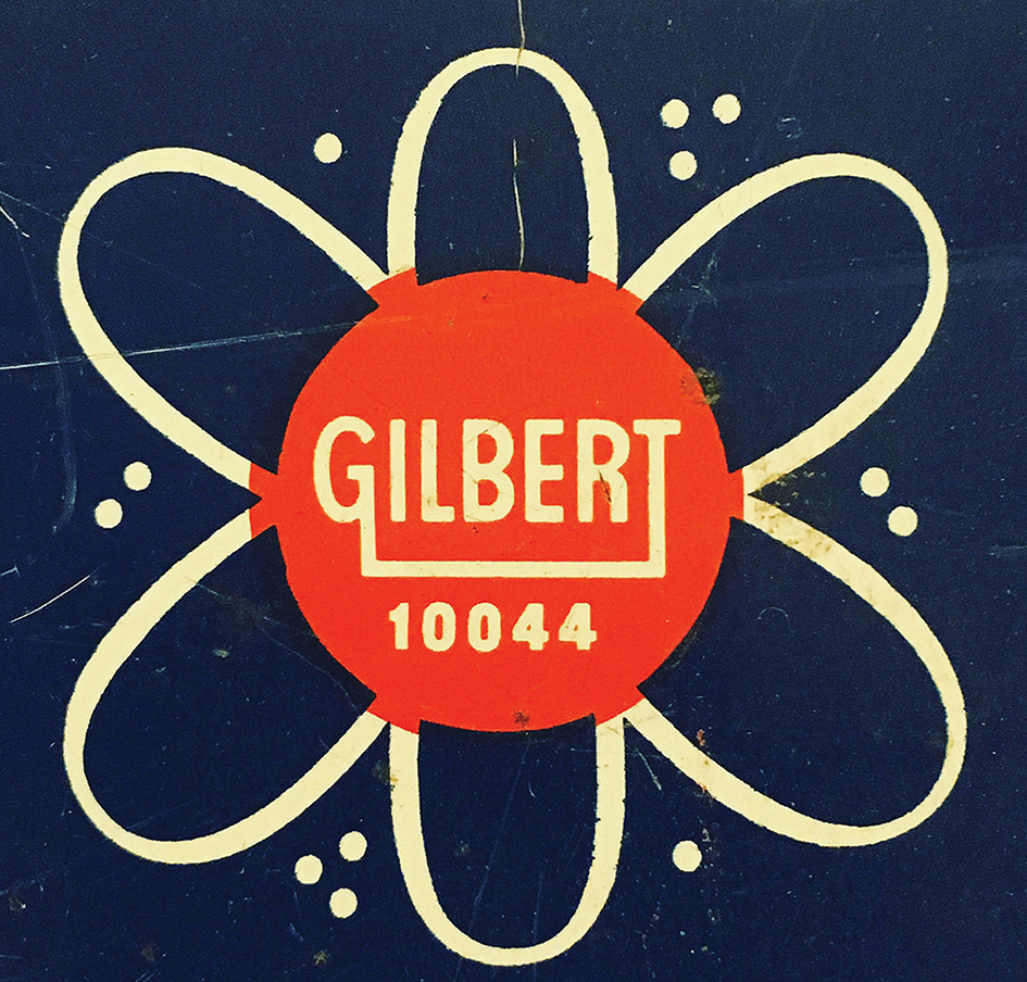
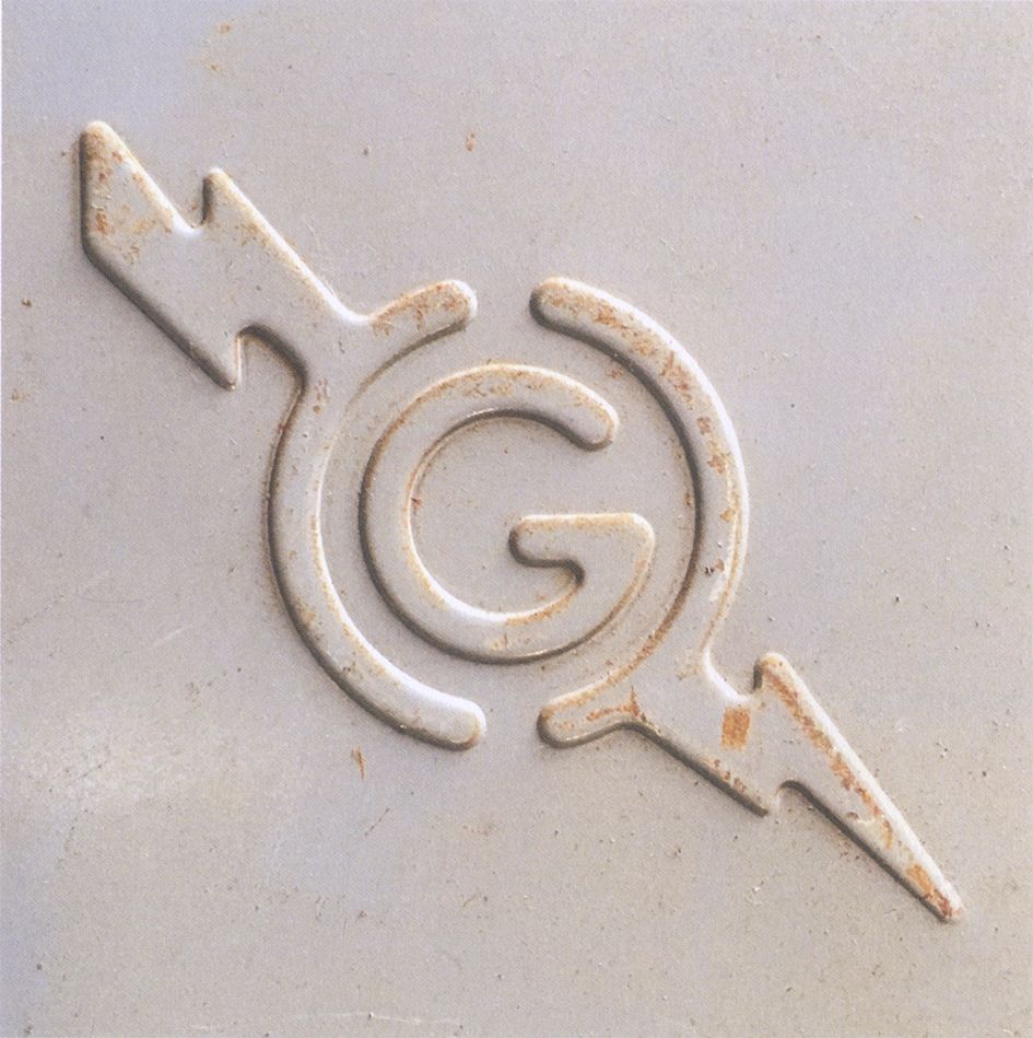
With each photograph representing just a detail—an embossed logo, a specially created icon, or an advertising slogan—this book captures the optimism and pragmatism of a golden age of American industrial creativity and distills it into a charming resource for anyone with an eye (or nostalgia) for vintage design.
Enter his adventure through the remnants of an endangered beauty not forgotten in 192 pages and explore his realm here.
Tags/ origins, american design, modern architecture, graphic collection, design and typography, compendium, junk type, recapturist, bill rose


