Julia Borns' & Shannon Ebners' public typographic affair explained
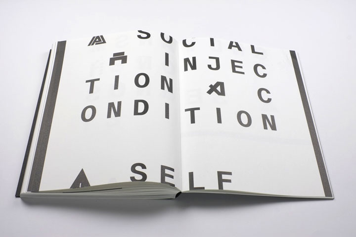
My entire job is all about collaboration and dialogue” says acclaimed graphic designer Julia Born on her recent fruitful collaboration with artist Shannon Ebner, aptly named “A Public Character”. “Every assignment, every project I make is developed in conversation with other people, be it artists, institutions, curators, printers, binders, etc. Books perhaps illustrate this collaborative effort in an extreme way, as there are so many parties involved throughout the process. Within this process I see myself as the “guide,” bringing together and coordinating all this expertise. Now and then I need to make decisions, but mostly I am making sure that everything is on the right track” she concludes. Published after Shannon Ebner’s exhibition A Public Character, held at the Institute of Contemporary Art, Miami, the book examines the artist’s body of work, an extended mediation of language that often takes the form of photography.
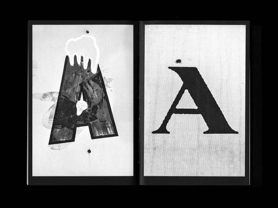
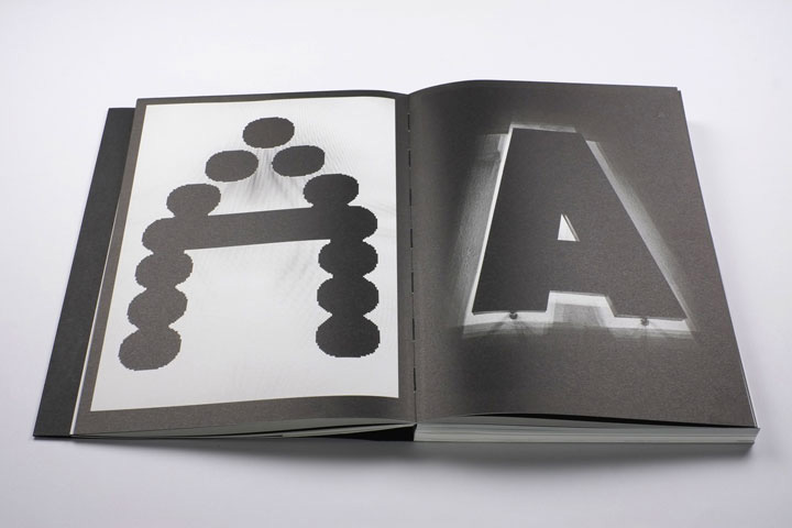
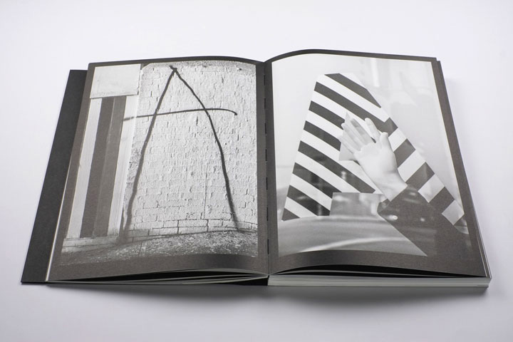
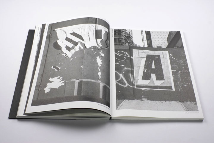
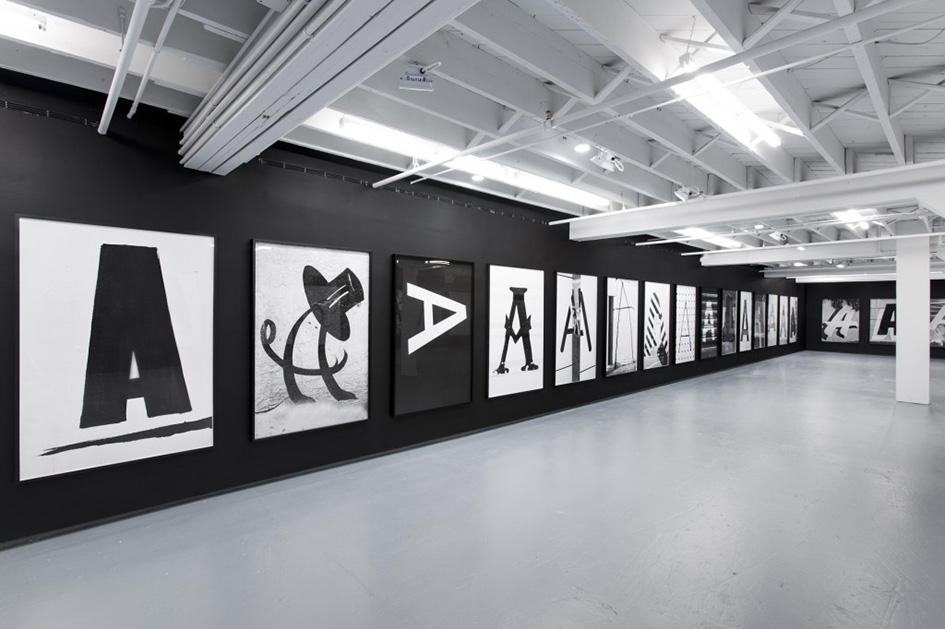
ICA Miami’s exhibition “A Public Character” marks the first major museum presentation of work by Shannon Ebner comprising photography, sculpture, installation and video. The exhibition begins with a dramatic presentation of works from Ebner’s ongoing series “Black Box Collision A” which, since 2012, has seen the artist photograph the letter “A” mined from the vestiges of signs, advertisements, messages, and other modes of visual communication.
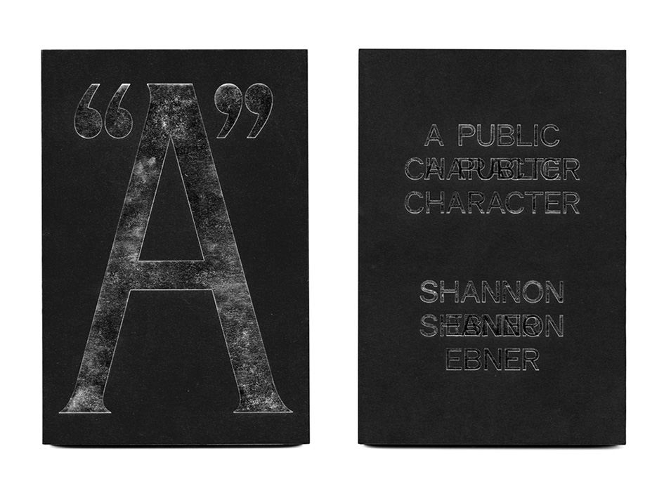
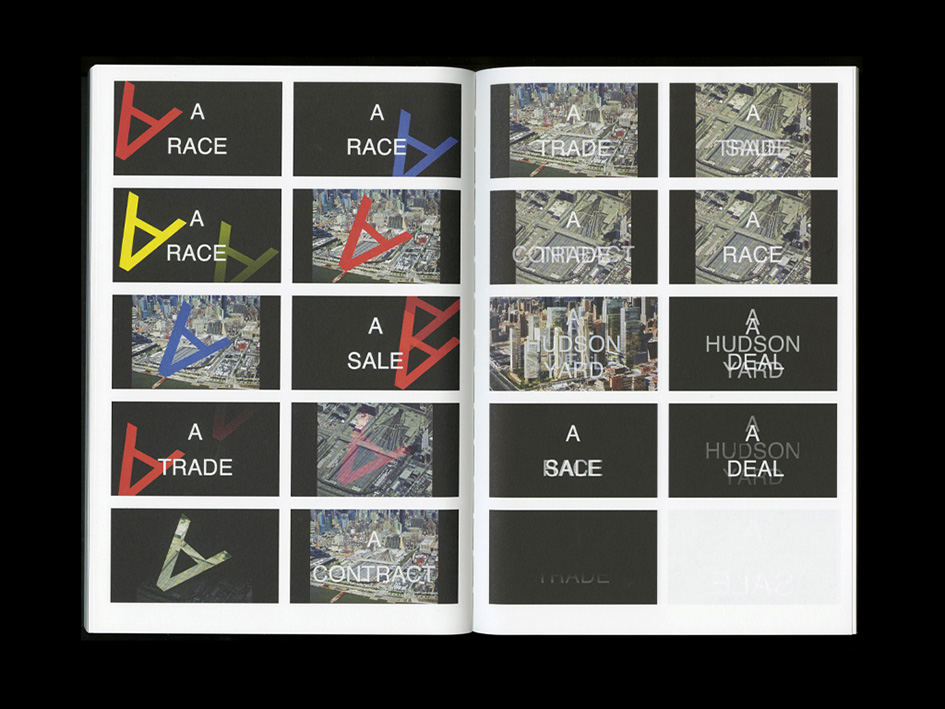
The exhibition also traces the artist’s efforts to re-insert her typographical imagery into the public realm, notably through A HUDSON YARD, a collaborative project with David Reinfurt. A PUBLIC CHARACTER, a new video by the artist, edited by Erika Vogt and scored by Alex Waterman, creates a physical and optical experience of those images’ dynamic lives amidst the Chelsea and Meatpacking District neighborhoods of New York, as they rapidly develop.
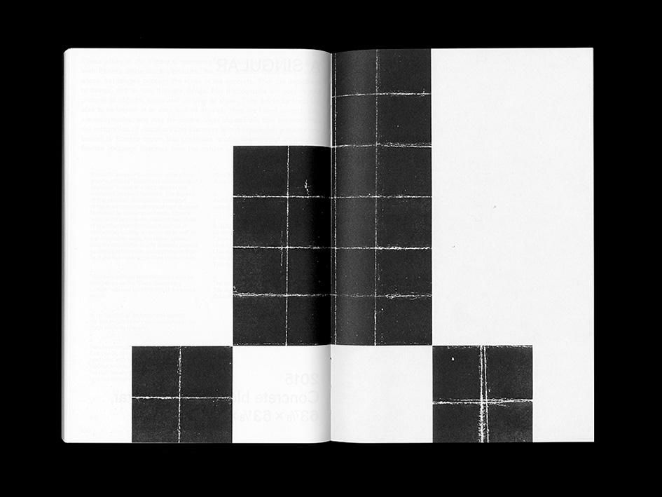
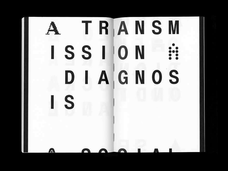
Ebner’s physical constructions of language are manifested by a new sculpture depicting the letter “A.” As the first museum exhibition to survey Ebner’s “Black Box Collision A” series, “A Public Character” demonstrates the artist’s efforts to build a catalogue of images, and reflect on the unstable nature of such an archive. The project is in full bloom in the pages Julia Born designed, which is part catalogue and part an artist book on it’s own.
A Public Character, this “beautiful artefact” is the result of a successful collaboration. “With the typographic nature of Shannon’s work, and Julia’s deep involvement with content and concept, I was interested in learning more about their working exchange” writes Ben Schwartz.

In his insightful interview, Born explains her decision to use the typeface Mercator throughout the book. “For quite some time I could not decide whether it should be a serif or sans serif typeface. I eventually realised it needed some pragmatism, something a bit down-to-earth, as every serif typeface I tested looked somewhat detached from the content. There was as well the fact that Shannon herself uses Helvetica in A Public Character in a beautifully brute, raw manner. If I were to use that typeface throughout the book, the borders between work and written content would have dissolved—which could have been an interesting path as well but didn’t seem appropriate in this context. I decided to “colour” the typeface for all editorial content just a bit differently, if only subtly.”
“I encountered Mercator in my years in the Netherlands many times, mostly in letterpress form (the workshop at Rietveld Academie used to have an almost complete set). It was designed by Dick Dooijes who happened to be a former director of my school, and digitized by Laurenz Brunner 10 years ago, though not commercially distributed. Some Dutch children’s books teaching the alphabet use Mercator in a very pure and elementary way. This association with the basics of language seemed quite fitting within the context of Shannon’s work.”
A Public Character is available for purchase via Roma Publications.
About Shannon Ebner
Shannon Ebner was born in Englewood, New Jersey in 1971 and lives and works in Los Angeles. She earned her BA from Bard College in 1993 and her MFA from Yale University in 2000 and she currently teaches at USC’s Roski School of Fine Arts. Solo exhibitions include kaufmann repetto, Milan (2010); Altman Siegel, San Francisco (2010); Wallspace, New York (2009, 2007, 2005); P.S.1 Contemporary Art Center, Long Island City (2007).
About Julia Born
Julia Born is a Swiss designer living in Amsterdam. She studied at the Gerrit Rietveld Academie and after receiving a diploma in 2000, she started her own practice in Amsterdam. She worked on several projects and publications for clients such as the Museum Boijmans van Beuningen, Rotterdam; Stedelijk Museum, Amsterdam; Swiss Federal Office of Culture, Bern; Casco Office for Art, Design and Theory, Utrecht; and TNT Post. From 2005 to 2008 she was the art director of Metropolis M, the Dutch magazine on contemporary art. Apart from commissioned work she has collaborated with other designers and artists on investigative projects, including fashion designer JOFF and performance artist Alexandra Bachzetsis. Her work has been shown in exhibitions in Switzerland, the Netherlands, Czech Republic, France, Portugal and the United Kingdom. She has been a professor of graphic design at the Gerrit Rietveld Academie since 2003. From 2003 to 2007 she was a jury member for “The most beautiful Swiss books”. Among other awards she has won the Charlotte Köhler Prize in 2008 and the Inform Award for Conceptual Design, for which she conceived her first solo exhibition, Title of the Show, in Leipzig. In 2008 she was appointed critic in graphic design at Yale University.

Tags/ inspiration, video, photography, exhibition, installation, new york, artist, sculpture, catalogue, julia born, shannon ebner, a public character, institute of contemporary art, miami, erika vogt, alex waterman, artist book, typographic nature, ben schwartz, typeface mercator, dick dooijes, roma publications


