Jan Middendorp on the reprint of his iconic typographic treasure “Dutch Type”
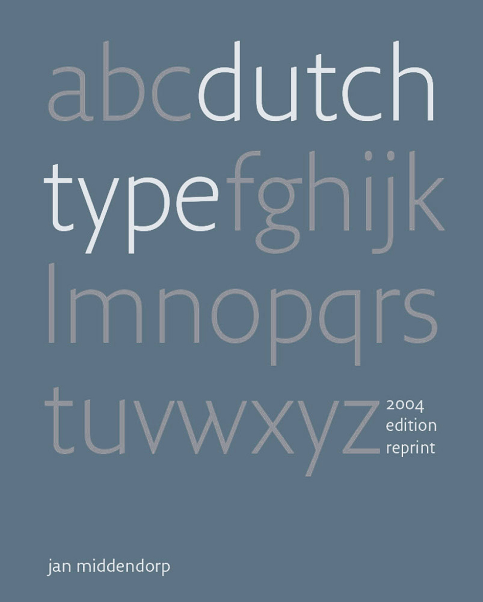
When it was first published back in March 2004, Jan Middendorp's uber informative “Dutch Type” was received with such huge enthusiasm that it became in under 3 years time a Holy Grail for the type enthusiasts. The 3,500 copies of this rich in visuals and information massive typographic tome were sold out in 3 years time and “Dutch Type” ended up being offered at embarrassingly high prices on Amazon, eBay and by antiquarians — between €400 and $800 for a copy. Now, almost 15 years after it's first edition Druk Editions, Middendorp's own imprint has self-published a near-identical edition of “Dutch Type” thanks to the massive support through crowdfunding and this is big news for us all.
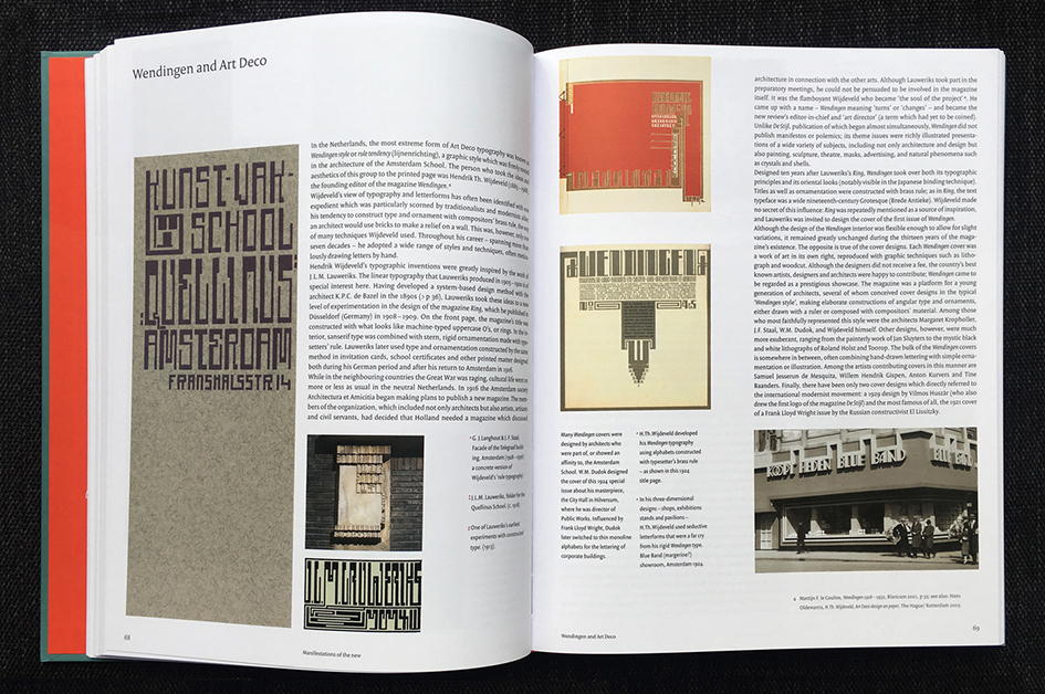
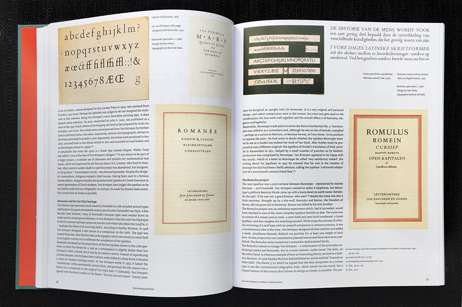
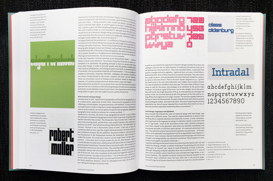
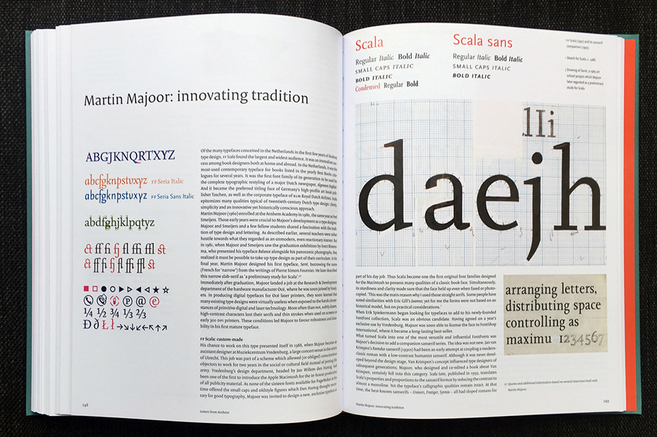
In “Dutch Type”, Jan Middendorp presents a comprehensive overview of type design and lettering in the Netherlands, tracing its origins through type designers and lettering artists from the 15th to the 20th centuries. Partly based on interviews, the book also offers insight into the motives and methods of the first generations of digital type designers, featuring published and unpublished typefaces as well as sketches, studies, and samples of lettering work. While the quest for quality and innovation has remained constant, it makes clear that the advent of desktop type has opened up the discipline to a more spontaneous, inventive, and democratic approach.
Enjoyed for its attractive combination of historic research, storytelling, type analysis and wealth of images “Dutch Type” has ardent fans, 700 of whom supported it's revival. These crowdfunding backers allowed Druk Editions to print a serious run, and introduce the book in the international distribution networks. So put on some eclectic Dutch music (Louis Andriessen or Willem Breuker will do) and enjoy our interview with Jan Middendorp who is on a Dutch-fuelled mission.
Typeroom: Jan you had been working on type for many years. Could you tell us something about your respective background?
Jan Middendorp: I never studied graphic design, although I edited and “designed” my earliest booklets at age 10 or so. When choosing a university at 18, I was more interested in studying subjects in the field of language and literature. I have a major in theory of literature and theatre, but made magazines and posters at school and while in college, and I loved drawing letters (for which I have no big talent). After a decade as a theatre and dance critic, I taught myself digital graphic design, and also began writing about typography.
TR: How did Dutch Type start? What was the inspiration for compiling this impressive amount of work?
JM: I had worked with Dutch graphic designers in the 1980s, but knew very little about the type design scene. When I got to know that world (as a type user ordering from FontShop) I realized that could be a fascinating subject to write about. I discovered there were not many people in the Netherlands writing about type, and most dealt with their subject in a rather academic way. I preferred the way Gerard Unger wrote: a mixture of seriousness and light-hearted analysis and speculation – but being a very productive type designer, he only wrote occasionally. His approach was a bit like the way I had been writing about theatre and dance, and I realized that type design could be an interesting direction to explore. I liked the designers I met, and realized there was no comprehensive yet readable book about the history of Dutch Type. So that became my project.
TR: Published in March, 2004, after seven years of work, Dutch Type was sold out about four years later. Why this edition started up until almost a decade later? What took you so long?
JM: My publisher, 010 in Rotterdam, had been very good to me and found quite a bit of subsidy for the first edition. They were hesitant to do a reprint, because they were used to pre-financing almost every book. As for me, I started making plans for an update, which would take quite a bit of time. And my time was nicely filled with work for FontShop, Linotype, and (from 2007) MyFonts. Then 010 merged into NAi Publishers, the imprint of the Dutch Architecture Institute. I decided to ask back my rights, as a new edition of a typographic work was not likely to be a priority for them. Fast forward: By the end of 2017, I had written and co-edited quite a pile of books on graphic design and type. But Dutch Type was still the most sought after of my books. I realised that the best thing I could do for the typographic world and for young type designers was to make my book available again at a reasonable price – actually, the same as in 2004. Ramiro Espinoza and his partner Paula Mastrangelo (working in greater The Hague) offered their help in reviving the old Quark XPress files as designed by Peter Verheul and Bart de Haas, who gracefully handed the files to us.
TR: Which was the most difficult aspect in compiling this publication?
JM: The original book? Well, I have rather encyclopaedic tendencies, so I wanted to know everything. I traveled around the country to do interviews (my partner and I even went to England to speak to Dutch stone carver Lida Lopes Cardozo), spent a lot of time in libraries, and bought as much old and new printed matter as I could afford. So probably the sheer quantity of interesting and beautiful stuff was what made it … kind of exhausting.
TR: Who would you consider the Dutch pioneer in breaking new barriers in typography?
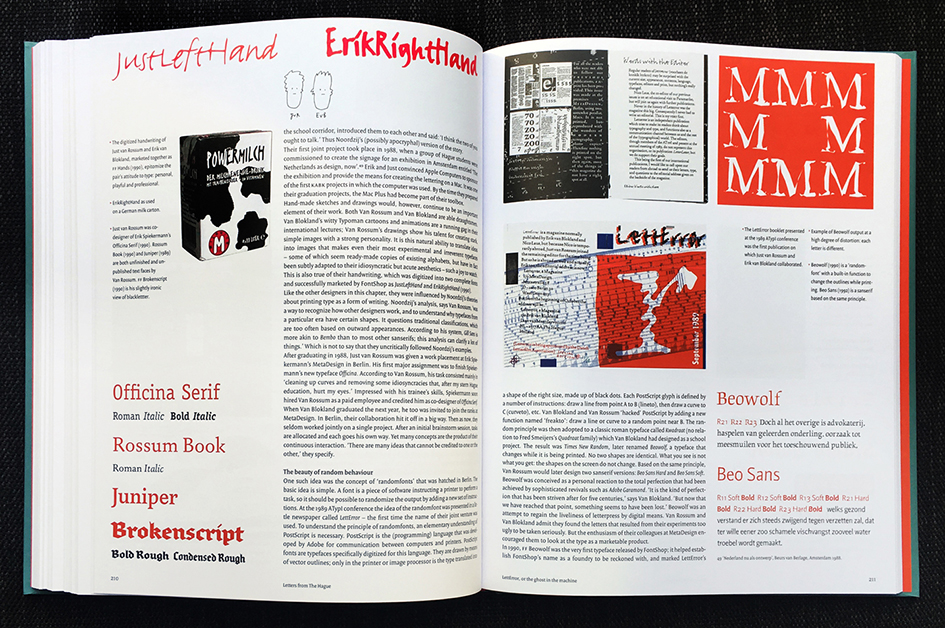
JM: I don’t think there is one, or rather: there have been several. As early as the 1910s, typographically talented architects like Wijdeveld and Lauweriks were experimenting with alphabets with no curves, as did Theo van Doesburg a decade later. He even influenced some individuals at the Bauhaus with his independent De Stijl workshops. After 1945: great lettering artists-illustrators like Salden, Kurpershoek, the less known Boudewijn Ietswaart and many others. The technology-hopping design of printing types in the 1970s-1990s: Gerrit Noordzij, Bram de Does, Gerard Unger. In digital times: Unger still, the Van Blokland brothers, Just van Rossum, Lucas de Groot, and the trio from Arnhem: Smeijers, Majoor, Bloemsma. And at least a dozen others.
TR: Please describe the Dutch type design scene in five words or less.
JM: Practical, innovative, technically savvy, historically aware. That’s six, sorry.
TR: Who is the most important yet lesser-known Dutch typographer that we should all learn about?
JM: If you mean “type designer” (as in Dutch and English, a typographer is a designer who uses fonts, not necessarily making them) I would say: Evert Bloemsma. Died, alas, in 2005, at only 46. Made four font families which each were the outcome of speculative research, but turned out very usable. All FontFont releases: FF Balance, FF Avance, FF Cocon and FF Legato.
TR: Which traits do Dutch graphic designers bring to the typographic realm?
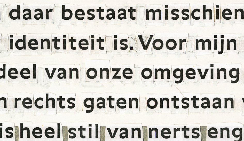
JM: Graphic design is a very broad field. I would say that Dutch (typo)graphic designers respect tradition but are never pompous or nostalgic – and if they use those modes, it is usually in an ironic or “commenting” way. Curious. Irreverent. Critical. Self-critical.
TR: This is an on-going adventure that spans in many years. How did you get evolved through your Dutch Type project? Has it changed you and in what ways?
JM: What influenced me most was my work for FontShop – first the Benelux branch, later working with FontShop International in Berlin, making an exhibition and a book with Erik Spiekermann. All that work brought me in contact with the contemporary type design scene, and fed into the books I wrote and edited. Later, as MyFonts’s main writer, I conducted and edited 100 type designer interviews. Which was a joy. Did it change me? I’m a bit of a chameleon and a bit of a sponge, and that hasn’t changed.
TR: What is the most important advice you have been told to and you would like to pass it on to the aspiring typographers of the future?
JM: I was never given one specific piece of life-changing advice, but talking to brilliant and ironic teachers like Gerrit Noordzij and Gerard Unger, and also somebody like Matthew Carter, I learned that the best minds are often also characterized by modesty – and accessibility.
TR: The iconic and much-respected Gerard Unger sadly passed away. What is his legacy?
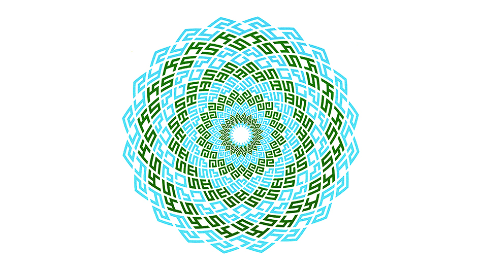
JM: Unger has left behind a huge legacy that encompasses three aspects: his typefaces, all with a very personal and recognizable set of solutions and constructive elements, and most of them extremely usable and practical; he left some well-written and often witty books about the making and the functions of letterforms and fonts; and most of all: he was a teacher with a lasting impact on how younger people look at making type, especially at the University of Reading, where he still travelled just weeks before his passing. I always found him very Dutch in his approach, yet very international.
TR: Dutch Type has been one of the Holy Grails since its first publication and now it's making a comeback. Why now?
JM: See above. Also, the requests to re-publish it grew manifold, and louder. What was an important step for me was the decision to do a near-facsimile: I enjoyed making the old book available agin, not throwing away half of it to update it. I hope one or more publications about 21st-century Dutch type will follow.
TR: Why did you choose to use Peter Verheul’s Versa as the font of this book? Which qualities draw you to this choice?
JM: Of course, Bart de Haas and Peter Verheul, the designers of "Dutch Type", chose the face. It was a very good choice because I had written a lot and this typeface can be quite space-saving. Also, new styles were developed in response to problems we encountered during production — the sans-serif did not yet exist when we started on the book, and a condensed sans-serif was ideal to accommodate the long captions I had written with people in mind who might read the main text only reluctantly.
TR: Netherlands is small, yet its influence on typography is immensely wide. Why is that?
JM: It is often easier to be inventive and innovative when you are part of a small culture that can learn to adopt and enjoy your work instead of having to cater to the masses. Switzerland is also a small country where very wilful designers do their thing for a relatively small market. Also, Erik Spiekermann’s interest in the Dutch ways during the early days of FontShop helped new Dutch type a lot. Their is probably a dozen more possible reasons.
TR: If you were a Dutch font which one would you be and what would your motto be?
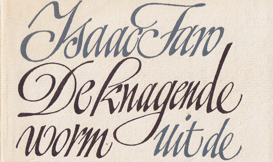
JM: That’s an impossible question for me to answer. I think I don’t want to be used by everyone. I would prefer to be piece of lettering, like a book title by Boudewijn Ietswaart.
TR: Which is your most beloved dutch font and why? What about the least?
JM: You don’t like fonts just as a stand-alone product. They are tools to design pages in response to somebody’s needs. When I had a design studio, I worked with Thesis, Quadraat, Caecilia and more (but also with French, German and American fonts) but for a single book title or a brochure for a crazy theatre project or a bank, something completely different might be ideal. And fonts I dislike are not worth talking about, haha.
TR: Many consider Gerrit Noordzij the most influential Dutch type designer of all times. What's your take on that?
JM: He has been the most influential teacher for sure, who wrote a few books that re-defined how to analyse letterforms. His typefaces are fairly unknown (only two are available) and he mainly designed them for himself – to use in a book design he was working on, because he could not find what he was looking for. So his typefaces are not very visible, and his method of sketching type and defining their place in the “cube” of weights and contracts was much more influential than any font.

TR: What is the state of the Dutch type design scene now? Who are the leaders of the pack if there are any?
JM: The most dynamic thing about the Dutch type scene is probably the Type & Media course at the Royal Academy of Arts (KABK) in The Hague. This has been the place from which both the principles of creating type, and the eagerness to embrace the latest technology, have spread. The type design scene itself has not changed so much. There is no young generation with the same impact as the people who emerged around 1990 – only a fairly small group of talented individuals. Almost all alumni of Type & Media are foreign: from all over Europe, the Americas, the Middle East and Asia, and only a few stayed in the Netherlands. The type scene in Berlin, where I have been living for 15 years now, is more varied in terms of age and gender. Quite a few, though, have perfected their skills at the KABK.
TR: How can Dutch type remain Dutch in the era of multinational, over the Internet, exchange?
JM: It doesn’t have to, does it? Many designers work very internationally, and are very flexible stylistically. You may recognize the Dutchness (even in the work by type designers who only were in the Netherlands for a year or so when at Type & Media) in a combinations of clarity, elegance and efficient, even “simplified” shapes.
TR: Does nationality play an important role on the typography realm after all?
JM: Less and less.
TR: Why did you choose to live in Berlin? How is the typographic scene there and in which ways is different to Dutch type?
JM: I was curious to get to know the city, and for several reasons I found it was time to leave Belgium behind, after 15+ years there. This city has so much to offer on a daily basis that you have to get used to missing about 400 events each week. Which can be nerve-racking, but it’s kind of OK for me.
TR: What does it being Dutch means to you?
JM: Well… you can take the Dutchman out of Holland, but you cannot remove Holland from the Dutchman. Unfortunately I would have to “become German” to vote on a national level, but I am not a German personality, although I respect much of the culture a lot. Of course, I do loathe how they imposed austerity on Greece. The worst medicine for economic infirmity. That’s one of the biggest errors of the EU: its politicians and administrators have never understood what a European is.
TR: What are you working on now?
JM: I’ve been pronounced ill, but I try to do new projects nonetheless. Hopefully there will be a sequel to Dutch Type, a kind of magazine-like book, covering aspects of the last 15 years. Also, distributing the book as my own publishing still involves a lot of administration – which I detest.
Grab your own precious copy here.
Tags/ type design, lettering, interview, faces, publication, netherlands, linotype, crowdfunding, jan middendorp, dutch type, bauhaus, de stijl, theo van doesburg, fontshop, gerard unger, druk editions, louis andriessen, willem breuker, myfonts, nai publishers, gerrit noordzij, bram de does, peter verheul, bart de haas, lucas de groot


