It's all in the A! The Atlantic is stunningly redesigned with a bespoke typeface & a monogram
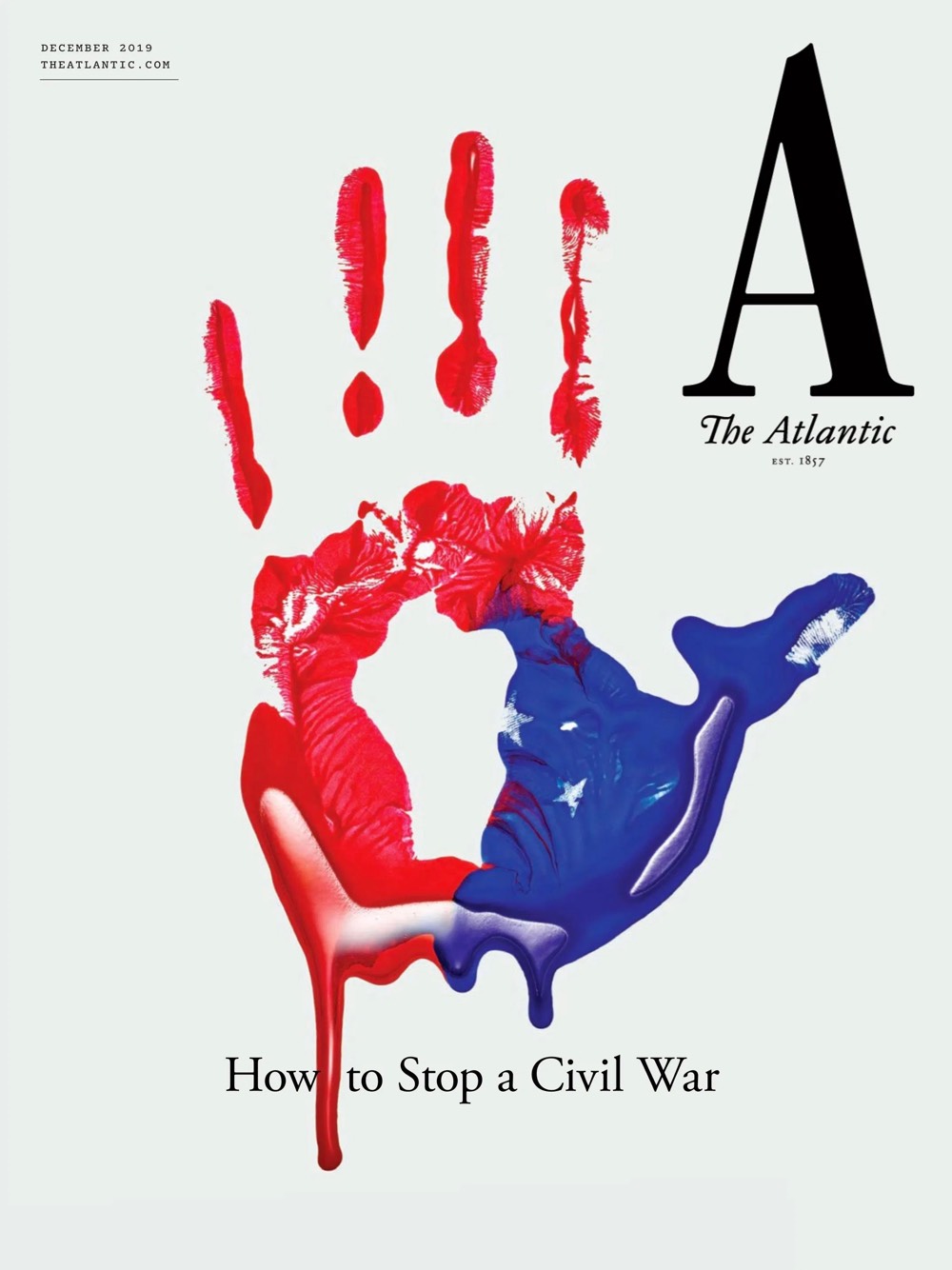
Led by creative director Peter Mendelsund and senior art director Oliver Munday, the well-respected book publishing design team who came on board full-time at The Atlantic almost a year ago, the magazine unveiled a new visual identity complete with a new logo, custom typeface, updated website, and iOS app with its December issue.
“It is the most dramatic new look for our magazine in its 162-year history, and one that, we hope, reflects boldness, elegance, and urgency,” writes Jeffrey Goldberg, the editor in chief of The Atlantic, author and a recipient of the National Magazine Award for Reporting.
“The interesting thing to me about the first cover in 1857 is how clear the hierarchy of information is. The forthrightness, the omitting of needless information, the seriousness of purpose and mission—I would say those are all components of the design that represent what The Atlantic, as an institution, does well” notes Mendelsund of his team effort to redesign the historic title.
“The most notable change in this redesign is the new nameplate, the move to the A as representative of the whole” adds Goldberg of the wordmark aka “an emblem—a logo.”
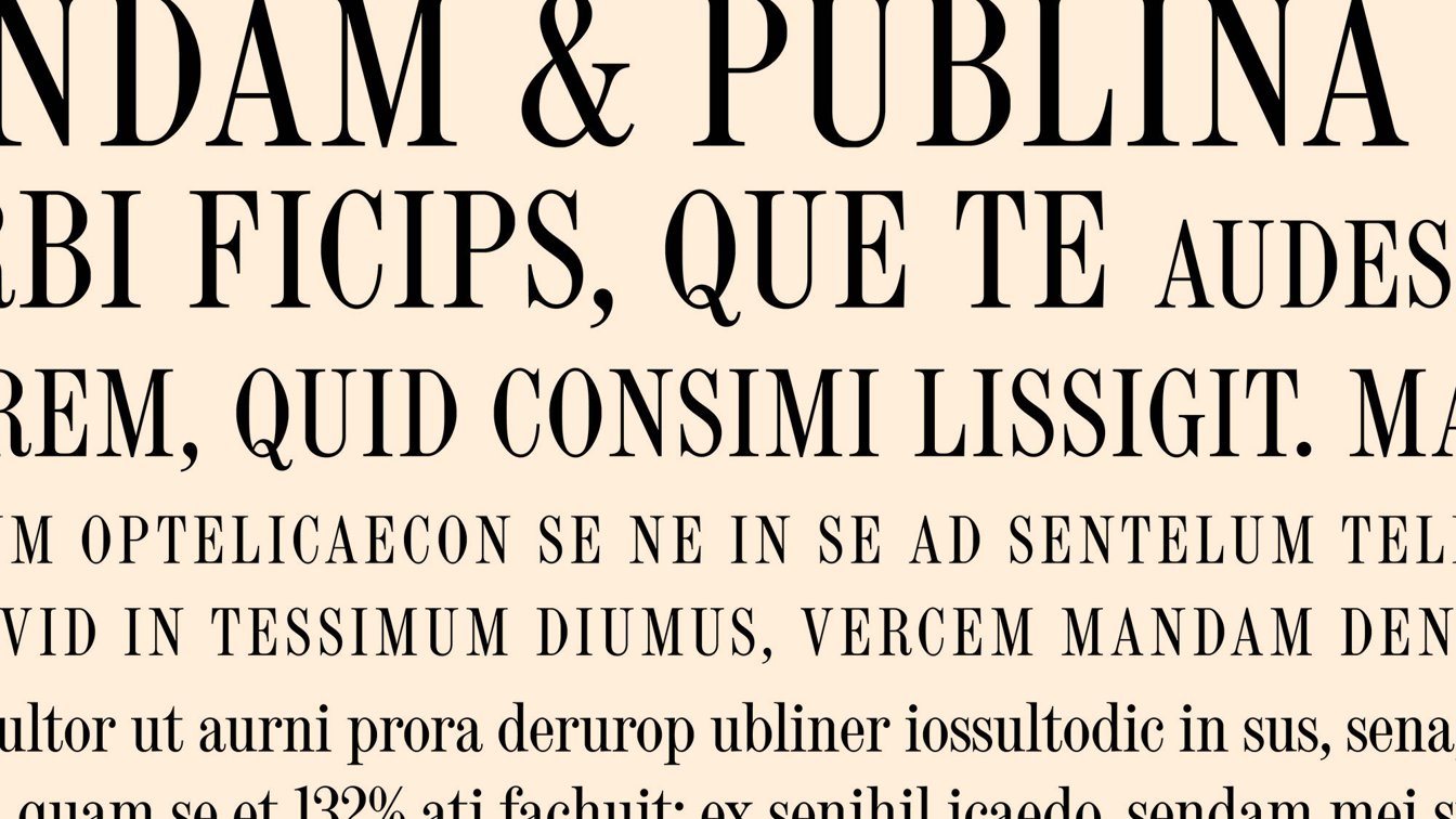
Set in the all-new bespoke typeface Atlantic Condensed based on the type forms that the founders chose for the first issue the font speaks of the magazine's legacy as well.
“We started with a condensed capital A that pointed toward an old version of The Atlantic logo drawn by Boston Type Foundry in the mid-19th century,” Munday explains to AdAge. With some adjustments for something "that felt weightier or slightly more bespoke” the design team added a notch to the top of the A, adjusted the feet and then hired typographer Jeremy Mickel for final refinement.
Eventually, the process led to the creation of a new custom condensed typeface, a full alphabet based on the original Boston Type Foundry sample used for the A.
This serif typeface known also as a “Scotch” face -a term describing the way the serifs are designed- is “an extremely legible, classical kind of typography, but also transmits a certain kind of vehemence and urgency that works nicely for our contemporary purposes.”

Atlantic Condensed, the bespoke and extremely legible serif typeface, aims to transmit a certain kind of vehemence and urgency that works nicely for The Atlantic's contemporary purposes
Per Mendelsund the new design had to be “readerly” and “to feel confident” without “clamoring for your attention in too many ways.” The task has been accomplished per the designers in a number of different ways.
“One is through good grids, making sure that the page itself has a rigorous, almost Euclidean logic to the way it’s laid out. Another is by ensuring that the type is interrupted as little as possible and that when it is interrupted by imagery, the imagery is contained within its own cordoned-off space.”
With the single-letter logo being the most striking aspect of this year's redesign -the magazine’s last full redesign happened in 2009- the A is set in roman, or normal, type. The upright letter conveys more authority, Mendelsund says. “Italics are typically not meant to work as a main graphical component but rather call attention in a body of text that is upright.”

Accompanied by a whole ecosystem of “engraved” nautical emblems to serve as visual elements of the Atlantic's latest redesign this is by far one of the most daring and visual pleasing rebranding projects of the year for a title which was launched in the autumn of 1857 by Boston publisher Moses Dresser Phillips.
The first issue of The Atlantic Monthly was published in November 1857 and quickly gained fame as one of the finest magazines in the English-speaking world. The magazine, which billed itself as a "journal of literature, politics, science, and the arts," was an immediate success and within two years the circulation of the magazine had risen above 30,000.
Two centuries later, on July 28, 2017, The Atlantic announced that multi-billionaire investor and philanthropist Laurene Powell Jobs (the widow of former Apple Inc. chairman and CEO Steve Jobs) had acquired majority ownership through her Emerson Collective organization. Now the magazine, subscribed to by over 500,000 readers, publishes ten times a year. Obviously the saga continues with an A.
Tags/ inspiration, font, magazine, rebranding, monogram, redesign, bespoke typeface, condensed, jeremy mickel, serifs, steve jobs, emblem, a, the atlantic, laurene powell jobs, peter mendelsund, oliver munday, jeffrey goldberg


