How Apollo 11 launched Futura to the moon
More than half a century ago, on July 20 1969, the world heard a quote destined to become iconic famous. “That's one small step for (a) man, one giant leap for mankind” said as Neil Armstrong lowered onto the surface of the Moon and this quote of him is probably evidence of “humankind's single greatest technological achievement.”
Neil Armstrong, Buzz Aldrin and Michael Collins were strapped into their Apollo spacecraft on top of Saturn V rocket on 16 July 1969. Four days later, Armstrong and Aldrin were officially the first humans to set foot on the lunar surface bringing a typeface along the Moon. Futura has landed and what a stunning journey has this font accomplished!
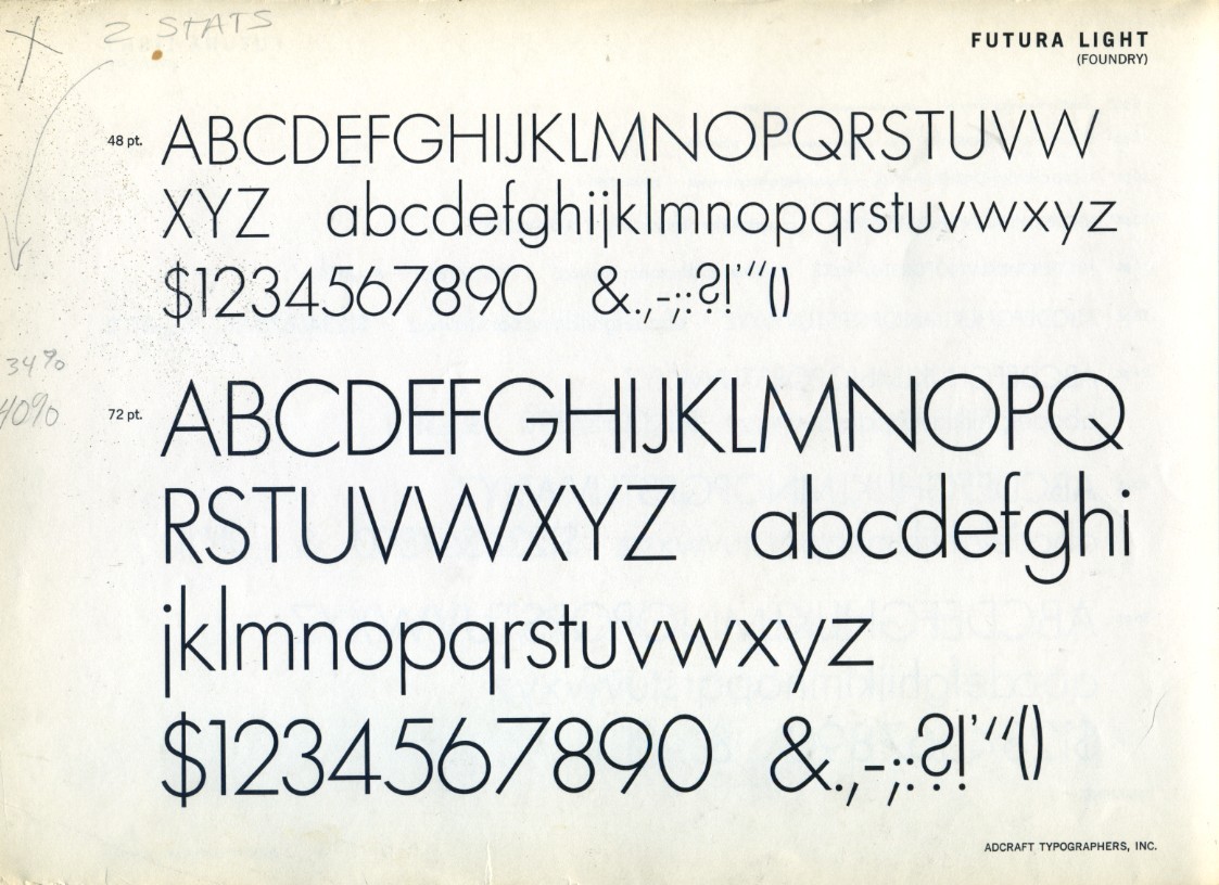
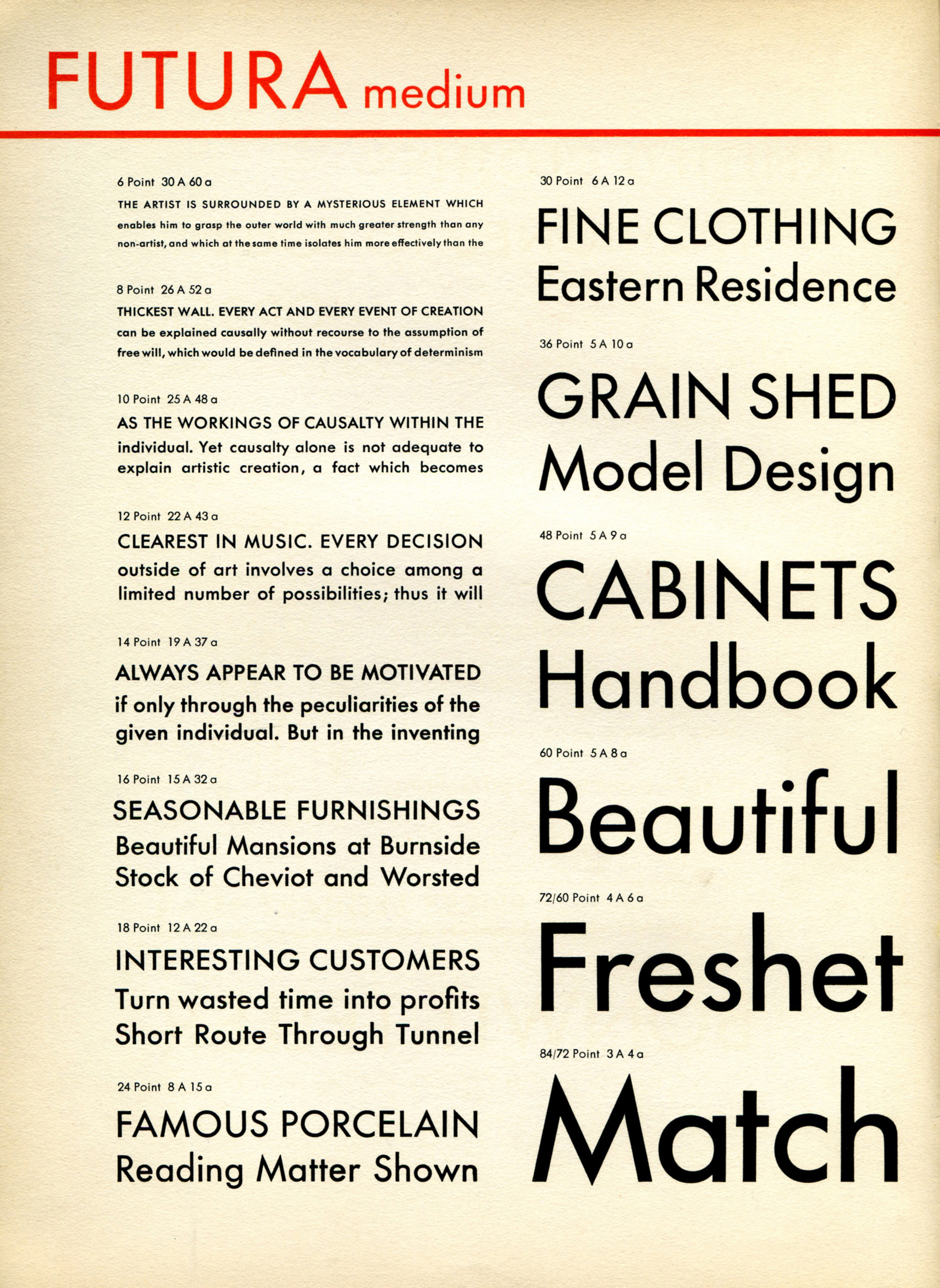
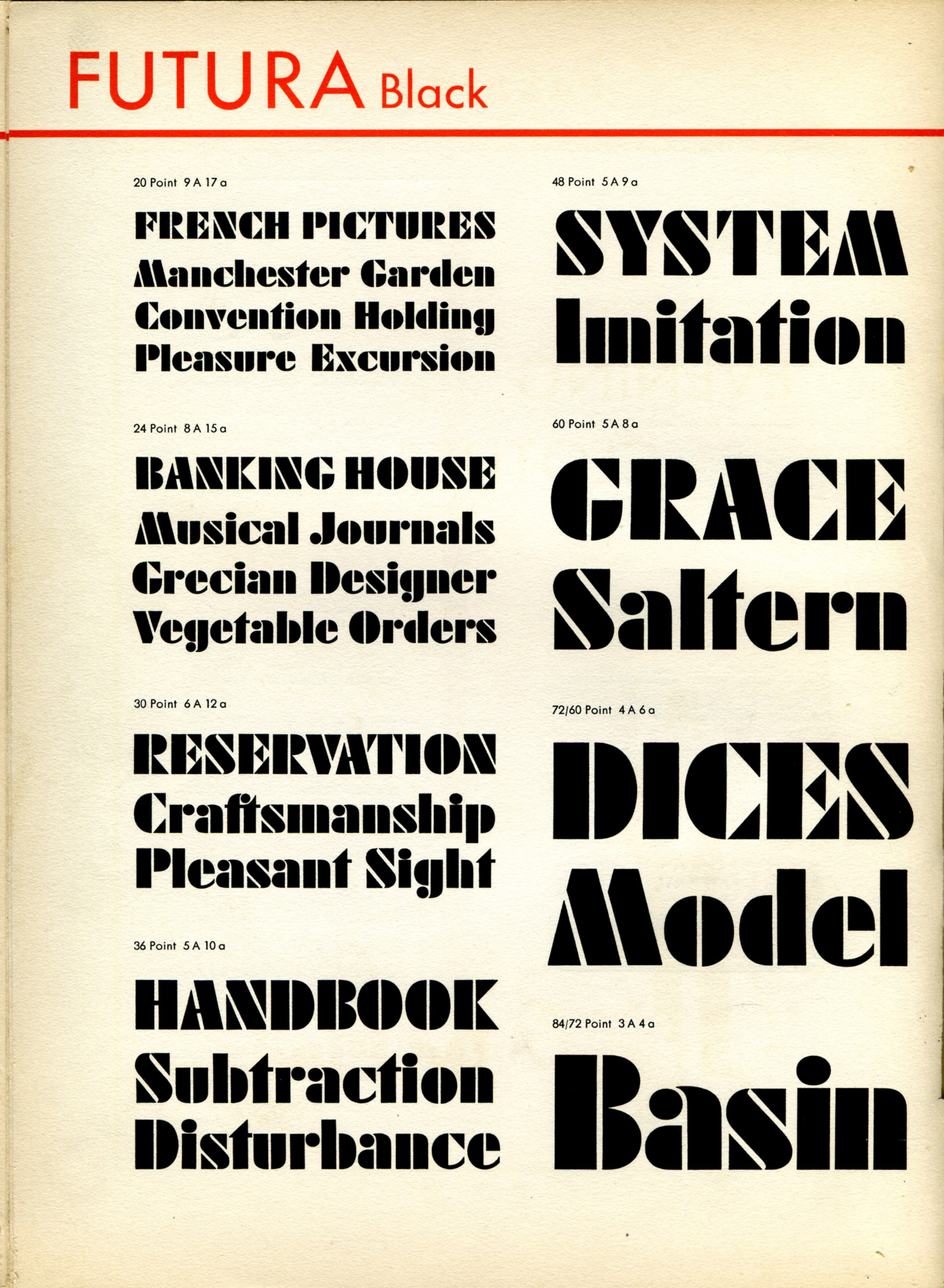
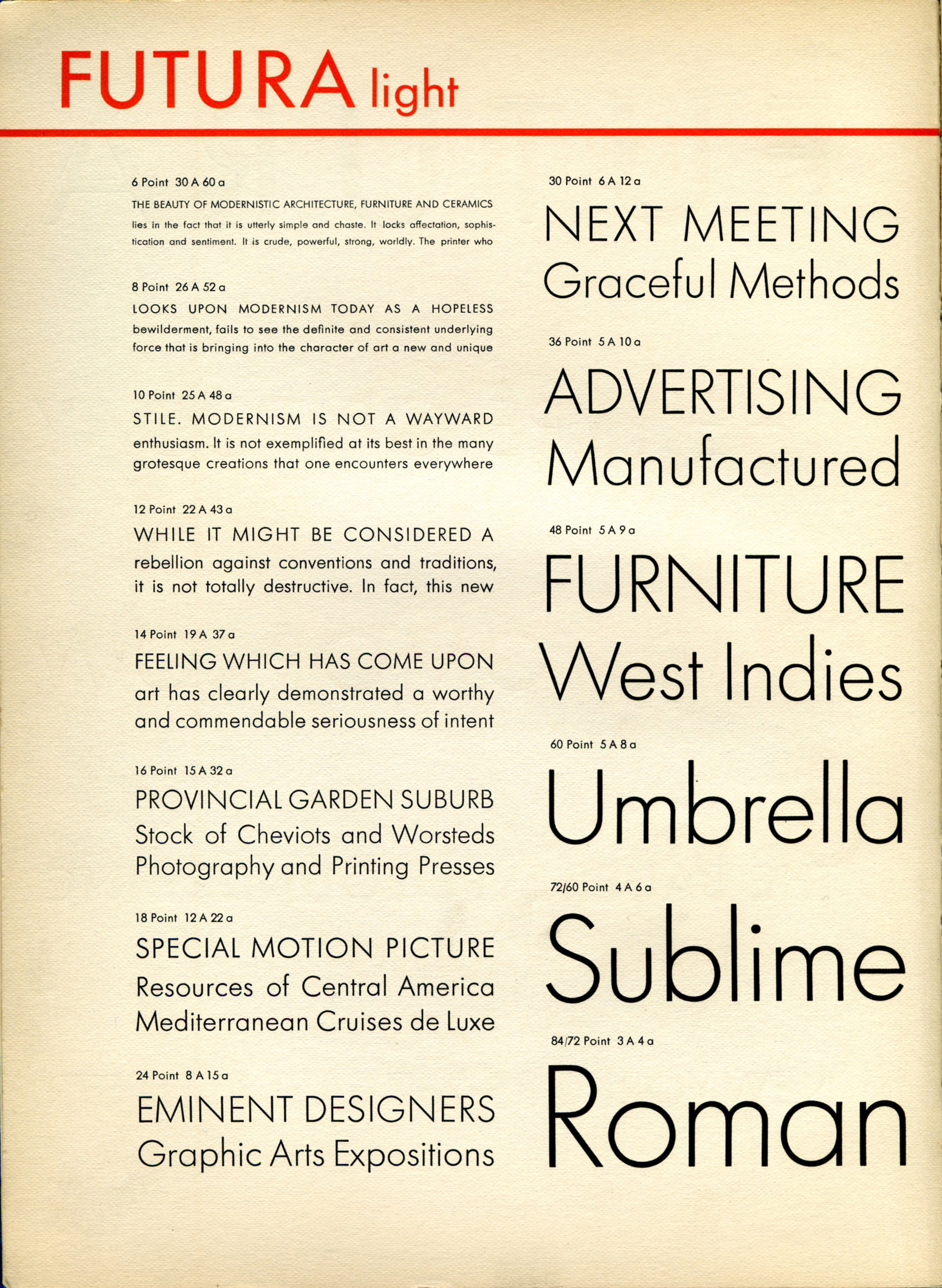
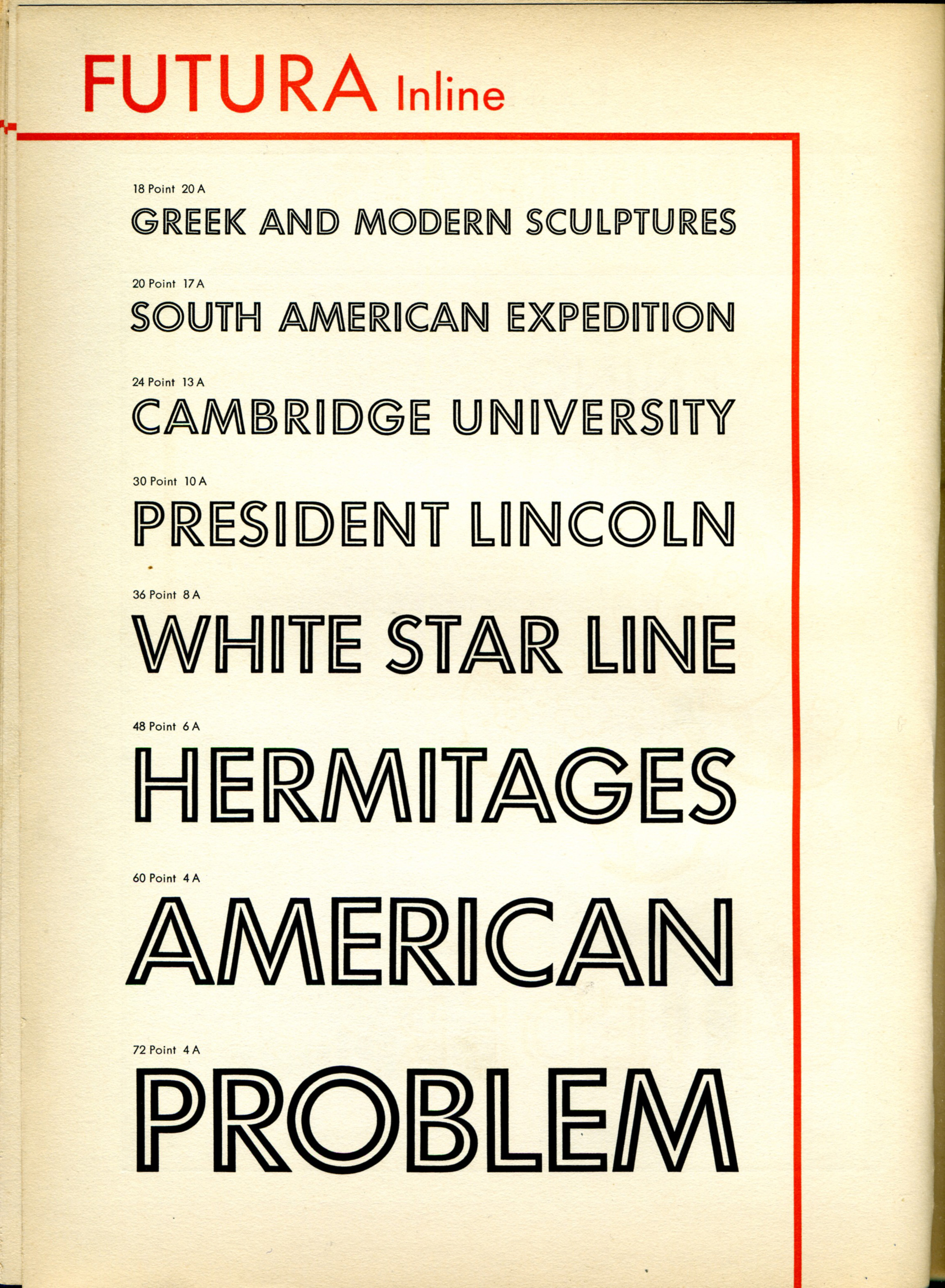
The geometric sans-serif typeface designed by Paul Renner and released in 1927 was designed as a contribution on the New Frankfurt-project.
Based on geometric shapes, especially the circle, similar in spirit to the Bauhaus design style of the period Futura was developed as a typeface by the Bauer Type Foundry, in competition with Ludwig & Mayer's seminal Erbar typeface of 1926.
Futura's forwardness and simple geometric forms are evident in the lunar plaque Aldrin and Armstrong left behind once they were lifted off the lunar surface.
Futura's near-perfect circles, triangles and squares, based on low in contrast strokes of near-even weight were ideal for NASA, after all the typeface's slogan in the font's brochure was “die Schrift unserer Zeit” (“the typeface of our time”) and in English "the typeface of today and tomorrow." But Futura didn't land on the Moon because of Stanley Kubrick's extensive use in his opus “2001: A Space Odyssey” as many claim.

“Futura wasn’t just a ceremonial embellishment, or a sunny commentary on the goals and ethos of NASA, the Apollo missions, and the United States. Rather, Futura (or one of its American clones, like Spartan) preceded the space program as a systems typeface, a method of communication and labeling that unified parts of the military, and then NASA’s myriad actors: contractors, engineers, and astronauts” writes Douglas Thomas.
“By the 1950s and ’60s, Futura had established itself as a visual cue for authority. It signaled factual information in headings, footnotes, and fine print across thousands of textbooks, newspapers, encyclopedias, and magazines. Futura’s visual authority sprang from its ubiquity, effectively robbing the typeface of its avant-garde exclusivity. In this environment, NASA didn’t choose Futura as a grand aesthetic statement of modernism unique to space travel. The U.S. Army had been using Futura as the basis for its detailed global mapping project since World War II, and the US Air Force had started using Futura on labels for its missiles by the late 1950s. By the time of the Apollo program in the 1960s, Futura was a generic choice for military operations” he adds in this article adapted from the book “Never Use Futura” (Princeton Architectural Press, 2017).
Futura's trip to where no other typeface has gone before was obviously not the last frontier for one of the world's most popular typefaces ever.
Futura's geometric authority was used extensively by the publishing industry as a general-purpose font lines until the 1950s whilst the use of the font is widespread in the aerospace industry for flight instrument and control markings.
Popular with Hollywood and any industry alike (from transport, an area where Futura has been used extensively due to its ability to be read quickly from a distance through aviation and more) NASA made Futura part of humanity's history on this day fifty years ago.
Explore more details of this font's influential adventure in type design in the book “Futura, The Typeface” (Laurence King).
Tags/ typeface, origins, nasa, futura, anniversary, stanley kubrick, princeton architectural press, laurence king, bauhaus, paul renner, apollo 11, 2001: a space odyssey, douglas thomas


