Head to Toe: Mirko Ilić & Steven Heller bare it all in their latest xrated publication
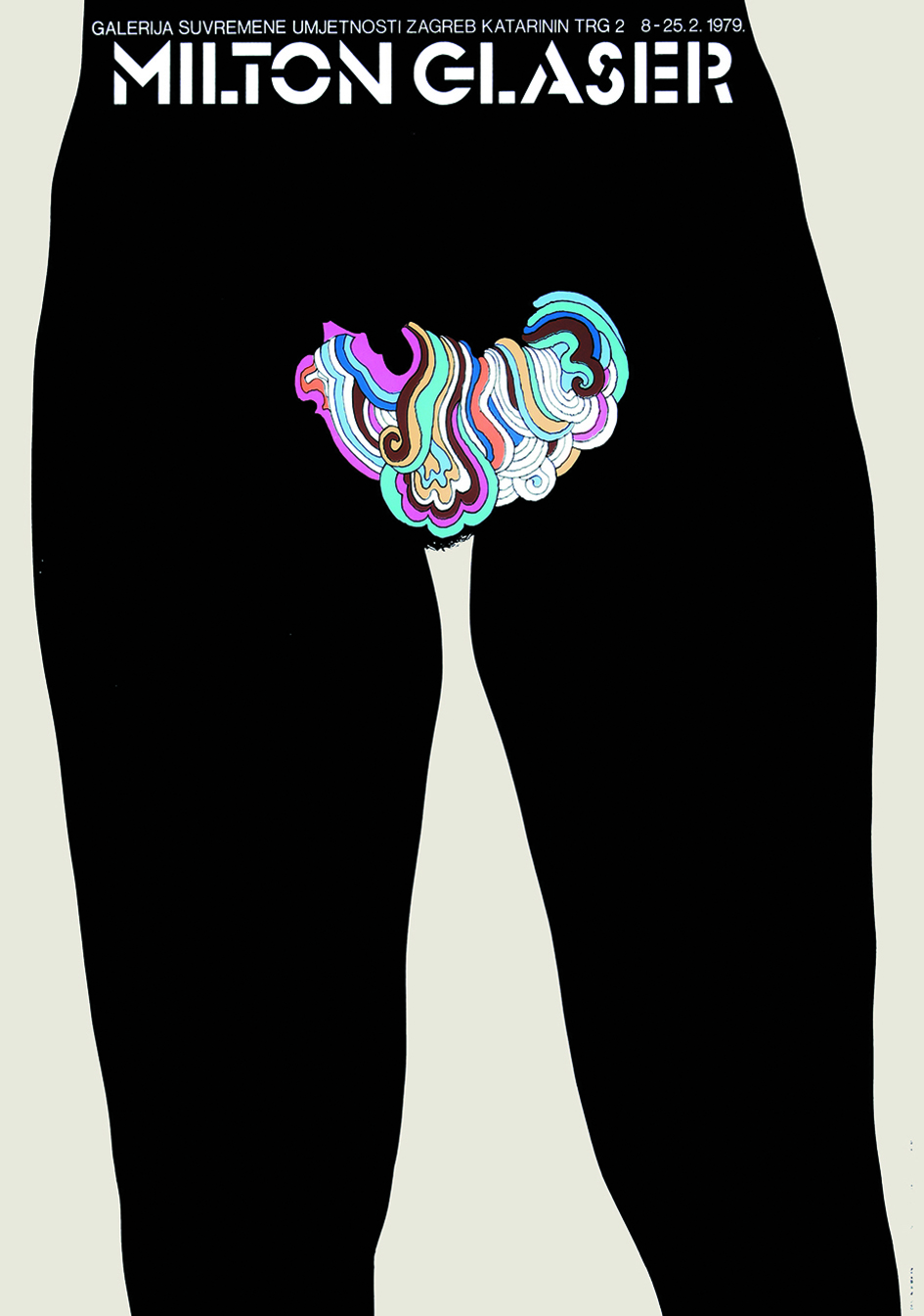
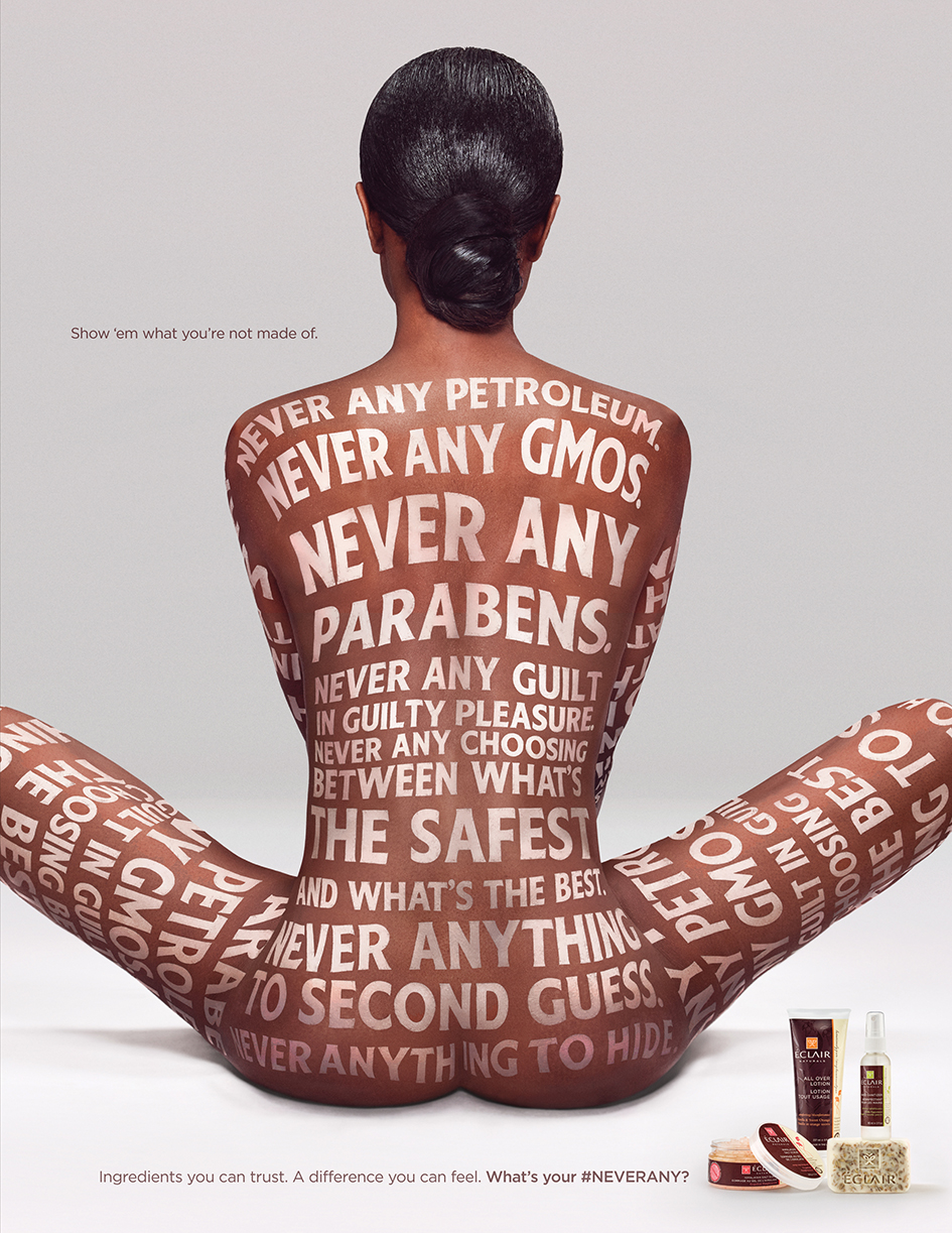
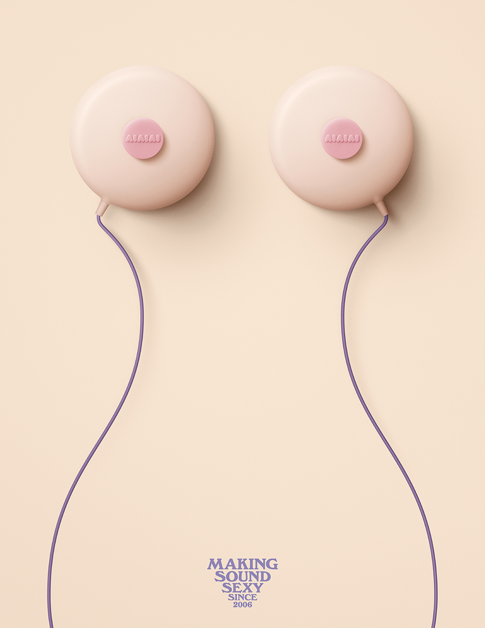
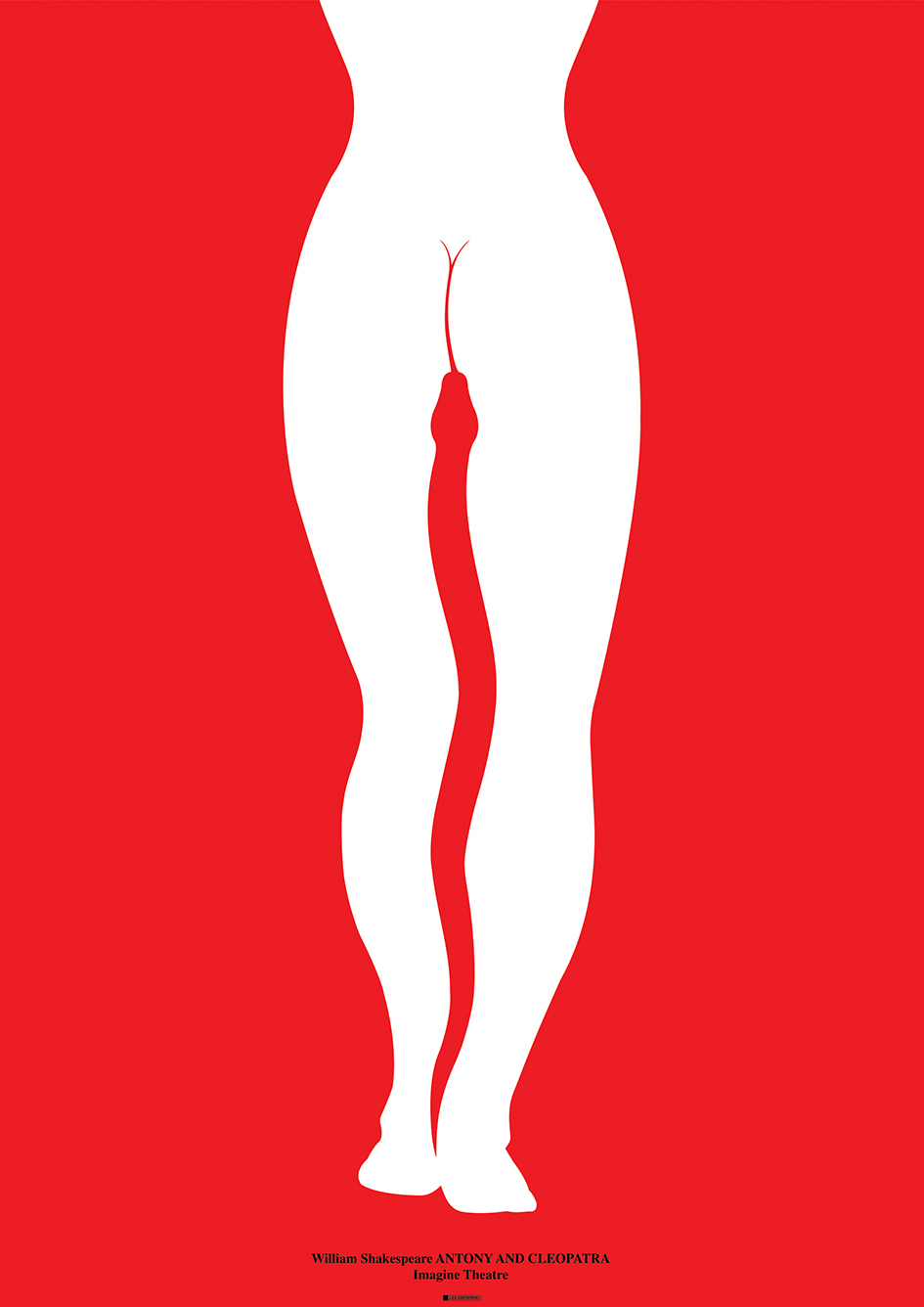
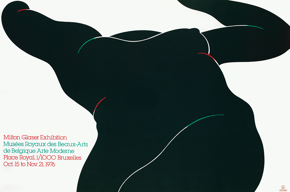
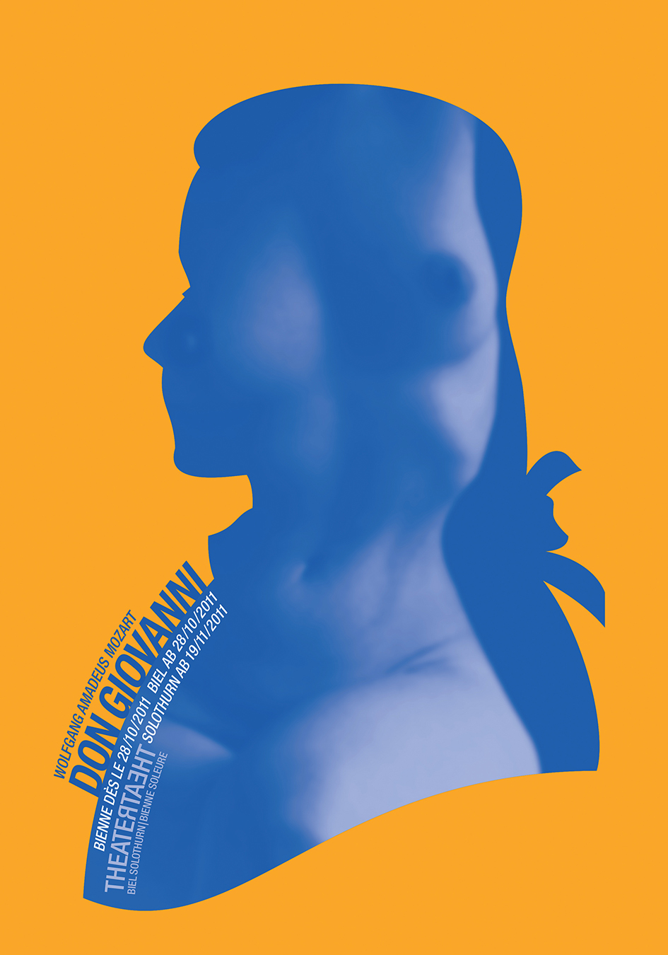
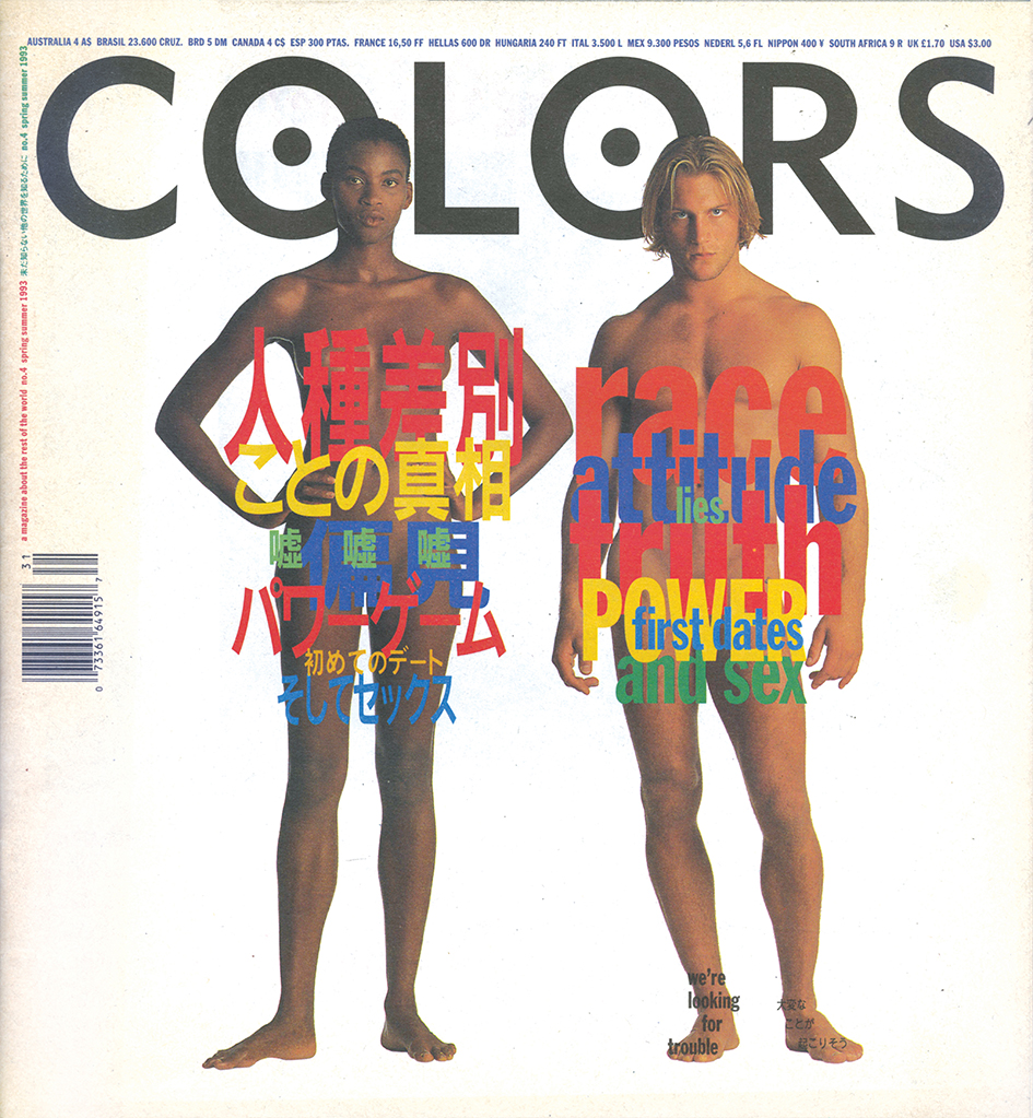
Comprehensively researched Head to Toe’s collection ranges from a witty array of images that imply female genitalia with nary a body part in sight, liberal use of fruit and vegetables to suggest human anatomy, naked bodies graffitied from head to toe with text, more ingeniously graphic uses of pubic hair than can be imagined, examples of PETA’s infamous “I’d Rather Go Nude” ad campaign, the first actual women used to model Playtex bras—formerly seen only on mannequins—to the then-shocking but instantly iconic John Lennon and Yoko Ono nude Rolling Stone cover.
Humorous, political, challenging, and subversive “Head to Toe: The Nude in Graphic Design” is a bold publication that bares it all. This collaboration between award-winning art director and educator Mirko Ilić, and Steven Heller, the renowned design critic, author, art director, and educator is an eye-opening survey of the myriad ways the human body is shown, implied, drawn and painted upon, politicized, abstracted, and illustrated to convey all manner of messages, both artistic, and commercial.
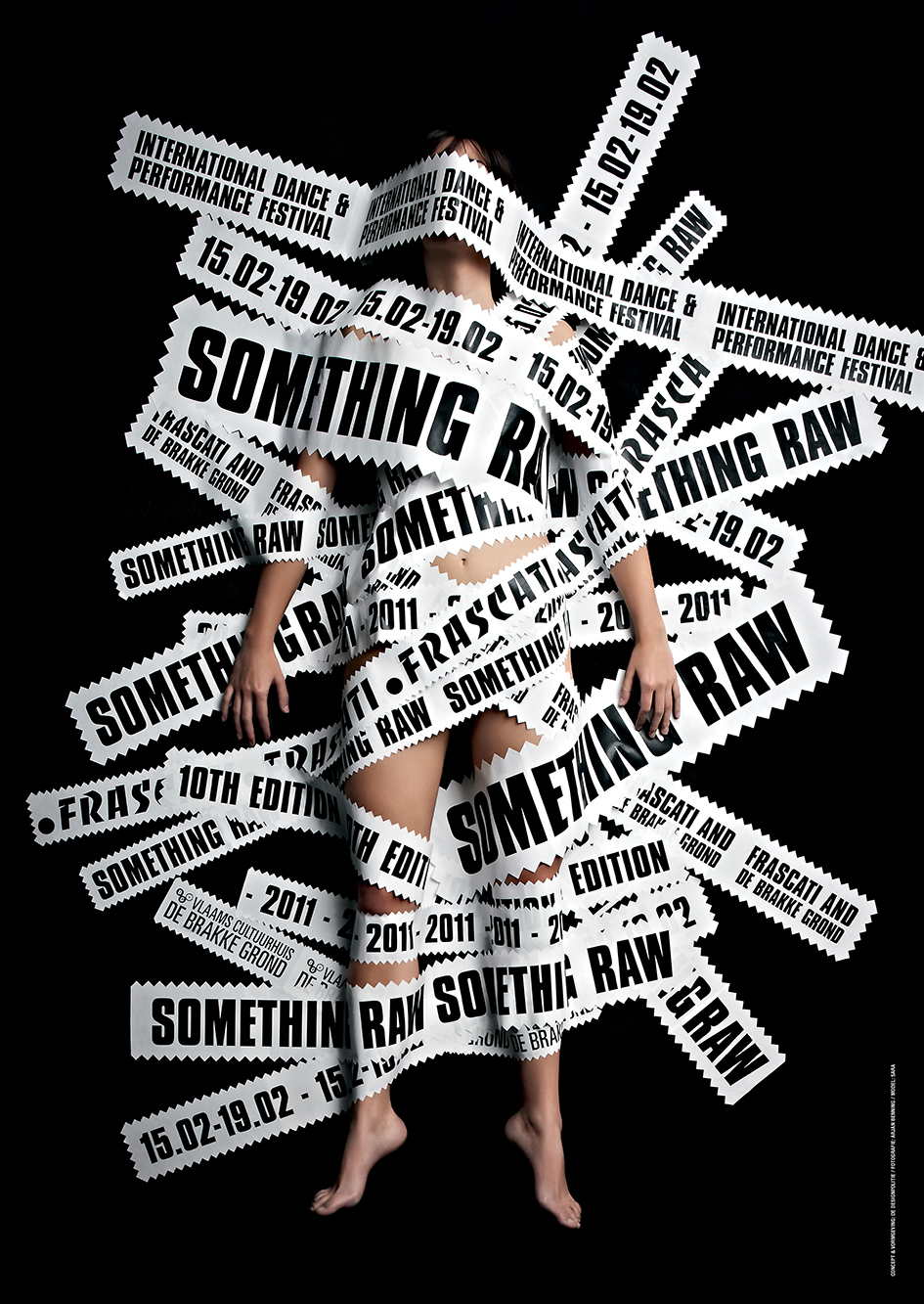
The book features more than 600 examples of the human body in graphic design from around the world, resulting in a handsome book that will appeal to art directors, graphic designers, and the generally design-savvy reader.
We talked with the two authors on this groundbreaking project that is pure typorn.

How long have you researched for this edition? Which where the steps, the methodology you followed to archive this genre?
The book took a little over a year to research. The method is simple, look in books, on websites and in magazines. Anywhere graphic design appears.
How did it all happen? Which event brought the idea to publish this book?
We are always looking for different ways design impacts culture, politics and art. This was simply an obvious example.
Also we were looking for a subject that had not yet been explored in a book. For example, we did our last book was 'Presenting Shakespeare, 1,100 Posters from Around the World’, when we realized nobody had ever done a compilation of Shakespeare posters before—even in England!
What is the one most shocking iconic example of shocking imagery that has gained the mainstream attention?
The funny thing is that once the ball started rolling, shock was in the eye of the beholder. The piece on our title page of April Greiman was shocking and then it was not. There are curious pieces, but once you see or feel the taboo, it becomes neutralized.
What’s shocking is that Facebook banned both of us for showing pages from this book on our FB pages. This from the service that brought you Russian interference in the American election.
Who was the most brilliant pornographer of graphic design of the century?
Oh my. We don’t call this porno. The most beautiful design that was considered porn was by Herb Lubalin, Eros Magazine (1962). Today it's tamer than Readers Digest.
Why penis, tits and the naked body shocks while the bloodsheds and violence don’t?
Goes back to the puritans I guess. Violence kept them alive. Sex was original sin. Nudity was considered sex. It's just the body, not sex.
How politically correct one can be whilst maintaining a provocative symbolism?
That’s a hard one to answer. Nudity is, as stated, often considered sexual, even misogynistic. If you look at it as natural or as a language then this question is moot.
Political correctness, in general, varies from region to region. In New York City or San Francisco, public nudity, while not commonplace, is entirely legal and mostly uncontroversial. On the other hand, a woman walking down the street topless will be treated very differently in other cities within America. When you start to talk about other countries, there are many more conflicting notions of political correctness.
Why graphic design was and still is reluctant towards the anatomy of the human body while other art forms weren’t?
Because graphic design is selling something or conveying someone’s message. Those somethings or someones may still be in the puritan age. Also, graphic design is a client-based industry. Ultimately, they make the final decision.
Which big corporate brand has invested more in the nudity of the body and why?
In Europe, nudity seems to be more prevalent. But usually fashion as an industry is more invested, because they are necessarily interested in the body. Take the example of the famous campaign for Calvin Klein underwear, and even Calvin Klein jeans.
What is the most brilliant typographic nude you ever encountered?
It is not in the book but I recently saw a poster of Sophia Lauren made of type. One of the most memorable ones is the early Body Type created by Anthon and Anna Beeke in 1970. Because it’s the most straightforward—it’s just bodies creating type. In history, that was drawn many times, but this was the first time someone went and photographed it really well
What is pornography now?
Pornography now is violence of almost any kind. And children being taken from their parents.
In today’s media climate, images of abject violence are consumed with the same kind of voyeuristic indulgence as pornography. Basically, pornography is based on appealing to people’s most basal instincts. Design that appeals to those basic instincts to sell you something you don’t need is, by definition, pornographic. Maybe it’s a coincidence, but it seems like advertising is most involved in that.
Has graphic design pushed the envelope as NSFW as it should or not?
As Bertolt Brecht once said, “Art [or the artist] is not a mirror held up to society but a hammer with which to shape it.”
Words: Loukas Karnis (Instagram @loukask)
Photos taken from "Head To Toe: The Nude in Graphic Design", Mirco Ilic & Stephen Heller
Credit: Rizzoli USA



Tags/ type, graphic design, book, interview, faces, steven heller, publication, herb lubalin, san francisco, eros magazine, america, print, anthon beeke, new york city, calvin klein, typographic, john lennon, head to toe, mirko ilic, naked, body, nudity, typorn, pornography, nsfw, body type, anna beeke, peta, playtex, rolling stone, yoko ono, sophia lauren, readers digest, bertolt brecht


