Google turns 20: the evolution of Google’s visual branding through the years
The Google story begins in 1995 at Stanford University. Larry Page was considering Stanford for grad school and Sergey Brin, a student there, was assigned to show him around. Working from their dorm rooms, they built a search engine that used links to determine the importance of individual pages on the World Wide Web. They called this search engine Backrub. Soon after, Backrub was renamed Google. The name was a play on the mathematical expression for the number 1 followed by 100 zeros and aptly reflected Larry and Sergey's mission “to organize the world’s information and make it universally accessible and useful.”
Three years later, in August 1998, Sun co-founder Andy Bechtolsheim wrote Larry and Sergey a check for $100,000, and Google Inc. was officially born. The rest is history.
To celebrate Google’s massive influence in today’s society we take a look at the company’s visual branding through the evolution of the company’s logo. Google’s logo history started in 1997 with a beta version that was quickly updated.
Sergey Brin created a beta logo using an online free platform called GIMP. The old Google logo was pure 90’s. The first official version of the logo was created in 1998 and had a different, pretty primary color palette than the logo in use today as the first “G”and the “L” were both green. Google’s first logo version was in use for only one month.
In September of 1998, the green “G” turned blue and the 3D effect on the letters also became more visible. The second logo featured an exclamation point at the end but due to the resemblance to Yahoo!’s logo it was dropped by May, 1999.
The company logo changed to one based on the Catull typeface and was used from May 31, 1999 to May 5, 2010. The exclamation mark was removed, and it remained the basis for the logo until August 31, 2015.
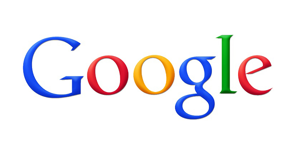
The logo used from May 6, 2010 to September 18, 2013 showed a reduced distance of the projected shadow, a change in the second "o" to a different yellow hue and a more flattened lettering with a custom font.
The logo used from September 19, 2013 to August 31, 2015 was even more simple, showing flattened lettering and the removal of shadows.
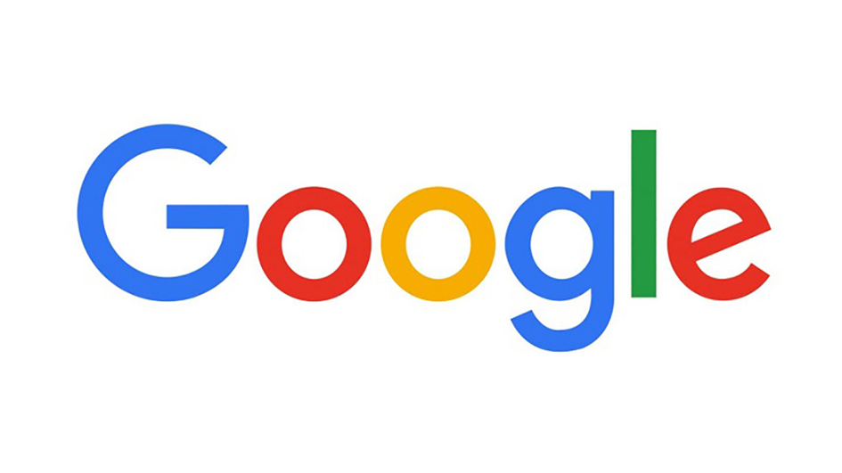
By September 2015 Google unveiled it’s entirely new visual branding with Product Sans geometric font, a new typeface developed in-house by the company, being the real star.
Product Sans is a geometric sans-serif typeface created by Google for branding purposes. As Google's branding was becoming more apparent on a multitude of devices, Google sought to adapt its design so that its logo could be portrayed in constrained spaces and remain consistent for its users across platforms. Product Sans is also used in some of Google’s user interfaces, in a size-optimized version named Google Sans.
At first glance, the font nearly matches the Futura typeface. The most notable difference between the two is the double-story 'a', which was implemented to contrast the circular shapes of the other characters.
Product Sans prefers to end the stroke terminals at about 45 degrees, with the cut off being perpendicular to the tangent of the stroke.
Slight optical corrections were also made to the geometric forms. The uppercase "G" has its circular shape pulled inwards slightly where it meets the crossbar. The counters of the '6', '8', and '9' are almost perfect circles. These visual corrections were made for legibility.
The present Google logo is based on Product Sans. Slight modifications do exist in the logo compared to the typeface: the most noticeable is the slanted 'e'. The differences between the logo and Product Sans allows for distinction between the Google logotype and product name.
Product Sans is mainly used in the text of Google's numerous services' logotypes such as Maps, Drive, News, Earth, etc. The font is also used on the "Made by Google" website, which showcases Google products, and in some versions of Android.
The new logo contained rounded letters, more subtle colors and Google officials stated that the change was meant to “make navigation easier and simpler from multiple devices”.
“Once upon a time, Google was one destination that you reached from one device: a desktop PC. These days, people interact with Google products across many different platforms, apps and devices—sometimes all in a single day. You expect Google to help you whenever and wherever you need it, whether it’s on your mobile phone, TV, watch, the dashboard in your car, and yes, even a desktop!” noted Google.
“Today we’re introducing a new logo and identity family that reflects this reality and shows you when the Google magic is working for you, even on the tiniest screens. As you’ll see, we’ve taken the Google logo and branding, which were originally built for a single desktop browser page, and updated them for a world of seamless computing across an endless number of devices and different kinds of inputs (such as tap, type and talk). It doesn’t simply tell you that you’re using Google, but also shows you how Google is working for you. For example, new elements like a colorful Google mic help you identify and interact with Google whether you’re talking, tapping or typing. Meanwhile, we’re bidding adieu to the little blue “g” icon and replacing it with a four-color “G” that matches the logo. This isn’t the first time we’ve changed our look and it probably won’t be the last, but we think today’s update is a great reflection of all the ways Google works for you across Search, Maps, Gmail, Chrome and many others. We think we’ve taken the best of Google (simple, uncluttered, colorful, friendly), and recast it not just for the Google of today, but for the Google of the future. You’ll see the new design roll out across our products soon. Hope you enjoy it!” added the company back in 2015.
Google’s first proprietary font is also in use for Alphabet—the corporate brand of Google.
Today, with more than 60,000 employees in 50 different countries, Google makes hundreds of products used by billions of people across the globe, from YouTube and Android to Smartbox and, of course, Google Search.


Tags/ typeface, origins, font, letters, alphabet, lettering, logotype, logo, 3d, stanford, futura, android, custom font, visual branding, legibility, sans-serif, google inc, larry page, sergey brin, search engine, world wide web, backrub, andy bechtolsheim, product sans, google sans, gimp, yahoo!, catull, google maps, google drive, gmail, google news, google earth, chrome, google search, made by google, youtube


