Gender by design. Pentagram’s all female team branding for The Wing
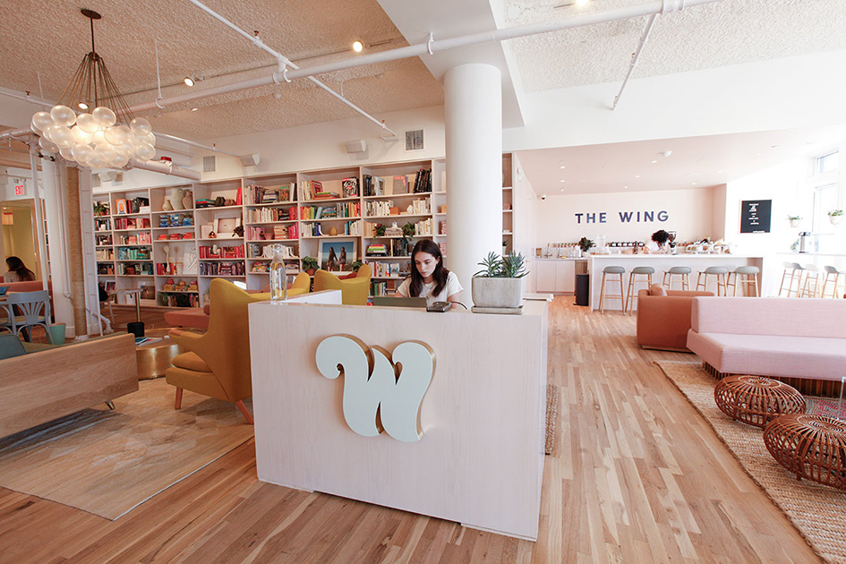
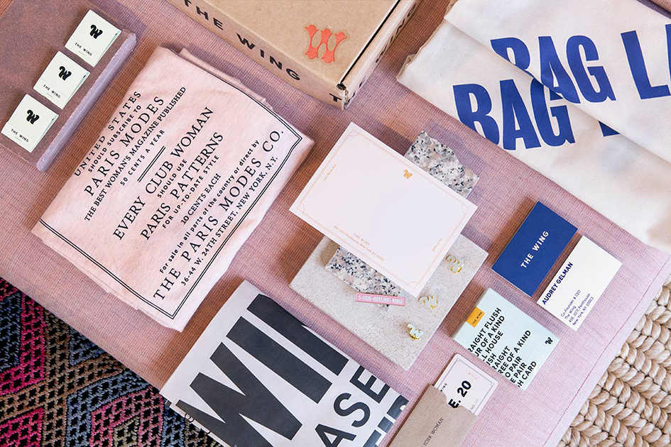
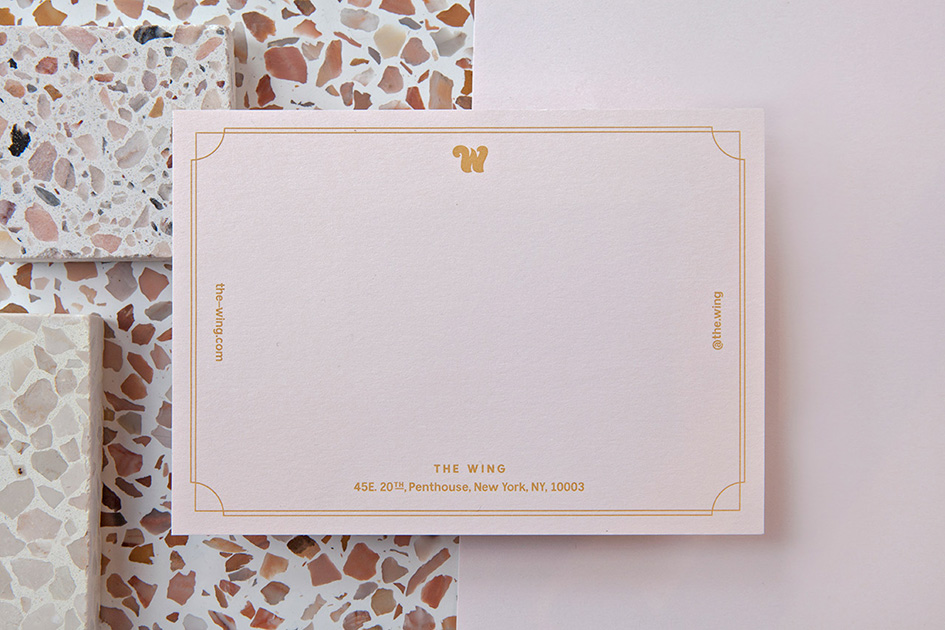
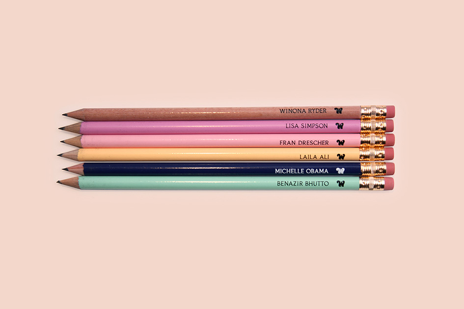
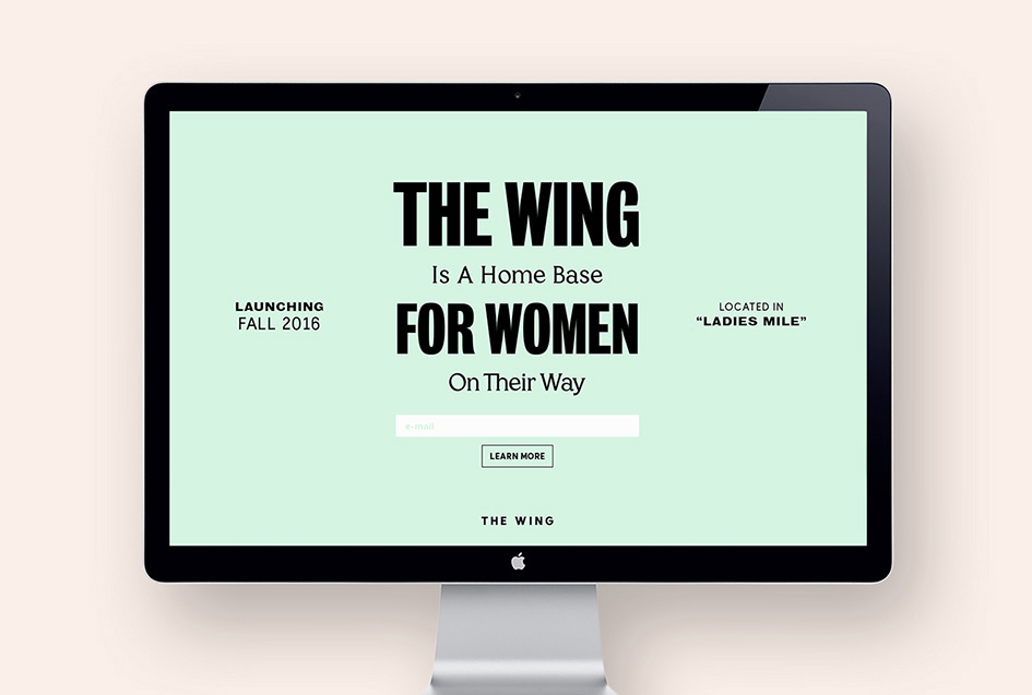
International Women's Day is a celebration for women who changed the world for the better and continue to do so. It’s a day to remember what women all over the world have done in pursuit of equal rights, honour them and be inspired by their words and deeds. It’ s a day "celebrating the social, economic, cultural and political achievements of women" and a "call to action for accelerating gender parity”. Eventually it’s a day to enter The Wing. This new women’s social club in New York is a place where women can work and connect “while they take on the world” and the members are greeted by the hero W on the front desk. Designed and branded by Pentagram’s Emily Oberman and an all-female team of designers, the visual identity of The Wing draws on the history of suffrage graphics and vernacular design to create a visual personality that’s smart, empowering, and more than a little fun. The project encompasses everything from the logo, messaging and collateral to environmental graphics, the Wing website, branded amenities for the club, and most of the products for the online shop.
Co-founded by the high-powered political and media relations strategist Audrey Gelman and Lauren Kassan, a former director of ClassPass, The Wing is envisioned as a place where women from different fields and backgrounds—writers, artists, designers, entrepreneurs and engineers, working in spheres as varied as politics, media, business, science, entertainment and the performing arts—can come together and have a creative exchange.
The Pentagram team worked closely with Gelman and Kassan to develop branding that felt authentic to the club’s bold point of view. The challenge was creating an identity that would appeal to a diversity of women without pandering or being stereotypical.
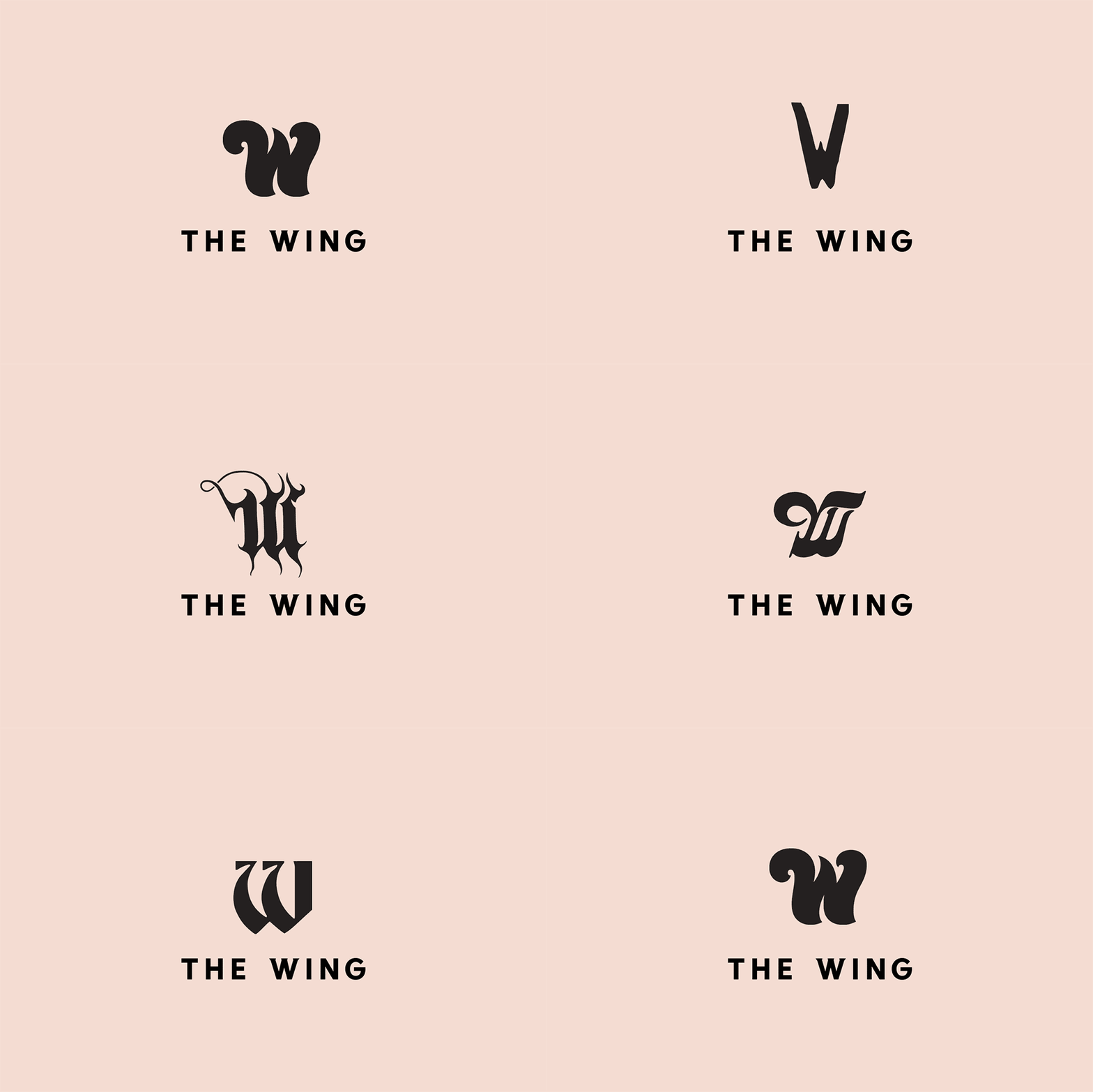
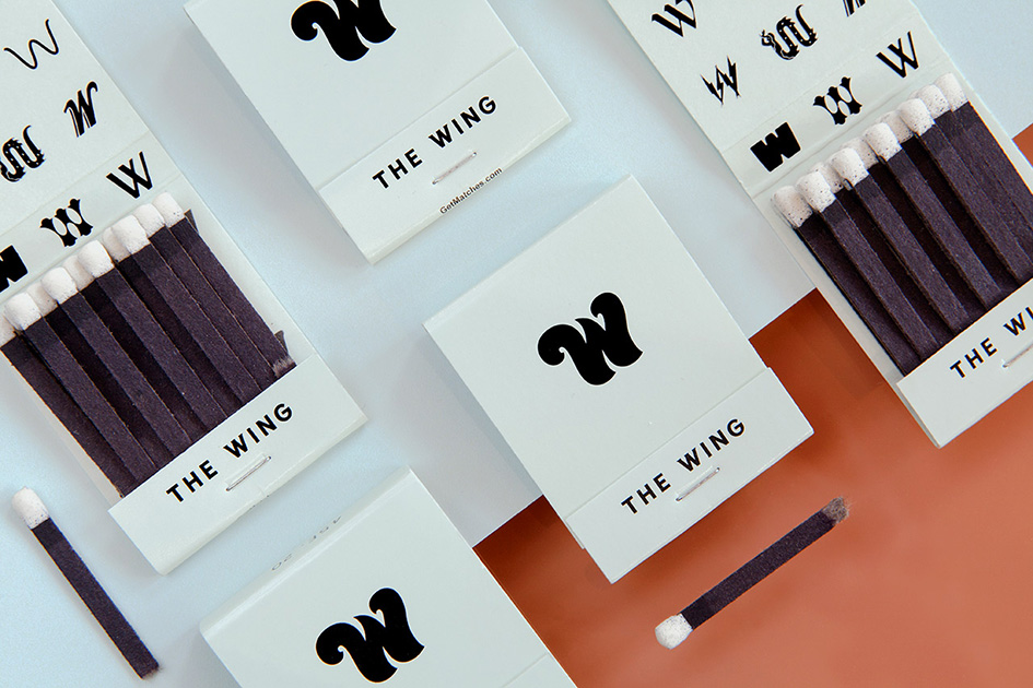
The Wing logo takes the form of an iconic letter “W”, a simple monogram that also references the familiar signage for a women's room. But the identity utilizes a series of 30 different W’s, a nod to the eclectic makeup of the membership and its diversity of perspectives and different voices. The W appears in a wide array of historical and contemporary W’s, everything from Wonder Woman’s distinctive wing-spread symbol to unusual typefaces such as Alpha Sausage, Cottonwood, Mythos and Retail Script.
The wide-ranging W’s introduce an element of visual surprise that keeps the identity fresh and unpredictable, and endlessly flexible. The hero W appears alone as a bold insignia—welcoming visitors at the club’s front desk, and as the cursor on the website—or as a motley crew of miscellaneous W’s that form typographic patterns.
“This is a social space, and everyone there is smart, witty and outspoken. The branding needed to participate in the conversation."
The logotype and primary typography is set in the straightforward sans-serif Bianco , with the W of “The Wing” signature set in the variant Bianco Serif, to give the letter little wings. Bianco Serif is also used for secondary typography and text. The hero W is a slightly redrawn Cruz Swinger and is meant to be strong, bold, curvy and unusual.
In tandem with the visual identity, Oberman and her team worked closely with the Wing founders to develop messaging that captured the club’s fearless spirit and attitude. The team imagined The Wing as a place where everyone from Fran Drescher to Issa Rae to Fran Lebowitz might possibly cross paths. Like the graphics, the messaging mixes contemporary vernacular with a smattering of sass.
“The powerful graphics of the suffrage movement were a perfect point of reference, as they came out of women’s clubs,” says Oberman. “At the same time, we wanted the identity and messaging to be fun and playful. This is a social space, and everyone there is smart, witty and outspoken. The branding needed to participate in the conversation."
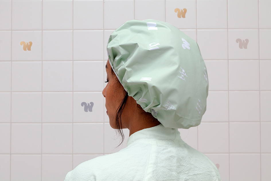
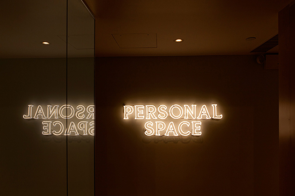
The branding is integrated throughout the interiors in environmental graphics that help make the space inviting and one-of-a-kind. The “W” logo is also emblazoned on custom tabletops in the café, and appears as a pattern in the custom tile of the bathrooms and even on the shower caps. The Personal Space is identified in blazing neon, and for the wallpaper in the beauty room, the founders commissioned the Brooklyn illustrator Joana Avillez to create a custom pattern of women doing different activities like yoga and hailing taxis.
As part of their work on the project, Oberman and her team have become members of The Wing. “It's a new kind of creative space, and we're proud to have helped bring it to life,” she says. “We can’t wait to see the amazing collaborations that it will foster among such an incredible group of women—and we’re already making more stuff!”
The Wing launched this fall with 350 members, and is already a huge success, with a lengthy waiting list for new members and plans to extend the idea to other cities.
Celebrating International Woman’s Day has never looked sassier.


Tags/ inspiration, logotype, logo, new york, pentagram, international women's day, the wing, emily oberman, suffrage graphics, audrey gelman, lauren kassan, “w”, alpha sausage, cottonwood, mythos, retail script, primary typography, sans-serif bianco, bianco serif, cruz swinger, suffrage movement, joana avillez


